How a simple design affects clarity and name acquisition
Texas State Historical Association
Experiment Summary
Timeframe: 09/19/2015 - 09/28/2015
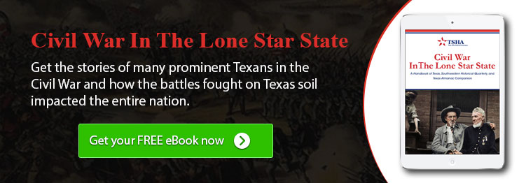
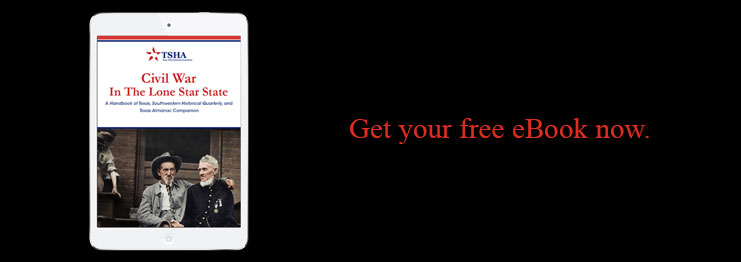
When launching their latest eBook offer, the Texas State Historical Association wanted to find the best way to drive the organic traffic that visits their site. Historically they had used banners with a simple headline, a design that matched the landing page, and a button with a clear call to action. On Facebook, however, the banners were a bit different due to the limitations on text amount imposed by the social network. These banners had been highly effective at driving traffic so we decided to test if this same simple style would have a similar impact on organic traffic.
Research Question
Which banner will drive the most traffic and allow for the acquisition of the most email addresses?
Design
Results
| Treatment Name | Conv. Rate | Relative Difference | Confidence | |
|---|---|---|---|---|
| C: | Designed Banner | 0.43% | ||
| T1: | Simple Banner | 0.58% | 34.7% | 100.0% |
This experiment has a required sample size of 17,137 in order to be valid. Since the experiment had a total sample size of 187,080, and the level of confidence is above 95% the experiment results are valid.
Flux Metrics Affected
The Flux Metrics analyze the three primary metrics that affect revenue (traffic, conversion rate, and average gift). This experiment produced the following results:
0% increase in traffic
× 34.7% increase in conversion rate
× 0% increase in average gift
Key Learnings
By simplifying the message and design of the banner, we were able to increase the number of emails acquired by 34%. The banner itself was able to drive 20% more traffic to the landing page and those visitors then converted at a much higher rate.
The more highly-designed banner had all of the elements that we normally look for in ads with a clear headline, simple description, and a button with a clear call to action. All of these same elements were then repeated on the homepage to reinforce the message. However, the simple banner was able to communicate this same value proposition much more clearly and concisely.