How advertising imagery affected the clarity of the value proposition
Buckner International
Buckner International is a global ministry dedicated to the transformation and restoration of the lives we serve. We are a Christ-centered organization that delivers redemptive ministry to the most vulnerable from the beginning to the ending of life.
Experiment Summary
Timeframe: 08/22/2016 - 08/31/2016
As part of their Shoes for Orphans Souls campaign, Buckner International created a 7-day digital devotional. The e-book guided individuals in prayer as a means to lift up orphans and other vulnerable children.
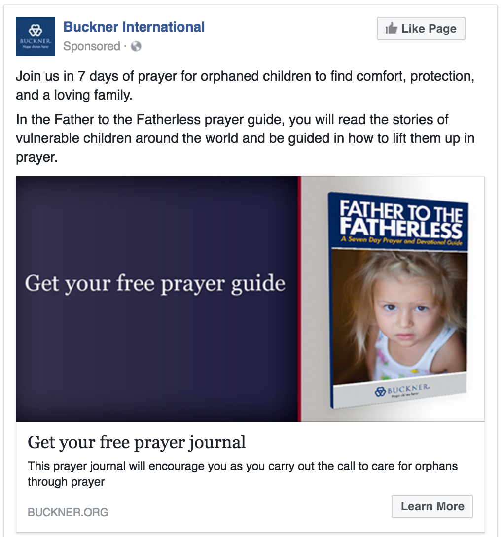
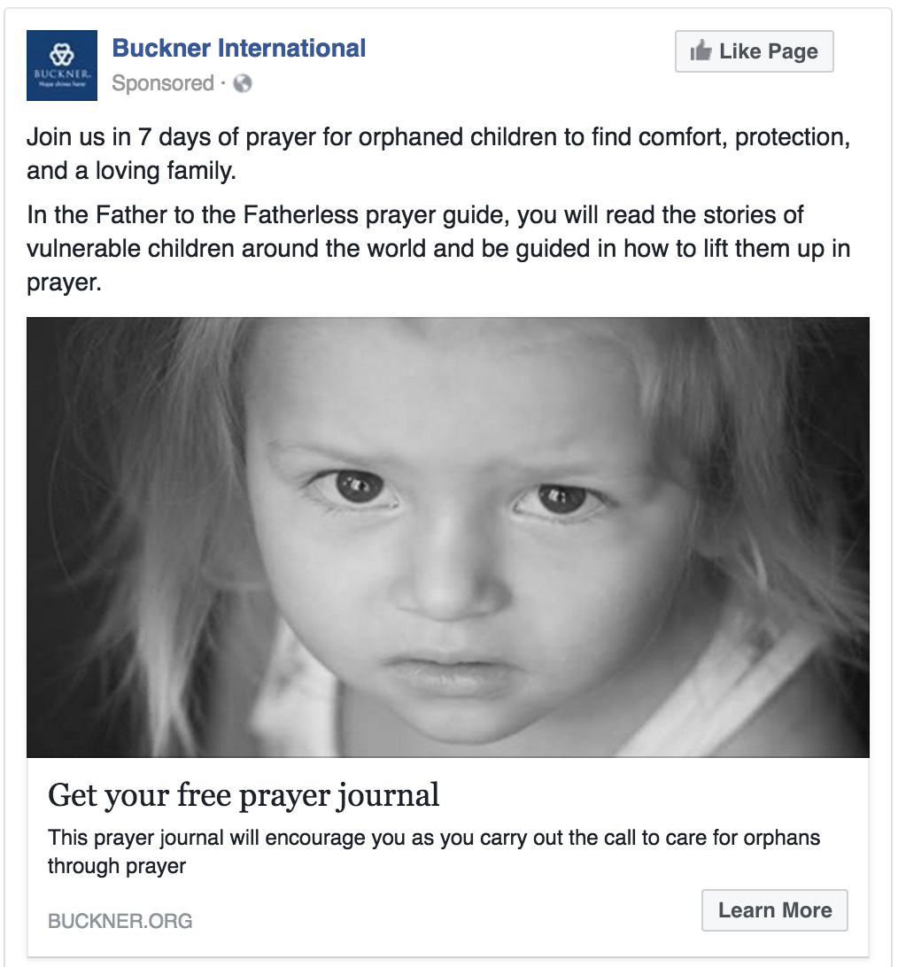
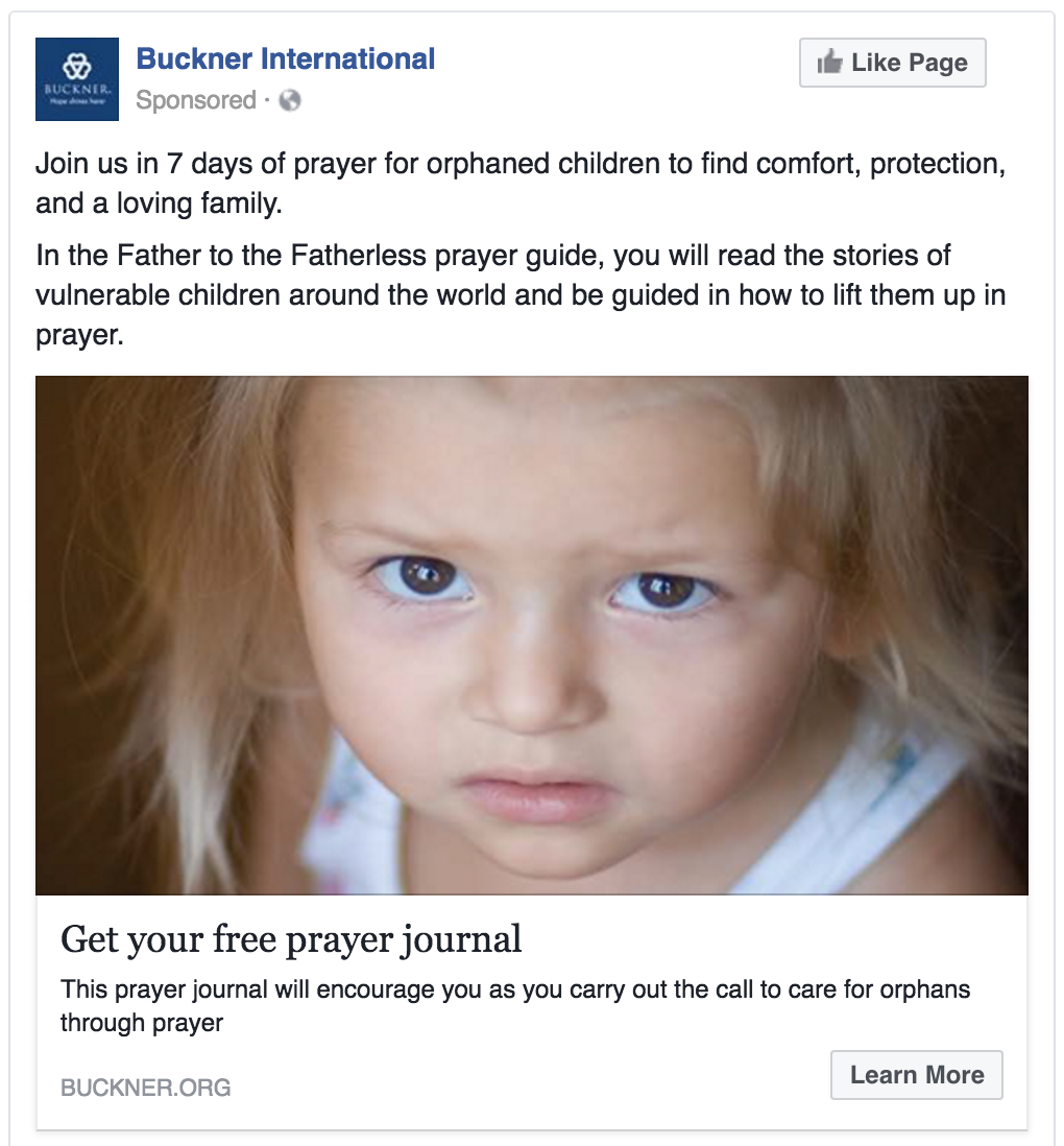
As part of the advertising for this campaign, we created Facebook ads to drive visitors to a conversion-focused email acquisition page. For similar organizations, past experiments had proven that showing a 3D version of the guide would produce the best response but with the topic of orphans and vulnerable children, we had a hypothesis that images of kids would provoke a better response. We created multiple versions of this ad and tested it across multiple audiences
Research Question
Which ad will produce the highest motivated visitors resulting in the highest conversion rate?
Design
Results
| Treatment Name | Conv. Rate | Relative Difference | Confidence | |
|---|---|---|---|---|
| C: | Book Cover | 0.21% | ||
| T1: | Black & White Image | 0.41% | 94.4% | 100.0% |
| T2: | Color Image | 0.43% | 101.3% | 100.0% |
This experiment has a required sample size of 9,798 in order to be valid. Since the experiment had a total sample size of 101,032, and the level of confidence is above 95% the experiment results are valid.
Flux Metrics Affected
The Flux Metrics analyze the three primary metrics that affect revenue (traffic, conversion rate, and average gift). This experiment produced the following results:
0% increase in traffic
× 94.4% increase in conversion rate
× 0% increase in average gift
Key Learnings
The ads that focused on the images of children had nearly double the email acquisition rate as the ad that just focused on the guide. Our hypothesis is that the images of children served as a reminder of why the prayers were needed whereas the guide was just what would be given. By answering the “why” first, the visitors were more motivated to download the devotional.
The visual aspect of black and white versus color did not seem to make any significant difference.