How removing elements of friction on an acquisition page impacts conversion
FamilyLife
FamilyLife® has been committed to helping individuals find biblical help for their marriage and family relationships. Through the Weekend to Remember® marriage getaways, FamilyLife Today® radio broadcasts, The Art of Marriage® video event, and the many other resources and content, God has used FamilyLife to restore hope for millions of couples and transform their lives.
Experiment Summary
Timeframe: 04/17/2018 - 04/26/2018
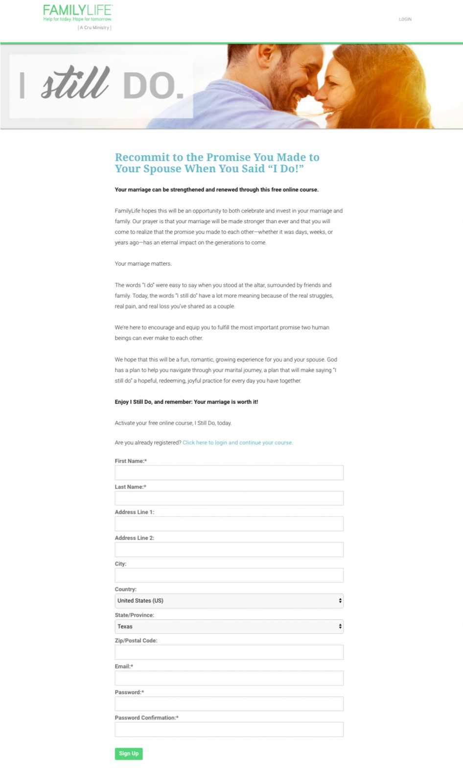
FamilyLife offers a free online course called, I Still Do. In an effort to increase acquisition through this online course, they hypothesized that there was significant friction on the page. The control used a hero image at the top of the page and they required people to give their mailing addresses as part of the sign-up process. To test this version of the page, they developed a treatment that removed the hero image and put it inline with the copy, and removed all of the mailing address fields from the form. They also moved the line of copy that addressed a portion of the audience that was already signed up for the course to right below the “Get Started” button.
Research Question
Would a simplified acquisition page increase conversion?
Design

Results
| Treatment Name | Conv. Rate | Relative Difference | Confidence | |
|---|---|---|---|---|
| C: | Control | 13.7% | ||
| T1: | Simplified Acquisition Page | 16.9% | 23.5% | 98.5% |
This experiment has a required sample size of 961 in order to be valid. Since the experiment had a total sample size of 2,948, and the level of confidence is above 95% the experiment results are valid.
Flux Metrics Affected
The Flux Metrics analyze the three primary metrics that affect revenue (traffic, conversion rate, and average gift). This experiment produced the following results:
0% increase in traffic
× 23.5% increase in conversion rate
× 0% increase in average gift
Key Learnings
The simplified page increased email acquisition by 23.5%! The large image and additional form fields on the control created significant friction on the page resulting in lower conversion rates. By removing the hero image and bringing the value proposition higher up on the page and removing fields that weren’t required for a person to take an online course, we were able to get more people to say “yes” and sign up for the course.