How adding additional clarity through the design affects registrations
NextAfter
Experiment Summary
Ended On:
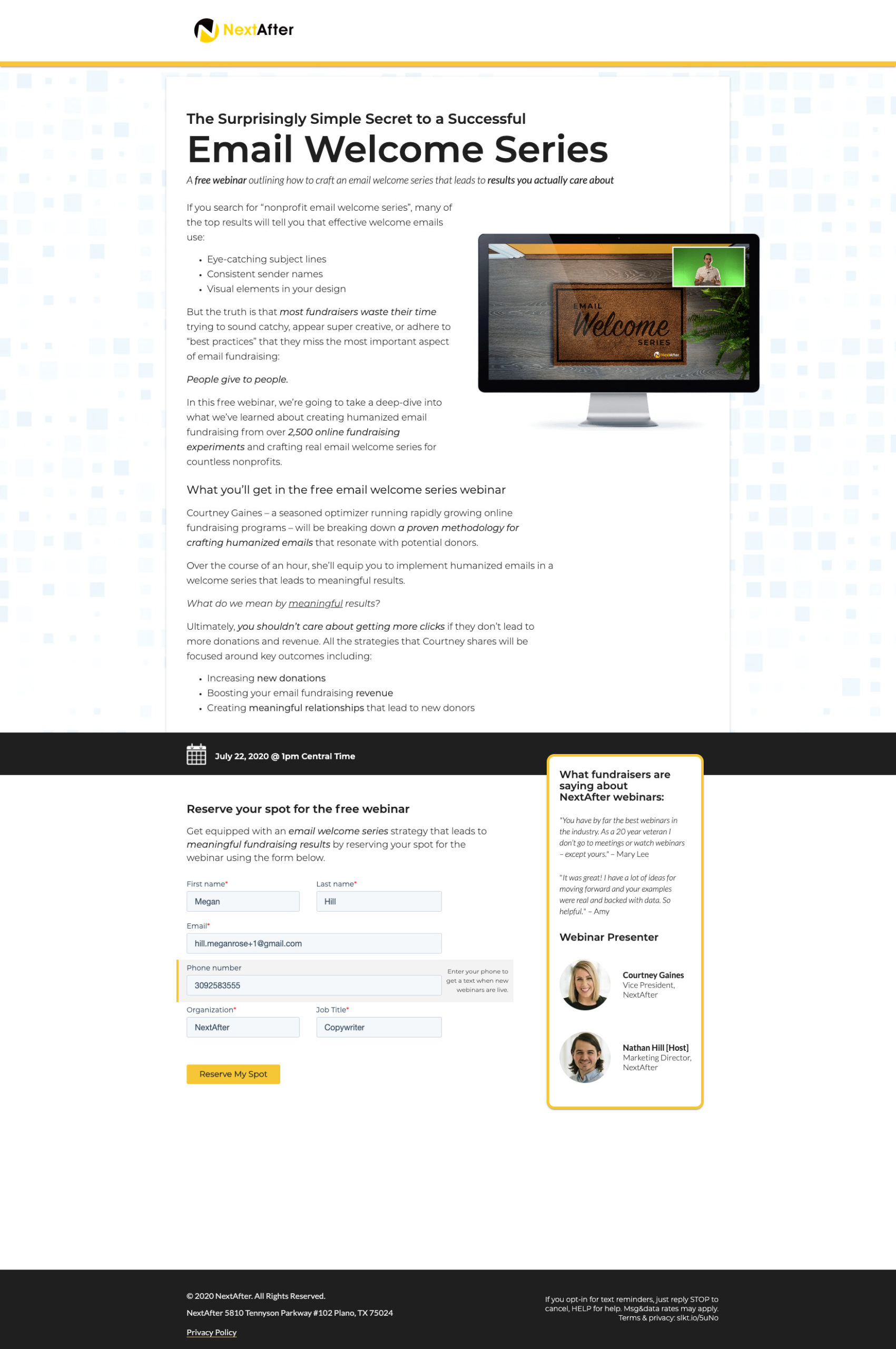
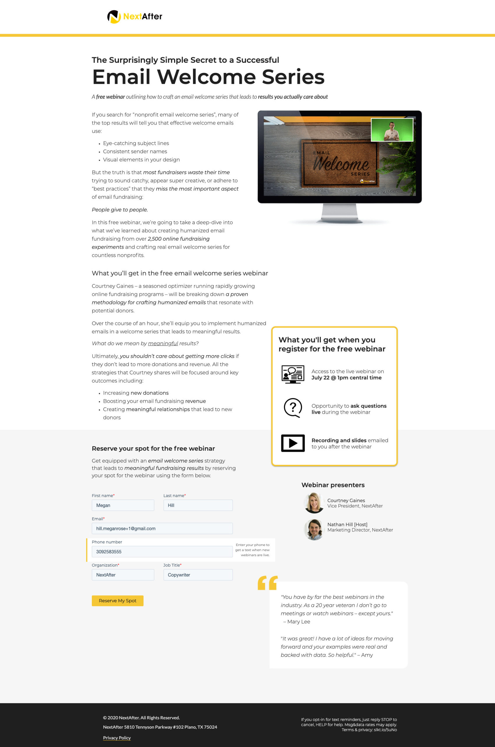
Prior to this experiment, we had tested into using a time/date bar on the webinar registration page. It hadn’t impacted conversion significantly, but led to less inquires and confusion about the actual start time of the webinar. In this experiment, we wondered if we could use design to bring additional clarity to not just the time and date of the webinar, but to some of the additional perks of registering including live Q&A time and access to a recording afterwards.
Research Question
Will adding additional clarity to the webinar details lead to more registrations?
Design
Results
| Treatment Name | Conv. Rate | Relative Difference | Confidence | |
|---|---|---|---|---|
| C: | Mid-Page Event Details Bar | 55.2% | ||
| T1: | Event Details Box with Added Clarity | 58.7% | 6.4% | 91.0% |
This experiment has a required sample size of 1,522 in order to be valid. Since the experiment had a total sample size of 2,275, and the level of confidence is not above 95% the experiment results are not valid.
Key Learnings
The new design led to a 6.4% increase in registrations, although it only reached a 90.9% level of confidence. As the overall conversion rate of this page is very high, it’s increasingly difficult to valid experiments on this page. That said, reaching a 90% level of confidence on a result that’s indicating positive growth gives me the confidence to roll out Version B as the winner.
Even if it makes no difference in conversion, there is now additional clarity on the page that all registrants will get a recording, which is one of the most common questions that registrants ask after the fact.