Avila Foundation
How a pulsing heart sticky donate button affected donations on homepage
Experiment ID: #155981
Avila Foundation
Experiment Summary
Timeframe: 06/13/2023 - 07/03/2023
Avila is an organization that aims to draw Christians worldwide into deeper union with Christ through mystagogically oriented spiritual education and formation.
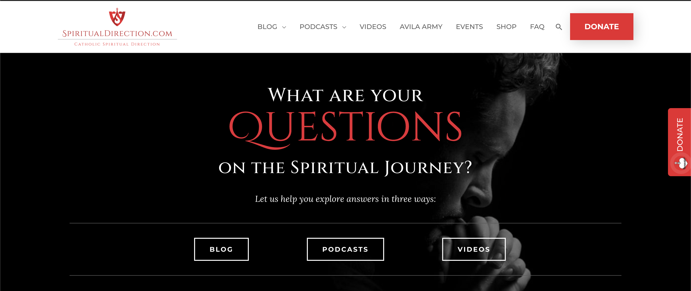
In an effort to increase donations from the Spiritual Directions Homepage we decided to test adding a side sticky donate button with a pulsing heart.
Research Question
We believe that by adding a side donate button for homepage visitors will achieve higher conversion in donors because the side button has a pulsing sacred heart and is eye catching.
Design
C: Control

Array
(
[0] => Array
(
[ID] => 57663
[id] => 57663
[title] => Control.png
[filename] => Control-165.png
[filesize] => 525009
[url] => https://nextafter-1a91a.kxcdn.com/wp-content/uploads/Control-165.png
[link] => https://www.nextafter.com/experiments/how-a-pulsing-heart-sticky-donate-button-affected-donations-on-homepage/attachment/control-png-6752/
[alt] =>
[author] => 0
[description] =>
[caption] =>
[name] => control-png-6752
[status] => inherit
[uploaded_to] => 53411
[date] => 2024-02-08 23:17:02
[modified] => 2024-02-08 23:17:02
[menu_order] => 0
[mime_type] => image/png
[type] => image
[subtype] => png
[icon] => https://nextafter-1a91a.kxcdn.com/wp-includes/images/media/default.png
[width] => 2854
[height] => 1368
[sizes] => Array
(
[thumbnail] => https://nextafter-1a91a.kxcdn.com/wp-content/uploads/Control-165-150x150.png
[thumbnail-width] => 150
[thumbnail-height] => 150
[medium] => https://nextafter-1a91a.kxcdn.com/wp-content/uploads/Control-165-300x144.png
[medium-width] => 300
[medium-height] => 144
[medium_large] => https://nextafter-1a91a.kxcdn.com/wp-content/uploads/Control-165-768x368.png
[medium_large-width] => 640
[medium_large-height] => 307
[large] => https://nextafter-1a91a.kxcdn.com/wp-content/uploads/Control-165-1024x491.png
[large-width] => 640
[large-height] => 307
[1536x1536] => https://nextafter-1a91a.kxcdn.com/wp-content/uploads/Control-165-1536x736.png
[1536x1536-width] => 1536
[1536x1536-height] => 736
[2048x2048] => https://nextafter-1a91a.kxcdn.com/wp-content/uploads/Control-165-2048x982.png
[2048x2048-width] => 2048
[2048x2048-height] => 982
[ab-block-post-grid-landscape] => https://nextafter-1a91a.kxcdn.com/wp-content/uploads/Control-165-600x400.png
[ab-block-post-grid-landscape-width] => 600
[ab-block-post-grid-landscape-height] => 400
[ab-block-post-grid-square] => https://nextafter-1a91a.kxcdn.com/wp-content/uploads/Control-165-600x600.png
[ab-block-post-grid-square-width] => 600
[ab-block-post-grid-square-height] => 600
[tp-image-grid] => https://nextafter-1a91a.kxcdn.com/wp-content/uploads/Control-165.png
[tp-image-grid-width] => 700
[tp-image-grid-height] => 336
[post-thumbnail] => https://nextafter-1a91a.kxcdn.com/wp-content/uploads/Control-165-150x150.png
[post-thumbnail-width] => 150
[post-thumbnail-height] => 150
[admin] => https://nextafter-1a91a.kxcdn.com/wp-content/uploads/Control-165-50x24.png
[admin-width] => 50
[admin-height] => 24
[full] => https://nextafter-1a91a.kxcdn.com/wp-content/uploads/Control-165.png
[full-width] => 2854
[full-height] => 1368
[thumb_372] => https://nextafter-1a91a.kxcdn.com/wp-content/uploads/Control-165-372x178.png
[thumb_372-width] => 372
[thumb_372-height] => 178
[single_post_thumbnail] => https://nextafter-1a91a.kxcdn.com/wp-content/uploads/Control-165-980x470.png
[single_post_thumbnail-width] => 980
[single_post_thumbnail-height] => 470
[thumb_32_32] => https://nextafter-1a91a.kxcdn.com/wp-content/uploads/Control-165-32x15.png
[thumb_32_32-width] => 32
[thumb_32_32-height] => 15
[thumb_48_48] => https://nextafter-1a91a.kxcdn.com/wp-content/uploads/Control-165-48x23.png
[thumb_48_48-width] => 48
[thumb_48_48-height] => 23
[thumb_64_64] => https://nextafter-1a91a.kxcdn.com/wp-content/uploads/Control-165-64x31.png
[thumb_64_64-width] => 64
[thumb_64_64-height] => 31
[thumb_128_128] => https://nextafter-1a91a.kxcdn.com/wp-content/uploads/Control-165-128x61.png
[thumb_128_128-width] => 128
[thumb_128_128-height] => 61
[thumb_122_67] => https://nextafter-1a91a.kxcdn.com/wp-content/uploads/Control-165-122x58.png
[thumb_122_67-width] => 122
[thumb_122_67-height] => 58
[thumb_153_153] => https://nextafter-1a91a.kxcdn.com/wp-content/uploads/Control-165-153x73.png
[thumb_153_153-width] => 153
[thumb_153_153-height] => 73
[thumb_130_163] => https://nextafter-1a91a.kxcdn.com/wp-content/uploads/Control-165-130x62.png
[thumb_130_163-width] => 130
[thumb_130_163-height] => 62
[thumb_232_177] => https://nextafter-1a91a.kxcdn.com/wp-content/uploads/Control-165-232x111.png
[thumb_232_177-width] => 232
[thumb_232_177-height] => 111
[thumb_272_325] => https://nextafter-1a91a.kxcdn.com/wp-content/uploads/Control-165-544x261.png
[thumb_272_325-width] => 544
[thumb_272_325-height] => 261
[thumb_271_346] => https://nextafter-1a91a.kxcdn.com/wp-content/uploads/Control-165-271x130.png
[thumb_271_346-width] => 271
[thumb_271_346-height] => 130
[thumb_271_271] => https://nextafter-1a91a.kxcdn.com/wp-content/uploads/Control-165-271x130.png
[thumb_271_271-width] => 271
[thumb_271_271-height] => 130
[thumb_272_172] => https://nextafter-1a91a.kxcdn.com/wp-content/uploads/Control-165-272x130.png
[thumb_272_172-width] => 272
[thumb_272_172-height] => 130
[thumb_372_461] => https://nextafter-1a91a.kxcdn.com/wp-content/uploads/Control-165-372x178.png
[thumb_372_461-width] => 372
[thumb_372_461-height] => 178
[thumb_372_500] => https://nextafter-1a91a.kxcdn.com/wp-content/uploads/Control-165-372x178.png
[thumb_372_500-width] => 372
[thumb_372_500-height] => 178
[thumb_385_270] => https://nextafter-1a91a.kxcdn.com/wp-content/uploads/Control-165-385x185.png
[thumb_385_270-width] => 385
[thumb_385_270-height] => 185
[thumb_416_241] => https://nextafter-1a91a.kxcdn.com/wp-content/uploads/Control-165-416x199.png
[thumb_416_241-width] => 416
[thumb_416_241-height] => 199
[thumb_448_410] => https://nextafter-1a91a.kxcdn.com/wp-content/uploads/Control-165-448x215.png
[thumb_448_410-width] => 448
[thumb_448_410-height] => 215
[thumb_448_410_retina] => https://nextafter-1a91a.kxcdn.com/wp-content/uploads/Control-165-896x429.png
[thumb_448_410_retina-width] => 896
[thumb_448_410_retina-height] => 429
[thumb_574_382] => https://nextafter-1a91a.kxcdn.com/wp-content/uploads/Control-165-574x275.png
[thumb_574_382-width] => 574
[thumb_574_382-height] => 275
[thumb_776_395] => https://nextafter-1a91a.kxcdn.com/wp-content/uploads/Control-165-776x372.png
[thumb_776_395-width] => 776
[thumb_776_395-height] => 372
) ) [1] => Array
(
[ID] => 57667
[id] => 57667
[title] => Sticky_Donate.png
[filename] => Sticky_Donate-3.png
[filesize] => 492531
[url] => https://nextafter-1a91a.kxcdn.com/wp-content/uploads/Sticky_Donate-3.png
[link] => https://www.nextafter.com/experiments/how-a-pulsing-heart-sticky-donate-button-affected-donations-on-homepage/attachment/sticky_donate-png-18/
[alt] =>
[author] => 0
[description] =>
[caption] =>
[name] => sticky_donate-png-18
[status] => inherit
[uploaded_to] => 53411
[date] => 2024-02-08 23:17:15
[modified] => 2024-02-08 23:17:15
[menu_order] => 0
[mime_type] => image/png
[type] => image
[subtype] => png
[icon] => https://nextafter-1a91a.kxcdn.com/wp-includes/images/media/default.png
[width] => 2880
[height] => 1214
[sizes] => Array
(
[thumbnail] => https://nextafter-1a91a.kxcdn.com/wp-content/uploads/Sticky_Donate-3-150x150.png
[thumbnail-width] => 150
[thumbnail-height] => 150
[medium] => https://nextafter-1a91a.kxcdn.com/wp-content/uploads/Sticky_Donate-3-300x126.png
[medium-width] => 300
[medium-height] => 126
[medium_large] => https://nextafter-1a91a.kxcdn.com/wp-content/uploads/Sticky_Donate-3-768x324.png
[medium_large-width] => 640
[medium_large-height] => 270
[large] => https://nextafter-1a91a.kxcdn.com/wp-content/uploads/Sticky_Donate-3-1024x432.png
[large-width] => 640
[large-height] => 270
[1536x1536] => https://nextafter-1a91a.kxcdn.com/wp-content/uploads/Sticky_Donate-3-1536x647.png
[1536x1536-width] => 1536
[1536x1536-height] => 647
[2048x2048] => https://nextafter-1a91a.kxcdn.com/wp-content/uploads/Sticky_Donate-3-2048x863.png
[2048x2048-width] => 2048
[2048x2048-height] => 863
[ab-block-post-grid-landscape] => https://nextafter-1a91a.kxcdn.com/wp-content/uploads/Sticky_Donate-3-600x400.png
[ab-block-post-grid-landscape-width] => 600
[ab-block-post-grid-landscape-height] => 400
[ab-block-post-grid-square] => https://nextafter-1a91a.kxcdn.com/wp-content/uploads/Sticky_Donate-3-600x600.png
[ab-block-post-grid-square-width] => 600
[ab-block-post-grid-square-height] => 600
[tp-image-grid] => https://nextafter-1a91a.kxcdn.com/wp-content/uploads/Sticky_Donate-3.png
[tp-image-grid-width] => 700
[tp-image-grid-height] => 295
[post-thumbnail] => https://nextafter-1a91a.kxcdn.com/wp-content/uploads/Sticky_Donate-3-150x150.png
[post-thumbnail-width] => 150
[post-thumbnail-height] => 150
[admin] => https://nextafter-1a91a.kxcdn.com/wp-content/uploads/Sticky_Donate-3-50x21.png
[admin-width] => 50
[admin-height] => 21
[full] => https://nextafter-1a91a.kxcdn.com/wp-content/uploads/Sticky_Donate-3.png
[full-width] => 2880
[full-height] => 1214
[thumb_372] => https://nextafter-1a91a.kxcdn.com/wp-content/uploads/Sticky_Donate-3-372x157.png
[thumb_372-width] => 372
[thumb_372-height] => 157
[single_post_thumbnail] => https://nextafter-1a91a.kxcdn.com/wp-content/uploads/Sticky_Donate-3-980x413.png
[single_post_thumbnail-width] => 980
[single_post_thumbnail-height] => 413
[thumb_32_32] => https://nextafter-1a91a.kxcdn.com/wp-content/uploads/Sticky_Donate-3-32x13.png
[thumb_32_32-width] => 32
[thumb_32_32-height] => 13
[thumb_48_48] => https://nextafter-1a91a.kxcdn.com/wp-content/uploads/Sticky_Donate-3-48x20.png
[thumb_48_48-width] => 48
[thumb_48_48-height] => 20
[thumb_64_64] => https://nextafter-1a91a.kxcdn.com/wp-content/uploads/Sticky_Donate-3-64x27.png
[thumb_64_64-width] => 64
[thumb_64_64-height] => 27
[thumb_128_128] => https://nextafter-1a91a.kxcdn.com/wp-content/uploads/Sticky_Donate-3-128x54.png
[thumb_128_128-width] => 128
[thumb_128_128-height] => 54
[thumb_122_67] => https://nextafter-1a91a.kxcdn.com/wp-content/uploads/Sticky_Donate-3-122x51.png
[thumb_122_67-width] => 122
[thumb_122_67-height] => 51
[thumb_153_153] => https://nextafter-1a91a.kxcdn.com/wp-content/uploads/Sticky_Donate-3-153x64.png
[thumb_153_153-width] => 153
[thumb_153_153-height] => 64
[thumb_130_163] => https://nextafter-1a91a.kxcdn.com/wp-content/uploads/Sticky_Donate-3-130x55.png
[thumb_130_163-width] => 130
[thumb_130_163-height] => 55
[thumb_232_177] => https://nextafter-1a91a.kxcdn.com/wp-content/uploads/Sticky_Donate-3-232x98.png
[thumb_232_177-width] => 232
[thumb_232_177-height] => 98
[thumb_272_325] => https://nextafter-1a91a.kxcdn.com/wp-content/uploads/Sticky_Donate-3-544x229.png
[thumb_272_325-width] => 544
[thumb_272_325-height] => 229
[thumb_271_346] => https://nextafter-1a91a.kxcdn.com/wp-content/uploads/Sticky_Donate-3-271x114.png
[thumb_271_346-width] => 271
[thumb_271_346-height] => 114
[thumb_271_271] => https://nextafter-1a91a.kxcdn.com/wp-content/uploads/Sticky_Donate-3-271x114.png
[thumb_271_271-width] => 271
[thumb_271_271-height] => 114
[thumb_272_172] => https://nextafter-1a91a.kxcdn.com/wp-content/uploads/Sticky_Donate-3-272x115.png
[thumb_272_172-width] => 272
[thumb_272_172-height] => 115
[thumb_372_461] => https://nextafter-1a91a.kxcdn.com/wp-content/uploads/Sticky_Donate-3-372x157.png
[thumb_372_461-width] => 372
[thumb_372_461-height] => 157
[thumb_372_500] => https://nextafter-1a91a.kxcdn.com/wp-content/uploads/Sticky_Donate-3-372x157.png
[thumb_372_500-width] => 372
[thumb_372_500-height] => 157
[thumb_385_270] => https://nextafter-1a91a.kxcdn.com/wp-content/uploads/Sticky_Donate-3-385x162.png
[thumb_385_270-width] => 385
[thumb_385_270-height] => 162
[thumb_416_241] => https://nextafter-1a91a.kxcdn.com/wp-content/uploads/Sticky_Donate-3-416x175.png
[thumb_416_241-width] => 416
[thumb_416_241-height] => 175
[thumb_448_410] => https://nextafter-1a91a.kxcdn.com/wp-content/uploads/Sticky_Donate-3-448x189.png
[thumb_448_410-width] => 448
[thumb_448_410-height] => 189
[thumb_448_410_retina] => https://nextafter-1a91a.kxcdn.com/wp-content/uploads/Sticky_Donate-3-896x378.png
[thumb_448_410_retina-width] => 896
[thumb_448_410_retina-height] => 378
[thumb_574_382] => https://nextafter-1a91a.kxcdn.com/wp-content/uploads/Sticky_Donate-3-574x242.png
[thumb_574_382-width] => 574
[thumb_574_382-height] => 242
[thumb_776_395] => https://nextafter-1a91a.kxcdn.com/wp-content/uploads/Sticky_Donate-3-776x327.png
[thumb_776_395-width] => 776
[thumb_776_395-height] => 327
) ) )
T1: Sticky Donate

Array
(
[0] => Array
(
[ID] => 57663
[id] => 57663
[title] => Control.png
[filename] => Control-165.png
[filesize] => 525009
[url] => https://nextafter-1a91a.kxcdn.com/wp-content/uploads/Control-165.png
[link] => https://www.nextafter.com/experiments/how-a-pulsing-heart-sticky-donate-button-affected-donations-on-homepage/attachment/control-png-6752/
[alt] =>
[author] => 0
[description] =>
[caption] =>
[name] => control-png-6752
[status] => inherit
[uploaded_to] => 53411
[date] => 2024-02-08 23:17:02
[modified] => 2024-02-08 23:17:02
[menu_order] => 0
[mime_type] => image/png
[type] => image
[subtype] => png
[icon] => https://nextafter-1a91a.kxcdn.com/wp-includes/images/media/default.png
[width] => 2854
[height] => 1368
[sizes] => Array
(
[thumbnail] => https://nextafter-1a91a.kxcdn.com/wp-content/uploads/Control-165-150x150.png
[thumbnail-width] => 150
[thumbnail-height] => 150
[medium] => https://nextafter-1a91a.kxcdn.com/wp-content/uploads/Control-165-300x144.png
[medium-width] => 300
[medium-height] => 144
[medium_large] => https://nextafter-1a91a.kxcdn.com/wp-content/uploads/Control-165-768x368.png
[medium_large-width] => 640
[medium_large-height] => 307
[large] => https://nextafter-1a91a.kxcdn.com/wp-content/uploads/Control-165-1024x491.png
[large-width] => 640
[large-height] => 307
[1536x1536] => https://nextafter-1a91a.kxcdn.com/wp-content/uploads/Control-165-1536x736.png
[1536x1536-width] => 1536
[1536x1536-height] => 736
[2048x2048] => https://nextafter-1a91a.kxcdn.com/wp-content/uploads/Control-165-2048x982.png
[2048x2048-width] => 2048
[2048x2048-height] => 982
[ab-block-post-grid-landscape] => https://nextafter-1a91a.kxcdn.com/wp-content/uploads/Control-165-600x400.png
[ab-block-post-grid-landscape-width] => 600
[ab-block-post-grid-landscape-height] => 400
[ab-block-post-grid-square] => https://nextafter-1a91a.kxcdn.com/wp-content/uploads/Control-165-600x600.png
[ab-block-post-grid-square-width] => 600
[ab-block-post-grid-square-height] => 600
[tp-image-grid] => https://nextafter-1a91a.kxcdn.com/wp-content/uploads/Control-165.png
[tp-image-grid-width] => 700
[tp-image-grid-height] => 336
[post-thumbnail] => https://nextafter-1a91a.kxcdn.com/wp-content/uploads/Control-165-150x150.png
[post-thumbnail-width] => 150
[post-thumbnail-height] => 150
[admin] => https://nextafter-1a91a.kxcdn.com/wp-content/uploads/Control-165-50x24.png
[admin-width] => 50
[admin-height] => 24
[full] => https://nextafter-1a91a.kxcdn.com/wp-content/uploads/Control-165.png
[full-width] => 2854
[full-height] => 1368
[thumb_372] => https://nextafter-1a91a.kxcdn.com/wp-content/uploads/Control-165-372x178.png
[thumb_372-width] => 372
[thumb_372-height] => 178
[single_post_thumbnail] => https://nextafter-1a91a.kxcdn.com/wp-content/uploads/Control-165-980x470.png
[single_post_thumbnail-width] => 980
[single_post_thumbnail-height] => 470
[thumb_32_32] => https://nextafter-1a91a.kxcdn.com/wp-content/uploads/Control-165-32x15.png
[thumb_32_32-width] => 32
[thumb_32_32-height] => 15
[thumb_48_48] => https://nextafter-1a91a.kxcdn.com/wp-content/uploads/Control-165-48x23.png
[thumb_48_48-width] => 48
[thumb_48_48-height] => 23
[thumb_64_64] => https://nextafter-1a91a.kxcdn.com/wp-content/uploads/Control-165-64x31.png
[thumb_64_64-width] => 64
[thumb_64_64-height] => 31
[thumb_128_128] => https://nextafter-1a91a.kxcdn.com/wp-content/uploads/Control-165-128x61.png
[thumb_128_128-width] => 128
[thumb_128_128-height] => 61
[thumb_122_67] => https://nextafter-1a91a.kxcdn.com/wp-content/uploads/Control-165-122x58.png
[thumb_122_67-width] => 122
[thumb_122_67-height] => 58
[thumb_153_153] => https://nextafter-1a91a.kxcdn.com/wp-content/uploads/Control-165-153x73.png
[thumb_153_153-width] => 153
[thumb_153_153-height] => 73
[thumb_130_163] => https://nextafter-1a91a.kxcdn.com/wp-content/uploads/Control-165-130x62.png
[thumb_130_163-width] => 130
[thumb_130_163-height] => 62
[thumb_232_177] => https://nextafter-1a91a.kxcdn.com/wp-content/uploads/Control-165-232x111.png
[thumb_232_177-width] => 232
[thumb_232_177-height] => 111
[thumb_272_325] => https://nextafter-1a91a.kxcdn.com/wp-content/uploads/Control-165-544x261.png
[thumb_272_325-width] => 544
[thumb_272_325-height] => 261
[thumb_271_346] => https://nextafter-1a91a.kxcdn.com/wp-content/uploads/Control-165-271x130.png
[thumb_271_346-width] => 271
[thumb_271_346-height] => 130
[thumb_271_271] => https://nextafter-1a91a.kxcdn.com/wp-content/uploads/Control-165-271x130.png
[thumb_271_271-width] => 271
[thumb_271_271-height] => 130
[thumb_272_172] => https://nextafter-1a91a.kxcdn.com/wp-content/uploads/Control-165-272x130.png
[thumb_272_172-width] => 272
[thumb_272_172-height] => 130
[thumb_372_461] => https://nextafter-1a91a.kxcdn.com/wp-content/uploads/Control-165-372x178.png
[thumb_372_461-width] => 372
[thumb_372_461-height] => 178
[thumb_372_500] => https://nextafter-1a91a.kxcdn.com/wp-content/uploads/Control-165-372x178.png
[thumb_372_500-width] => 372
[thumb_372_500-height] => 178
[thumb_385_270] => https://nextafter-1a91a.kxcdn.com/wp-content/uploads/Control-165-385x185.png
[thumb_385_270-width] => 385
[thumb_385_270-height] => 185
[thumb_416_241] => https://nextafter-1a91a.kxcdn.com/wp-content/uploads/Control-165-416x199.png
[thumb_416_241-width] => 416
[thumb_416_241-height] => 199
[thumb_448_410] => https://nextafter-1a91a.kxcdn.com/wp-content/uploads/Control-165-448x215.png
[thumb_448_410-width] => 448
[thumb_448_410-height] => 215
[thumb_448_410_retina] => https://nextafter-1a91a.kxcdn.com/wp-content/uploads/Control-165-896x429.png
[thumb_448_410_retina-width] => 896
[thumb_448_410_retina-height] => 429
[thumb_574_382] => https://nextafter-1a91a.kxcdn.com/wp-content/uploads/Control-165-574x275.png
[thumb_574_382-width] => 574
[thumb_574_382-height] => 275
[thumb_776_395] => https://nextafter-1a91a.kxcdn.com/wp-content/uploads/Control-165-776x372.png
[thumb_776_395-width] => 776
[thumb_776_395-height] => 372
) ) [1] => Array
(
[ID] => 57667
[id] => 57667
[title] => Sticky_Donate.png
[filename] => Sticky_Donate-3.png
[filesize] => 492531
[url] => https://nextafter-1a91a.kxcdn.com/wp-content/uploads/Sticky_Donate-3.png
[link] => https://www.nextafter.com/experiments/how-a-pulsing-heart-sticky-donate-button-affected-donations-on-homepage/attachment/sticky_donate-png-18/
[alt] =>
[author] => 0
[description] =>
[caption] =>
[name] => sticky_donate-png-18
[status] => inherit
[uploaded_to] => 53411
[date] => 2024-02-08 23:17:15
[modified] => 2024-02-08 23:17:15
[menu_order] => 0
[mime_type] => image/png
[type] => image
[subtype] => png
[icon] => https://nextafter-1a91a.kxcdn.com/wp-includes/images/media/default.png
[width] => 2880
[height] => 1214
[sizes] => Array
(
[thumbnail] => https://nextafter-1a91a.kxcdn.com/wp-content/uploads/Sticky_Donate-3-150x150.png
[thumbnail-width] => 150
[thumbnail-height] => 150
[medium] => https://nextafter-1a91a.kxcdn.com/wp-content/uploads/Sticky_Donate-3-300x126.png
[medium-width] => 300
[medium-height] => 126
[medium_large] => https://nextafter-1a91a.kxcdn.com/wp-content/uploads/Sticky_Donate-3-768x324.png
[medium_large-width] => 640
[medium_large-height] => 270
[large] => https://nextafter-1a91a.kxcdn.com/wp-content/uploads/Sticky_Donate-3-1024x432.png
[large-width] => 640
[large-height] => 270
[1536x1536] => https://nextafter-1a91a.kxcdn.com/wp-content/uploads/Sticky_Donate-3-1536x647.png
[1536x1536-width] => 1536
[1536x1536-height] => 647
[2048x2048] => https://nextafter-1a91a.kxcdn.com/wp-content/uploads/Sticky_Donate-3-2048x863.png
[2048x2048-width] => 2048
[2048x2048-height] => 863
[ab-block-post-grid-landscape] => https://nextafter-1a91a.kxcdn.com/wp-content/uploads/Sticky_Donate-3-600x400.png
[ab-block-post-grid-landscape-width] => 600
[ab-block-post-grid-landscape-height] => 400
[ab-block-post-grid-square] => https://nextafter-1a91a.kxcdn.com/wp-content/uploads/Sticky_Donate-3-600x600.png
[ab-block-post-grid-square-width] => 600
[ab-block-post-grid-square-height] => 600
[tp-image-grid] => https://nextafter-1a91a.kxcdn.com/wp-content/uploads/Sticky_Donate-3.png
[tp-image-grid-width] => 700
[tp-image-grid-height] => 295
[post-thumbnail] => https://nextafter-1a91a.kxcdn.com/wp-content/uploads/Sticky_Donate-3-150x150.png
[post-thumbnail-width] => 150
[post-thumbnail-height] => 150
[admin] => https://nextafter-1a91a.kxcdn.com/wp-content/uploads/Sticky_Donate-3-50x21.png
[admin-width] => 50
[admin-height] => 21
[full] => https://nextafter-1a91a.kxcdn.com/wp-content/uploads/Sticky_Donate-3.png
[full-width] => 2880
[full-height] => 1214
[thumb_372] => https://nextafter-1a91a.kxcdn.com/wp-content/uploads/Sticky_Donate-3-372x157.png
[thumb_372-width] => 372
[thumb_372-height] => 157
[single_post_thumbnail] => https://nextafter-1a91a.kxcdn.com/wp-content/uploads/Sticky_Donate-3-980x413.png
[single_post_thumbnail-width] => 980
[single_post_thumbnail-height] => 413
[thumb_32_32] => https://nextafter-1a91a.kxcdn.com/wp-content/uploads/Sticky_Donate-3-32x13.png
[thumb_32_32-width] => 32
[thumb_32_32-height] => 13
[thumb_48_48] => https://nextafter-1a91a.kxcdn.com/wp-content/uploads/Sticky_Donate-3-48x20.png
[thumb_48_48-width] => 48
[thumb_48_48-height] => 20
[thumb_64_64] => https://nextafter-1a91a.kxcdn.com/wp-content/uploads/Sticky_Donate-3-64x27.png
[thumb_64_64-width] => 64
[thumb_64_64-height] => 27
[thumb_128_128] => https://nextafter-1a91a.kxcdn.com/wp-content/uploads/Sticky_Donate-3-128x54.png
[thumb_128_128-width] => 128
[thumb_128_128-height] => 54
[thumb_122_67] => https://nextafter-1a91a.kxcdn.com/wp-content/uploads/Sticky_Donate-3-122x51.png
[thumb_122_67-width] => 122
[thumb_122_67-height] => 51
[thumb_153_153] => https://nextafter-1a91a.kxcdn.com/wp-content/uploads/Sticky_Donate-3-153x64.png
[thumb_153_153-width] => 153
[thumb_153_153-height] => 64
[thumb_130_163] => https://nextafter-1a91a.kxcdn.com/wp-content/uploads/Sticky_Donate-3-130x55.png
[thumb_130_163-width] => 130
[thumb_130_163-height] => 55
[thumb_232_177] => https://nextafter-1a91a.kxcdn.com/wp-content/uploads/Sticky_Donate-3-232x98.png
[thumb_232_177-width] => 232
[thumb_232_177-height] => 98
[thumb_272_325] => https://nextafter-1a91a.kxcdn.com/wp-content/uploads/Sticky_Donate-3-544x229.png
[thumb_272_325-width] => 544
[thumb_272_325-height] => 229
[thumb_271_346] => https://nextafter-1a91a.kxcdn.com/wp-content/uploads/Sticky_Donate-3-271x114.png
[thumb_271_346-width] => 271
[thumb_271_346-height] => 114
[thumb_271_271] => https://nextafter-1a91a.kxcdn.com/wp-content/uploads/Sticky_Donate-3-271x114.png
[thumb_271_271-width] => 271
[thumb_271_271-height] => 114
[thumb_272_172] => https://nextafter-1a91a.kxcdn.com/wp-content/uploads/Sticky_Donate-3-272x115.png
[thumb_272_172-width] => 272
[thumb_272_172-height] => 115
[thumb_372_461] => https://nextafter-1a91a.kxcdn.com/wp-content/uploads/Sticky_Donate-3-372x157.png
[thumb_372_461-width] => 372
[thumb_372_461-height] => 157
[thumb_372_500] => https://nextafter-1a91a.kxcdn.com/wp-content/uploads/Sticky_Donate-3-372x157.png
[thumb_372_500-width] => 372
[thumb_372_500-height] => 157
[thumb_385_270] => https://nextafter-1a91a.kxcdn.com/wp-content/uploads/Sticky_Donate-3-385x162.png
[thumb_385_270-width] => 385
[thumb_385_270-height] => 162
[thumb_416_241] => https://nextafter-1a91a.kxcdn.com/wp-content/uploads/Sticky_Donate-3-416x175.png
[thumb_416_241-width] => 416
[thumb_416_241-height] => 175
[thumb_448_410] => https://nextafter-1a91a.kxcdn.com/wp-content/uploads/Sticky_Donate-3-448x189.png
[thumb_448_410-width] => 448
[thumb_448_410-height] => 189
[thumb_448_410_retina] => https://nextafter-1a91a.kxcdn.com/wp-content/uploads/Sticky_Donate-3-896x378.png
[thumb_448_410_retina-width] => 896
[thumb_448_410_retina-height] => 378
[thumb_574_382] => https://nextafter-1a91a.kxcdn.com/wp-content/uploads/Sticky_Donate-3-574x242.png
[thumb_574_382-width] => 574
[thumb_574_382-height] => 242
[thumb_776_395] => https://nextafter-1a91a.kxcdn.com/wp-content/uploads/Sticky_Donate-3-776x327.png
[thumb_776_395-width] => 776
[thumb_776_395-height] => 327
) ) )
Results
| | Treatment Name | Conv. Rate | Relative Difference | Confidence | Average Gift |
|---|
| C: | Control | 0.17% | | | $21.67 |
| T1: | Sticky Donate | 0.51% | 193.6% | 91.2% | $28.89 |
This experiment has a required sample size of 2,339 in order to be valid. Since the experiment had a total sample size of 3,510, and
the level of confidence is not above 95% the experiment results are not valid.
Key Learnings
The key learnings from this experiment are:
1. The treatment version with the side donate button featuring a pulsing sacred heart significantly increased donations, with a 193.6% increase for all traffic.
2. The treatment version had a higher level of confidence (91.2%) compared to the control version, indicating that the results are approaching validity.
3. When looking at specific visitor segments, the treatment version showed a significant increase in donations for desktop visitors (5903% increase with 97% confidence level) and email visitors (9% increase with 96% confidence level).
4. The changes made in the treatment version, including the addition of the side donate button with a pulsing sacred heart, seem to have a positive impact on donor conversion.
To use these learnings in future experimentation, it would be beneficial to conduct further tests to validate the findings and increase the level of confidence. This could involve testing different versions of the side donate button, such as variations in size, color, or animation. Additionally, exploring other elements on the homepage that could be modified, such as placement or wording of the donate button, could provide further insights into increasing donations. It’s also important to consider the specific characteristics of different visitor segments and tailor the donation strategy accordingly, as seen with the significant increase in donations for desktop and email visitors in this experiment.
When results of the blog page experiment is combined with the blog pages results of the same test (https://app.winstonknows.com/experiment/6142) we find a 66% increase in donations with a 94% level of confidence