Harvest Ministries
How a radical donation page redesign affects donor conversion
Experiment ID: #7301
Harvest Ministries
Experiment Summary
Timeframe: 08/22/2017 - 08/30/2017
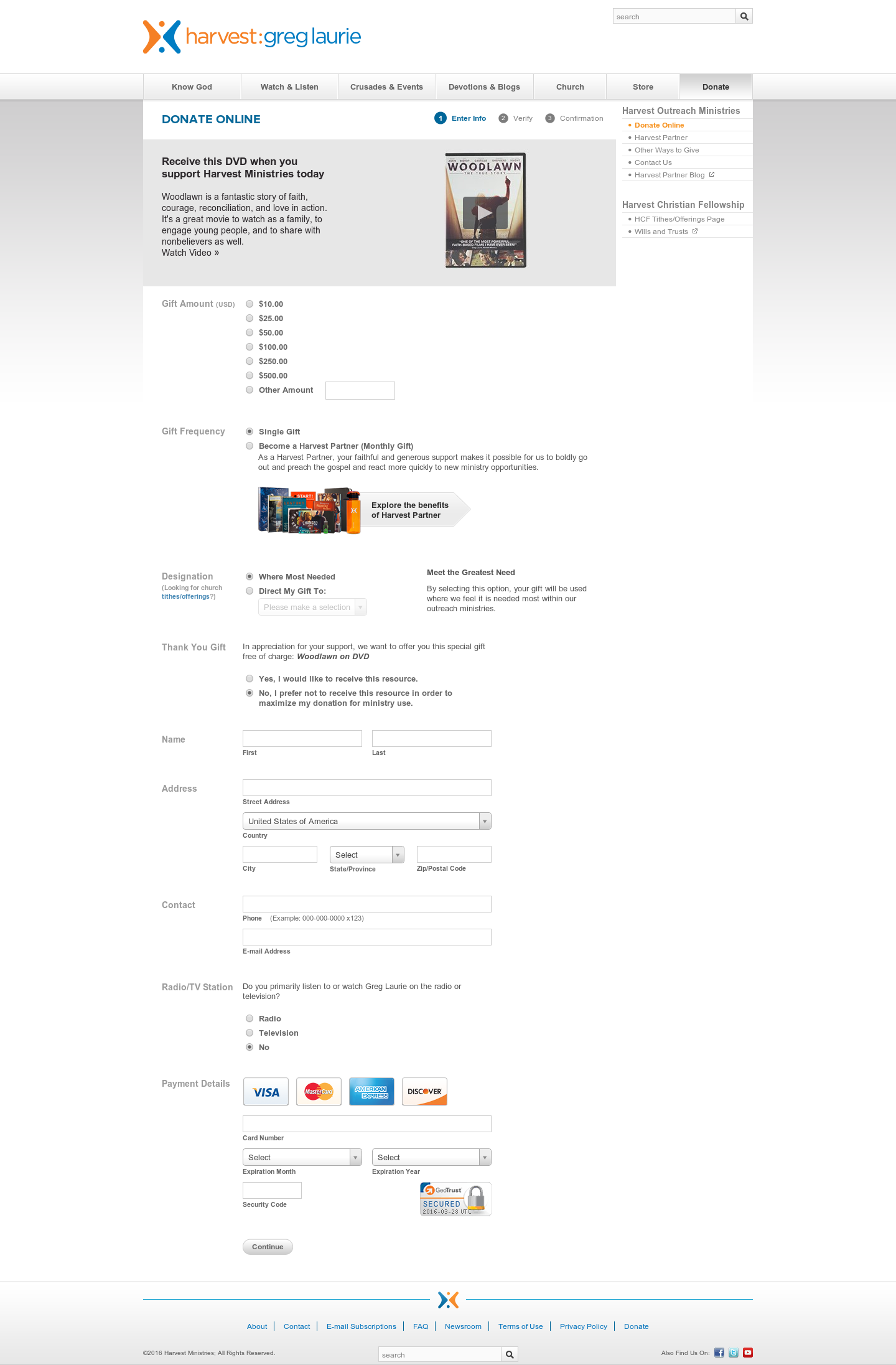
Harvest Ministries had a donation page that produced above-average conversion rates (at nearly 20%). However, they viewed this as an 80% failure rate, and wanted to run an experiment to optimize for donor conversion.
Their control donation page kept the same template as their website (which is common for ministries and nonprofits). This template included navigation that gave many opportunities to leave the page and take other actions. The page copy also started with a premium ask, with little value proposition language to hook the visitor.
The donation form started with radio buttons, which presented possible usability friction for the visitor. The prospective donor was then presented with the choice to make a single gift or a recurring gift, the details of which were located on another page. This introduced possible decision friction into the funnel. Next was a designation. Designations can be helpful for the organization, but research has showed that they present another decision for the user and can bring the donation process to a halt.
Next, the visitor was asked to claim their premium, and fill out the typical information and payment fields, with a question about where they engage with Harvest in the middle.
The treatment removed all the excess navigation from the page and began with a simple, clear value proposition: “Your gift helps reach the lost with the gospel of Jesus Christ”. It then unpacked the value proposition, providing evidentials to each claim of value and connecting the gift to different forms of impact. Then, it repositioned the premium as a thank-you in response to the gift, rather than the reason for the gift.
The gift array was reworked into larger buttons that were easier to click and see which amount was selected. The information and payment fields were moved to the second step of a two-step screen.
Harvest launched an A/B test to discover which donation page flow resulted in more donations and revenue.
Research Question
Will a radical redesign that removes friction and strengthens and emphasizes the value proposition increase donor conversion?
Design
C: Control
Array
(
[0] => Array
(
[ID] => 12596
[id] => 12596
[title] => Original-4-1.png
[filename] => Original-4-1.png
[filesize] => 0
[url] => https://www.nextafter.com/wp-content/uploads/Original-4-1.png
[link] => https://www.nextafter.com/experiments/how-a-radical-donation-page-redesign-affects-donor-conversion/attachment/original-4-1-png/
[alt] =>
[author] => 6
[description] =>
[caption] =>
[name] => original-4-1-png
[status] => inherit
[uploaded_to] => 12595
[date] => 2021-02-25 01:35:36
[modified] => 2021-02-25 01:35:36
[menu_order] => 0
[mime_type] => image/png
[type] => image
[subtype] => png
[icon] => https://www.nextafter.com/wp-includes/images/media/default.png
[width] => 1440
[height] => 2193
[sizes] => Array
(
[thumbnail] => https://www.nextafter.com/wp-content/uploads/Original-4-1-150x150.png
[thumbnail-width] => 150
[thumbnail-height] => 150
[medium] => https://www.nextafter.com/wp-content/uploads/Original-4-1-197x300.png
[medium-width] => 197
[medium-height] => 300
[medium_large] => https://www.nextafter.com/wp-content/uploads/Original-4-1-768x1170.png
[medium_large-width] => 640
[medium_large-height] => 975
[large] => https://www.nextafter.com/wp-content/uploads/Original-4-1-672x1024.png
[large-width] => 640
[large-height] => 975
[1536x1536] => https://www.nextafter.com/wp-content/uploads/Original-4-1-1009x1536.png
[1536x1536-width] => 1009
[1536x1536-height] => 1536
[2048x2048] => https://www.nextafter.com/wp-content/uploads/Original-4-1-1345x2048.png
[2048x2048-width] => 1345
[2048x2048-height] => 2048
[tp-image-grid] => https://www.nextafter.com/wp-content/uploads/Original-4-1.png
[tp-image-grid-width] => 460
[tp-image-grid-height] => 700
[post-thumbnail] => https://www.nextafter.com/wp-content/uploads/Original-4-1-150x150.png
[post-thumbnail-width] => 150
[post-thumbnail-height] => 150
[admin] => https://www.nextafter.com/wp-content/uploads/Original-4-1-33x50.png
[admin-width] => 33
[admin-height] => 50
[full] => https://www.nextafter.com/wp-content/uploads/Original-4-1.png
[full-width] => 1440
[full-height] => 2193
[thumb_372] => https://www.nextafter.com/wp-content/uploads/Original-4-1-372x567.png
[thumb_372-width] => 372
[thumb_372-height] => 567
[single_post_thumbnail] => https://www.nextafter.com/wp-content/uploads/Original-4-1-410x625.png
[single_post_thumbnail-width] => 410
[single_post_thumbnail-height] => 625
[thumb_32_32] => https://www.nextafter.com/wp-content/uploads/Original-4-1-21x32.png
[thumb_32_32-width] => 21
[thumb_32_32-height] => 32
[thumb_48_48] => https://www.nextafter.com/wp-content/uploads/Original-4-1-32x48.png
[thumb_48_48-width] => 32
[thumb_48_48-height] => 48
[thumb_64_64] => https://www.nextafter.com/wp-content/uploads/Original-4-1-42x64.png
[thumb_64_64-width] => 42
[thumb_64_64-height] => 64
[thumb_128_128] => https://www.nextafter.com/wp-content/uploads/Original-4-1-84x128.png
[thumb_128_128-width] => 84
[thumb_128_128-height] => 128
[thumb_122_67] => https://www.nextafter.com/wp-content/uploads/Original-4-1-44x67.png
[thumb_122_67-width] => 44
[thumb_122_67-height] => 67
[thumb_153_153] => https://www.nextafter.com/wp-content/uploads/Original-4-1-100x153.png
[thumb_153_153-width] => 100
[thumb_153_153-height] => 153
[thumb_130_163] => https://www.nextafter.com/wp-content/uploads/Original-4-1-107x163.png
[thumb_130_163-width] => 107
[thumb_130_163-height] => 163
[thumb_232_177] => https://www.nextafter.com/wp-content/uploads/Original-4-1-116x177.png
[thumb_232_177-width] => 116
[thumb_232_177-height] => 177
[thumb_272_325] => https://www.nextafter.com/wp-content/uploads/Original-4-1-427x650.png
[thumb_272_325-width] => 427
[thumb_272_325-height] => 650
[thumb_271_346] => https://www.nextafter.com/wp-content/uploads/Original-4-1-227x346.png
[thumb_271_346-width] => 227
[thumb_271_346-height] => 346
[thumb_271_271] => https://www.nextafter.com/wp-content/uploads/Original-4-1-178x271.png
[thumb_271_271-width] => 178
[thumb_271_271-height] => 271
[thumb_272_172] => https://www.nextafter.com/wp-content/uploads/Original-4-1-113x172.png
[thumb_272_172-width] => 113
[thumb_272_172-height] => 172
[thumb_372_461] => https://www.nextafter.com/wp-content/uploads/Original-4-1-303x461.png
[thumb_372_461-width] => 303
[thumb_372_461-height] => 461
[thumb_372_500] => https://www.nextafter.com/wp-content/uploads/Original-4-1-328x500.png
[thumb_372_500-width] => 328
[thumb_372_500-height] => 500
[thumb_385_270] => https://www.nextafter.com/wp-content/uploads/Original-4-1-177x270.png
[thumb_385_270-width] => 177
[thumb_385_270-height] => 270
[thumb_416_241] => https://www.nextafter.com/wp-content/uploads/Original-4-1-158x241.png
[thumb_416_241-width] => 158
[thumb_416_241-height] => 241
[thumb_448_410] => https://www.nextafter.com/wp-content/uploads/Original-4-1-269x410.png
[thumb_448_410-width] => 269
[thumb_448_410-height] => 410
[thumb_448_410_retina] => https://www.nextafter.com/wp-content/uploads/Original-4-1-538x820.png
[thumb_448_410_retina-width] => 538
[thumb_448_410_retina-height] => 820
[thumb_574_382] => https://www.nextafter.com/wp-content/uploads/Original-4-1-251x382.png
[thumb_574_382-width] => 251
[thumb_574_382-height] => 382
[thumb_776_395] => https://www.nextafter.com/wp-content/uploads/Original-4-1-259x395.png
[thumb_776_395-width] => 259
[thumb_776_395-height] => 395
[gform-image-choice-sm] => https://www.nextafter.com/wp-content/uploads/Original-4-1.png
[gform-image-choice-sm-width] => 197
[gform-image-choice-sm-height] => 300
[gform-image-choice-md] => https://www.nextafter.com/wp-content/uploads/Original-4-1.png
[gform-image-choice-md-width] => 263
[gform-image-choice-md-height] => 400
[gform-image-choice-lg] => https://www.nextafter.com/wp-content/uploads/Original-4-1.png
[gform-image-choice-lg-width] => 394
[gform-image-choice-lg-height] => 600
)
)
)
Results
| |
Treatment Name |
Conv. Rate |
Relative Difference |
Confidence |
| C: |
Control
|
30.9% |
|
|
| T1: |
Radical Redesign |
44.7% |
44.8% |
100.0%
|
This experiment has a required sample size of
97 in order to be valid. Since the experiment had a total sample size of
1,478, and
the level of confidence is above 95%
the experiment results are
valid.
Flux Metrics Affected
The Flux Metrics analyze the three primary metrics that affect revenue (traffic, conversion rate, and average
gift).
This experiment produced the following results:
0% increase in traffic
× 44.8% increase in conversion rate
× 0% increase in average gift
Key Learnings
The treatment page generated a 44.8% lift in donations — a big feat for a page that was already attracting highly motivated donors. This showed that some combination of all the elements of friction on the page were distracting would-be donors. It also proved that focusing on the clarity of the value proposition (rather than the incentive alone) can increase motivation to give.
This prompted a series of tests to remove more friction from the giving process and further clarify the value proposition.

