FamilyLife
How a radical redesign of an email appeal and donation page affected donor conversion rate
Experiment ID: #2693
FamilyLife
Experiment Summary
Timeframe: 07/14/2017 - 07/21/2017
The treatment donation flow produced a statistically valid 272.1% increase in donor conversion. This strong leap forward was due to a few identifiable conversion factors:
- Reduction of visual friction in the control email led to more readers engaging with the copy.
- Personal tone in the email increased motivation to give.
- Decreased friction on the landing page increased likelihood to complete a donation
However, since all of these optimizations were made in one fell swoop, we cannot know exactly how each change contributed to the total increase. That said, this experiment provides a new benchmark for email appeal testing for FamilyLife—one that can be optimized in its own right.
Research Question
How will a radical redesign of both the email and the landing page impact donor conversion?
Design
C: Control
Array
(
[0] => Array
(
[ID] => 63620
[id] => 63620
[title] => Control.jpg
[filename] => Control-68.jpg
[filesize] => 213038
[url] => https://www.nextafter.com/wp-content/uploads/Control-68.jpg
[link] => https://www.nextafter.com/experiments/how-a-radical-redesign-of-an-email-appeal-and-donation-page-affected-donor-conversion-rate-3/attachment/control-jpg-3169/
[alt] =>
[author] => 0
[description] =>
[caption] =>
[name] => control-jpg-3169
[status] => inherit
[uploaded_to] => 37459
[date] => 2024-08-09 16:23:07
[modified] => 2024-08-09 16:23:07
[menu_order] => 0
[mime_type] => image/jpeg
[type] => image
[subtype] => jpeg
[icon] => https://www.nextafter.com/wp-includes/images/media/default.png
[width] => 1168
[height] => 1400
[sizes] => Array
(
[thumbnail] => https://www.nextafter.com/wp-content/uploads/Control-68-150x150.jpg
[thumbnail-width] => 150
[thumbnail-height] => 150
[medium] => https://www.nextafter.com/wp-content/uploads/Control-68-250x300.jpg
[medium-width] => 250
[medium-height] => 300
[medium_large] => https://www.nextafter.com/wp-content/uploads/Control-68-768x921.jpg
[medium_large-width] => 640
[medium_large-height] => 768
[large] => https://www.nextafter.com/wp-content/uploads/Control-68-854x1024.jpg
[large-width] => 640
[large-height] => 767
[1536x1536] => https://www.nextafter.com/wp-content/uploads/Control-68.jpg
[1536x1536-width] => 1168
[1536x1536-height] => 1400
[2048x2048] => https://www.nextafter.com/wp-content/uploads/Control-68.jpg
[2048x2048-width] => 1168
[2048x2048-height] => 1400
[tp-image-grid] => https://www.nextafter.com/wp-content/uploads/Control-68-700x700.jpg
[tp-image-grid-width] => 700
[tp-image-grid-height] => 700
[post-thumbnail] => https://www.nextafter.com/wp-content/uploads/Control-68-150x150.jpg
[post-thumbnail-width] => 150
[post-thumbnail-height] => 150
[admin] => https://www.nextafter.com/wp-content/uploads/Control-68-42x50.jpg
[admin-width] => 42
[admin-height] => 50
[full] => https://www.nextafter.com/wp-content/uploads/Control-68.jpg
[full-width] => 1168
[full-height] => 1400
[thumb_372] => https://www.nextafter.com/wp-content/uploads/Control-68-372x446.jpg
[thumb_372-width] => 372
[thumb_372-height] => 446
[single_post_thumbnail] => https://www.nextafter.com/wp-content/uploads/Control-68-521x625.jpg
[single_post_thumbnail-width] => 521
[single_post_thumbnail-height] => 625
[thumb_32_32] => https://www.nextafter.com/wp-content/uploads/Control-68-27x32.jpg
[thumb_32_32-width] => 27
[thumb_32_32-height] => 32
[thumb_48_48] => https://www.nextafter.com/wp-content/uploads/Control-68-40x48.jpg
[thumb_48_48-width] => 40
[thumb_48_48-height] => 48
[thumb_64_64] => https://www.nextafter.com/wp-content/uploads/Control-68-53x64.jpg
[thumb_64_64-width] => 53
[thumb_64_64-height] => 64
[thumb_128_128] => https://www.nextafter.com/wp-content/uploads/Control-68-107x128.jpg
[thumb_128_128-width] => 107
[thumb_128_128-height] => 128
[thumb_122_67] => https://www.nextafter.com/wp-content/uploads/Control-68-56x67.jpg
[thumb_122_67-width] => 56
[thumb_122_67-height] => 67
[thumb_153_153] => https://www.nextafter.com/wp-content/uploads/Control-68-128x153.jpg
[thumb_153_153-width] => 128
[thumb_153_153-height] => 153
[thumb_130_163] => https://www.nextafter.com/wp-content/uploads/Control-68-130x156.jpg
[thumb_130_163-width] => 130
[thumb_130_163-height] => 156
[thumb_232_177] => https://www.nextafter.com/wp-content/uploads/Control-68-148x177.jpg
[thumb_232_177-width] => 148
[thumb_232_177-height] => 177
[thumb_272_325] => https://www.nextafter.com/wp-content/uploads/Control-68-542x650.jpg
[thumb_272_325-width] => 542
[thumb_272_325-height] => 650
[thumb_271_346] => https://www.nextafter.com/wp-content/uploads/Control-68-271x325.jpg
[thumb_271_346-width] => 271
[thumb_271_346-height] => 325
[thumb_271_271] => https://www.nextafter.com/wp-content/uploads/Control-68-226x271.jpg
[thumb_271_271-width] => 226
[thumb_271_271-height] => 271
[thumb_272_172] => https://www.nextafter.com/wp-content/uploads/Control-68-143x172.jpg
[thumb_272_172-width] => 143
[thumb_272_172-height] => 172
[thumb_372_461] => https://www.nextafter.com/wp-content/uploads/Control-68-372x446.jpg
[thumb_372_461-width] => 372
[thumb_372_461-height] => 446
[thumb_372_500] => https://www.nextafter.com/wp-content/uploads/Control-68-372x446.jpg
[thumb_372_500-width] => 372
[thumb_372_500-height] => 446
[thumb_385_270] => https://www.nextafter.com/wp-content/uploads/Control-68-225x270.jpg
[thumb_385_270-width] => 225
[thumb_385_270-height] => 270
[thumb_416_241] => https://www.nextafter.com/wp-content/uploads/Control-68-201x241.jpg
[thumb_416_241-width] => 201
[thumb_416_241-height] => 241
[thumb_448_410] => https://www.nextafter.com/wp-content/uploads/Control-68-342x410.jpg
[thumb_448_410-width] => 342
[thumb_448_410-height] => 410
[thumb_448_410_retina] => https://www.nextafter.com/wp-content/uploads/Control-68-684x820.jpg
[thumb_448_410_retina-width] => 684
[thumb_448_410_retina-height] => 820
[thumb_574_382] => https://www.nextafter.com/wp-content/uploads/Control-68-319x382.jpg
[thumb_574_382-width] => 319
[thumb_574_382-height] => 382
[thumb_776_395] => https://www.nextafter.com/wp-content/uploads/Control-68-330x395.jpg
[thumb_776_395-width] => 330
[thumb_776_395-height] => 395
[gform-image-choice-sm] => https://www.nextafter.com/wp-content/uploads/Control-68.jpg
[gform-image-choice-sm-width] => 250
[gform-image-choice-sm-height] => 300
[gform-image-choice-md] => https://www.nextafter.com/wp-content/uploads/Control-68.jpg
[gform-image-choice-md-width] => 334
[gform-image-choice-md-height] => 400
[gform-image-choice-lg] => https://www.nextafter.com/wp-content/uploads/Control-68.jpg
[gform-image-choice-lg-width] => 501
[gform-image-choice-lg-height] => 600
)
)
[1] => Array
(
[ID] => 63623
[id] => 63623
[title] => Radical_Redesign.jpg
[filename] => Radical_Redesign-6.jpg
[filesize] => 255047
[url] => https://www.nextafter.com/wp-content/uploads/Radical_Redesign-6.jpg
[link] => https://www.nextafter.com/experiments/how-a-radical-redesign-of-an-email-appeal-and-donation-page-affected-donor-conversion-rate-3/attachment/radical_redesign-jpg-52/
[alt] =>
[author] => 0
[description] =>
[caption] =>
[name] => radical_redesign-jpg-52
[status] => inherit
[uploaded_to] => 37459
[date] => 2024-08-09 16:23:13
[modified] => 2024-08-09 16:23:13
[menu_order] => 0
[mime_type] => image/jpeg
[type] => image
[subtype] => jpeg
[icon] => https://www.nextafter.com/wp-includes/images/media/default.png
[width] => 1332
[height] => 1400
[sizes] => Array
(
[thumbnail] => https://www.nextafter.com/wp-content/uploads/Radical_Redesign-6-150x150.jpg
[thumbnail-width] => 150
[thumbnail-height] => 150
[medium] => https://www.nextafter.com/wp-content/uploads/Radical_Redesign-6-285x300.jpg
[medium-width] => 285
[medium-height] => 300
[medium_large] => https://www.nextafter.com/wp-content/uploads/Radical_Redesign-6-768x807.jpg
[medium_large-width] => 640
[medium_large-height] => 673
[large] => https://www.nextafter.com/wp-content/uploads/Radical_Redesign-6-974x1024.jpg
[large-width] => 640
[large-height] => 673
[1536x1536] => https://www.nextafter.com/wp-content/uploads/Radical_Redesign-6.jpg
[1536x1536-width] => 1332
[1536x1536-height] => 1400
[2048x2048] => https://www.nextafter.com/wp-content/uploads/Radical_Redesign-6.jpg
[2048x2048-width] => 1332
[2048x2048-height] => 1400
[tp-image-grid] => https://www.nextafter.com/wp-content/uploads/Radical_Redesign-6-700x700.jpg
[tp-image-grid-width] => 700
[tp-image-grid-height] => 700
[post-thumbnail] => https://www.nextafter.com/wp-content/uploads/Radical_Redesign-6-150x150.jpg
[post-thumbnail-width] => 150
[post-thumbnail-height] => 150
[admin] => https://www.nextafter.com/wp-content/uploads/Radical_Redesign-6-48x50.jpg
[admin-width] => 48
[admin-height] => 50
[full] => https://www.nextafter.com/wp-content/uploads/Radical_Redesign-6.jpg
[full-width] => 1332
[full-height] => 1400
[thumb_372] => https://www.nextafter.com/wp-content/uploads/Radical_Redesign-6-372x391.jpg
[thumb_372-width] => 372
[thumb_372-height] => 391
[single_post_thumbnail] => https://www.nextafter.com/wp-content/uploads/Radical_Redesign-6-595x625.jpg
[single_post_thumbnail-width] => 595
[single_post_thumbnail-height] => 625
[thumb_32_32] => https://www.nextafter.com/wp-content/uploads/Radical_Redesign-6-30x32.jpg
[thumb_32_32-width] => 30
[thumb_32_32-height] => 32
[thumb_48_48] => https://www.nextafter.com/wp-content/uploads/Radical_Redesign-6-46x48.jpg
[thumb_48_48-width] => 46
[thumb_48_48-height] => 48
[thumb_64_64] => https://www.nextafter.com/wp-content/uploads/Radical_Redesign-6-61x64.jpg
[thumb_64_64-width] => 61
[thumb_64_64-height] => 64
[thumb_128_128] => https://www.nextafter.com/wp-content/uploads/Radical_Redesign-6-122x128.jpg
[thumb_128_128-width] => 122
[thumb_128_128-height] => 128
[thumb_122_67] => https://www.nextafter.com/wp-content/uploads/Radical_Redesign-6-64x67.jpg
[thumb_122_67-width] => 64
[thumb_122_67-height] => 67
[thumb_153_153] => https://www.nextafter.com/wp-content/uploads/Radical_Redesign-6-146x153.jpg
[thumb_153_153-width] => 146
[thumb_153_153-height] => 153
[thumb_130_163] => https://www.nextafter.com/wp-content/uploads/Radical_Redesign-6-130x137.jpg
[thumb_130_163-width] => 130
[thumb_130_163-height] => 137
[thumb_232_177] => https://www.nextafter.com/wp-content/uploads/Radical_Redesign-6-168x177.jpg
[thumb_232_177-width] => 168
[thumb_232_177-height] => 177
[thumb_272_325] => https://www.nextafter.com/wp-content/uploads/Radical_Redesign-6-544x572.jpg
[thumb_272_325-width] => 544
[thumb_272_325-height] => 572
[thumb_271_346] => https://www.nextafter.com/wp-content/uploads/Radical_Redesign-6-271x285.jpg
[thumb_271_346-width] => 271
[thumb_271_346-height] => 285
[thumb_271_271] => https://www.nextafter.com/wp-content/uploads/Radical_Redesign-6-258x271.jpg
[thumb_271_271-width] => 258
[thumb_271_271-height] => 271
[thumb_272_172] => https://www.nextafter.com/wp-content/uploads/Radical_Redesign-6-164x172.jpg
[thumb_272_172-width] => 164
[thumb_272_172-height] => 172
[thumb_372_461] => https://www.nextafter.com/wp-content/uploads/Radical_Redesign-6-372x391.jpg
[thumb_372_461-width] => 372
[thumb_372_461-height] => 391
[thumb_372_500] => https://www.nextafter.com/wp-content/uploads/Radical_Redesign-6-372x391.jpg
[thumb_372_500-width] => 372
[thumb_372_500-height] => 391
[thumb_385_270] => https://www.nextafter.com/wp-content/uploads/Radical_Redesign-6-257x270.jpg
[thumb_385_270-width] => 257
[thumb_385_270-height] => 270
[thumb_416_241] => https://www.nextafter.com/wp-content/uploads/Radical_Redesign-6-229x241.jpg
[thumb_416_241-width] => 229
[thumb_416_241-height] => 241
[thumb_448_410] => https://www.nextafter.com/wp-content/uploads/Radical_Redesign-6-390x410.jpg
[thumb_448_410-width] => 390
[thumb_448_410-height] => 410
[thumb_448_410_retina] => https://www.nextafter.com/wp-content/uploads/Radical_Redesign-6-780x820.jpg
[thumb_448_410_retina-width] => 780
[thumb_448_410_retina-height] => 820
[thumb_574_382] => https://www.nextafter.com/wp-content/uploads/Radical_Redesign-6-363x382.jpg
[thumb_574_382-width] => 363
[thumb_574_382-height] => 382
[thumb_776_395] => https://www.nextafter.com/wp-content/uploads/Radical_Redesign-6-376x395.jpg
[thumb_776_395-width] => 376
[thumb_776_395-height] => 395
[gform-image-choice-sm] => https://www.nextafter.com/wp-content/uploads/Radical_Redesign-6.jpg
[gform-image-choice-sm-width] => 285
[gform-image-choice-sm-height] => 300
[gform-image-choice-md] => https://www.nextafter.com/wp-content/uploads/Radical_Redesign-6.jpg
[gform-image-choice-md-width] => 381
[gform-image-choice-md-height] => 400
[gform-image-choice-lg] => https://www.nextafter.com/wp-content/uploads/Radical_Redesign-6.jpg
[gform-image-choice-lg-width] => 571
[gform-image-choice-lg-height] => 600
)
)
)
T1: Radical Redesign
Array
(
[0] => Array
(
[ID] => 63620
[id] => 63620
[title] => Control.jpg
[filename] => Control-68.jpg
[filesize] => 213038
[url] => https://www.nextafter.com/wp-content/uploads/Control-68.jpg
[link] => https://www.nextafter.com/experiments/how-a-radical-redesign-of-an-email-appeal-and-donation-page-affected-donor-conversion-rate-3/attachment/control-jpg-3169/
[alt] =>
[author] => 0
[description] =>
[caption] =>
[name] => control-jpg-3169
[status] => inherit
[uploaded_to] => 37459
[date] => 2024-08-09 16:23:07
[modified] => 2024-08-09 16:23:07
[menu_order] => 0
[mime_type] => image/jpeg
[type] => image
[subtype] => jpeg
[icon] => https://www.nextafter.com/wp-includes/images/media/default.png
[width] => 1168
[height] => 1400
[sizes] => Array
(
[thumbnail] => https://www.nextafter.com/wp-content/uploads/Control-68-150x150.jpg
[thumbnail-width] => 150
[thumbnail-height] => 150
[medium] => https://www.nextafter.com/wp-content/uploads/Control-68-250x300.jpg
[medium-width] => 250
[medium-height] => 300
[medium_large] => https://www.nextafter.com/wp-content/uploads/Control-68-768x921.jpg
[medium_large-width] => 640
[medium_large-height] => 768
[large] => https://www.nextafter.com/wp-content/uploads/Control-68-854x1024.jpg
[large-width] => 640
[large-height] => 767
[1536x1536] => https://www.nextafter.com/wp-content/uploads/Control-68.jpg
[1536x1536-width] => 1168
[1536x1536-height] => 1400
[2048x2048] => https://www.nextafter.com/wp-content/uploads/Control-68.jpg
[2048x2048-width] => 1168
[2048x2048-height] => 1400
[tp-image-grid] => https://www.nextafter.com/wp-content/uploads/Control-68-700x700.jpg
[tp-image-grid-width] => 700
[tp-image-grid-height] => 700
[post-thumbnail] => https://www.nextafter.com/wp-content/uploads/Control-68-150x150.jpg
[post-thumbnail-width] => 150
[post-thumbnail-height] => 150
[admin] => https://www.nextafter.com/wp-content/uploads/Control-68-42x50.jpg
[admin-width] => 42
[admin-height] => 50
[full] => https://www.nextafter.com/wp-content/uploads/Control-68.jpg
[full-width] => 1168
[full-height] => 1400
[thumb_372] => https://www.nextafter.com/wp-content/uploads/Control-68-372x446.jpg
[thumb_372-width] => 372
[thumb_372-height] => 446
[single_post_thumbnail] => https://www.nextafter.com/wp-content/uploads/Control-68-521x625.jpg
[single_post_thumbnail-width] => 521
[single_post_thumbnail-height] => 625
[thumb_32_32] => https://www.nextafter.com/wp-content/uploads/Control-68-27x32.jpg
[thumb_32_32-width] => 27
[thumb_32_32-height] => 32
[thumb_48_48] => https://www.nextafter.com/wp-content/uploads/Control-68-40x48.jpg
[thumb_48_48-width] => 40
[thumb_48_48-height] => 48
[thumb_64_64] => https://www.nextafter.com/wp-content/uploads/Control-68-53x64.jpg
[thumb_64_64-width] => 53
[thumb_64_64-height] => 64
[thumb_128_128] => https://www.nextafter.com/wp-content/uploads/Control-68-107x128.jpg
[thumb_128_128-width] => 107
[thumb_128_128-height] => 128
[thumb_122_67] => https://www.nextafter.com/wp-content/uploads/Control-68-56x67.jpg
[thumb_122_67-width] => 56
[thumb_122_67-height] => 67
[thumb_153_153] => https://www.nextafter.com/wp-content/uploads/Control-68-128x153.jpg
[thumb_153_153-width] => 128
[thumb_153_153-height] => 153
[thumb_130_163] => https://www.nextafter.com/wp-content/uploads/Control-68-130x156.jpg
[thumb_130_163-width] => 130
[thumb_130_163-height] => 156
[thumb_232_177] => https://www.nextafter.com/wp-content/uploads/Control-68-148x177.jpg
[thumb_232_177-width] => 148
[thumb_232_177-height] => 177
[thumb_272_325] => https://www.nextafter.com/wp-content/uploads/Control-68-542x650.jpg
[thumb_272_325-width] => 542
[thumb_272_325-height] => 650
[thumb_271_346] => https://www.nextafter.com/wp-content/uploads/Control-68-271x325.jpg
[thumb_271_346-width] => 271
[thumb_271_346-height] => 325
[thumb_271_271] => https://www.nextafter.com/wp-content/uploads/Control-68-226x271.jpg
[thumb_271_271-width] => 226
[thumb_271_271-height] => 271
[thumb_272_172] => https://www.nextafter.com/wp-content/uploads/Control-68-143x172.jpg
[thumb_272_172-width] => 143
[thumb_272_172-height] => 172
[thumb_372_461] => https://www.nextafter.com/wp-content/uploads/Control-68-372x446.jpg
[thumb_372_461-width] => 372
[thumb_372_461-height] => 446
[thumb_372_500] => https://www.nextafter.com/wp-content/uploads/Control-68-372x446.jpg
[thumb_372_500-width] => 372
[thumb_372_500-height] => 446
[thumb_385_270] => https://www.nextafter.com/wp-content/uploads/Control-68-225x270.jpg
[thumb_385_270-width] => 225
[thumb_385_270-height] => 270
[thumb_416_241] => https://www.nextafter.com/wp-content/uploads/Control-68-201x241.jpg
[thumb_416_241-width] => 201
[thumb_416_241-height] => 241
[thumb_448_410] => https://www.nextafter.com/wp-content/uploads/Control-68-342x410.jpg
[thumb_448_410-width] => 342
[thumb_448_410-height] => 410
[thumb_448_410_retina] => https://www.nextafter.com/wp-content/uploads/Control-68-684x820.jpg
[thumb_448_410_retina-width] => 684
[thumb_448_410_retina-height] => 820
[thumb_574_382] => https://www.nextafter.com/wp-content/uploads/Control-68-319x382.jpg
[thumb_574_382-width] => 319
[thumb_574_382-height] => 382
[thumb_776_395] => https://www.nextafter.com/wp-content/uploads/Control-68-330x395.jpg
[thumb_776_395-width] => 330
[thumb_776_395-height] => 395
[gform-image-choice-sm] => https://www.nextafter.com/wp-content/uploads/Control-68.jpg
[gform-image-choice-sm-width] => 250
[gform-image-choice-sm-height] => 300
[gform-image-choice-md] => https://www.nextafter.com/wp-content/uploads/Control-68.jpg
[gform-image-choice-md-width] => 334
[gform-image-choice-md-height] => 400
[gform-image-choice-lg] => https://www.nextafter.com/wp-content/uploads/Control-68.jpg
[gform-image-choice-lg-width] => 501
[gform-image-choice-lg-height] => 600
)
)
[1] => Array
(
[ID] => 63623
[id] => 63623
[title] => Radical_Redesign.jpg
[filename] => Radical_Redesign-6.jpg
[filesize] => 255047
[url] => https://www.nextafter.com/wp-content/uploads/Radical_Redesign-6.jpg
[link] => https://www.nextafter.com/experiments/how-a-radical-redesign-of-an-email-appeal-and-donation-page-affected-donor-conversion-rate-3/attachment/radical_redesign-jpg-52/
[alt] =>
[author] => 0
[description] =>
[caption] =>
[name] => radical_redesign-jpg-52
[status] => inherit
[uploaded_to] => 37459
[date] => 2024-08-09 16:23:13
[modified] => 2024-08-09 16:23:13
[menu_order] => 0
[mime_type] => image/jpeg
[type] => image
[subtype] => jpeg
[icon] => https://www.nextafter.com/wp-includes/images/media/default.png
[width] => 1332
[height] => 1400
[sizes] => Array
(
[thumbnail] => https://www.nextafter.com/wp-content/uploads/Radical_Redesign-6-150x150.jpg
[thumbnail-width] => 150
[thumbnail-height] => 150
[medium] => https://www.nextafter.com/wp-content/uploads/Radical_Redesign-6-285x300.jpg
[medium-width] => 285
[medium-height] => 300
[medium_large] => https://www.nextafter.com/wp-content/uploads/Radical_Redesign-6-768x807.jpg
[medium_large-width] => 640
[medium_large-height] => 673
[large] => https://www.nextafter.com/wp-content/uploads/Radical_Redesign-6-974x1024.jpg
[large-width] => 640
[large-height] => 673
[1536x1536] => https://www.nextafter.com/wp-content/uploads/Radical_Redesign-6.jpg
[1536x1536-width] => 1332
[1536x1536-height] => 1400
[2048x2048] => https://www.nextafter.com/wp-content/uploads/Radical_Redesign-6.jpg
[2048x2048-width] => 1332
[2048x2048-height] => 1400
[tp-image-grid] => https://www.nextafter.com/wp-content/uploads/Radical_Redesign-6-700x700.jpg
[tp-image-grid-width] => 700
[tp-image-grid-height] => 700
[post-thumbnail] => https://www.nextafter.com/wp-content/uploads/Radical_Redesign-6-150x150.jpg
[post-thumbnail-width] => 150
[post-thumbnail-height] => 150
[admin] => https://www.nextafter.com/wp-content/uploads/Radical_Redesign-6-48x50.jpg
[admin-width] => 48
[admin-height] => 50
[full] => https://www.nextafter.com/wp-content/uploads/Radical_Redesign-6.jpg
[full-width] => 1332
[full-height] => 1400
[thumb_372] => https://www.nextafter.com/wp-content/uploads/Radical_Redesign-6-372x391.jpg
[thumb_372-width] => 372
[thumb_372-height] => 391
[single_post_thumbnail] => https://www.nextafter.com/wp-content/uploads/Radical_Redesign-6-595x625.jpg
[single_post_thumbnail-width] => 595
[single_post_thumbnail-height] => 625
[thumb_32_32] => https://www.nextafter.com/wp-content/uploads/Radical_Redesign-6-30x32.jpg
[thumb_32_32-width] => 30
[thumb_32_32-height] => 32
[thumb_48_48] => https://www.nextafter.com/wp-content/uploads/Radical_Redesign-6-46x48.jpg
[thumb_48_48-width] => 46
[thumb_48_48-height] => 48
[thumb_64_64] => https://www.nextafter.com/wp-content/uploads/Radical_Redesign-6-61x64.jpg
[thumb_64_64-width] => 61
[thumb_64_64-height] => 64
[thumb_128_128] => https://www.nextafter.com/wp-content/uploads/Radical_Redesign-6-122x128.jpg
[thumb_128_128-width] => 122
[thumb_128_128-height] => 128
[thumb_122_67] => https://www.nextafter.com/wp-content/uploads/Radical_Redesign-6-64x67.jpg
[thumb_122_67-width] => 64
[thumb_122_67-height] => 67
[thumb_153_153] => https://www.nextafter.com/wp-content/uploads/Radical_Redesign-6-146x153.jpg
[thumb_153_153-width] => 146
[thumb_153_153-height] => 153
[thumb_130_163] => https://www.nextafter.com/wp-content/uploads/Radical_Redesign-6-130x137.jpg
[thumb_130_163-width] => 130
[thumb_130_163-height] => 137
[thumb_232_177] => https://www.nextafter.com/wp-content/uploads/Radical_Redesign-6-168x177.jpg
[thumb_232_177-width] => 168
[thumb_232_177-height] => 177
[thumb_272_325] => https://www.nextafter.com/wp-content/uploads/Radical_Redesign-6-544x572.jpg
[thumb_272_325-width] => 544
[thumb_272_325-height] => 572
[thumb_271_346] => https://www.nextafter.com/wp-content/uploads/Radical_Redesign-6-271x285.jpg
[thumb_271_346-width] => 271
[thumb_271_346-height] => 285
[thumb_271_271] => https://www.nextafter.com/wp-content/uploads/Radical_Redesign-6-258x271.jpg
[thumb_271_271-width] => 258
[thumb_271_271-height] => 271
[thumb_272_172] => https://www.nextafter.com/wp-content/uploads/Radical_Redesign-6-164x172.jpg
[thumb_272_172-width] => 164
[thumb_272_172-height] => 172
[thumb_372_461] => https://www.nextafter.com/wp-content/uploads/Radical_Redesign-6-372x391.jpg
[thumb_372_461-width] => 372
[thumb_372_461-height] => 391
[thumb_372_500] => https://www.nextafter.com/wp-content/uploads/Radical_Redesign-6-372x391.jpg
[thumb_372_500-width] => 372
[thumb_372_500-height] => 391
[thumb_385_270] => https://www.nextafter.com/wp-content/uploads/Radical_Redesign-6-257x270.jpg
[thumb_385_270-width] => 257
[thumb_385_270-height] => 270
[thumb_416_241] => https://www.nextafter.com/wp-content/uploads/Radical_Redesign-6-229x241.jpg
[thumb_416_241-width] => 229
[thumb_416_241-height] => 241
[thumb_448_410] => https://www.nextafter.com/wp-content/uploads/Radical_Redesign-6-390x410.jpg
[thumb_448_410-width] => 390
[thumb_448_410-height] => 410
[thumb_448_410_retina] => https://www.nextafter.com/wp-content/uploads/Radical_Redesign-6-780x820.jpg
[thumb_448_410_retina-width] => 780
[thumb_448_410_retina-height] => 820
[thumb_574_382] => https://www.nextafter.com/wp-content/uploads/Radical_Redesign-6-363x382.jpg
[thumb_574_382-width] => 363
[thumb_574_382-height] => 382
[thumb_776_395] => https://www.nextafter.com/wp-content/uploads/Radical_Redesign-6-376x395.jpg
[thumb_776_395-width] => 376
[thumb_776_395-height] => 395
[gform-image-choice-sm] => https://www.nextafter.com/wp-content/uploads/Radical_Redesign-6.jpg
[gform-image-choice-sm-width] => 285
[gform-image-choice-sm-height] => 300
[gform-image-choice-md] => https://www.nextafter.com/wp-content/uploads/Radical_Redesign-6.jpg
[gform-image-choice-md-width] => 381
[gform-image-choice-md-height] => 400
[gform-image-choice-lg] => https://www.nextafter.com/wp-content/uploads/Radical_Redesign-6.jpg
[gform-image-choice-lg-width] => 571
[gform-image-choice-lg-height] => 600
)
)
)
Results
This experiment has a required sample size of
27,274 in order to be valid. Since the experiment had a total sample size of
158,461, and
the level of confidence is above 95%
the experiment results are
valid.
Flux Metrics Affected
The Flux Metrics analyze the three primary metrics that affect revenue (traffic, conversion rate, and average
gift).
This experiment produced the following results:
0% increase in traffic
× 272.1% increase in conversion rate
× 0% increase in average gift
Key Learnings
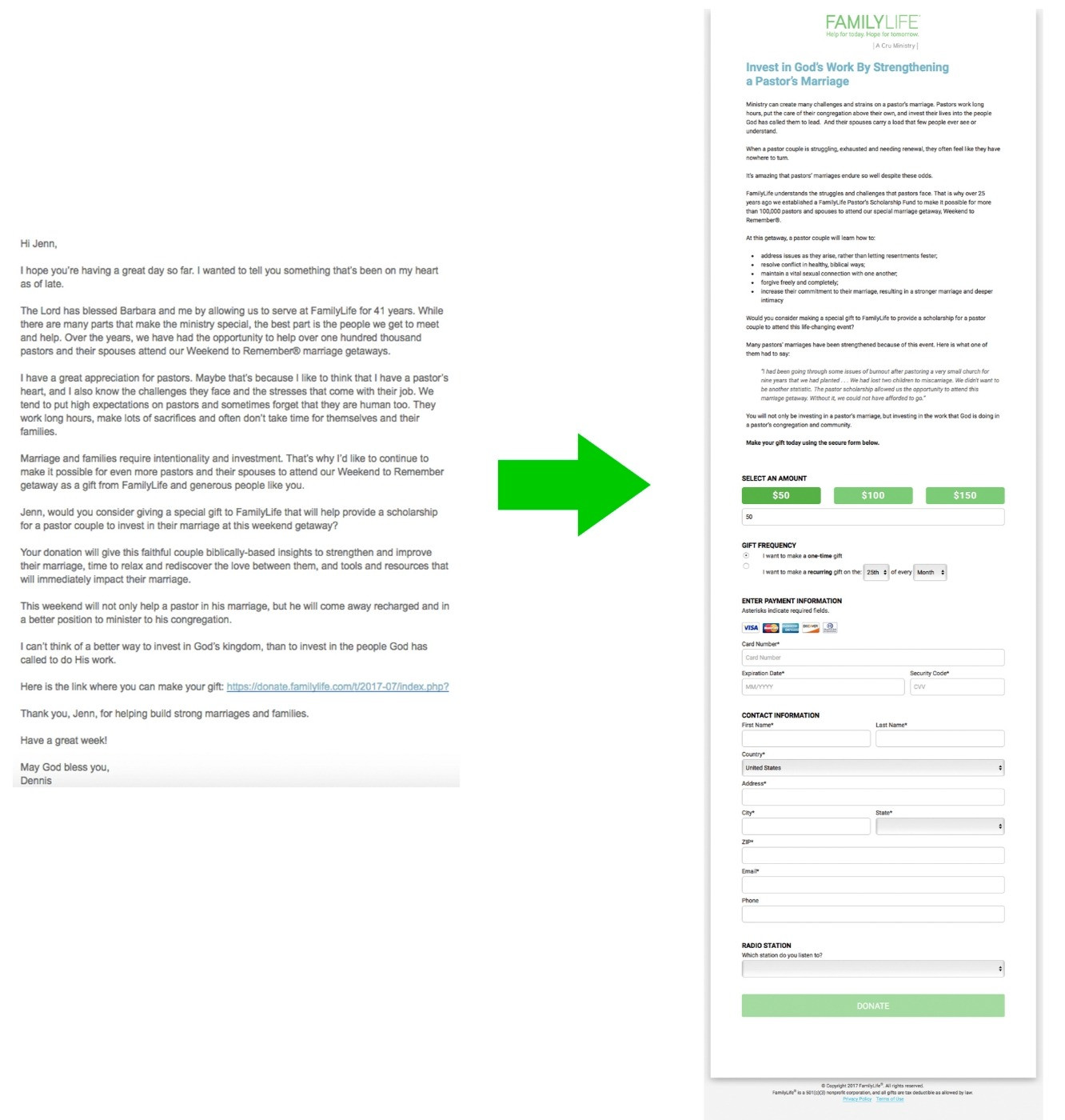
FamilyLife had a mature email fundraising program that relied heavily on third-party stories with large images. wanted to test an entirely new approach to their email fundraising that integrated a more personal tone and removed possible sources of friction from the “mental conversation” provoked by the email.
The control email used a template with a large FamilyLife logo at the top, followed by an image, a pull quote and a donate button, before any actual email copy. The email copy made an offer to provide a scholarship for a couple like “Fred and Melissa”, even though that couple had not been introduced yet. This presented clarity issues—who are Fred and Melissa? The couple in the picture? The call to action never really requested a gift, it just suggested a gift by linking text telling the reader what their gift would do. Finally, the email had a donate button at the bottom as well. This email led to a landing page that had the headline “Scholarships for Hardworking Pastor Couples”, which didn’t address the reader. That copy gave more information about Fred and Melissa, and then led into a separate call to action section (visually separated by a green box) that was disconnected from the pastor-centric message: “Help Families Stay Together”. This extra section then led to a donation form that had all the fields stacked on top of each other.
The FamilyLife team started with the email, developing a treatment that stripped out all the visual elements to reduce visual friction and resemble an email that their founder, Dennis Rainey, might actually write. Then they took a new approach with the tone, making it very personal. The treatment copy talked about his wife, their history serving pastors, and the challenges they’ve seen firsthand. The ask was vey clear and direct to the reader, and provided just a single link to the donation page, with no button.
This led to a donation page that led with a headline that extends an offer to the reader: Invest in God’s work by strengthening a pastor’s marriage. This copy removed the story, with the hypothesis that the third-party story with no real connection and anonymized names might detract from the clarity of the value proposition. The treatment added a bulleted list of what the pastor couple would receive at a Weekend to Remember event, and made a clear ask to the reader. The visual separation from the green box was removed, and the donation form was shortened by bringing multiple fields (i.e. first name and last name) onto the same line, which gave the perception of less friction, while still collecting the same information.
They split their file evenly (making sure to evenly split donors and non-donors) and sent one version to each segment. The control email linked to the control page and the treatment email to the treatment page to preserve the integrity of the test throughout the entire appeal flow.

