The Navigators
How a radical redesign on a donation page affects donor conversion rate
Experiment ID: #100222
The Navigators
Experiment Summary
Timeframe: 07/11/2022 - 08/15/2022
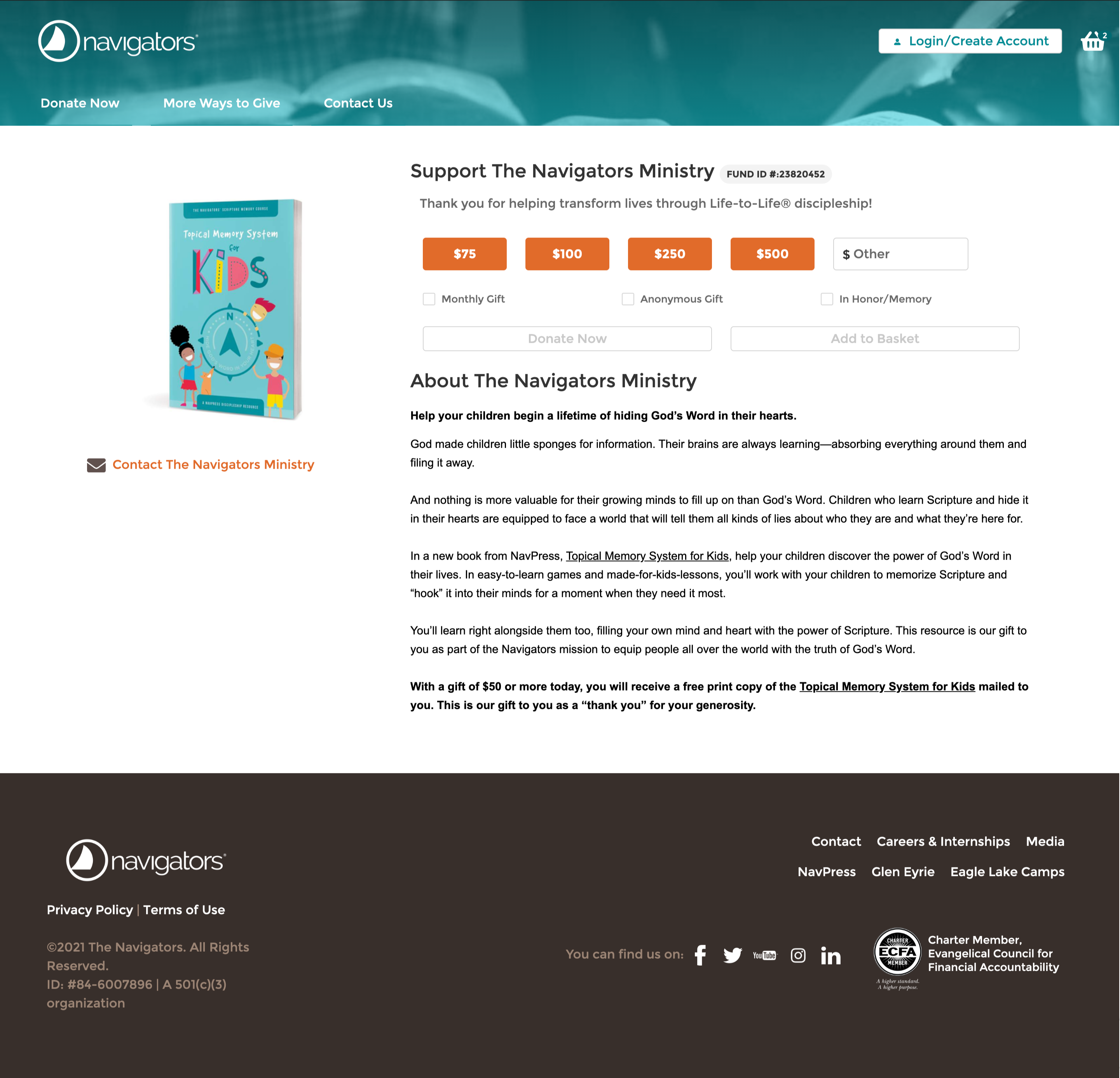
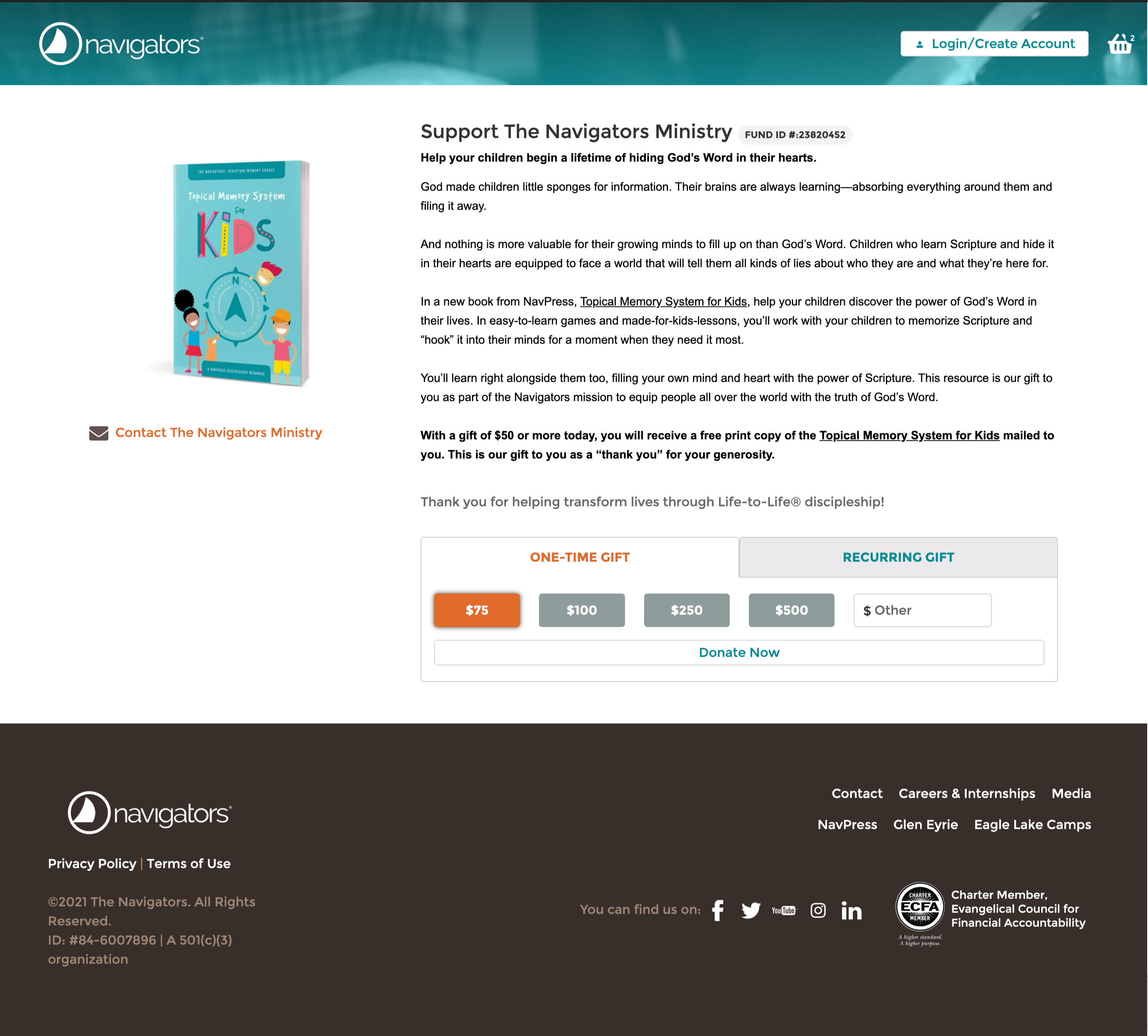
The Navigators recently moved donation page platforms where the previous donation page template was adjusted. The new template had the gift array at the very top of the page. Our hypothesis is that having the gift array at the bottom of the page gives the prospective donor to read supporting copy which makes them more likely to give. In addition, we made the gift array form a tabbed form (just like their previous template). Our hypothesis is that their previous template would generate more donations. The previous template guides the donor by presenting them a reason to give and making the one-time and recurring giving options easier to identify through the tabbed form. We also removed the navigation at the top of the page as part of this radical redesign.
We ran this experiment on a direct appeal premium offer running on Facebook.
Research Question
We believe that guiding to prospective donor through their donation process through a radical redesign for donation page visitors will achieve a higher donor conversion rate.
Design
C: Control
Array
(
[0] => Array
(
[ID] => 63138
[id] => 63138
[title] => Control.png
[filename] => Control-433.png
[filesize] => 1437391
[url] => https://www.nextafter.com/wp-content/uploads/Control-433.png
[link] => https://www.nextafter.com/experiments/how-a-radical-redesign-on-a-donation-page-affects-donor-conversion-rate/attachment/control-png-8252/
[alt] =>
[author] => 0
[description] =>
[caption] =>
[name] => control-png-8252
[status] => inherit
[uploaded_to] => 31139
[date] => 2024-08-08 21:30:54
[modified] => 2024-08-08 21:30:54
[menu_order] => 0
[mime_type] => image/png
[type] => image
[subtype] => png
[icon] => https://www.nextafter.com/wp-includes/images/media/default.png
[width] => 2882
[height] => 2774
[sizes] => Array
(
[thumbnail] => https://www.nextafter.com/wp-content/uploads/Control-433-150x150.png
[thumbnail-width] => 150
[thumbnail-height] => 150
[medium] => https://www.nextafter.com/wp-content/uploads/Control-433-300x289.png
[medium-width] => 300
[medium-height] => 289
[medium_large] => https://www.nextafter.com/wp-content/uploads/Control-433-768x739.png
[medium_large-width] => 640
[medium_large-height] => 616
[large] => https://www.nextafter.com/wp-content/uploads/Control-433-1024x986.png
[large-width] => 640
[large-height] => 616
[1536x1536] => https://www.nextafter.com/wp-content/uploads/Control-433-1536x1478.png
[1536x1536-width] => 1536
[1536x1536-height] => 1478
[2048x2048] => https://www.nextafter.com/wp-content/uploads/Control-433-2048x1971.png
[2048x2048-width] => 2048
[2048x2048-height] => 1971
[tp-image-grid] => https://www.nextafter.com/wp-content/uploads/Control-433-700x700.png
[tp-image-grid-width] => 700
[tp-image-grid-height] => 700
[post-thumbnail] => https://www.nextafter.com/wp-content/uploads/Control-433-150x150.png
[post-thumbnail-width] => 150
[post-thumbnail-height] => 150
[admin] => https://www.nextafter.com/wp-content/uploads/Control-433-50x48.png
[admin-width] => 50
[admin-height] => 48
[full] => https://www.nextafter.com/wp-content/uploads/Control-433.png
[full-width] => 2882
[full-height] => 2774
[thumb_372] => https://www.nextafter.com/wp-content/uploads/Control-433-372x358.png
[thumb_372-width] => 372
[thumb_372-height] => 358
[single_post_thumbnail] => https://www.nextafter.com/wp-content/uploads/Control-433-649x625.png
[single_post_thumbnail-width] => 649
[single_post_thumbnail-height] => 625
[thumb_32_32] => https://www.nextafter.com/wp-content/uploads/Control-433-32x32.png
[thumb_32_32-width] => 32
[thumb_32_32-height] => 32
[thumb_48_48] => https://www.nextafter.com/wp-content/uploads/Control-433-48x46.png
[thumb_48_48-width] => 48
[thumb_48_48-height] => 46
[thumb_64_64] => https://www.nextafter.com/wp-content/uploads/Control-433-64x62.png
[thumb_64_64-width] => 64
[thumb_64_64-height] => 62
[thumb_128_128] => https://www.nextafter.com/wp-content/uploads/Control-433-128x123.png
[thumb_128_128-width] => 128
[thumb_128_128-height] => 123
[thumb_122_67] => https://www.nextafter.com/wp-content/uploads/Control-433-70x67.png
[thumb_122_67-width] => 70
[thumb_122_67-height] => 67
[thumb_153_153] => https://www.nextafter.com/wp-content/uploads/Control-433-153x147.png
[thumb_153_153-width] => 153
[thumb_153_153-height] => 147
[thumb_130_163] => https://www.nextafter.com/wp-content/uploads/Control-433-130x125.png
[thumb_130_163-width] => 130
[thumb_130_163-height] => 125
[thumb_232_177] => https://www.nextafter.com/wp-content/uploads/Control-433-184x177.png
[thumb_232_177-width] => 184
[thumb_232_177-height] => 177
[thumb_272_325] => https://www.nextafter.com/wp-content/uploads/Control-433-544x524.png
[thumb_272_325-width] => 544
[thumb_272_325-height] => 524
[thumb_271_346] => https://www.nextafter.com/wp-content/uploads/Control-433-271x261.png
[thumb_271_346-width] => 271
[thumb_271_346-height] => 261
[thumb_271_271] => https://www.nextafter.com/wp-content/uploads/Control-433-271x261.png
[thumb_271_271-width] => 271
[thumb_271_271-height] => 261
[thumb_272_172] => https://www.nextafter.com/wp-content/uploads/Control-433-179x172.png
[thumb_272_172-width] => 179
[thumb_272_172-height] => 172
[thumb_372_461] => https://www.nextafter.com/wp-content/uploads/Control-433-372x358.png
[thumb_372_461-width] => 372
[thumb_372_461-height] => 358
[thumb_372_500] => https://www.nextafter.com/wp-content/uploads/Control-433-372x358.png
[thumb_372_500-width] => 372
[thumb_372_500-height] => 358
[thumb_385_270] => https://www.nextafter.com/wp-content/uploads/Control-433-281x270.png
[thumb_385_270-width] => 281
[thumb_385_270-height] => 270
[thumb_416_241] => https://www.nextafter.com/wp-content/uploads/Control-433-250x241.png
[thumb_416_241-width] => 250
[thumb_416_241-height] => 241
[thumb_448_410] => https://www.nextafter.com/wp-content/uploads/Control-433-426x410.png
[thumb_448_410-width] => 426
[thumb_448_410-height] => 410
[thumb_448_410_retina] => https://www.nextafter.com/wp-content/uploads/Control-433-852x820.png
[thumb_448_410_retina-width] => 852
[thumb_448_410_retina-height] => 820
[thumb_574_382] => https://www.nextafter.com/wp-content/uploads/Control-433-397x382.png
[thumb_574_382-width] => 397
[thumb_574_382-height] => 382
[thumb_776_395] => https://www.nextafter.com/wp-content/uploads/Control-433-410x395.png
[thumb_776_395-width] => 410
[thumb_776_395-height] => 395
[gform-image-choice-sm] => https://www.nextafter.com/wp-content/uploads/Control-433.png
[gform-image-choice-sm-width] => 300
[gform-image-choice-sm-height] => 289
[gform-image-choice-md] => https://www.nextafter.com/wp-content/uploads/Control-433.png
[gform-image-choice-md-width] => 400
[gform-image-choice-md-height] => 385
[gform-image-choice-lg] => https://www.nextafter.com/wp-content/uploads/Control-433.png
[gform-image-choice-lg-width] => 600
[gform-image-choice-lg-height] => 578
)
)
[1] => Array
(
[ID] => 63141
[id] => 63141
[title] => Radical_Redesign.png
[filename] => Radical_Redesign-2.png
[filesize] => 1190040
[url] => https://www.nextafter.com/wp-content/uploads/Radical_Redesign-2.png
[link] => https://www.nextafter.com/experiments/how-a-radical-redesign-on-a-donation-page-affects-donor-conversion-rate/attachment/radical_redesign-png-38/
[alt] =>
[author] => 0
[description] =>
[caption] =>
[name] => radical_redesign-png-38
[status] => inherit
[uploaded_to] => 31139
[date] => 2024-08-08 21:31:21
[modified] => 2024-08-08 21:31:21
[menu_order] => 0
[mime_type] => image/png
[type] => image
[subtype] => png
[icon] => https://www.nextafter.com/wp-includes/images/media/default.png
[width] => 2882
[height] => 2600
[sizes] => Array
(
[thumbnail] => https://www.nextafter.com/wp-content/uploads/Radical_Redesign-2-150x150.png
[thumbnail-width] => 150
[thumbnail-height] => 150
[medium] => https://www.nextafter.com/wp-content/uploads/Radical_Redesign-2-300x271.png
[medium-width] => 300
[medium-height] => 271
[medium_large] => https://www.nextafter.com/wp-content/uploads/Radical_Redesign-2-768x693.png
[medium_large-width] => 640
[medium_large-height] => 578
[large] => https://www.nextafter.com/wp-content/uploads/Radical_Redesign-2-1024x924.png
[large-width] => 640
[large-height] => 578
[1536x1536] => https://www.nextafter.com/wp-content/uploads/Radical_Redesign-2-1536x1386.png
[1536x1536-width] => 1536
[1536x1536-height] => 1386
[2048x2048] => https://www.nextafter.com/wp-content/uploads/Radical_Redesign-2-2048x1848.png
[2048x2048-width] => 2048
[2048x2048-height] => 1848
[tp-image-grid] => https://www.nextafter.com/wp-content/uploads/Radical_Redesign-2-700x700.png
[tp-image-grid-width] => 700
[tp-image-grid-height] => 700
[post-thumbnail] => https://www.nextafter.com/wp-content/uploads/Radical_Redesign-2-150x150.png
[post-thumbnail-width] => 150
[post-thumbnail-height] => 150
[admin] => https://www.nextafter.com/wp-content/uploads/Radical_Redesign-2-50x45.png
[admin-width] => 50
[admin-height] => 45
[full] => https://www.nextafter.com/wp-content/uploads/Radical_Redesign-2.png
[full-width] => 2882
[full-height] => 2600
[thumb_372] => https://www.nextafter.com/wp-content/uploads/Radical_Redesign-2-372x336.png
[thumb_372-width] => 372
[thumb_372-height] => 336
[single_post_thumbnail] => https://www.nextafter.com/wp-content/uploads/Radical_Redesign-2-693x625.png
[single_post_thumbnail-width] => 693
[single_post_thumbnail-height] => 625
[thumb_32_32] => https://www.nextafter.com/wp-content/uploads/Radical_Redesign-2-32x29.png
[thumb_32_32-width] => 32
[thumb_32_32-height] => 29
[thumb_48_48] => https://www.nextafter.com/wp-content/uploads/Radical_Redesign-2-48x43.png
[thumb_48_48-width] => 48
[thumb_48_48-height] => 43
[thumb_64_64] => https://www.nextafter.com/wp-content/uploads/Radical_Redesign-2-64x58.png
[thumb_64_64-width] => 64
[thumb_64_64-height] => 58
[thumb_128_128] => https://www.nextafter.com/wp-content/uploads/Radical_Redesign-2-128x115.png
[thumb_128_128-width] => 128
[thumb_128_128-height] => 115
[thumb_122_67] => https://www.nextafter.com/wp-content/uploads/Radical_Redesign-2-74x67.png
[thumb_122_67-width] => 74
[thumb_122_67-height] => 67
[thumb_153_153] => https://www.nextafter.com/wp-content/uploads/Radical_Redesign-2-153x138.png
[thumb_153_153-width] => 153
[thumb_153_153-height] => 138
[thumb_130_163] => https://www.nextafter.com/wp-content/uploads/Radical_Redesign-2-130x117.png
[thumb_130_163-width] => 130
[thumb_130_163-height] => 117
[thumb_232_177] => https://www.nextafter.com/wp-content/uploads/Radical_Redesign-2-196x177.png
[thumb_232_177-width] => 196
[thumb_232_177-height] => 177
[thumb_272_325] => https://www.nextafter.com/wp-content/uploads/Radical_Redesign-2-544x491.png
[thumb_272_325-width] => 544
[thumb_272_325-height] => 491
[thumb_271_346] => https://www.nextafter.com/wp-content/uploads/Radical_Redesign-2-271x244.png
[thumb_271_346-width] => 271
[thumb_271_346-height] => 244
[thumb_271_271] => https://www.nextafter.com/wp-content/uploads/Radical_Redesign-2-271x244.png
[thumb_271_271-width] => 271
[thumb_271_271-height] => 244
[thumb_272_172] => https://www.nextafter.com/wp-content/uploads/Radical_Redesign-2-191x172.png
[thumb_272_172-width] => 191
[thumb_272_172-height] => 172
[thumb_372_461] => https://www.nextafter.com/wp-content/uploads/Radical_Redesign-2-372x336.png
[thumb_372_461-width] => 372
[thumb_372_461-height] => 336
[thumb_372_500] => https://www.nextafter.com/wp-content/uploads/Radical_Redesign-2-372x336.png
[thumb_372_500-width] => 372
[thumb_372_500-height] => 336
[thumb_385_270] => https://www.nextafter.com/wp-content/uploads/Radical_Redesign-2-299x270.png
[thumb_385_270-width] => 299
[thumb_385_270-height] => 270
[thumb_416_241] => https://www.nextafter.com/wp-content/uploads/Radical_Redesign-2-267x241.png
[thumb_416_241-width] => 267
[thumb_416_241-height] => 241
[thumb_448_410] => https://www.nextafter.com/wp-content/uploads/Radical_Redesign-2-448x404.png
[thumb_448_410-width] => 448
[thumb_448_410-height] => 404
[thumb_448_410_retina] => https://www.nextafter.com/wp-content/uploads/Radical_Redesign-2-896x808.png
[thumb_448_410_retina-width] => 896
[thumb_448_410_retina-height] => 808
[thumb_574_382] => https://www.nextafter.com/wp-content/uploads/Radical_Redesign-2-423x382.png
[thumb_574_382-width] => 423
[thumb_574_382-height] => 382
[thumb_776_395] => https://www.nextafter.com/wp-content/uploads/Radical_Redesign-2-438x395.png
[thumb_776_395-width] => 438
[thumb_776_395-height] => 395
[gform-image-choice-sm] => https://www.nextafter.com/wp-content/uploads/Radical_Redesign-2.png
[gform-image-choice-sm-width] => 300
[gform-image-choice-sm-height] => 271
[gform-image-choice-md] => https://www.nextafter.com/wp-content/uploads/Radical_Redesign-2.png
[gform-image-choice-md-width] => 400
[gform-image-choice-md-height] => 361
[gform-image-choice-lg] => https://www.nextafter.com/wp-content/uploads/Radical_Redesign-2.png
[gform-image-choice-lg-width] => 600
[gform-image-choice-lg-height] => 541
)
)
)
T1: Radical Redesign
Array
(
[0] => Array
(
[ID] => 63138
[id] => 63138
[title] => Control.png
[filename] => Control-433.png
[filesize] => 1437391
[url] => https://www.nextafter.com/wp-content/uploads/Control-433.png
[link] => https://www.nextafter.com/experiments/how-a-radical-redesign-on-a-donation-page-affects-donor-conversion-rate/attachment/control-png-8252/
[alt] =>
[author] => 0
[description] =>
[caption] =>
[name] => control-png-8252
[status] => inherit
[uploaded_to] => 31139
[date] => 2024-08-08 21:30:54
[modified] => 2024-08-08 21:30:54
[menu_order] => 0
[mime_type] => image/png
[type] => image
[subtype] => png
[icon] => https://www.nextafter.com/wp-includes/images/media/default.png
[width] => 2882
[height] => 2774
[sizes] => Array
(
[thumbnail] => https://www.nextafter.com/wp-content/uploads/Control-433-150x150.png
[thumbnail-width] => 150
[thumbnail-height] => 150
[medium] => https://www.nextafter.com/wp-content/uploads/Control-433-300x289.png
[medium-width] => 300
[medium-height] => 289
[medium_large] => https://www.nextafter.com/wp-content/uploads/Control-433-768x739.png
[medium_large-width] => 640
[medium_large-height] => 616
[large] => https://www.nextafter.com/wp-content/uploads/Control-433-1024x986.png
[large-width] => 640
[large-height] => 616
[1536x1536] => https://www.nextafter.com/wp-content/uploads/Control-433-1536x1478.png
[1536x1536-width] => 1536
[1536x1536-height] => 1478
[2048x2048] => https://www.nextafter.com/wp-content/uploads/Control-433-2048x1971.png
[2048x2048-width] => 2048
[2048x2048-height] => 1971
[tp-image-grid] => https://www.nextafter.com/wp-content/uploads/Control-433-700x700.png
[tp-image-grid-width] => 700
[tp-image-grid-height] => 700
[post-thumbnail] => https://www.nextafter.com/wp-content/uploads/Control-433-150x150.png
[post-thumbnail-width] => 150
[post-thumbnail-height] => 150
[admin] => https://www.nextafter.com/wp-content/uploads/Control-433-50x48.png
[admin-width] => 50
[admin-height] => 48
[full] => https://www.nextafter.com/wp-content/uploads/Control-433.png
[full-width] => 2882
[full-height] => 2774
[thumb_372] => https://www.nextafter.com/wp-content/uploads/Control-433-372x358.png
[thumb_372-width] => 372
[thumb_372-height] => 358
[single_post_thumbnail] => https://www.nextafter.com/wp-content/uploads/Control-433-649x625.png
[single_post_thumbnail-width] => 649
[single_post_thumbnail-height] => 625
[thumb_32_32] => https://www.nextafter.com/wp-content/uploads/Control-433-32x32.png
[thumb_32_32-width] => 32
[thumb_32_32-height] => 32
[thumb_48_48] => https://www.nextafter.com/wp-content/uploads/Control-433-48x46.png
[thumb_48_48-width] => 48
[thumb_48_48-height] => 46
[thumb_64_64] => https://www.nextafter.com/wp-content/uploads/Control-433-64x62.png
[thumb_64_64-width] => 64
[thumb_64_64-height] => 62
[thumb_128_128] => https://www.nextafter.com/wp-content/uploads/Control-433-128x123.png
[thumb_128_128-width] => 128
[thumb_128_128-height] => 123
[thumb_122_67] => https://www.nextafter.com/wp-content/uploads/Control-433-70x67.png
[thumb_122_67-width] => 70
[thumb_122_67-height] => 67
[thumb_153_153] => https://www.nextafter.com/wp-content/uploads/Control-433-153x147.png
[thumb_153_153-width] => 153
[thumb_153_153-height] => 147
[thumb_130_163] => https://www.nextafter.com/wp-content/uploads/Control-433-130x125.png
[thumb_130_163-width] => 130
[thumb_130_163-height] => 125
[thumb_232_177] => https://www.nextafter.com/wp-content/uploads/Control-433-184x177.png
[thumb_232_177-width] => 184
[thumb_232_177-height] => 177
[thumb_272_325] => https://www.nextafter.com/wp-content/uploads/Control-433-544x524.png
[thumb_272_325-width] => 544
[thumb_272_325-height] => 524
[thumb_271_346] => https://www.nextafter.com/wp-content/uploads/Control-433-271x261.png
[thumb_271_346-width] => 271
[thumb_271_346-height] => 261
[thumb_271_271] => https://www.nextafter.com/wp-content/uploads/Control-433-271x261.png
[thumb_271_271-width] => 271
[thumb_271_271-height] => 261
[thumb_272_172] => https://www.nextafter.com/wp-content/uploads/Control-433-179x172.png
[thumb_272_172-width] => 179
[thumb_272_172-height] => 172
[thumb_372_461] => https://www.nextafter.com/wp-content/uploads/Control-433-372x358.png
[thumb_372_461-width] => 372
[thumb_372_461-height] => 358
[thumb_372_500] => https://www.nextafter.com/wp-content/uploads/Control-433-372x358.png
[thumb_372_500-width] => 372
[thumb_372_500-height] => 358
[thumb_385_270] => https://www.nextafter.com/wp-content/uploads/Control-433-281x270.png
[thumb_385_270-width] => 281
[thumb_385_270-height] => 270
[thumb_416_241] => https://www.nextafter.com/wp-content/uploads/Control-433-250x241.png
[thumb_416_241-width] => 250
[thumb_416_241-height] => 241
[thumb_448_410] => https://www.nextafter.com/wp-content/uploads/Control-433-426x410.png
[thumb_448_410-width] => 426
[thumb_448_410-height] => 410
[thumb_448_410_retina] => https://www.nextafter.com/wp-content/uploads/Control-433-852x820.png
[thumb_448_410_retina-width] => 852
[thumb_448_410_retina-height] => 820
[thumb_574_382] => https://www.nextafter.com/wp-content/uploads/Control-433-397x382.png
[thumb_574_382-width] => 397
[thumb_574_382-height] => 382
[thumb_776_395] => https://www.nextafter.com/wp-content/uploads/Control-433-410x395.png
[thumb_776_395-width] => 410
[thumb_776_395-height] => 395
[gform-image-choice-sm] => https://www.nextafter.com/wp-content/uploads/Control-433.png
[gform-image-choice-sm-width] => 300
[gform-image-choice-sm-height] => 289
[gform-image-choice-md] => https://www.nextafter.com/wp-content/uploads/Control-433.png
[gform-image-choice-md-width] => 400
[gform-image-choice-md-height] => 385
[gform-image-choice-lg] => https://www.nextafter.com/wp-content/uploads/Control-433.png
[gform-image-choice-lg-width] => 600
[gform-image-choice-lg-height] => 578
)
)
[1] => Array
(
[ID] => 63141
[id] => 63141
[title] => Radical_Redesign.png
[filename] => Radical_Redesign-2.png
[filesize] => 1190040
[url] => https://www.nextafter.com/wp-content/uploads/Radical_Redesign-2.png
[link] => https://www.nextafter.com/experiments/how-a-radical-redesign-on-a-donation-page-affects-donor-conversion-rate/attachment/radical_redesign-png-38/
[alt] =>
[author] => 0
[description] =>
[caption] =>
[name] => radical_redesign-png-38
[status] => inherit
[uploaded_to] => 31139
[date] => 2024-08-08 21:31:21
[modified] => 2024-08-08 21:31:21
[menu_order] => 0
[mime_type] => image/png
[type] => image
[subtype] => png
[icon] => https://www.nextafter.com/wp-includes/images/media/default.png
[width] => 2882
[height] => 2600
[sizes] => Array
(
[thumbnail] => https://www.nextafter.com/wp-content/uploads/Radical_Redesign-2-150x150.png
[thumbnail-width] => 150
[thumbnail-height] => 150
[medium] => https://www.nextafter.com/wp-content/uploads/Radical_Redesign-2-300x271.png
[medium-width] => 300
[medium-height] => 271
[medium_large] => https://www.nextafter.com/wp-content/uploads/Radical_Redesign-2-768x693.png
[medium_large-width] => 640
[medium_large-height] => 578
[large] => https://www.nextafter.com/wp-content/uploads/Radical_Redesign-2-1024x924.png
[large-width] => 640
[large-height] => 578
[1536x1536] => https://www.nextafter.com/wp-content/uploads/Radical_Redesign-2-1536x1386.png
[1536x1536-width] => 1536
[1536x1536-height] => 1386
[2048x2048] => https://www.nextafter.com/wp-content/uploads/Radical_Redesign-2-2048x1848.png
[2048x2048-width] => 2048
[2048x2048-height] => 1848
[tp-image-grid] => https://www.nextafter.com/wp-content/uploads/Radical_Redesign-2-700x700.png
[tp-image-grid-width] => 700
[tp-image-grid-height] => 700
[post-thumbnail] => https://www.nextafter.com/wp-content/uploads/Radical_Redesign-2-150x150.png
[post-thumbnail-width] => 150
[post-thumbnail-height] => 150
[admin] => https://www.nextafter.com/wp-content/uploads/Radical_Redesign-2-50x45.png
[admin-width] => 50
[admin-height] => 45
[full] => https://www.nextafter.com/wp-content/uploads/Radical_Redesign-2.png
[full-width] => 2882
[full-height] => 2600
[thumb_372] => https://www.nextafter.com/wp-content/uploads/Radical_Redesign-2-372x336.png
[thumb_372-width] => 372
[thumb_372-height] => 336
[single_post_thumbnail] => https://www.nextafter.com/wp-content/uploads/Radical_Redesign-2-693x625.png
[single_post_thumbnail-width] => 693
[single_post_thumbnail-height] => 625
[thumb_32_32] => https://www.nextafter.com/wp-content/uploads/Radical_Redesign-2-32x29.png
[thumb_32_32-width] => 32
[thumb_32_32-height] => 29
[thumb_48_48] => https://www.nextafter.com/wp-content/uploads/Radical_Redesign-2-48x43.png
[thumb_48_48-width] => 48
[thumb_48_48-height] => 43
[thumb_64_64] => https://www.nextafter.com/wp-content/uploads/Radical_Redesign-2-64x58.png
[thumb_64_64-width] => 64
[thumb_64_64-height] => 58
[thumb_128_128] => https://www.nextafter.com/wp-content/uploads/Radical_Redesign-2-128x115.png
[thumb_128_128-width] => 128
[thumb_128_128-height] => 115
[thumb_122_67] => https://www.nextafter.com/wp-content/uploads/Radical_Redesign-2-74x67.png
[thumb_122_67-width] => 74
[thumb_122_67-height] => 67
[thumb_153_153] => https://www.nextafter.com/wp-content/uploads/Radical_Redesign-2-153x138.png
[thumb_153_153-width] => 153
[thumb_153_153-height] => 138
[thumb_130_163] => https://www.nextafter.com/wp-content/uploads/Radical_Redesign-2-130x117.png
[thumb_130_163-width] => 130
[thumb_130_163-height] => 117
[thumb_232_177] => https://www.nextafter.com/wp-content/uploads/Radical_Redesign-2-196x177.png
[thumb_232_177-width] => 196
[thumb_232_177-height] => 177
[thumb_272_325] => https://www.nextafter.com/wp-content/uploads/Radical_Redesign-2-544x491.png
[thumb_272_325-width] => 544
[thumb_272_325-height] => 491
[thumb_271_346] => https://www.nextafter.com/wp-content/uploads/Radical_Redesign-2-271x244.png
[thumb_271_346-width] => 271
[thumb_271_346-height] => 244
[thumb_271_271] => https://www.nextafter.com/wp-content/uploads/Radical_Redesign-2-271x244.png
[thumb_271_271-width] => 271
[thumb_271_271-height] => 244
[thumb_272_172] => https://www.nextafter.com/wp-content/uploads/Radical_Redesign-2-191x172.png
[thumb_272_172-width] => 191
[thumb_272_172-height] => 172
[thumb_372_461] => https://www.nextafter.com/wp-content/uploads/Radical_Redesign-2-372x336.png
[thumb_372_461-width] => 372
[thumb_372_461-height] => 336
[thumb_372_500] => https://www.nextafter.com/wp-content/uploads/Radical_Redesign-2-372x336.png
[thumb_372_500-width] => 372
[thumb_372_500-height] => 336
[thumb_385_270] => https://www.nextafter.com/wp-content/uploads/Radical_Redesign-2-299x270.png
[thumb_385_270-width] => 299
[thumb_385_270-height] => 270
[thumb_416_241] => https://www.nextafter.com/wp-content/uploads/Radical_Redesign-2-267x241.png
[thumb_416_241-width] => 267
[thumb_416_241-height] => 241
[thumb_448_410] => https://www.nextafter.com/wp-content/uploads/Radical_Redesign-2-448x404.png
[thumb_448_410-width] => 448
[thumb_448_410-height] => 404
[thumb_448_410_retina] => https://www.nextafter.com/wp-content/uploads/Radical_Redesign-2-896x808.png
[thumb_448_410_retina-width] => 896
[thumb_448_410_retina-height] => 808
[thumb_574_382] => https://www.nextafter.com/wp-content/uploads/Radical_Redesign-2-423x382.png
[thumb_574_382-width] => 423
[thumb_574_382-height] => 382
[thumb_776_395] => https://www.nextafter.com/wp-content/uploads/Radical_Redesign-2-438x395.png
[thumb_776_395-width] => 438
[thumb_776_395-height] => 395
[gform-image-choice-sm] => https://www.nextafter.com/wp-content/uploads/Radical_Redesign-2.png
[gform-image-choice-sm-width] => 300
[gform-image-choice-sm-height] => 271
[gform-image-choice-md] => https://www.nextafter.com/wp-content/uploads/Radical_Redesign-2.png
[gform-image-choice-md-width] => 400
[gform-image-choice-md-height] => 361
[gform-image-choice-lg] => https://www.nextafter.com/wp-content/uploads/Radical_Redesign-2.png
[gform-image-choice-lg-width] => 600
[gform-image-choice-lg-height] => 541
)
)
)
Results
| |
Treatment Name |
Conv. Rate |
Relative Difference |
Confidence |
Average Gift |
| C: |
Control
|
0.74% |
|
|
$0.00 |
| T1: |
Radical Redesign
|
2.3% |
212.7% |
96.3%
|
$0.00 |
This experiment has a required sample size of
461 in order to be valid. Since the experiment had a total sample size of
1,058, and
the level of confidence is above 95%
the experiment results are
valid.
Flux Metrics Affected
The Flux Metrics analyze the three primary metrics that affect revenue (traffic, conversion rate, and average
gift).
This experiment produced the following results:
0% increase in traffic
× 212.7% increase in conversion rate
× 0% increase in average gift
Key Learnings
This experiment resulted in a 212% lift in donor conversion rate with a level of confidence of 96% - making this a valid increase. This tells us that the changes made to this instant donation page make a better experience for the prospective donor: they're able to read why they should give before taking action, they are given a clearer selection of a one time vs monthly gift, and they are giving a clearer call to action by removing the external links in the navigation bar.

