The Gospel Coalition
How redesigning the main donate button on the homepage affected traffic at year-end
Experiment ID: #81349
The Gospel Coalition
Experiment Summary
Ended On: 12/30/2021
Leading up to calendar year-end, we know that visitors to the TGC homepage had a high motivation to give. We wanted to make sure that potentially highly motivated donors could easily find where to make their year-end gift.
We rolled out a new button design on the homepage to see if we could make it easier for potential donors to find the donation page, but we wanted to run this as a test against the old version to capture the impact.
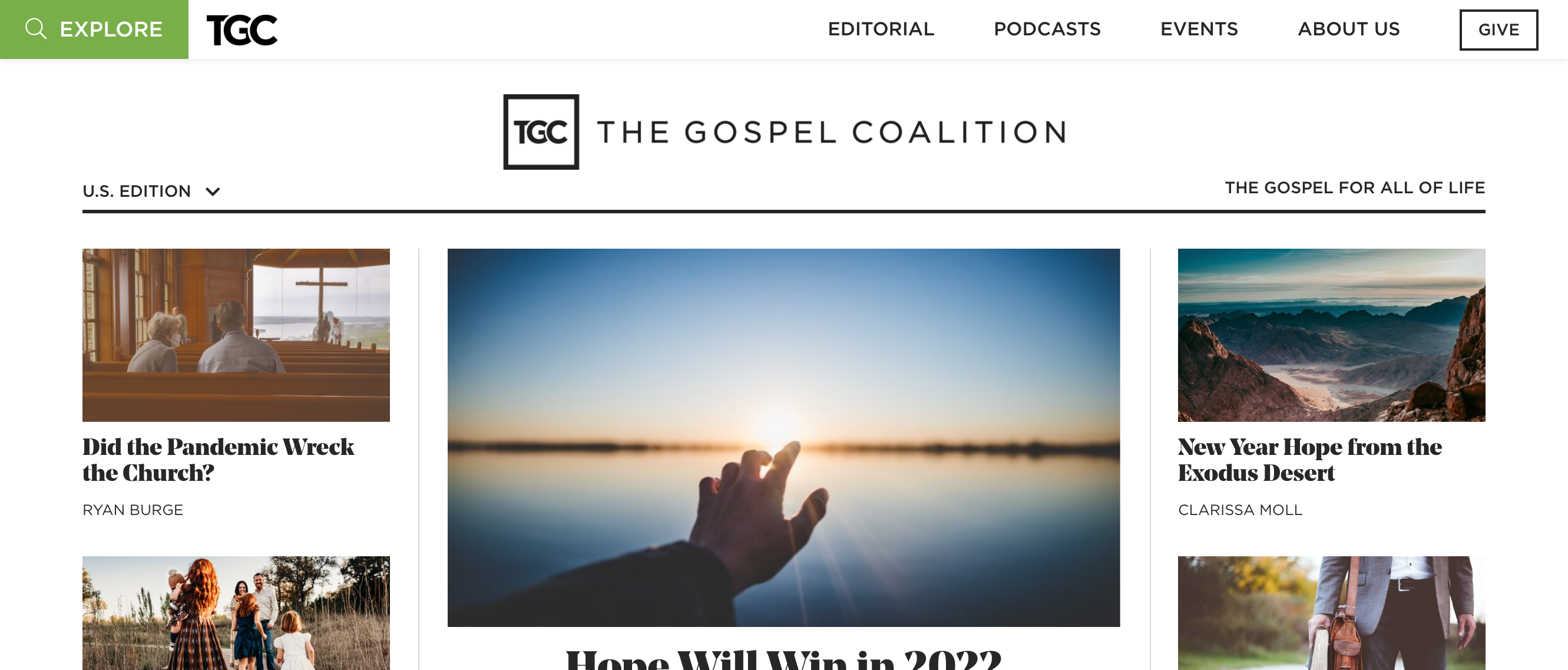
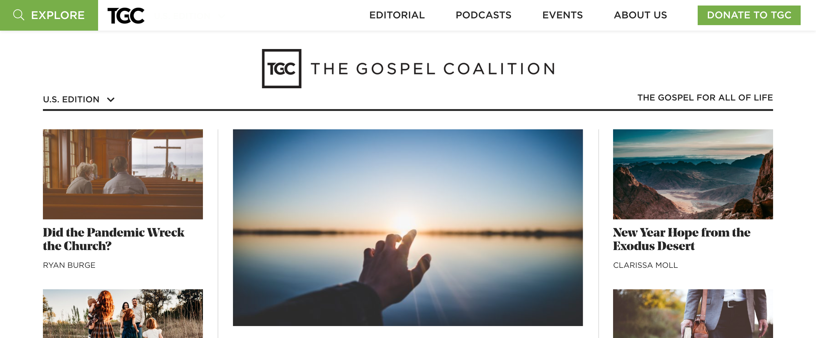
The new button (running as the control for this experiment) read “Donate to TGC” and we made it green to stand out for visual emphasis while the old button (the treatment version) simply said “Give” and visually matched all other menu options in the header.
We split traffic to each version.
Research Question
We believe that emphasizing the main donation button for homepage visitors will achieve an increase in traffic to the donation page.
Design
C: Old - Give Button
Array
(
[0] => Array
(
[ID] => 38877
[id] => 38877
[title] => Old_-_Give_Button.png
[filename] => Old_-_Give_Button-8.png
[filesize] => 1370717
[url] => https://www.nextafter.com/wp-content/uploads/Old_-_Give_Button-8.png
[link] => https://www.nextafter.com/experiments/how-redesigning-the-main-donate-button-on-the-homepage-affects-traffic/attachment/old_-_give_button-png-9/
[alt] =>
[author] => 0
[description] =>
[caption] =>
[name] => old_-_give_button-png-9
[status] => inherit
[uploaded_to] => 25118
[date] => 2022-10-19 19:35:00
[modified] => 2022-10-19 19:35:00
[menu_order] => 0
[mime_type] => image/png
[type] => image
[subtype] => png
[icon] => https://www.nextafter.com/wp-includes/images/media/default.png
[width] => 2662
[height] => 1137
[sizes] => Array
(
[thumbnail] => https://www.nextafter.com/wp-content/uploads/Old_-_Give_Button-8-150x150.png
[thumbnail-width] => 150
[thumbnail-height] => 150
[medium] => https://www.nextafter.com/wp-content/uploads/Old_-_Give_Button-8-300x128.png
[medium-width] => 300
[medium-height] => 128
[medium_large] => https://www.nextafter.com/wp-content/uploads/Old_-_Give_Button-8-768x328.png
[medium_large-width] => 640
[medium_large-height] => 273
[large] => https://www.nextafter.com/wp-content/uploads/Old_-_Give_Button-8-1024x437.png
[large-width] => 640
[large-height] => 273
[1536x1536] => https://www.nextafter.com/wp-content/uploads/Old_-_Give_Button-8-1536x656.png
[1536x1536-width] => 1536
[1536x1536-height] => 656
[2048x2048] => https://www.nextafter.com/wp-content/uploads/Old_-_Give_Button-8-2048x875.png
[2048x2048-width] => 2048
[2048x2048-height] => 875
[tp-image-grid] => https://www.nextafter.com/wp-content/uploads/Old_-_Give_Button-8.png
[tp-image-grid-width] => 700
[tp-image-grid-height] => 299
[post-thumbnail] => https://www.nextafter.com/wp-content/uploads/Old_-_Give_Button-8-150x150.png
[post-thumbnail-width] => 150
[post-thumbnail-height] => 150
[admin] => https://www.nextafter.com/wp-content/uploads/Old_-_Give_Button-8-50x21.png
[admin-width] => 50
[admin-height] => 21
[full] => https://www.nextafter.com/wp-content/uploads/Old_-_Give_Button-8.png
[full-width] => 2662
[full-height] => 1137
[thumb_372] => https://www.nextafter.com/wp-content/uploads/Old_-_Give_Button-8-372x159.png
[thumb_372-width] => 372
[thumb_372-height] => 159
[single_post_thumbnail] => https://www.nextafter.com/wp-content/uploads/Old_-_Give_Button-8-980x419.png
[single_post_thumbnail-width] => 980
[single_post_thumbnail-height] => 419
[thumb_32_32] => https://www.nextafter.com/wp-content/uploads/Old_-_Give_Button-8-32x14.png
[thumb_32_32-width] => 32
[thumb_32_32-height] => 14
[thumb_48_48] => https://www.nextafter.com/wp-content/uploads/Old_-_Give_Button-8-48x21.png
[thumb_48_48-width] => 48
[thumb_48_48-height] => 21
[thumb_64_64] => https://www.nextafter.com/wp-content/uploads/Old_-_Give_Button-8-64x27.png
[thumb_64_64-width] => 64
[thumb_64_64-height] => 27
[thumb_128_128] => https://www.nextafter.com/wp-content/uploads/Old_-_Give_Button-8-128x55.png
[thumb_128_128-width] => 128
[thumb_128_128-height] => 55
[thumb_122_67] => https://www.nextafter.com/wp-content/uploads/Old_-_Give_Button-8-122x52.png
[thumb_122_67-width] => 122
[thumb_122_67-height] => 52
[thumb_153_153] => https://www.nextafter.com/wp-content/uploads/Old_-_Give_Button-8-153x65.png
[thumb_153_153-width] => 153
[thumb_153_153-height] => 65
[thumb_130_163] => https://www.nextafter.com/wp-content/uploads/Old_-_Give_Button-8-130x56.png
[thumb_130_163-width] => 130
[thumb_130_163-height] => 56
[thumb_232_177] => https://www.nextafter.com/wp-content/uploads/Old_-_Give_Button-8-232x99.png
[thumb_232_177-width] => 232
[thumb_232_177-height] => 99
[thumb_272_325] => https://www.nextafter.com/wp-content/uploads/Old_-_Give_Button-8-544x232.png
[thumb_272_325-width] => 544
[thumb_272_325-height] => 232
[thumb_271_346] => https://www.nextafter.com/wp-content/uploads/Old_-_Give_Button-8-271x116.png
[thumb_271_346-width] => 271
[thumb_271_346-height] => 116
[thumb_271_271] => https://www.nextafter.com/wp-content/uploads/Old_-_Give_Button-8-271x116.png
[thumb_271_271-width] => 271
[thumb_271_271-height] => 116
[thumb_272_172] => https://www.nextafter.com/wp-content/uploads/Old_-_Give_Button-8-272x116.png
[thumb_272_172-width] => 272
[thumb_272_172-height] => 116
[thumb_372_461] => https://www.nextafter.com/wp-content/uploads/Old_-_Give_Button-8-372x159.png
[thumb_372_461-width] => 372
[thumb_372_461-height] => 159
[thumb_372_500] => https://www.nextafter.com/wp-content/uploads/Old_-_Give_Button-8-372x159.png
[thumb_372_500-width] => 372
[thumb_372_500-height] => 159
[thumb_385_270] => https://www.nextafter.com/wp-content/uploads/Old_-_Give_Button-8-385x164.png
[thumb_385_270-width] => 385
[thumb_385_270-height] => 164
[thumb_416_241] => https://www.nextafter.com/wp-content/uploads/Old_-_Give_Button-8-416x178.png
[thumb_416_241-width] => 416
[thumb_416_241-height] => 178
[thumb_448_410] => https://www.nextafter.com/wp-content/uploads/Old_-_Give_Button-8-448x191.png
[thumb_448_410-width] => 448
[thumb_448_410-height] => 191
[thumb_448_410_retina] => https://www.nextafter.com/wp-content/uploads/Old_-_Give_Button-8-896x383.png
[thumb_448_410_retina-width] => 896
[thumb_448_410_retina-height] => 383
[thumb_574_382] => https://www.nextafter.com/wp-content/uploads/Old_-_Give_Button-8-574x245.png
[thumb_574_382-width] => 574
[thumb_574_382-height] => 245
[thumb_776_395] => https://www.nextafter.com/wp-content/uploads/Old_-_Give_Button-8-776x331.png
[thumb_776_395-width] => 776
[thumb_776_395-height] => 331
[gform-image-choice-sm] => https://www.nextafter.com/wp-content/uploads/Old_-_Give_Button-8.png
[gform-image-choice-sm-width] => 300
[gform-image-choice-sm-height] => 128
[gform-image-choice-md] => https://www.nextafter.com/wp-content/uploads/Old_-_Give_Button-8.png
[gform-image-choice-md-width] => 400
[gform-image-choice-md-height] => 171
[gform-image-choice-lg] => https://www.nextafter.com/wp-content/uploads/Old_-_Give_Button-8.png
[gform-image-choice-lg-width] => 600
[gform-image-choice-lg-height] => 256
)
)
[1] => Array
(
[ID] => 38878
[id] => 38878
[title] => New_-_Green_Donate_to_TGC_Button.png
[filename] => New_-_Green_Donate_to_TGC_Button-7.png
[filesize] => 1295690
[url] => https://www.nextafter.com/wp-content/uploads/New_-_Green_Donate_to_TGC_Button-7.png
[link] => https://www.nextafter.com/experiments/how-redesigning-the-main-donate-button-on-the-homepage-affects-traffic/attachment/new_-_green_donate_to_tgc_button-png-8/
[alt] =>
[author] => 0
[description] =>
[caption] =>
[name] => new_-_green_donate_to_tgc_button-png-8
[status] => inherit
[uploaded_to] => 25118
[date] => 2022-10-19 19:35:03
[modified] => 2022-10-19 19:35:03
[menu_order] => 0
[mime_type] => image/png
[type] => image
[subtype] => png
[icon] => https://www.nextafter.com/wp-includes/images/media/default.png
[width] => 2662
[height] => 1103
[sizes] => Array
(
[thumbnail] => https://www.nextafter.com/wp-content/uploads/New_-_Green_Donate_to_TGC_Button-7-150x150.png
[thumbnail-width] => 150
[thumbnail-height] => 150
[medium] => https://www.nextafter.com/wp-content/uploads/New_-_Green_Donate_to_TGC_Button-7-300x124.png
[medium-width] => 300
[medium-height] => 124
[medium_large] => https://www.nextafter.com/wp-content/uploads/New_-_Green_Donate_to_TGC_Button-7-768x318.png
[medium_large-width] => 640
[medium_large-height] => 265
[large] => https://www.nextafter.com/wp-content/uploads/New_-_Green_Donate_to_TGC_Button-7-1024x424.png
[large-width] => 640
[large-height] => 265
[1536x1536] => https://www.nextafter.com/wp-content/uploads/New_-_Green_Donate_to_TGC_Button-7-1536x636.png
[1536x1536-width] => 1536
[1536x1536-height] => 636
[2048x2048] => https://www.nextafter.com/wp-content/uploads/New_-_Green_Donate_to_TGC_Button-7-2048x849.png
[2048x2048-width] => 2048
[2048x2048-height] => 849
[tp-image-grid] => https://www.nextafter.com/wp-content/uploads/New_-_Green_Donate_to_TGC_Button-7.png
[tp-image-grid-width] => 700
[tp-image-grid-height] => 290
[post-thumbnail] => https://www.nextafter.com/wp-content/uploads/New_-_Green_Donate_to_TGC_Button-7-150x150.png
[post-thumbnail-width] => 150
[post-thumbnail-height] => 150
[admin] => https://www.nextafter.com/wp-content/uploads/New_-_Green_Donate_to_TGC_Button-7-50x21.png
[admin-width] => 50
[admin-height] => 21
[full] => https://www.nextafter.com/wp-content/uploads/New_-_Green_Donate_to_TGC_Button-7.png
[full-width] => 2662
[full-height] => 1103
[thumb_372] => https://www.nextafter.com/wp-content/uploads/New_-_Green_Donate_to_TGC_Button-7-372x154.png
[thumb_372-width] => 372
[thumb_372-height] => 154
[single_post_thumbnail] => https://www.nextafter.com/wp-content/uploads/New_-_Green_Donate_to_TGC_Button-7-980x406.png
[single_post_thumbnail-width] => 980
[single_post_thumbnail-height] => 406
[thumb_32_32] => https://www.nextafter.com/wp-content/uploads/New_-_Green_Donate_to_TGC_Button-7-32x13.png
[thumb_32_32-width] => 32
[thumb_32_32-height] => 13
[thumb_48_48] => https://www.nextafter.com/wp-content/uploads/New_-_Green_Donate_to_TGC_Button-7-48x20.png
[thumb_48_48-width] => 48
[thumb_48_48-height] => 20
[thumb_64_64] => https://www.nextafter.com/wp-content/uploads/New_-_Green_Donate_to_TGC_Button-7-64x27.png
[thumb_64_64-width] => 64
[thumb_64_64-height] => 27
[thumb_128_128] => https://www.nextafter.com/wp-content/uploads/New_-_Green_Donate_to_TGC_Button-7-128x53.png
[thumb_128_128-width] => 128
[thumb_128_128-height] => 53
[thumb_122_67] => https://www.nextafter.com/wp-content/uploads/New_-_Green_Donate_to_TGC_Button-7-122x51.png
[thumb_122_67-width] => 122
[thumb_122_67-height] => 51
[thumb_153_153] => https://www.nextafter.com/wp-content/uploads/New_-_Green_Donate_to_TGC_Button-7-153x63.png
[thumb_153_153-width] => 153
[thumb_153_153-height] => 63
[thumb_130_163] => https://www.nextafter.com/wp-content/uploads/New_-_Green_Donate_to_TGC_Button-7-130x54.png
[thumb_130_163-width] => 130
[thumb_130_163-height] => 54
[thumb_232_177] => https://www.nextafter.com/wp-content/uploads/New_-_Green_Donate_to_TGC_Button-7-232x96.png
[thumb_232_177-width] => 232
[thumb_232_177-height] => 96
[thumb_272_325] => https://www.nextafter.com/wp-content/uploads/New_-_Green_Donate_to_TGC_Button-7-544x225.png
[thumb_272_325-width] => 544
[thumb_272_325-height] => 225
[thumb_271_346] => https://www.nextafter.com/wp-content/uploads/New_-_Green_Donate_to_TGC_Button-7-271x112.png
[thumb_271_346-width] => 271
[thumb_271_346-height] => 112
[thumb_271_271] => https://www.nextafter.com/wp-content/uploads/New_-_Green_Donate_to_TGC_Button-7-271x112.png
[thumb_271_271-width] => 271
[thumb_271_271-height] => 112
[thumb_272_172] => https://www.nextafter.com/wp-content/uploads/New_-_Green_Donate_to_TGC_Button-7-272x113.png
[thumb_272_172-width] => 272
[thumb_272_172-height] => 113
[thumb_372_461] => https://www.nextafter.com/wp-content/uploads/New_-_Green_Donate_to_TGC_Button-7-372x154.png
[thumb_372_461-width] => 372
[thumb_372_461-height] => 154
[thumb_372_500] => https://www.nextafter.com/wp-content/uploads/New_-_Green_Donate_to_TGC_Button-7-372x154.png
[thumb_372_500-width] => 372
[thumb_372_500-height] => 154
[thumb_385_270] => https://www.nextafter.com/wp-content/uploads/New_-_Green_Donate_to_TGC_Button-7-385x160.png
[thumb_385_270-width] => 385
[thumb_385_270-height] => 160
[thumb_416_241] => https://www.nextafter.com/wp-content/uploads/New_-_Green_Donate_to_TGC_Button-7-416x172.png
[thumb_416_241-width] => 416
[thumb_416_241-height] => 172
[thumb_448_410] => https://www.nextafter.com/wp-content/uploads/New_-_Green_Donate_to_TGC_Button-7-448x186.png
[thumb_448_410-width] => 448
[thumb_448_410-height] => 186
[thumb_448_410_retina] => https://www.nextafter.com/wp-content/uploads/New_-_Green_Donate_to_TGC_Button-7-896x371.png
[thumb_448_410_retina-width] => 896
[thumb_448_410_retina-height] => 371
[thumb_574_382] => https://www.nextafter.com/wp-content/uploads/New_-_Green_Donate_to_TGC_Button-7-574x238.png
[thumb_574_382-width] => 574
[thumb_574_382-height] => 238
[thumb_776_395] => https://www.nextafter.com/wp-content/uploads/New_-_Green_Donate_to_TGC_Button-7-776x322.png
[thumb_776_395-width] => 776
[thumb_776_395-height] => 322
[gform-image-choice-sm] => https://www.nextafter.com/wp-content/uploads/New_-_Green_Donate_to_TGC_Button-7.png
[gform-image-choice-sm-width] => 300
[gform-image-choice-sm-height] => 124
[gform-image-choice-md] => https://www.nextafter.com/wp-content/uploads/New_-_Green_Donate_to_TGC_Button-7.png
[gform-image-choice-md-width] => 400
[gform-image-choice-md-height] => 166
[gform-image-choice-lg] => https://www.nextafter.com/wp-content/uploads/New_-_Green_Donate_to_TGC_Button-7.png
[gform-image-choice-lg-width] => 600
[gform-image-choice-lg-height] => 249
)
)
)
T1: New - Green Donate to TGC Button
Array
(
[0] => Array
(
[ID] => 38877
[id] => 38877
[title] => Old_-_Give_Button.png
[filename] => Old_-_Give_Button-8.png
[filesize] => 1370717
[url] => https://www.nextafter.com/wp-content/uploads/Old_-_Give_Button-8.png
[link] => https://www.nextafter.com/experiments/how-redesigning-the-main-donate-button-on-the-homepage-affects-traffic/attachment/old_-_give_button-png-9/
[alt] =>
[author] => 0
[description] =>
[caption] =>
[name] => old_-_give_button-png-9
[status] => inherit
[uploaded_to] => 25118
[date] => 2022-10-19 19:35:00
[modified] => 2022-10-19 19:35:00
[menu_order] => 0
[mime_type] => image/png
[type] => image
[subtype] => png
[icon] => https://www.nextafter.com/wp-includes/images/media/default.png
[width] => 2662
[height] => 1137
[sizes] => Array
(
[thumbnail] => https://www.nextafter.com/wp-content/uploads/Old_-_Give_Button-8-150x150.png
[thumbnail-width] => 150
[thumbnail-height] => 150
[medium] => https://www.nextafter.com/wp-content/uploads/Old_-_Give_Button-8-300x128.png
[medium-width] => 300
[medium-height] => 128
[medium_large] => https://www.nextafter.com/wp-content/uploads/Old_-_Give_Button-8-768x328.png
[medium_large-width] => 640
[medium_large-height] => 273
[large] => https://www.nextafter.com/wp-content/uploads/Old_-_Give_Button-8-1024x437.png
[large-width] => 640
[large-height] => 273
[1536x1536] => https://www.nextafter.com/wp-content/uploads/Old_-_Give_Button-8-1536x656.png
[1536x1536-width] => 1536
[1536x1536-height] => 656
[2048x2048] => https://www.nextafter.com/wp-content/uploads/Old_-_Give_Button-8-2048x875.png
[2048x2048-width] => 2048
[2048x2048-height] => 875
[tp-image-grid] => https://www.nextafter.com/wp-content/uploads/Old_-_Give_Button-8.png
[tp-image-grid-width] => 700
[tp-image-grid-height] => 299
[post-thumbnail] => https://www.nextafter.com/wp-content/uploads/Old_-_Give_Button-8-150x150.png
[post-thumbnail-width] => 150
[post-thumbnail-height] => 150
[admin] => https://www.nextafter.com/wp-content/uploads/Old_-_Give_Button-8-50x21.png
[admin-width] => 50
[admin-height] => 21
[full] => https://www.nextafter.com/wp-content/uploads/Old_-_Give_Button-8.png
[full-width] => 2662
[full-height] => 1137
[thumb_372] => https://www.nextafter.com/wp-content/uploads/Old_-_Give_Button-8-372x159.png
[thumb_372-width] => 372
[thumb_372-height] => 159
[single_post_thumbnail] => https://www.nextafter.com/wp-content/uploads/Old_-_Give_Button-8-980x419.png
[single_post_thumbnail-width] => 980
[single_post_thumbnail-height] => 419
[thumb_32_32] => https://www.nextafter.com/wp-content/uploads/Old_-_Give_Button-8-32x14.png
[thumb_32_32-width] => 32
[thumb_32_32-height] => 14
[thumb_48_48] => https://www.nextafter.com/wp-content/uploads/Old_-_Give_Button-8-48x21.png
[thumb_48_48-width] => 48
[thumb_48_48-height] => 21
[thumb_64_64] => https://www.nextafter.com/wp-content/uploads/Old_-_Give_Button-8-64x27.png
[thumb_64_64-width] => 64
[thumb_64_64-height] => 27
[thumb_128_128] => https://www.nextafter.com/wp-content/uploads/Old_-_Give_Button-8-128x55.png
[thumb_128_128-width] => 128
[thumb_128_128-height] => 55
[thumb_122_67] => https://www.nextafter.com/wp-content/uploads/Old_-_Give_Button-8-122x52.png
[thumb_122_67-width] => 122
[thumb_122_67-height] => 52
[thumb_153_153] => https://www.nextafter.com/wp-content/uploads/Old_-_Give_Button-8-153x65.png
[thumb_153_153-width] => 153
[thumb_153_153-height] => 65
[thumb_130_163] => https://www.nextafter.com/wp-content/uploads/Old_-_Give_Button-8-130x56.png
[thumb_130_163-width] => 130
[thumb_130_163-height] => 56
[thumb_232_177] => https://www.nextafter.com/wp-content/uploads/Old_-_Give_Button-8-232x99.png
[thumb_232_177-width] => 232
[thumb_232_177-height] => 99
[thumb_272_325] => https://www.nextafter.com/wp-content/uploads/Old_-_Give_Button-8-544x232.png
[thumb_272_325-width] => 544
[thumb_272_325-height] => 232
[thumb_271_346] => https://www.nextafter.com/wp-content/uploads/Old_-_Give_Button-8-271x116.png
[thumb_271_346-width] => 271
[thumb_271_346-height] => 116
[thumb_271_271] => https://www.nextafter.com/wp-content/uploads/Old_-_Give_Button-8-271x116.png
[thumb_271_271-width] => 271
[thumb_271_271-height] => 116
[thumb_272_172] => https://www.nextafter.com/wp-content/uploads/Old_-_Give_Button-8-272x116.png
[thumb_272_172-width] => 272
[thumb_272_172-height] => 116
[thumb_372_461] => https://www.nextafter.com/wp-content/uploads/Old_-_Give_Button-8-372x159.png
[thumb_372_461-width] => 372
[thumb_372_461-height] => 159
[thumb_372_500] => https://www.nextafter.com/wp-content/uploads/Old_-_Give_Button-8-372x159.png
[thumb_372_500-width] => 372
[thumb_372_500-height] => 159
[thumb_385_270] => https://www.nextafter.com/wp-content/uploads/Old_-_Give_Button-8-385x164.png
[thumb_385_270-width] => 385
[thumb_385_270-height] => 164
[thumb_416_241] => https://www.nextafter.com/wp-content/uploads/Old_-_Give_Button-8-416x178.png
[thumb_416_241-width] => 416
[thumb_416_241-height] => 178
[thumb_448_410] => https://www.nextafter.com/wp-content/uploads/Old_-_Give_Button-8-448x191.png
[thumb_448_410-width] => 448
[thumb_448_410-height] => 191
[thumb_448_410_retina] => https://www.nextafter.com/wp-content/uploads/Old_-_Give_Button-8-896x383.png
[thumb_448_410_retina-width] => 896
[thumb_448_410_retina-height] => 383
[thumb_574_382] => https://www.nextafter.com/wp-content/uploads/Old_-_Give_Button-8-574x245.png
[thumb_574_382-width] => 574
[thumb_574_382-height] => 245
[thumb_776_395] => https://www.nextafter.com/wp-content/uploads/Old_-_Give_Button-8-776x331.png
[thumb_776_395-width] => 776
[thumb_776_395-height] => 331
[gform-image-choice-sm] => https://www.nextafter.com/wp-content/uploads/Old_-_Give_Button-8.png
[gform-image-choice-sm-width] => 300
[gform-image-choice-sm-height] => 128
[gform-image-choice-md] => https://www.nextafter.com/wp-content/uploads/Old_-_Give_Button-8.png
[gform-image-choice-md-width] => 400
[gform-image-choice-md-height] => 171
[gform-image-choice-lg] => https://www.nextafter.com/wp-content/uploads/Old_-_Give_Button-8.png
[gform-image-choice-lg-width] => 600
[gform-image-choice-lg-height] => 256
)
)
[1] => Array
(
[ID] => 38878
[id] => 38878
[title] => New_-_Green_Donate_to_TGC_Button.png
[filename] => New_-_Green_Donate_to_TGC_Button-7.png
[filesize] => 1295690
[url] => https://www.nextafter.com/wp-content/uploads/New_-_Green_Donate_to_TGC_Button-7.png
[link] => https://www.nextafter.com/experiments/how-redesigning-the-main-donate-button-on-the-homepage-affects-traffic/attachment/new_-_green_donate_to_tgc_button-png-8/
[alt] =>
[author] => 0
[description] =>
[caption] =>
[name] => new_-_green_donate_to_tgc_button-png-8
[status] => inherit
[uploaded_to] => 25118
[date] => 2022-10-19 19:35:03
[modified] => 2022-10-19 19:35:03
[menu_order] => 0
[mime_type] => image/png
[type] => image
[subtype] => png
[icon] => https://www.nextafter.com/wp-includes/images/media/default.png
[width] => 2662
[height] => 1103
[sizes] => Array
(
[thumbnail] => https://www.nextafter.com/wp-content/uploads/New_-_Green_Donate_to_TGC_Button-7-150x150.png
[thumbnail-width] => 150
[thumbnail-height] => 150
[medium] => https://www.nextafter.com/wp-content/uploads/New_-_Green_Donate_to_TGC_Button-7-300x124.png
[medium-width] => 300
[medium-height] => 124
[medium_large] => https://www.nextafter.com/wp-content/uploads/New_-_Green_Donate_to_TGC_Button-7-768x318.png
[medium_large-width] => 640
[medium_large-height] => 265
[large] => https://www.nextafter.com/wp-content/uploads/New_-_Green_Donate_to_TGC_Button-7-1024x424.png
[large-width] => 640
[large-height] => 265
[1536x1536] => https://www.nextafter.com/wp-content/uploads/New_-_Green_Donate_to_TGC_Button-7-1536x636.png
[1536x1536-width] => 1536
[1536x1536-height] => 636
[2048x2048] => https://www.nextafter.com/wp-content/uploads/New_-_Green_Donate_to_TGC_Button-7-2048x849.png
[2048x2048-width] => 2048
[2048x2048-height] => 849
[tp-image-grid] => https://www.nextafter.com/wp-content/uploads/New_-_Green_Donate_to_TGC_Button-7.png
[tp-image-grid-width] => 700
[tp-image-grid-height] => 290
[post-thumbnail] => https://www.nextafter.com/wp-content/uploads/New_-_Green_Donate_to_TGC_Button-7-150x150.png
[post-thumbnail-width] => 150
[post-thumbnail-height] => 150
[admin] => https://www.nextafter.com/wp-content/uploads/New_-_Green_Donate_to_TGC_Button-7-50x21.png
[admin-width] => 50
[admin-height] => 21
[full] => https://www.nextafter.com/wp-content/uploads/New_-_Green_Donate_to_TGC_Button-7.png
[full-width] => 2662
[full-height] => 1103
[thumb_372] => https://www.nextafter.com/wp-content/uploads/New_-_Green_Donate_to_TGC_Button-7-372x154.png
[thumb_372-width] => 372
[thumb_372-height] => 154
[single_post_thumbnail] => https://www.nextafter.com/wp-content/uploads/New_-_Green_Donate_to_TGC_Button-7-980x406.png
[single_post_thumbnail-width] => 980
[single_post_thumbnail-height] => 406
[thumb_32_32] => https://www.nextafter.com/wp-content/uploads/New_-_Green_Donate_to_TGC_Button-7-32x13.png
[thumb_32_32-width] => 32
[thumb_32_32-height] => 13
[thumb_48_48] => https://www.nextafter.com/wp-content/uploads/New_-_Green_Donate_to_TGC_Button-7-48x20.png
[thumb_48_48-width] => 48
[thumb_48_48-height] => 20
[thumb_64_64] => https://www.nextafter.com/wp-content/uploads/New_-_Green_Donate_to_TGC_Button-7-64x27.png
[thumb_64_64-width] => 64
[thumb_64_64-height] => 27
[thumb_128_128] => https://www.nextafter.com/wp-content/uploads/New_-_Green_Donate_to_TGC_Button-7-128x53.png
[thumb_128_128-width] => 128
[thumb_128_128-height] => 53
[thumb_122_67] => https://www.nextafter.com/wp-content/uploads/New_-_Green_Donate_to_TGC_Button-7-122x51.png
[thumb_122_67-width] => 122
[thumb_122_67-height] => 51
[thumb_153_153] => https://www.nextafter.com/wp-content/uploads/New_-_Green_Donate_to_TGC_Button-7-153x63.png
[thumb_153_153-width] => 153
[thumb_153_153-height] => 63
[thumb_130_163] => https://www.nextafter.com/wp-content/uploads/New_-_Green_Donate_to_TGC_Button-7-130x54.png
[thumb_130_163-width] => 130
[thumb_130_163-height] => 54
[thumb_232_177] => https://www.nextafter.com/wp-content/uploads/New_-_Green_Donate_to_TGC_Button-7-232x96.png
[thumb_232_177-width] => 232
[thumb_232_177-height] => 96
[thumb_272_325] => https://www.nextafter.com/wp-content/uploads/New_-_Green_Donate_to_TGC_Button-7-544x225.png
[thumb_272_325-width] => 544
[thumb_272_325-height] => 225
[thumb_271_346] => https://www.nextafter.com/wp-content/uploads/New_-_Green_Donate_to_TGC_Button-7-271x112.png
[thumb_271_346-width] => 271
[thumb_271_346-height] => 112
[thumb_271_271] => https://www.nextafter.com/wp-content/uploads/New_-_Green_Donate_to_TGC_Button-7-271x112.png
[thumb_271_271-width] => 271
[thumb_271_271-height] => 112
[thumb_272_172] => https://www.nextafter.com/wp-content/uploads/New_-_Green_Donate_to_TGC_Button-7-272x113.png
[thumb_272_172-width] => 272
[thumb_272_172-height] => 113
[thumb_372_461] => https://www.nextafter.com/wp-content/uploads/New_-_Green_Donate_to_TGC_Button-7-372x154.png
[thumb_372_461-width] => 372
[thumb_372_461-height] => 154
[thumb_372_500] => https://www.nextafter.com/wp-content/uploads/New_-_Green_Donate_to_TGC_Button-7-372x154.png
[thumb_372_500-width] => 372
[thumb_372_500-height] => 154
[thumb_385_270] => https://www.nextafter.com/wp-content/uploads/New_-_Green_Donate_to_TGC_Button-7-385x160.png
[thumb_385_270-width] => 385
[thumb_385_270-height] => 160
[thumb_416_241] => https://www.nextafter.com/wp-content/uploads/New_-_Green_Donate_to_TGC_Button-7-416x172.png
[thumb_416_241-width] => 416
[thumb_416_241-height] => 172
[thumb_448_410] => https://www.nextafter.com/wp-content/uploads/New_-_Green_Donate_to_TGC_Button-7-448x186.png
[thumb_448_410-width] => 448
[thumb_448_410-height] => 186
[thumb_448_410_retina] => https://www.nextafter.com/wp-content/uploads/New_-_Green_Donate_to_TGC_Button-7-896x371.png
[thumb_448_410_retina-width] => 896
[thumb_448_410_retina-height] => 371
[thumb_574_382] => https://www.nextafter.com/wp-content/uploads/New_-_Green_Donate_to_TGC_Button-7-574x238.png
[thumb_574_382-width] => 574
[thumb_574_382-height] => 238
[thumb_776_395] => https://www.nextafter.com/wp-content/uploads/New_-_Green_Donate_to_TGC_Button-7-776x322.png
[thumb_776_395-width] => 776
[thumb_776_395-height] => 322
[gform-image-choice-sm] => https://www.nextafter.com/wp-content/uploads/New_-_Green_Donate_to_TGC_Button-7.png
[gform-image-choice-sm-width] => 300
[gform-image-choice-sm-height] => 124
[gform-image-choice-md] => https://www.nextafter.com/wp-content/uploads/New_-_Green_Donate_to_TGC_Button-7.png
[gform-image-choice-md-width] => 400
[gform-image-choice-md-height] => 166
[gform-image-choice-lg] => https://www.nextafter.com/wp-content/uploads/New_-_Green_Donate_to_TGC_Button-7.png
[gform-image-choice-lg-width] => 600
[gform-image-choice-lg-height] => 249
)
)
)
Results
This experiment has a required sample size of
36,495 in order to be valid. Since the experiment had a total sample size of
410,520, and
the level of confidence is above 95%
the experiment results are
valid.
Flux Metrics Affected
The Flux Metrics analyze the three primary metrics that affect revenue (traffic, conversion rate, and average
gift).
This experiment produced the following results:
25.3% increase in traffic
× 0% increase in conversion rate
× 0% increase in average gift
Key Learnings
What we found was the new button (green button) drove more traffic to the donation page. Of these two buttons, the “Donate to TGC” button provided the additional clarity necessary to increase traffic to the page while the white "Give" button saw a decrease in traffic of 20%.
Because we were running a separate test on the donation page, we did not factor in conversion rate or revenue on the donation page from this experiment. We only wanted to measure the impact on clicks through to the donation page. What we learned is that the more visual button made it easier for potential donors to find the next step we want them to take by adding clarity in the messaging and visually leading them where to go.

