Americans for Prosperity
How reducing navigation affects donor conversion
Experiment ID: #4903
Americans for Prosperity
Experiment Summary
Timeframe: 08/02/2016 - 09/08/2016
Americans for Prosperity Foundation was preparing to launch a website redesign. In the few weeks they had before launch, wanted to run a quick donation page experiment to see if they could lift conversion.
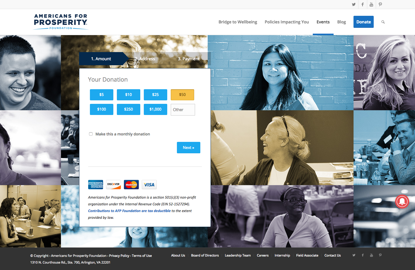
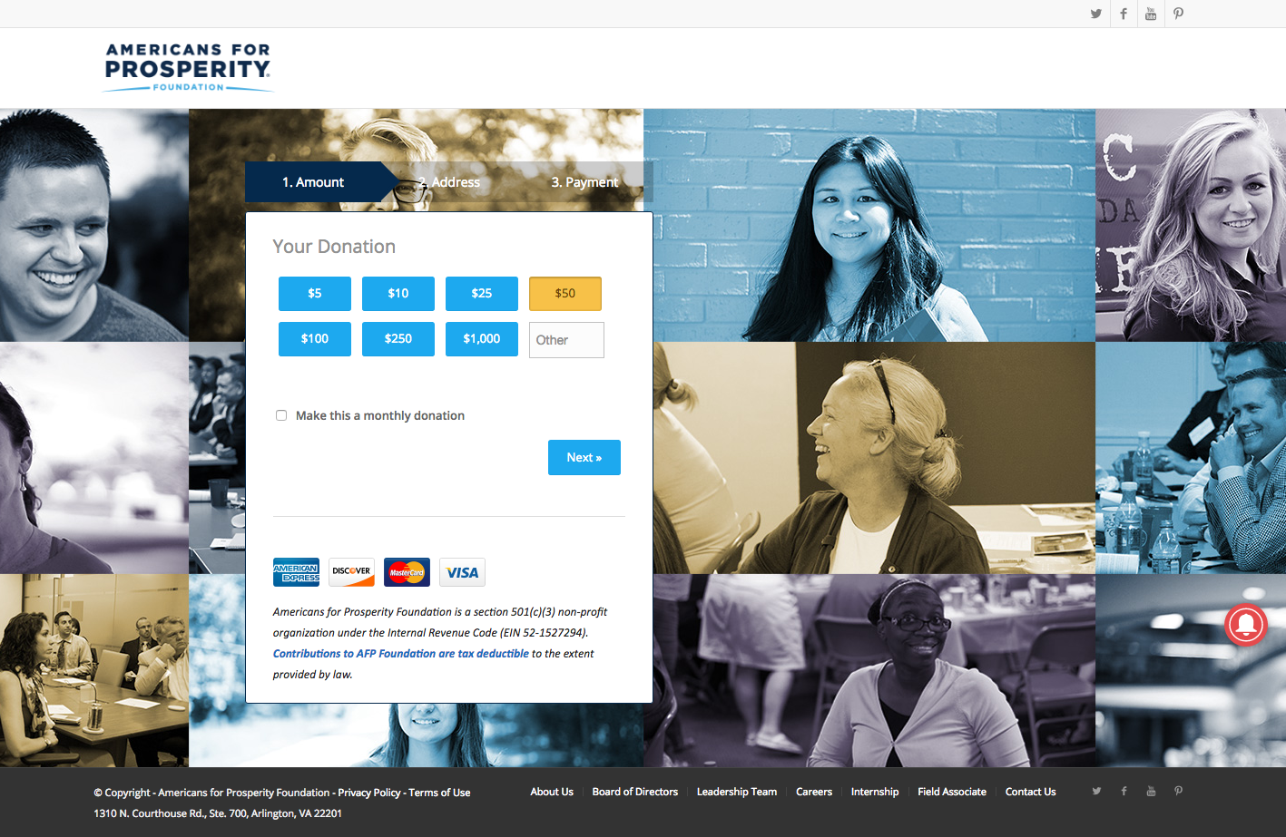
The current donation page had a large navigation menu at the top that gave the visitor plenty of opportunities to leave the page before making a gift. They knew that removing these would prevent “unsupervised thinking” and they hypothesized that it would increase conversion.
They used Adobe Target to create a treatment with this navigation removed, and launched an A/B test to measure the winner.
Research Question
Will removing donation page navigation increase donor conversion?
Design
C: With Navigation
Array
(
[0] => Array
(
[ID] => 13037
[id] => 13037
[title] => AFP-Control-2.png
[filename] => AFP-Control-2.png
[filesize] => 0
[url] => https://www.nextafter.com/wp-content/uploads/AFP-Control-2.png
[link] => https://www.nextafter.com/experiments/how-reducing-navigation-affects-donor-conversion/attachment/afp-control-2-png/
[alt] =>
[author] => 6
[description] =>
[caption] =>
[name] => afp-control-2-png
[status] => inherit
[uploaded_to] => 13036
[date] => 2021-02-25 05:21:26
[modified] => 2021-02-25 05:21:26
[menu_order] => 0
[mime_type] => image/png
[type] => image
[subtype] => png
[icon] => https://www.nextafter.com/wp-includes/images/media/default.png
[width] => 1417
[height] => 923
[sizes] => Array
(
[thumbnail] => https://www.nextafter.com/wp-content/uploads/AFP-Control-2-150x150.png
[thumbnail-width] => 150
[thumbnail-height] => 150
[medium] => https://www.nextafter.com/wp-content/uploads/AFP-Control-2-300x195.png
[medium-width] => 300
[medium-height] => 195
[medium_large] => https://www.nextafter.com/wp-content/uploads/AFP-Control-2-768x500.png
[medium_large-width] => 640
[medium_large-height] => 417
[large] => https://www.nextafter.com/wp-content/uploads/AFP-Control-2-1024x667.png
[large-width] => 640
[large-height] => 417
[1536x1536] => https://www.nextafter.com/wp-content/uploads/AFP-Control-2.png
[1536x1536-width] => 1417
[1536x1536-height] => 923
[2048x2048] => https://www.nextafter.com/wp-content/uploads/AFP-Control-2.png
[2048x2048-width] => 1417
[2048x2048-height] => 923
[tp-image-grid] => https://www.nextafter.com/wp-content/uploads/AFP-Control-2.png
[tp-image-grid-width] => 700
[tp-image-grid-height] => 456
[post-thumbnail] => https://www.nextafter.com/wp-content/uploads/AFP-Control-2-150x150.png
[post-thumbnail-width] => 150
[post-thumbnail-height] => 150
[admin] => https://www.nextafter.com/wp-content/uploads/AFP-Control-2-50x33.png
[admin-width] => 50
[admin-height] => 33
[full] => https://www.nextafter.com/wp-content/uploads/AFP-Control-2.png
[full-width] => 1417
[full-height] => 923
[thumb_372] => https://www.nextafter.com/wp-content/uploads/AFP-Control-2-372x242.png
[thumb_372-width] => 372
[thumb_372-height] => 242
[single_post_thumbnail] => https://www.nextafter.com/wp-content/uploads/AFP-Control-2-960x625.png
[single_post_thumbnail-width] => 960
[single_post_thumbnail-height] => 625
[thumb_32_32] => https://www.nextafter.com/wp-content/uploads/AFP-Control-2-32x21.png
[thumb_32_32-width] => 32
[thumb_32_32-height] => 21
[thumb_48_48] => https://www.nextafter.com/wp-content/uploads/AFP-Control-2-48x31.png
[thumb_48_48-width] => 48
[thumb_48_48-height] => 31
[thumb_64_64] => https://www.nextafter.com/wp-content/uploads/AFP-Control-2-64x42.png
[thumb_64_64-width] => 64
[thumb_64_64-height] => 42
[thumb_128_128] => https://www.nextafter.com/wp-content/uploads/AFP-Control-2-128x83.png
[thumb_128_128-width] => 128
[thumb_128_128-height] => 83
[thumb_122_67] => https://www.nextafter.com/wp-content/uploads/AFP-Control-2-103x67.png
[thumb_122_67-width] => 103
[thumb_122_67-height] => 67
[thumb_153_153] => https://www.nextafter.com/wp-content/uploads/AFP-Control-2-153x100.png
[thumb_153_153-width] => 153
[thumb_153_153-height] => 100
[thumb_130_163] => https://www.nextafter.com/wp-content/uploads/AFP-Control-2-130x85.png
[thumb_130_163-width] => 130
[thumb_130_163-height] => 85
[thumb_232_177] => https://www.nextafter.com/wp-content/uploads/AFP-Control-2-232x151.png
[thumb_232_177-width] => 232
[thumb_232_177-height] => 151
[thumb_272_325] => https://www.nextafter.com/wp-content/uploads/AFP-Control-2-544x354.png
[thumb_272_325-width] => 544
[thumb_272_325-height] => 354
[thumb_271_346] => https://www.nextafter.com/wp-content/uploads/AFP-Control-2-271x177.png
[thumb_271_346-width] => 271
[thumb_271_346-height] => 177
[thumb_271_271] => https://www.nextafter.com/wp-content/uploads/AFP-Control-2-271x177.png
[thumb_271_271-width] => 271
[thumb_271_271-height] => 177
[thumb_272_172] => https://www.nextafter.com/wp-content/uploads/AFP-Control-2-264x172.png
[thumb_272_172-width] => 264
[thumb_272_172-height] => 172
[thumb_372_461] => https://www.nextafter.com/wp-content/uploads/AFP-Control-2-372x242.png
[thumb_372_461-width] => 372
[thumb_372_461-height] => 242
[thumb_372_500] => https://www.nextafter.com/wp-content/uploads/AFP-Control-2-372x242.png
[thumb_372_500-width] => 372
[thumb_372_500-height] => 242
[thumb_385_270] => https://www.nextafter.com/wp-content/uploads/AFP-Control-2-385x251.png
[thumb_385_270-width] => 385
[thumb_385_270-height] => 251
[thumb_416_241] => https://www.nextafter.com/wp-content/uploads/AFP-Control-2-370x241.png
[thumb_416_241-width] => 370
[thumb_416_241-height] => 241
[thumb_448_410] => https://www.nextafter.com/wp-content/uploads/AFP-Control-2-448x292.png
[thumb_448_410-width] => 448
[thumb_448_410-height] => 292
[thumb_448_410_retina] => https://www.nextafter.com/wp-content/uploads/AFP-Control-2-896x584.png
[thumb_448_410_retina-width] => 896
[thumb_448_410_retina-height] => 584
[thumb_574_382] => https://www.nextafter.com/wp-content/uploads/AFP-Control-2-574x374.png
[thumb_574_382-width] => 574
[thumb_574_382-height] => 374
[thumb_776_395] => https://www.nextafter.com/wp-content/uploads/AFP-Control-2-606x395.png
[thumb_776_395-width] => 606
[thumb_776_395-height] => 395
[gform-image-choice-sm] => https://www.nextafter.com/wp-content/uploads/AFP-Control-2.png
[gform-image-choice-sm-width] => 300
[gform-image-choice-sm-height] => 195
[gform-image-choice-md] => https://www.nextafter.com/wp-content/uploads/AFP-Control-2.png
[gform-image-choice-md-width] => 400
[gform-image-choice-md-height] => 261
[gform-image-choice-lg] => https://www.nextafter.com/wp-content/uploads/AFP-Control-2.png
[gform-image-choice-lg-width] => 600
[gform-image-choice-lg-height] => 391
)
)
[1] => Array
(
[ID] => 13038
[id] => 13038
[title] => AFP-Treatment-2.png
[filename] => AFP-Treatment-2.png
[filesize] => 0
[url] => https://www.nextafter.com/wp-content/uploads/AFP-Treatment-2.png
[link] => https://www.nextafter.com/experiments/how-reducing-navigation-affects-donor-conversion/attachment/afp-treatment-2-png/
[alt] =>
[author] => 6
[description] =>
[caption] =>
[name] => afp-treatment-2-png
[status] => inherit
[uploaded_to] => 13036
[date] => 2021-02-25 05:21:37
[modified] => 2021-02-25 05:21:37
[menu_order] => 0
[mime_type] => image/png
[type] => image
[subtype] => png
[icon] => https://www.nextafter.com/wp-includes/images/media/default.png
[width] => 1417
[height] => 923
[sizes] => Array
(
[thumbnail] => https://www.nextafter.com/wp-content/uploads/AFP-Treatment-2-150x150.png
[thumbnail-width] => 150
[thumbnail-height] => 150
[medium] => https://www.nextafter.com/wp-content/uploads/AFP-Treatment-2-300x195.png
[medium-width] => 300
[medium-height] => 195
[medium_large] => https://www.nextafter.com/wp-content/uploads/AFP-Treatment-2-768x500.png
[medium_large-width] => 640
[medium_large-height] => 417
[large] => https://www.nextafter.com/wp-content/uploads/AFP-Treatment-2-1024x667.png
[large-width] => 640
[large-height] => 417
[1536x1536] => https://www.nextafter.com/wp-content/uploads/AFP-Treatment-2.png
[1536x1536-width] => 1417
[1536x1536-height] => 923
[2048x2048] => https://www.nextafter.com/wp-content/uploads/AFP-Treatment-2.png
[2048x2048-width] => 1417
[2048x2048-height] => 923
[tp-image-grid] => https://www.nextafter.com/wp-content/uploads/AFP-Treatment-2.png
[tp-image-grid-width] => 700
[tp-image-grid-height] => 456
[post-thumbnail] => https://www.nextafter.com/wp-content/uploads/AFP-Treatment-2-150x150.png
[post-thumbnail-width] => 150
[post-thumbnail-height] => 150
[admin] => https://www.nextafter.com/wp-content/uploads/AFP-Treatment-2-50x33.png
[admin-width] => 50
[admin-height] => 33
[full] => https://www.nextafter.com/wp-content/uploads/AFP-Treatment-2.png
[full-width] => 1417
[full-height] => 923
[thumb_372] => https://www.nextafter.com/wp-content/uploads/AFP-Treatment-2-372x242.png
[thumb_372-width] => 372
[thumb_372-height] => 242
[single_post_thumbnail] => https://www.nextafter.com/wp-content/uploads/AFP-Treatment-2-960x625.png
[single_post_thumbnail-width] => 960
[single_post_thumbnail-height] => 625
[thumb_32_32] => https://www.nextafter.com/wp-content/uploads/AFP-Treatment-2-32x21.png
[thumb_32_32-width] => 32
[thumb_32_32-height] => 21
[thumb_48_48] => https://www.nextafter.com/wp-content/uploads/AFP-Treatment-2-48x31.png
[thumb_48_48-width] => 48
[thumb_48_48-height] => 31
[thumb_64_64] => https://www.nextafter.com/wp-content/uploads/AFP-Treatment-2-64x42.png
[thumb_64_64-width] => 64
[thumb_64_64-height] => 42
[thumb_128_128] => https://www.nextafter.com/wp-content/uploads/AFP-Treatment-2-128x83.png
[thumb_128_128-width] => 128
[thumb_128_128-height] => 83
[thumb_122_67] => https://www.nextafter.com/wp-content/uploads/AFP-Treatment-2-103x67.png
[thumb_122_67-width] => 103
[thumb_122_67-height] => 67
[thumb_153_153] => https://www.nextafter.com/wp-content/uploads/AFP-Treatment-2-153x100.png
[thumb_153_153-width] => 153
[thumb_153_153-height] => 100
[thumb_130_163] => https://www.nextafter.com/wp-content/uploads/AFP-Treatment-2-130x85.png
[thumb_130_163-width] => 130
[thumb_130_163-height] => 85
[thumb_232_177] => https://www.nextafter.com/wp-content/uploads/AFP-Treatment-2-232x151.png
[thumb_232_177-width] => 232
[thumb_232_177-height] => 151
[thumb_272_325] => https://www.nextafter.com/wp-content/uploads/AFP-Treatment-2-544x354.png
[thumb_272_325-width] => 544
[thumb_272_325-height] => 354
[thumb_271_346] => https://www.nextafter.com/wp-content/uploads/AFP-Treatment-2-271x177.png
[thumb_271_346-width] => 271
[thumb_271_346-height] => 177
[thumb_271_271] => https://www.nextafter.com/wp-content/uploads/AFP-Treatment-2-271x177.png
[thumb_271_271-width] => 271
[thumb_271_271-height] => 177
[thumb_272_172] => https://www.nextafter.com/wp-content/uploads/AFP-Treatment-2-264x172.png
[thumb_272_172-width] => 264
[thumb_272_172-height] => 172
[thumb_372_461] => https://www.nextafter.com/wp-content/uploads/AFP-Treatment-2-372x242.png
[thumb_372_461-width] => 372
[thumb_372_461-height] => 242
[thumb_372_500] => https://www.nextafter.com/wp-content/uploads/AFP-Treatment-2-372x242.png
[thumb_372_500-width] => 372
[thumb_372_500-height] => 242
[thumb_385_270] => https://www.nextafter.com/wp-content/uploads/AFP-Treatment-2-385x251.png
[thumb_385_270-width] => 385
[thumb_385_270-height] => 251
[thumb_416_241] => https://www.nextafter.com/wp-content/uploads/AFP-Treatment-2-370x241.png
[thumb_416_241-width] => 370
[thumb_416_241-height] => 241
[thumb_448_410] => https://www.nextafter.com/wp-content/uploads/AFP-Treatment-2-448x292.png
[thumb_448_410-width] => 448
[thumb_448_410-height] => 292
[thumb_448_410_retina] => https://www.nextafter.com/wp-content/uploads/AFP-Treatment-2-896x584.png
[thumb_448_410_retina-width] => 896
[thumb_448_410_retina-height] => 584
[thumb_574_382] => https://www.nextafter.com/wp-content/uploads/AFP-Treatment-2-574x374.png
[thumb_574_382-width] => 574
[thumb_574_382-height] => 374
[thumb_776_395] => https://www.nextafter.com/wp-content/uploads/AFP-Treatment-2-606x395.png
[thumb_776_395-width] => 606
[thumb_776_395-height] => 395
[gform-image-choice-sm] => https://www.nextafter.com/wp-content/uploads/AFP-Treatment-2.png
[gform-image-choice-sm-width] => 300
[gform-image-choice-sm-height] => 195
[gform-image-choice-md] => https://www.nextafter.com/wp-content/uploads/AFP-Treatment-2.png
[gform-image-choice-md-width] => 400
[gform-image-choice-md-height] => 261
[gform-image-choice-lg] => https://www.nextafter.com/wp-content/uploads/AFP-Treatment-2.png
[gform-image-choice-lg-width] => 600
[gform-image-choice-lg-height] => 391
)
)
)
T1: Without Navigation
Array
(
[0] => Array
(
[ID] => 13037
[id] => 13037
[title] => AFP-Control-2.png
[filename] => AFP-Control-2.png
[filesize] => 0
[url] => https://www.nextafter.com/wp-content/uploads/AFP-Control-2.png
[link] => https://www.nextafter.com/experiments/how-reducing-navigation-affects-donor-conversion/attachment/afp-control-2-png/
[alt] =>
[author] => 6
[description] =>
[caption] =>
[name] => afp-control-2-png
[status] => inherit
[uploaded_to] => 13036
[date] => 2021-02-25 05:21:26
[modified] => 2021-02-25 05:21:26
[menu_order] => 0
[mime_type] => image/png
[type] => image
[subtype] => png
[icon] => https://www.nextafter.com/wp-includes/images/media/default.png
[width] => 1417
[height] => 923
[sizes] => Array
(
[thumbnail] => https://www.nextafter.com/wp-content/uploads/AFP-Control-2-150x150.png
[thumbnail-width] => 150
[thumbnail-height] => 150
[medium] => https://www.nextafter.com/wp-content/uploads/AFP-Control-2-300x195.png
[medium-width] => 300
[medium-height] => 195
[medium_large] => https://www.nextafter.com/wp-content/uploads/AFP-Control-2-768x500.png
[medium_large-width] => 640
[medium_large-height] => 417
[large] => https://www.nextafter.com/wp-content/uploads/AFP-Control-2-1024x667.png
[large-width] => 640
[large-height] => 417
[1536x1536] => https://www.nextafter.com/wp-content/uploads/AFP-Control-2.png
[1536x1536-width] => 1417
[1536x1536-height] => 923
[2048x2048] => https://www.nextafter.com/wp-content/uploads/AFP-Control-2.png
[2048x2048-width] => 1417
[2048x2048-height] => 923
[tp-image-grid] => https://www.nextafter.com/wp-content/uploads/AFP-Control-2.png
[tp-image-grid-width] => 700
[tp-image-grid-height] => 456
[post-thumbnail] => https://www.nextafter.com/wp-content/uploads/AFP-Control-2-150x150.png
[post-thumbnail-width] => 150
[post-thumbnail-height] => 150
[admin] => https://www.nextafter.com/wp-content/uploads/AFP-Control-2-50x33.png
[admin-width] => 50
[admin-height] => 33
[full] => https://www.nextafter.com/wp-content/uploads/AFP-Control-2.png
[full-width] => 1417
[full-height] => 923
[thumb_372] => https://www.nextafter.com/wp-content/uploads/AFP-Control-2-372x242.png
[thumb_372-width] => 372
[thumb_372-height] => 242
[single_post_thumbnail] => https://www.nextafter.com/wp-content/uploads/AFP-Control-2-960x625.png
[single_post_thumbnail-width] => 960
[single_post_thumbnail-height] => 625
[thumb_32_32] => https://www.nextafter.com/wp-content/uploads/AFP-Control-2-32x21.png
[thumb_32_32-width] => 32
[thumb_32_32-height] => 21
[thumb_48_48] => https://www.nextafter.com/wp-content/uploads/AFP-Control-2-48x31.png
[thumb_48_48-width] => 48
[thumb_48_48-height] => 31
[thumb_64_64] => https://www.nextafter.com/wp-content/uploads/AFP-Control-2-64x42.png
[thumb_64_64-width] => 64
[thumb_64_64-height] => 42
[thumb_128_128] => https://www.nextafter.com/wp-content/uploads/AFP-Control-2-128x83.png
[thumb_128_128-width] => 128
[thumb_128_128-height] => 83
[thumb_122_67] => https://www.nextafter.com/wp-content/uploads/AFP-Control-2-103x67.png
[thumb_122_67-width] => 103
[thumb_122_67-height] => 67
[thumb_153_153] => https://www.nextafter.com/wp-content/uploads/AFP-Control-2-153x100.png
[thumb_153_153-width] => 153
[thumb_153_153-height] => 100
[thumb_130_163] => https://www.nextafter.com/wp-content/uploads/AFP-Control-2-130x85.png
[thumb_130_163-width] => 130
[thumb_130_163-height] => 85
[thumb_232_177] => https://www.nextafter.com/wp-content/uploads/AFP-Control-2-232x151.png
[thumb_232_177-width] => 232
[thumb_232_177-height] => 151
[thumb_272_325] => https://www.nextafter.com/wp-content/uploads/AFP-Control-2-544x354.png
[thumb_272_325-width] => 544
[thumb_272_325-height] => 354
[thumb_271_346] => https://www.nextafter.com/wp-content/uploads/AFP-Control-2-271x177.png
[thumb_271_346-width] => 271
[thumb_271_346-height] => 177
[thumb_271_271] => https://www.nextafter.com/wp-content/uploads/AFP-Control-2-271x177.png
[thumb_271_271-width] => 271
[thumb_271_271-height] => 177
[thumb_272_172] => https://www.nextafter.com/wp-content/uploads/AFP-Control-2-264x172.png
[thumb_272_172-width] => 264
[thumb_272_172-height] => 172
[thumb_372_461] => https://www.nextafter.com/wp-content/uploads/AFP-Control-2-372x242.png
[thumb_372_461-width] => 372
[thumb_372_461-height] => 242
[thumb_372_500] => https://www.nextafter.com/wp-content/uploads/AFP-Control-2-372x242.png
[thumb_372_500-width] => 372
[thumb_372_500-height] => 242
[thumb_385_270] => https://www.nextafter.com/wp-content/uploads/AFP-Control-2-385x251.png
[thumb_385_270-width] => 385
[thumb_385_270-height] => 251
[thumb_416_241] => https://www.nextafter.com/wp-content/uploads/AFP-Control-2-370x241.png
[thumb_416_241-width] => 370
[thumb_416_241-height] => 241
[thumb_448_410] => https://www.nextafter.com/wp-content/uploads/AFP-Control-2-448x292.png
[thumb_448_410-width] => 448
[thumb_448_410-height] => 292
[thumb_448_410_retina] => https://www.nextafter.com/wp-content/uploads/AFP-Control-2-896x584.png
[thumb_448_410_retina-width] => 896
[thumb_448_410_retina-height] => 584
[thumb_574_382] => https://www.nextafter.com/wp-content/uploads/AFP-Control-2-574x374.png
[thumb_574_382-width] => 574
[thumb_574_382-height] => 374
[thumb_776_395] => https://www.nextafter.com/wp-content/uploads/AFP-Control-2-606x395.png
[thumb_776_395-width] => 606
[thumb_776_395-height] => 395
[gform-image-choice-sm] => https://www.nextafter.com/wp-content/uploads/AFP-Control-2.png
[gform-image-choice-sm-width] => 300
[gform-image-choice-sm-height] => 195
[gform-image-choice-md] => https://www.nextafter.com/wp-content/uploads/AFP-Control-2.png
[gform-image-choice-md-width] => 400
[gform-image-choice-md-height] => 261
[gform-image-choice-lg] => https://www.nextafter.com/wp-content/uploads/AFP-Control-2.png
[gform-image-choice-lg-width] => 600
[gform-image-choice-lg-height] => 391
)
)
[1] => Array
(
[ID] => 13038
[id] => 13038
[title] => AFP-Treatment-2.png
[filename] => AFP-Treatment-2.png
[filesize] => 0
[url] => https://www.nextafter.com/wp-content/uploads/AFP-Treatment-2.png
[link] => https://www.nextafter.com/experiments/how-reducing-navigation-affects-donor-conversion/attachment/afp-treatment-2-png/
[alt] =>
[author] => 6
[description] =>
[caption] =>
[name] => afp-treatment-2-png
[status] => inherit
[uploaded_to] => 13036
[date] => 2021-02-25 05:21:37
[modified] => 2021-02-25 05:21:37
[menu_order] => 0
[mime_type] => image/png
[type] => image
[subtype] => png
[icon] => https://www.nextafter.com/wp-includes/images/media/default.png
[width] => 1417
[height] => 923
[sizes] => Array
(
[thumbnail] => https://www.nextafter.com/wp-content/uploads/AFP-Treatment-2-150x150.png
[thumbnail-width] => 150
[thumbnail-height] => 150
[medium] => https://www.nextafter.com/wp-content/uploads/AFP-Treatment-2-300x195.png
[medium-width] => 300
[medium-height] => 195
[medium_large] => https://www.nextafter.com/wp-content/uploads/AFP-Treatment-2-768x500.png
[medium_large-width] => 640
[medium_large-height] => 417
[large] => https://www.nextafter.com/wp-content/uploads/AFP-Treatment-2-1024x667.png
[large-width] => 640
[large-height] => 417
[1536x1536] => https://www.nextafter.com/wp-content/uploads/AFP-Treatment-2.png
[1536x1536-width] => 1417
[1536x1536-height] => 923
[2048x2048] => https://www.nextafter.com/wp-content/uploads/AFP-Treatment-2.png
[2048x2048-width] => 1417
[2048x2048-height] => 923
[tp-image-grid] => https://www.nextafter.com/wp-content/uploads/AFP-Treatment-2.png
[tp-image-grid-width] => 700
[tp-image-grid-height] => 456
[post-thumbnail] => https://www.nextafter.com/wp-content/uploads/AFP-Treatment-2-150x150.png
[post-thumbnail-width] => 150
[post-thumbnail-height] => 150
[admin] => https://www.nextafter.com/wp-content/uploads/AFP-Treatment-2-50x33.png
[admin-width] => 50
[admin-height] => 33
[full] => https://www.nextafter.com/wp-content/uploads/AFP-Treatment-2.png
[full-width] => 1417
[full-height] => 923
[thumb_372] => https://www.nextafter.com/wp-content/uploads/AFP-Treatment-2-372x242.png
[thumb_372-width] => 372
[thumb_372-height] => 242
[single_post_thumbnail] => https://www.nextafter.com/wp-content/uploads/AFP-Treatment-2-960x625.png
[single_post_thumbnail-width] => 960
[single_post_thumbnail-height] => 625
[thumb_32_32] => https://www.nextafter.com/wp-content/uploads/AFP-Treatment-2-32x21.png
[thumb_32_32-width] => 32
[thumb_32_32-height] => 21
[thumb_48_48] => https://www.nextafter.com/wp-content/uploads/AFP-Treatment-2-48x31.png
[thumb_48_48-width] => 48
[thumb_48_48-height] => 31
[thumb_64_64] => https://www.nextafter.com/wp-content/uploads/AFP-Treatment-2-64x42.png
[thumb_64_64-width] => 64
[thumb_64_64-height] => 42
[thumb_128_128] => https://www.nextafter.com/wp-content/uploads/AFP-Treatment-2-128x83.png
[thumb_128_128-width] => 128
[thumb_128_128-height] => 83
[thumb_122_67] => https://www.nextafter.com/wp-content/uploads/AFP-Treatment-2-103x67.png
[thumb_122_67-width] => 103
[thumb_122_67-height] => 67
[thumb_153_153] => https://www.nextafter.com/wp-content/uploads/AFP-Treatment-2-153x100.png
[thumb_153_153-width] => 153
[thumb_153_153-height] => 100
[thumb_130_163] => https://www.nextafter.com/wp-content/uploads/AFP-Treatment-2-130x85.png
[thumb_130_163-width] => 130
[thumb_130_163-height] => 85
[thumb_232_177] => https://www.nextafter.com/wp-content/uploads/AFP-Treatment-2-232x151.png
[thumb_232_177-width] => 232
[thumb_232_177-height] => 151
[thumb_272_325] => https://www.nextafter.com/wp-content/uploads/AFP-Treatment-2-544x354.png
[thumb_272_325-width] => 544
[thumb_272_325-height] => 354
[thumb_271_346] => https://www.nextafter.com/wp-content/uploads/AFP-Treatment-2-271x177.png
[thumb_271_346-width] => 271
[thumb_271_346-height] => 177
[thumb_271_271] => https://www.nextafter.com/wp-content/uploads/AFP-Treatment-2-271x177.png
[thumb_271_271-width] => 271
[thumb_271_271-height] => 177
[thumb_272_172] => https://www.nextafter.com/wp-content/uploads/AFP-Treatment-2-264x172.png
[thumb_272_172-width] => 264
[thumb_272_172-height] => 172
[thumb_372_461] => https://www.nextafter.com/wp-content/uploads/AFP-Treatment-2-372x242.png
[thumb_372_461-width] => 372
[thumb_372_461-height] => 242
[thumb_372_500] => https://www.nextafter.com/wp-content/uploads/AFP-Treatment-2-372x242.png
[thumb_372_500-width] => 372
[thumb_372_500-height] => 242
[thumb_385_270] => https://www.nextafter.com/wp-content/uploads/AFP-Treatment-2-385x251.png
[thumb_385_270-width] => 385
[thumb_385_270-height] => 251
[thumb_416_241] => https://www.nextafter.com/wp-content/uploads/AFP-Treatment-2-370x241.png
[thumb_416_241-width] => 370
[thumb_416_241-height] => 241
[thumb_448_410] => https://www.nextafter.com/wp-content/uploads/AFP-Treatment-2-448x292.png
[thumb_448_410-width] => 448
[thumb_448_410-height] => 292
[thumb_448_410_retina] => https://www.nextafter.com/wp-content/uploads/AFP-Treatment-2-896x584.png
[thumb_448_410_retina-width] => 896
[thumb_448_410_retina-height] => 584
[thumb_574_382] => https://www.nextafter.com/wp-content/uploads/AFP-Treatment-2-574x374.png
[thumb_574_382-width] => 574
[thumb_574_382-height] => 374
[thumb_776_395] => https://www.nextafter.com/wp-content/uploads/AFP-Treatment-2-606x395.png
[thumb_776_395-width] => 606
[thumb_776_395-height] => 395
[gform-image-choice-sm] => https://www.nextafter.com/wp-content/uploads/AFP-Treatment-2.png
[gform-image-choice-sm-width] => 300
[gform-image-choice-sm-height] => 195
[gform-image-choice-md] => https://www.nextafter.com/wp-content/uploads/AFP-Treatment-2.png
[gform-image-choice-md-width] => 400
[gform-image-choice-md-height] => 261
[gform-image-choice-lg] => https://www.nextafter.com/wp-content/uploads/AFP-Treatment-2.png
[gform-image-choice-lg-width] => 600
[gform-image-choice-lg-height] => 391
)
)
)
Results
This experiment has a required sample size of
583 in order to be valid. Since the experiment had a total sample size of
623, and
the level of confidence is not above 95%
the experiment results are
not valid.
Key Learnings
The treatment with no navigation produced a 195.1% increase in conversion, although the results came just short of statistical validity. They ended the test before arriving at validity to launch the new site, although the test will be repeated with the new design.

