Human Coalition
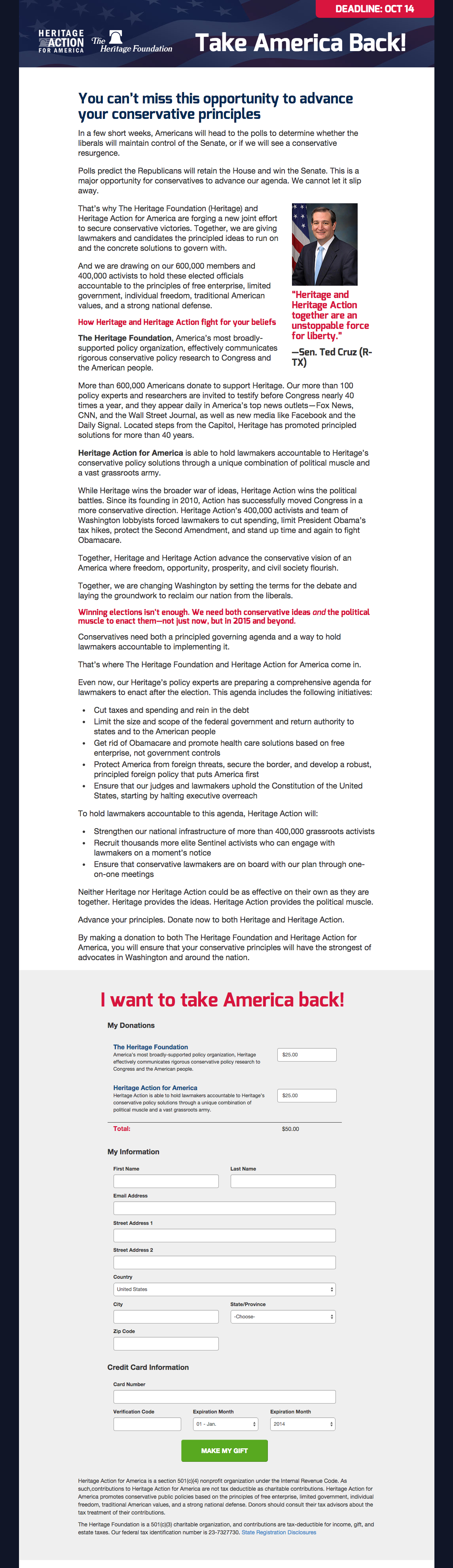
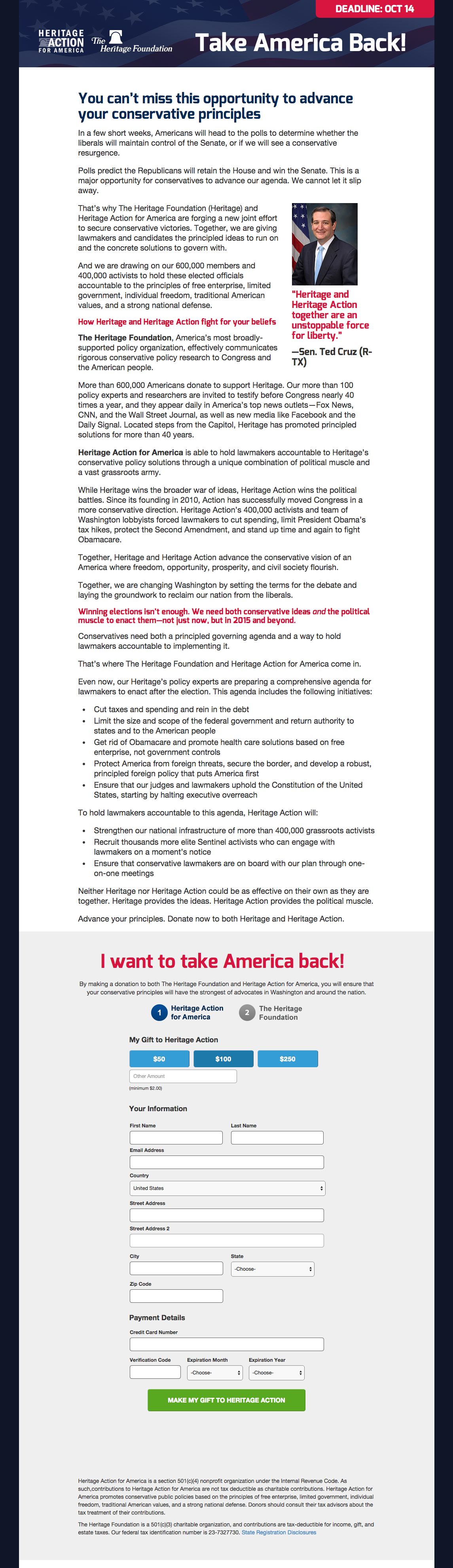
How the layout of a donation form affects conversion rate
Experiment ID: #15
Human Coalition
Experiment Summary
Timeframe: 09/16/2014 - 09/23/2014
The out-of-the-box defaults for Online for Life’s donation system results in giving arrays that consist of radio buttons. Given the amount of text that accompanies each giving option on the form, these radio buttons tend to clutter the form and make it hard to operate on a mobile phone. We wanted to test a new way of laying out the same information.
Research Question
Regular buttons will increase the conversion rate given their increased ease of use both for reading and selecting.
Design
C: Radio Buttons

Array
(
[0] => Array
(
[ID] => 11337
[id] => 11337
[title] => control.png
[filename] => control.png
[filesize] => 0
[url] => https://nextafter-1a91a.kxcdn.com/wp-content/uploads/control.png
[link] => https://www.nextafter.com/experiments/how-the-layout-of-a-donation-form-affects-conversion/attachment/control-png-146/
[alt] =>
[author] => 6
[description] =>
[caption] =>
[name] => control-png-146
[status] => inherit
[uploaded_to] => 11336
[date] => 2021-02-24 08:53:59
[modified] => 2021-02-24 08:53:59
[menu_order] => 0
[mime_type] => image/png
[type] => image
[subtype] => png
[icon] => https://nextafter-1a91a.kxcdn.com/wp-includes/images/media/default.png
[width] => 1145
[height] => 3957
[sizes] => Array
(
[thumbnail] => https://nextafter-1a91a.kxcdn.com/wp-content/uploads/control-150x150.png
[thumbnail-width] => 150
[thumbnail-height] => 150
[medium] => https://nextafter-1a91a.kxcdn.com/wp-content/uploads/control-87x300.png
[medium-width] => 87
[medium-height] => 300
[medium_large] => https://nextafter-1a91a.kxcdn.com/wp-content/uploads/control-768x2654.png
[medium_large-width] => 640
[medium_large-height] => 2212
[large] => https://nextafter-1a91a.kxcdn.com/wp-content/uploads/control-296x1024.png
[large-width] => 296
[large-height] => 1024
[1536x1536] => https://nextafter-1a91a.kxcdn.com/wp-content/uploads/control-444x1536.png
[1536x1536-width] => 444
[1536x1536-height] => 1536
[2048x2048] => https://nextafter-1a91a.kxcdn.com/wp-content/uploads/control-593x2048.png
[2048x2048-width] => 593
[2048x2048-height] => 2048
[ab-block-post-grid-landscape] => https://nextafter-1a91a.kxcdn.com/wp-content/uploads/control-600x400.png
[ab-block-post-grid-landscape-width] => 600
[ab-block-post-grid-landscape-height] => 400
[ab-block-post-grid-square] => https://nextafter-1a91a.kxcdn.com/wp-content/uploads/control-600x600.png
[ab-block-post-grid-square-width] => 600
[ab-block-post-grid-square-height] => 600
[tp-image-grid] => https://nextafter-1a91a.kxcdn.com/wp-content/uploads/control.png
[tp-image-grid-width] => 203
[tp-image-grid-height] => 700
[post-thumbnail] => https://nextafter-1a91a.kxcdn.com/wp-content/uploads/control-150x150.png
[post-thumbnail-width] => 150
[post-thumbnail-height] => 150
[admin] => https://nextafter-1a91a.kxcdn.com/wp-content/uploads/control-14x50.png
[admin-width] => 14
[admin-height] => 50
[full] => https://nextafter-1a91a.kxcdn.com/wp-content/uploads/control.png
[full-width] => 1145
[full-height] => 3957
[thumb_372] => https://nextafter-1a91a.kxcdn.com/wp-content/uploads/control-372x1286.png
[thumb_372-width] => 372
[thumb_372-height] => 1286
[single_post_thumbnail] => https://nextafter-1a91a.kxcdn.com/wp-content/uploads/control-181x625.png
[single_post_thumbnail-width] => 181
[single_post_thumbnail-height] => 625
[thumb_32_32] => https://nextafter-1a91a.kxcdn.com/wp-content/uploads/control-9x32.png
[thumb_32_32-width] => 9
[thumb_32_32-height] => 32
[thumb_48_48] => https://nextafter-1a91a.kxcdn.com/wp-content/uploads/control-14x48.png
[thumb_48_48-width] => 14
[thumb_48_48-height] => 48
[thumb_64_64] => https://nextafter-1a91a.kxcdn.com/wp-content/uploads/control-19x64.png
[thumb_64_64-width] => 19
[thumb_64_64-height] => 64
[thumb_128_128] => https://nextafter-1a91a.kxcdn.com/wp-content/uploads/control-37x128.png
[thumb_128_128-width] => 37
[thumb_128_128-height] => 128
[thumb_122_67] => https://nextafter-1a91a.kxcdn.com/wp-content/uploads/control-19x67.png
[thumb_122_67-width] => 19
[thumb_122_67-height] => 67
[thumb_153_153] => https://nextafter-1a91a.kxcdn.com/wp-content/uploads/control-44x153.png
[thumb_153_153-width] => 44
[thumb_153_153-height] => 153
[thumb_130_163] => https://nextafter-1a91a.kxcdn.com/wp-content/uploads/control-47x163.png
[thumb_130_163-width] => 47
[thumb_130_163-height] => 163
[thumb_232_177] => https://nextafter-1a91a.kxcdn.com/wp-content/uploads/control-51x177.png
[thumb_232_177-width] => 51
[thumb_232_177-height] => 177
[thumb_272_325] => https://nextafter-1a91a.kxcdn.com/wp-content/uploads/control-188x650.png
[thumb_272_325-width] => 188
[thumb_272_325-height] => 650
[thumb_271_346] => https://nextafter-1a91a.kxcdn.com/wp-content/uploads/control-100x346.png
[thumb_271_346-width] => 100
[thumb_271_346-height] => 346
[thumb_271_271] => https://nextafter-1a91a.kxcdn.com/wp-content/uploads/control-78x271.png
[thumb_271_271-width] => 78
[thumb_271_271-height] => 271
[thumb_272_172] => https://nextafter-1a91a.kxcdn.com/wp-content/uploads/control-50x172.png
[thumb_272_172-width] => 50
[thumb_272_172-height] => 172
[thumb_372_461] => https://nextafter-1a91a.kxcdn.com/wp-content/uploads/control-133x461.png
[thumb_372_461-width] => 133
[thumb_372_461-height] => 461
[thumb_372_500] => https://nextafter-1a91a.kxcdn.com/wp-content/uploads/control-145x500.png
[thumb_372_500-width] => 145
[thumb_372_500-height] => 500
[thumb_385_270] => https://nextafter-1a91a.kxcdn.com/wp-content/uploads/control-78x270.png
[thumb_385_270-width] => 78
[thumb_385_270-height] => 270
[thumb_416_241] => https://nextafter-1a91a.kxcdn.com/wp-content/uploads/control-70x241.png
[thumb_416_241-width] => 70
[thumb_416_241-height] => 241
[thumb_448_410] => https://nextafter-1a91a.kxcdn.com/wp-content/uploads/control-119x410.png
[thumb_448_410-width] => 119
[thumb_448_410-height] => 410
[thumb_448_410_retina] => https://nextafter-1a91a.kxcdn.com/wp-content/uploads/control-237x820.png
[thumb_448_410_retina-width] => 237
[thumb_448_410_retina-height] => 820
[thumb_574_382] => https://nextafter-1a91a.kxcdn.com/wp-content/uploads/control-111x382.png
[thumb_574_382-width] => 111
[thumb_574_382-height] => 382
[thumb_776_395] => https://nextafter-1a91a.kxcdn.com/wp-content/uploads/control-114x395.png
[thumb_776_395-width] => 114
[thumb_776_395-height] => 395
) ) [1] => Array
(
[ID] => 11338
[id] => 11338
[title] => treatment.png
[filename] => treatment.png
[filesize] => 0
[url] => https://nextafter-1a91a.kxcdn.com/wp-content/uploads/treatment.png
[link] => https://www.nextafter.com/experiments/how-the-layout-of-a-donation-form-affects-conversion/attachment/treatment-png/
[alt] =>
[author] => 6
[description] =>
[caption] =>
[name] => treatment-png
[status] => inherit
[uploaded_to] => 11336
[date] => 2021-02-24 08:59:11
[modified] => 2021-02-24 08:59:11
[menu_order] => 0
[mime_type] => image/png
[type] => image
[subtype] => png
[icon] => https://nextafter-1a91a.kxcdn.com/wp-includes/images/media/default.png
[width] => 1145
[height] => 3961
[sizes] => Array
(
[thumbnail] => https://nextafter-1a91a.kxcdn.com/wp-content/uploads/treatment-150x150.png
[thumbnail-width] => 150
[thumbnail-height] => 150
[medium] => https://nextafter-1a91a.kxcdn.com/wp-content/uploads/treatment-87x300.png
[medium-width] => 87
[medium-height] => 300
[medium_large] => https://nextafter-1a91a.kxcdn.com/wp-content/uploads/treatment-768x2657.png
[medium_large-width] => 640
[medium_large-height] => 2214
[large] => https://nextafter-1a91a.kxcdn.com/wp-content/uploads/treatment-296x1024.png
[large-width] => 296
[large-height] => 1024
[1536x1536] => https://nextafter-1a91a.kxcdn.com/wp-content/uploads/treatment-444x1536.png
[1536x1536-width] => 444
[1536x1536-height] => 1536
[2048x2048] => https://nextafter-1a91a.kxcdn.com/wp-content/uploads/treatment-592x2048.png
[2048x2048-width] => 592
[2048x2048-height] => 2048
[ab-block-post-grid-landscape] => https://nextafter-1a91a.kxcdn.com/wp-content/uploads/treatment-600x400.png
[ab-block-post-grid-landscape-width] => 600
[ab-block-post-grid-landscape-height] => 400
[ab-block-post-grid-square] => https://nextafter-1a91a.kxcdn.com/wp-content/uploads/treatment-600x600.png
[ab-block-post-grid-square-width] => 600
[ab-block-post-grid-square-height] => 600
[tp-image-grid] => https://nextafter-1a91a.kxcdn.com/wp-content/uploads/treatment.png
[tp-image-grid-width] => 202
[tp-image-grid-height] => 700
[post-thumbnail] => https://nextafter-1a91a.kxcdn.com/wp-content/uploads/treatment-150x150.png
[post-thumbnail-width] => 150
[post-thumbnail-height] => 150
[admin] => https://nextafter-1a91a.kxcdn.com/wp-content/uploads/treatment-14x50.png
[admin-width] => 14
[admin-height] => 50
[full] => https://nextafter-1a91a.kxcdn.com/wp-content/uploads/treatment.png
[full-width] => 1145
[full-height] => 3961
[thumb_372] => https://nextafter-1a91a.kxcdn.com/wp-content/uploads/treatment-372x1287.png
[thumb_372-width] => 372
[thumb_372-height] => 1287
[single_post_thumbnail] => https://nextafter-1a91a.kxcdn.com/wp-content/uploads/treatment-181x625.png
[single_post_thumbnail-width] => 181
[single_post_thumbnail-height] => 625
[thumb_32_32] => https://nextafter-1a91a.kxcdn.com/wp-content/uploads/treatment-9x32.png
[thumb_32_32-width] => 9
[thumb_32_32-height] => 32
[thumb_48_48] => https://nextafter-1a91a.kxcdn.com/wp-content/uploads/treatment-14x48.png
[thumb_48_48-width] => 14
[thumb_48_48-height] => 48
[thumb_64_64] => https://nextafter-1a91a.kxcdn.com/wp-content/uploads/treatment-19x64.png
[thumb_64_64-width] => 19
[thumb_64_64-height] => 64
[thumb_128_128] => https://nextafter-1a91a.kxcdn.com/wp-content/uploads/treatment-37x128.png
[thumb_128_128-width] => 37
[thumb_128_128-height] => 128
[thumb_122_67] => https://nextafter-1a91a.kxcdn.com/wp-content/uploads/treatment-19x67.png
[thumb_122_67-width] => 19
[thumb_122_67-height] => 67
[thumb_153_153] => https://nextafter-1a91a.kxcdn.com/wp-content/uploads/treatment-44x153.png
[thumb_153_153-width] => 44
[thumb_153_153-height] => 153
[thumb_130_163] => https://nextafter-1a91a.kxcdn.com/wp-content/uploads/treatment-47x163.png
[thumb_130_163-width] => 47
[thumb_130_163-height] => 163
[thumb_232_177] => https://nextafter-1a91a.kxcdn.com/wp-content/uploads/treatment-51x177.png
[thumb_232_177-width] => 51
[thumb_232_177-height] => 177
[thumb_272_325] => https://nextafter-1a91a.kxcdn.com/wp-content/uploads/treatment-188x650.png
[thumb_272_325-width] => 188
[thumb_272_325-height] => 650
[thumb_271_346] => https://nextafter-1a91a.kxcdn.com/wp-content/uploads/treatment-100x346.png
[thumb_271_346-width] => 100
[thumb_271_346-height] => 346
[thumb_271_271] => https://nextafter-1a91a.kxcdn.com/wp-content/uploads/treatment-78x271.png
[thumb_271_271-width] => 78
[thumb_271_271-height] => 271
[thumb_272_172] => https://nextafter-1a91a.kxcdn.com/wp-content/uploads/treatment-50x172.png
[thumb_272_172-width] => 50
[thumb_272_172-height] => 172
[thumb_372_461] => https://nextafter-1a91a.kxcdn.com/wp-content/uploads/treatment-133x461.png
[thumb_372_461-width] => 133
[thumb_372_461-height] => 461
[thumb_372_500] => https://nextafter-1a91a.kxcdn.com/wp-content/uploads/treatment-145x500.png
[thumb_372_500-width] => 145
[thumb_372_500-height] => 500
[thumb_385_270] => https://nextafter-1a91a.kxcdn.com/wp-content/uploads/treatment-78x270.png
[thumb_385_270-width] => 78
[thumb_385_270-height] => 270
[thumb_416_241] => https://nextafter-1a91a.kxcdn.com/wp-content/uploads/treatment-70x241.png
[thumb_416_241-width] => 70
[thumb_416_241-height] => 241
[thumb_448_410] => https://nextafter-1a91a.kxcdn.com/wp-content/uploads/treatment-119x410.png
[thumb_448_410-width] => 119
[thumb_448_410-height] => 410
[thumb_448_410_retina] => https://nextafter-1a91a.kxcdn.com/wp-content/uploads/treatment-237x820.png
[thumb_448_410_retina-width] => 237
[thumb_448_410_retina-height] => 820
[thumb_574_382] => https://nextafter-1a91a.kxcdn.com/wp-content/uploads/treatment-110x382.png
[thumb_574_382-width] => 110
[thumb_574_382-height] => 382
[thumb_776_395] => https://nextafter-1a91a.kxcdn.com/wp-content/uploads/treatment-114x395.png
[thumb_776_395-width] => 114
[thumb_776_395-height] => 395
) ) )
T1: Designed Buttons

Array
(
[0] => Array
(
[ID] => 11337
[id] => 11337
[title] => control.png
[filename] => control.png
[filesize] => 0
[url] => https://nextafter-1a91a.kxcdn.com/wp-content/uploads/control.png
[link] => https://www.nextafter.com/experiments/how-the-layout-of-a-donation-form-affects-conversion/attachment/control-png-146/
[alt] =>
[author] => 6
[description] =>
[caption] =>
[name] => control-png-146
[status] => inherit
[uploaded_to] => 11336
[date] => 2021-02-24 08:53:59
[modified] => 2021-02-24 08:53:59
[menu_order] => 0
[mime_type] => image/png
[type] => image
[subtype] => png
[icon] => https://nextafter-1a91a.kxcdn.com/wp-includes/images/media/default.png
[width] => 1145
[height] => 3957
[sizes] => Array
(
[thumbnail] => https://nextafter-1a91a.kxcdn.com/wp-content/uploads/control-150x150.png
[thumbnail-width] => 150
[thumbnail-height] => 150
[medium] => https://nextafter-1a91a.kxcdn.com/wp-content/uploads/control-87x300.png
[medium-width] => 87
[medium-height] => 300
[medium_large] => https://nextafter-1a91a.kxcdn.com/wp-content/uploads/control-768x2654.png
[medium_large-width] => 640
[medium_large-height] => 2212
[large] => https://nextafter-1a91a.kxcdn.com/wp-content/uploads/control-296x1024.png
[large-width] => 296
[large-height] => 1024
[1536x1536] => https://nextafter-1a91a.kxcdn.com/wp-content/uploads/control-444x1536.png
[1536x1536-width] => 444
[1536x1536-height] => 1536
[2048x2048] => https://nextafter-1a91a.kxcdn.com/wp-content/uploads/control-593x2048.png
[2048x2048-width] => 593
[2048x2048-height] => 2048
[ab-block-post-grid-landscape] => https://nextafter-1a91a.kxcdn.com/wp-content/uploads/control-600x400.png
[ab-block-post-grid-landscape-width] => 600
[ab-block-post-grid-landscape-height] => 400
[ab-block-post-grid-square] => https://nextafter-1a91a.kxcdn.com/wp-content/uploads/control-600x600.png
[ab-block-post-grid-square-width] => 600
[ab-block-post-grid-square-height] => 600
[tp-image-grid] => https://nextafter-1a91a.kxcdn.com/wp-content/uploads/control.png
[tp-image-grid-width] => 203
[tp-image-grid-height] => 700
[post-thumbnail] => https://nextafter-1a91a.kxcdn.com/wp-content/uploads/control-150x150.png
[post-thumbnail-width] => 150
[post-thumbnail-height] => 150
[admin] => https://nextafter-1a91a.kxcdn.com/wp-content/uploads/control-14x50.png
[admin-width] => 14
[admin-height] => 50
[full] => https://nextafter-1a91a.kxcdn.com/wp-content/uploads/control.png
[full-width] => 1145
[full-height] => 3957
[thumb_372] => https://nextafter-1a91a.kxcdn.com/wp-content/uploads/control-372x1286.png
[thumb_372-width] => 372
[thumb_372-height] => 1286
[single_post_thumbnail] => https://nextafter-1a91a.kxcdn.com/wp-content/uploads/control-181x625.png
[single_post_thumbnail-width] => 181
[single_post_thumbnail-height] => 625
[thumb_32_32] => https://nextafter-1a91a.kxcdn.com/wp-content/uploads/control-9x32.png
[thumb_32_32-width] => 9
[thumb_32_32-height] => 32
[thumb_48_48] => https://nextafter-1a91a.kxcdn.com/wp-content/uploads/control-14x48.png
[thumb_48_48-width] => 14
[thumb_48_48-height] => 48
[thumb_64_64] => https://nextafter-1a91a.kxcdn.com/wp-content/uploads/control-19x64.png
[thumb_64_64-width] => 19
[thumb_64_64-height] => 64
[thumb_128_128] => https://nextafter-1a91a.kxcdn.com/wp-content/uploads/control-37x128.png
[thumb_128_128-width] => 37
[thumb_128_128-height] => 128
[thumb_122_67] => https://nextafter-1a91a.kxcdn.com/wp-content/uploads/control-19x67.png
[thumb_122_67-width] => 19
[thumb_122_67-height] => 67
[thumb_153_153] => https://nextafter-1a91a.kxcdn.com/wp-content/uploads/control-44x153.png
[thumb_153_153-width] => 44
[thumb_153_153-height] => 153
[thumb_130_163] => https://nextafter-1a91a.kxcdn.com/wp-content/uploads/control-47x163.png
[thumb_130_163-width] => 47
[thumb_130_163-height] => 163
[thumb_232_177] => https://nextafter-1a91a.kxcdn.com/wp-content/uploads/control-51x177.png
[thumb_232_177-width] => 51
[thumb_232_177-height] => 177
[thumb_272_325] => https://nextafter-1a91a.kxcdn.com/wp-content/uploads/control-188x650.png
[thumb_272_325-width] => 188
[thumb_272_325-height] => 650
[thumb_271_346] => https://nextafter-1a91a.kxcdn.com/wp-content/uploads/control-100x346.png
[thumb_271_346-width] => 100
[thumb_271_346-height] => 346
[thumb_271_271] => https://nextafter-1a91a.kxcdn.com/wp-content/uploads/control-78x271.png
[thumb_271_271-width] => 78
[thumb_271_271-height] => 271
[thumb_272_172] => https://nextafter-1a91a.kxcdn.com/wp-content/uploads/control-50x172.png
[thumb_272_172-width] => 50
[thumb_272_172-height] => 172
[thumb_372_461] => https://nextafter-1a91a.kxcdn.com/wp-content/uploads/control-133x461.png
[thumb_372_461-width] => 133
[thumb_372_461-height] => 461
[thumb_372_500] => https://nextafter-1a91a.kxcdn.com/wp-content/uploads/control-145x500.png
[thumb_372_500-width] => 145
[thumb_372_500-height] => 500
[thumb_385_270] => https://nextafter-1a91a.kxcdn.com/wp-content/uploads/control-78x270.png
[thumb_385_270-width] => 78
[thumb_385_270-height] => 270
[thumb_416_241] => https://nextafter-1a91a.kxcdn.com/wp-content/uploads/control-70x241.png
[thumb_416_241-width] => 70
[thumb_416_241-height] => 241
[thumb_448_410] => https://nextafter-1a91a.kxcdn.com/wp-content/uploads/control-119x410.png
[thumb_448_410-width] => 119
[thumb_448_410-height] => 410
[thumb_448_410_retina] => https://nextafter-1a91a.kxcdn.com/wp-content/uploads/control-237x820.png
[thumb_448_410_retina-width] => 237
[thumb_448_410_retina-height] => 820
[thumb_574_382] => https://nextafter-1a91a.kxcdn.com/wp-content/uploads/control-111x382.png
[thumb_574_382-width] => 111
[thumb_574_382-height] => 382
[thumb_776_395] => https://nextafter-1a91a.kxcdn.com/wp-content/uploads/control-114x395.png
[thumb_776_395-width] => 114
[thumb_776_395-height] => 395
) ) [1] => Array
(
[ID] => 11338
[id] => 11338
[title] => treatment.png
[filename] => treatment.png
[filesize] => 0
[url] => https://nextafter-1a91a.kxcdn.com/wp-content/uploads/treatment.png
[link] => https://www.nextafter.com/experiments/how-the-layout-of-a-donation-form-affects-conversion/attachment/treatment-png/
[alt] =>
[author] => 6
[description] =>
[caption] =>
[name] => treatment-png
[status] => inherit
[uploaded_to] => 11336
[date] => 2021-02-24 08:59:11
[modified] => 2021-02-24 08:59:11
[menu_order] => 0
[mime_type] => image/png
[type] => image
[subtype] => png
[icon] => https://nextafter-1a91a.kxcdn.com/wp-includes/images/media/default.png
[width] => 1145
[height] => 3961
[sizes] => Array
(
[thumbnail] => https://nextafter-1a91a.kxcdn.com/wp-content/uploads/treatment-150x150.png
[thumbnail-width] => 150
[thumbnail-height] => 150
[medium] => https://nextafter-1a91a.kxcdn.com/wp-content/uploads/treatment-87x300.png
[medium-width] => 87
[medium-height] => 300
[medium_large] => https://nextafter-1a91a.kxcdn.com/wp-content/uploads/treatment-768x2657.png
[medium_large-width] => 640
[medium_large-height] => 2214
[large] => https://nextafter-1a91a.kxcdn.com/wp-content/uploads/treatment-296x1024.png
[large-width] => 296
[large-height] => 1024
[1536x1536] => https://nextafter-1a91a.kxcdn.com/wp-content/uploads/treatment-444x1536.png
[1536x1536-width] => 444
[1536x1536-height] => 1536
[2048x2048] => https://nextafter-1a91a.kxcdn.com/wp-content/uploads/treatment-592x2048.png
[2048x2048-width] => 592
[2048x2048-height] => 2048
[ab-block-post-grid-landscape] => https://nextafter-1a91a.kxcdn.com/wp-content/uploads/treatment-600x400.png
[ab-block-post-grid-landscape-width] => 600
[ab-block-post-grid-landscape-height] => 400
[ab-block-post-grid-square] => https://nextafter-1a91a.kxcdn.com/wp-content/uploads/treatment-600x600.png
[ab-block-post-grid-square-width] => 600
[ab-block-post-grid-square-height] => 600
[tp-image-grid] => https://nextafter-1a91a.kxcdn.com/wp-content/uploads/treatment.png
[tp-image-grid-width] => 202
[tp-image-grid-height] => 700
[post-thumbnail] => https://nextafter-1a91a.kxcdn.com/wp-content/uploads/treatment-150x150.png
[post-thumbnail-width] => 150
[post-thumbnail-height] => 150
[admin] => https://nextafter-1a91a.kxcdn.com/wp-content/uploads/treatment-14x50.png
[admin-width] => 14
[admin-height] => 50
[full] => https://nextafter-1a91a.kxcdn.com/wp-content/uploads/treatment.png
[full-width] => 1145
[full-height] => 3961
[thumb_372] => https://nextafter-1a91a.kxcdn.com/wp-content/uploads/treatment-372x1287.png
[thumb_372-width] => 372
[thumb_372-height] => 1287
[single_post_thumbnail] => https://nextafter-1a91a.kxcdn.com/wp-content/uploads/treatment-181x625.png
[single_post_thumbnail-width] => 181
[single_post_thumbnail-height] => 625
[thumb_32_32] => https://nextafter-1a91a.kxcdn.com/wp-content/uploads/treatment-9x32.png
[thumb_32_32-width] => 9
[thumb_32_32-height] => 32
[thumb_48_48] => https://nextafter-1a91a.kxcdn.com/wp-content/uploads/treatment-14x48.png
[thumb_48_48-width] => 14
[thumb_48_48-height] => 48
[thumb_64_64] => https://nextafter-1a91a.kxcdn.com/wp-content/uploads/treatment-19x64.png
[thumb_64_64-width] => 19
[thumb_64_64-height] => 64
[thumb_128_128] => https://nextafter-1a91a.kxcdn.com/wp-content/uploads/treatment-37x128.png
[thumb_128_128-width] => 37
[thumb_128_128-height] => 128
[thumb_122_67] => https://nextafter-1a91a.kxcdn.com/wp-content/uploads/treatment-19x67.png
[thumb_122_67-width] => 19
[thumb_122_67-height] => 67
[thumb_153_153] => https://nextafter-1a91a.kxcdn.com/wp-content/uploads/treatment-44x153.png
[thumb_153_153-width] => 44
[thumb_153_153-height] => 153
[thumb_130_163] => https://nextafter-1a91a.kxcdn.com/wp-content/uploads/treatment-47x163.png
[thumb_130_163-width] => 47
[thumb_130_163-height] => 163
[thumb_232_177] => https://nextafter-1a91a.kxcdn.com/wp-content/uploads/treatment-51x177.png
[thumb_232_177-width] => 51
[thumb_232_177-height] => 177
[thumb_272_325] => https://nextafter-1a91a.kxcdn.com/wp-content/uploads/treatment-188x650.png
[thumb_272_325-width] => 188
[thumb_272_325-height] => 650
[thumb_271_346] => https://nextafter-1a91a.kxcdn.com/wp-content/uploads/treatment-100x346.png
[thumb_271_346-width] => 100
[thumb_271_346-height] => 346
[thumb_271_271] => https://nextafter-1a91a.kxcdn.com/wp-content/uploads/treatment-78x271.png
[thumb_271_271-width] => 78
[thumb_271_271-height] => 271
[thumb_272_172] => https://nextafter-1a91a.kxcdn.com/wp-content/uploads/treatment-50x172.png
[thumb_272_172-width] => 50
[thumb_272_172-height] => 172
[thumb_372_461] => https://nextafter-1a91a.kxcdn.com/wp-content/uploads/treatment-133x461.png
[thumb_372_461-width] => 133
[thumb_372_461-height] => 461
[thumb_372_500] => https://nextafter-1a91a.kxcdn.com/wp-content/uploads/treatment-145x500.png
[thumb_372_500-width] => 145
[thumb_372_500-height] => 500
[thumb_385_270] => https://nextafter-1a91a.kxcdn.com/wp-content/uploads/treatment-78x270.png
[thumb_385_270-width] => 78
[thumb_385_270-height] => 270
[thumb_416_241] => https://nextafter-1a91a.kxcdn.com/wp-content/uploads/treatment-70x241.png
[thumb_416_241-width] => 70
[thumb_416_241-height] => 241
[thumb_448_410] => https://nextafter-1a91a.kxcdn.com/wp-content/uploads/treatment-119x410.png
[thumb_448_410-width] => 119
[thumb_448_410-height] => 410
[thumb_448_410_retina] => https://nextafter-1a91a.kxcdn.com/wp-content/uploads/treatment-237x820.png
[thumb_448_410_retina-width] => 237
[thumb_448_410_retina-height] => 820
[thumb_574_382] => https://nextafter-1a91a.kxcdn.com/wp-content/uploads/treatment-110x382.png
[thumb_574_382-width] => 110
[thumb_574_382-height] => 382
[thumb_776_395] => https://nextafter-1a91a.kxcdn.com/wp-content/uploads/treatment-114x395.png
[thumb_776_395-width] => 114
[thumb_776_395-height] => 395
) ) )
Results
This experiment has a required sample size of 2,258 in order to be valid. Since the experiment had a total sample size of 3,156, and
the level of confidence is not above 95% the experiment results are not valid.
Key Learnings
The new buttons resulted in a 59.9% increase in conversion rate and were also able to increase the average gift by 56.5%. This proved how the new method for displaying the donation options made it easier for donors to understand. As a result, the gift had more value to the donor resulting in a net increase of 150.2% revenue.