


After spending a year observing every online fundraising idea, test, and experiment being run by all the optimizers here at NextAfter, I found 10 online fundraising ideas that you need to be testing and implementing this year.
Let’s get right to it!
1. Focus on the 3 online fundraising metrics that really matter.
There are a ton of shiny objects in digital fundraising and marketing to get you distracted from real goal: increasing revenue.

To optimize your online fundraising, you’ve got to get laser-focused on the 3 metrics that we call The Flux Capacitor of Online Revenue Maximization.
The three online fundraising metrics that really matter are:
- Website Traffic
- Donation Conversion Rate
- Average Gift Size
Increasing any single one of these metrics is going to lead to more revenue. But increasing 2 or all 3 of these metrics is going to lead to exponentially more revenue.
To learn more about the FCORM metrics and how they relate to online fundraising revenue, read this blog post by Nathan Hill. Here, he breaks down what it is and how nonprofits can leverage it for higher online revenue.
But here’s the basics of what you need to know…
Key Online Fundraising Idea
Use these 3 metrics as your strategic framework. Anytime you and your team make a decision about a new online fundraising idea, activity, or strategy, ask yourself these questions:
- Will it produce more traffic to my website?
- Will it drive more of my traffic to donate?
- Will it encourage donors to make bigger donations?
2. Think of your donor funnel as a donor mountain.
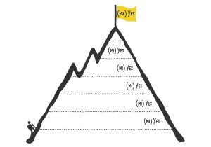 Really this is more of a way of thinking than a strategy. But changing your perspective on the how your donors interact with you is critical.
We can’t pretend that donors are organically falling into a typical “sales funnel.” They’re not falling in at all. In fact, making a donation can be a lot of hard work.
A donor rarely wakes up thinking, “I’m going to donate to ORGANIZATION today.” Something has to prompt them to consider giving. And it’s your job to help them make the journey from being prompted, to actually completing a donation.
Your message is your main tool to help your donor up the mountain.
From the moment a donor is prompted to consider giving, there are distractions and micr-decisions all along the way.
You have to use the copy in your emails, on your landing pages, and on your donation page to explain why someone should keep moving forward to the ultimate goal of donating.
Key Online Fundraising Idea
A donation doesn’t happen in one step. You have to help your donor take a lot of little steps towards the ultimate goal of donating.
3. Your emails and donation pages need to be longer than you might think.
It’s often considered “best practice” to keep your copy (or your message) really short. But over and over again, testing and research shows that almost every organization needs to write longer copy.
Here’s why…
How more copy on an email signup form increased conversions
In this experiment, we wanted to increase email sign ups. The version on the left is what the vast majority of nonprofit email signup forms look like.

The treatment on the right really has one substantial change…there is more copy explaining why you should sign up!
The new version says this: “Get exclusive access to breaking campus reform stories as they happen. Sign up below and we’ll keep you in the loop too.”
Adding two sentences and tweaking a headline increase email signups by 28%.
Key Online Fundraising Idea
Use more copy to communicate why someone should sign up, click through, or donate.
Keep in mind, it’s not the length of copy that improves conversion. It’s how well your copy communicates why someone should give, or click, or sign up.
If you want to dig deeper into how you write better copy to increase conversion, you can check out this post on improving your value proposition.
4. Send your fundraising emails from real people to real people.
Almost every single email best practice out there recommends using some form of a designed email template. But here’s something most experts will never tell you (because they don’t dare test it)…
All the hours you spend designing emails are costing you donors and revenue.
“Well, how else are you supposed to do it, Brady?”
Just write an email like an average, everyday human being who doesn’t know how to create a flashy HTML email.
This is how real people write emails to their friends and family — and that there is a multitude of experiments and data to show that sending plain-text style emails is far more effective for raising money.
Here’s just one of numerous experiments that strongly suggest that a personal approach performs better than a heavily designed email.
How a more humanized email increase donations…by a lot!
 In the control on the left, you can see some graphic elements like the corporate logo and the big blue button below. The recipient’s name is personalized with their first name.
In the treatment on the right, we’ve removed these graphical elements and saw 145.5% increase in donations.
With these results in mind, try experimenting with your own email fundraising by:
- Removing design elements so it looks more like a personal email.
- Using copy/text that’s more personal and about your donor (like the second-person pronoun “you”).
- Using a real person’s name and email as your email sender
- Personalizing the email with the recipient’s name.
Key Online Fundraising Idea
People give to people, not email marketing machines. The more human and believable your email is, the more successful your online fundraising will be.
For more on making your emails more human, you can dive into a free online course on Email Fundraising Optimization here.
5. Send emails when others aren’t.
When I check my email in the morning, I often have 10, 20, 30 or more emails to sift through – depending on the day. But when I check email throughout the day, there’s not nearly as much to sift through all once.
You can stand out in the inbox by sending emails when others aren’t!
So what days are organization sending emails? Well, I’ve got some data for you on that.
In the month of December, we looked at all the emails we received in our aggregate donor inbox from hundreds of organizations and charted them.
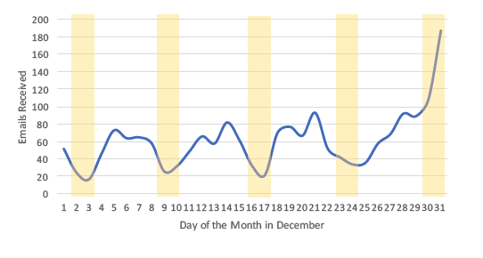 We found that weekends present an opportunity for nonprofits to stand out because they have lower send volumes from “competitor” organizations.
In fact, not only were email open rates optimized, the data shows an increase in average gift size from emails sent on the weekend too.
Key Online Fundraising Idea
Try publishing your emails on weekends and during afternoons and evenings, when fewer organizations are sending emails. By sending during relatively quiet times, you’re more likely to be noticed.
6. You don’t always have to send more email to bring in more donations.
You can always send more emails to try and bring in more donations. But you don’t always have to do this to increase donations.
You can increase donations without adding more email sends to your calendar by using content marketing.
This is one of the coolest experiments in our research library. And it’s a perfect mashup of how direct mail and online fundraising come together to make even stronger donors.
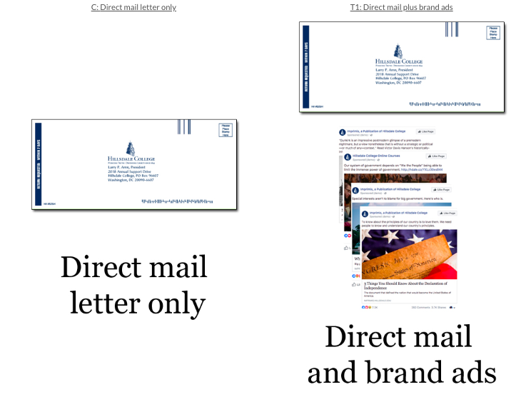 In this experiment, one half of the donors were sent a direct mail letter with a donation ask.
The other half were sent the same direct mail letter, but they were also targeted with brand ads on Facebook.
The goal wasn’t necessarily to get people to click on the ads. It was to make sure they were continually reminded of the organization.
The group that was targeted with brand ads saw a 25% increase in donations.
Key Online Fundraising Idea
Create content (both organic and paid advertising) that reinforces the impact of donating. Use this to cultivate and prime your donors in order to make your direct donation asks even more effective.
Here’s another super cool experiment that shows how a personal post-card (without a donation ask) can lead to greater year-end giving.
7. Throw away your boring confirmation pages, and start using instant donation pages instead.
Last year, I went around and signed to receive emails from 152 organizations. And I made this startling find…
Only 48% of organizations used a confirmation page after an email signup.
You might be saying, “Why does that matter? My form shows a thank you message without using a new page.”
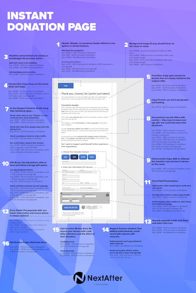 But here’s the deal… A real confirmation page will let you:
- Improve the user experience by letting users be 100% they’re done.
- Continue the engagement by providing more interesting and useful content.
- Track completions and conversions easier
Now, for those that are using confirmation pages, only 8% actually asked for a donation right away.
“But Brady…that’s so rude to ask someone who just signed up for an email to donate.”
I prefer to let the donor be the judge of that. And time and time again, we see new contacts becoming new donor instantly when using an instant donation page.
Key Online Fundraising Idea
Instead of just showing a thank you message or standard confirmation page after someone signs up for an email, use an instant donation page to start acquiring new donors right away.
You can dig into the ins and outs of instant donation pages here.
8. Stop designing to make things look pretty. Start designing to make things more effective.
Don’t get me wrong…I’m not anti-design.
I’m very pro-design. But that design has to be communicating the right message in a way that is empathetic to our donors.
Designing for the sake of being modern or pretty often leads to some pretty negative results. And just because Charity Water has a really cool looking page doesn’t mean that it’s the most effective thing for you.
We need to design with our donors in mind.
Take a look at how redesigning a donation page to make it more personal affected the actual revenue coming in from the page below…
How design impacts conversion on a donation page
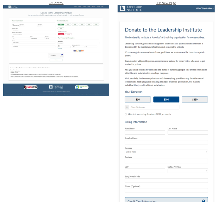 You can see the original page here. It’s just one giant form. No value proposition copy. Hardly any personal copy at all. There’s also a load of distracting button links across the page.
Now, here’s the treatment version of that donation page.
You can see quickly how the design changed drastically on this page to be much simpler and have more value proposition copy.
This new layout saw a 340% increase in revenue.
In this experiment, we see how a “pretty” page became a lot less pretty – but it drastically improve donations.

You don’t have to read the copy to see what changed in the design. The treatment opted to use less imagery and more copy to help donors understand why they should give.
The “less pretty” page saw a 134% increase in donations.
Key Online Fundraising Idea
The goal of design isn’t to be the prettiest, or the most modern. The goal is to get more donations.
Here are some of the essential elements we’ve found are proven to increase donations on your page.
9. Get rid of all other links on your landing pages and donation pages.
One of the easiest ways to improve and optimize your donation page performance is to remove all the unnecessary distractions from your donation page.
Every other link on your donation page is an opportunity for a donor to get distracted from the primary goal, and head off down a rabbit trail to something else.
Even something like a link to “login” can actually hurt your donations – primarily because remembering a username and password can be so incredibly frustrating.
Other examples of distracting links include:
- Share this on social media
- Follow us on Facebook
- Look at Planned Giving options
- Subscribe to our newsletter
The list goes on and on.
All of these options create friction in the process of giving and reduce the likelihood that your page visitor is going to donate.
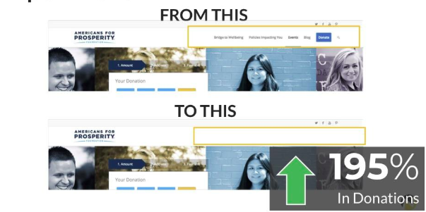 Removing the navigation from the donation page saw a 195% increase in donations!
In this experiment, we went a step further. It’s not just navigation links that can hurt donations. Even the most well intended links can be holding your donations back.
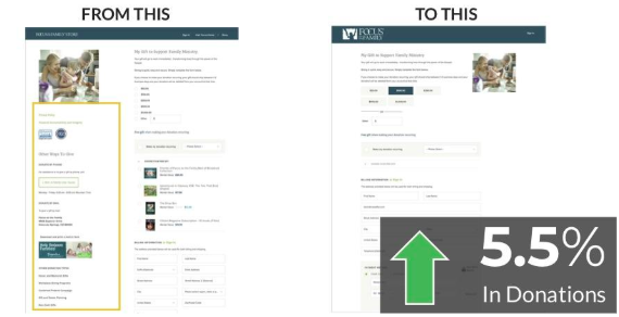 Removing the “Other Ways to Give” link saw a 5.5% increase in donations.
Key Online Fundraising Idea
Reduce friction anywhere you can. In your email marketing, donation pages, and website.
Wondering how much friction is actually on your donation page? Take the Friction Self Assessment and find out how you can optimize your donation pages!
10. Focus on recurring giving.
Recurring donors are worth a lot more in a year — and over their lifetime – than your other donors.
The State of Modern Philanthropy report shows that recurring donors are worth 5.4 times more than one-time donors over their lifetime.
Yet when we looked at 150 nonprofits in the U.S., we found that only one out of 11 organizations had a value proposition that explained why a donor should become a recurring giver.
To increase the number of recurring donors, you need to answer the question: “Why should I give a recurring gift to you rather than a one-time gift… or to another organization… or not at all?”
How a recurring donation prompt increase recurring donor conversions
In this experiment, this organization showed a pop-up right when you clicked the “Donate” button. Before the gift was processed, they asked if you wanted to upgrade to a recurring donation.
It gave some strong reasons why a recurring donation (even with a smaller initial donation) was more effective.

Using this recurring donor prompt led to a 64% increase in recurring donations.
Key Online Fundraising Idea
Increasing recurring donations can be transformational for your fundraising, and there are tons of ideas to test to try and grow this essential donor segment. Here are two ideas:
- Give a reason as to why someone should make a recurring gift on your one-time donation page.
- Place a recurring donation ask right before someone completes a one-time donation.
And if you want to go really deep on recurring giving, you can check out the free Nonprofit Recurring Donation Benchmark Study and get 30+ new strategies and online fundraising ideas to test based on data and research.
You can get the recurring donor report at recurringgiving.com
Need more ideas to grow your online fundraising?
 We’ve developed (are continuing to develop) a series of online fundraising courses that will show you everything we’ve learned from [nextafter stat=”tests”] online fundraising experiments. These courses cover proven strategies to help you:
- Grow your email fundraising
- Improve conversion and revenue on your donation pages
- Acquire more emails from your email acquisition landing pages
- Use Facebook to acquire new donors
- Set up and run a/b tests to learn what really works to grow
- Create an effective online year-end fundraising campaign
Every single course is available for free. So if you want to dive deeper and learn proven ways to keep growing, you can activate your free courses at courses.nextafter.com
Comments are closed.