How more visual and design elements on a landing page affect downloads
NextAfter
Experiment Summary
Ended On: 01/10/2019
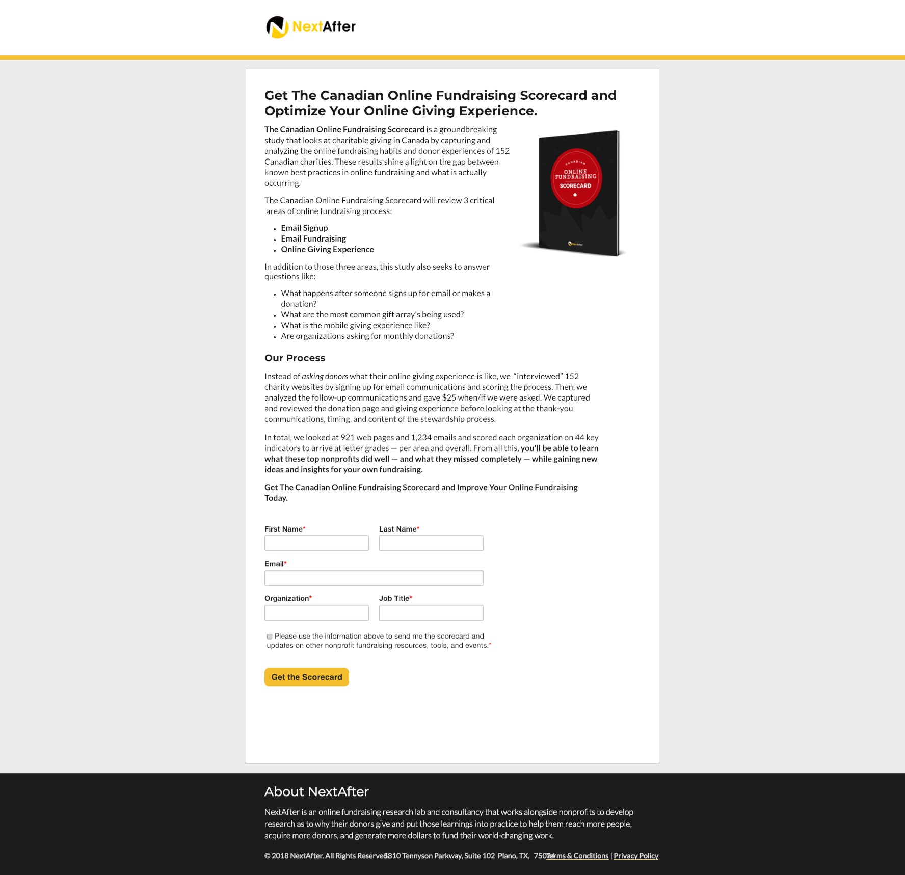
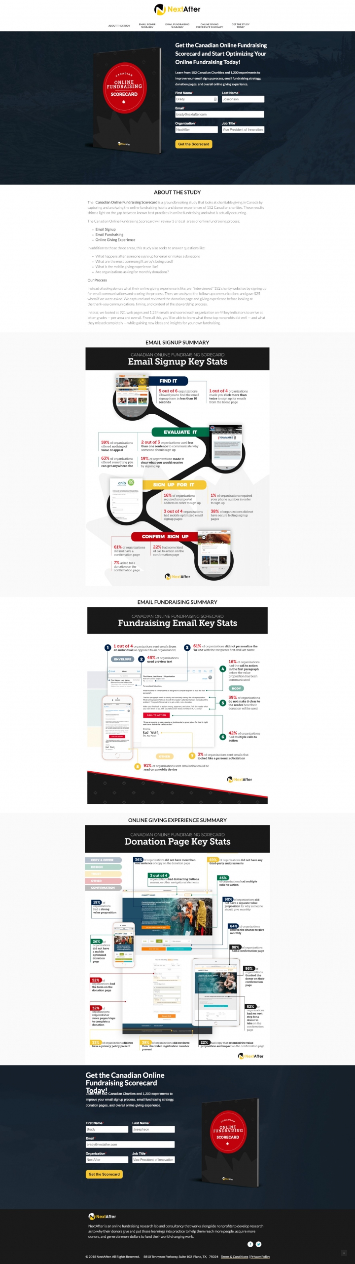
NextAfter produces a number of reports, studies, and eBooks each year and has a ‘template’ for the download landing page which is very simple and copy heavy. With The Canadian Online Fundraising Scorecard there were some strong visuals and infographics within the report so we wondered if we shared more of the visual components on the landing page and gave the landing page a bit more of an aesthetic that matched the report itself if people would be more willing to download the report.
Research Question
Will adding more design and visual elements lead to more downloads?
Design
Results
| Treatment Name | Conv. Rate | Relative Difference | Confidence | |
|---|---|---|---|---|
| C: | Control | 34.4% | ||
| T1: | Treatment: More Design | 35.1% | 2.2% | 19.4% |
This experiment has a required sample size of 29,613 in order to be valid. Unfortunately, the required sample size was not met and a level of confidence above 95% was not met so the experiment results are not valid.
Key Learnings
There was a very slight increase in downloads on the more designed version so it is worth looking at. The treatment had a signup option right away as opposed to the control where you have to scroll/read before you provide your information which means you may choose to download, or not, before you experience the offer or value so we could keep more of the conversational flow similar while adding more visual elements to see if that makes a difference. The visitor also has a pretty high motivation when they hit the page so perhaps the quick download added value. Again, worth looking at in future experiments.