How the redesign of a tribute widget affects donations
CaringBridge
CaringBridge offers free personal, protected websites for people to easily share updates and receive support and encouragement from their community during a health journey. Every 7 minutes, a CaringBridge website is created for someone experiencing a health event.
Experiment Summary
Timeframe: 04/06/2021 - 04/24/2021
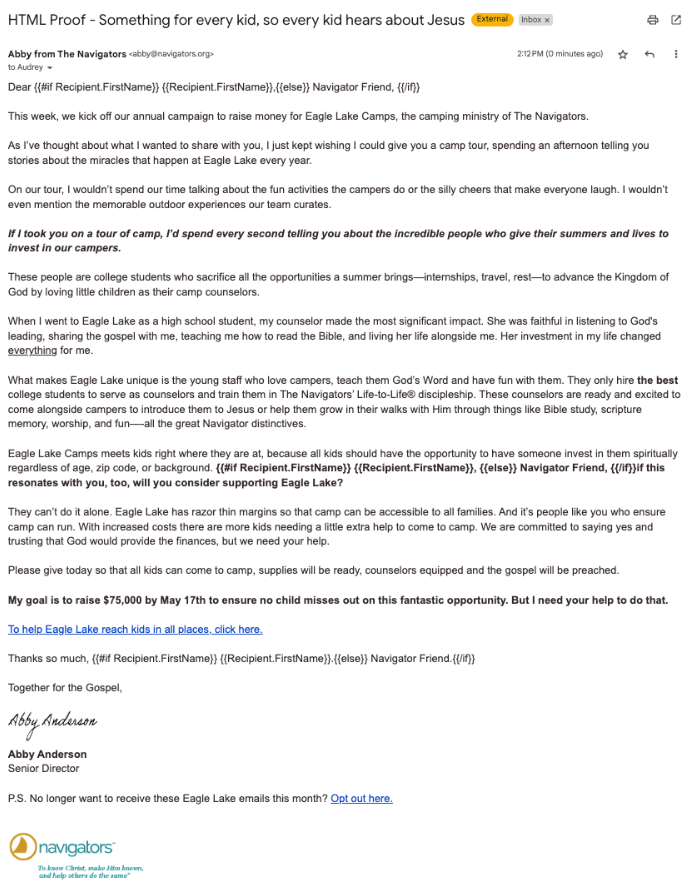
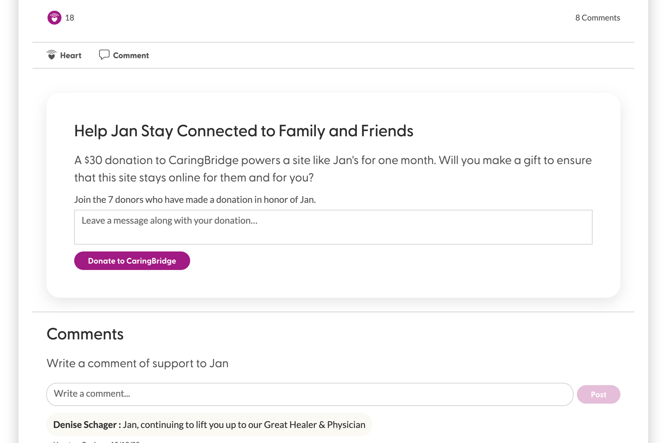
CaringBridge’s development team had recently begun to collaborate with the design team on new product iterations. Since the most recent redesign, comments had declined slightly. The team wanted to redesign the area surrounding comments, which included the tribute widget—which led to many donations. Since the redesign of the comments section might have an impact on donations, they decided to test it.
The team redesigned the tribute widget to provide more spacing between the comments and the tribute widget, since both asked for a text input. They also added a header and call-to-action to the top of the comments section to clarify the two sections.
Then they split traffic 50/50 to see how comments and donations were affected by this change.
Research Question
We believe that creating more separation between page sections for journal page visitors will achieve an increase in comments with no change to donations.
Design
Results
| Treatment Name | Conv. Rate | Relative Difference | Confidence | Average Gift | |
|---|---|---|---|---|---|
| C: | Control | 0.24% | |||
| T1: | Journal Page | 0.21% | -13.8% | 100.0% |
This experiment has a required sample size of 156,012 in order to be valid. Since the experiment had a total sample size of 1,052,940, and the level of confidence is above 95% the experiment results are valid.
Flux Metrics Affected
The Flux Metrics analyze the three primary metrics that affect revenue (traffic, conversion rate, and average gift). This experiment produced the following results:
0% increase in traffic
× 13.8% decrease in conversion rate
× 0% increase in average gift
Key Learnings
The treatment produced zero impact on comments, but a 13.8% decrease in conversion rate which led to a similar decrease in revenue.
The hypothesis behind why this happened is that the extra spacing provided a visual break that disrupted the mental progression that the prospective donor was making down the page. The extra separation might have pushed the donation ask out of sight, especially for mobile users (where conversion was reduced 18%).
An additional supporting hypothesis to this result is that the header and CTA on the comments section might have provided a “lesser impact bailout” to people who might have otherwise donated.
Either way, the experiment did not produce a lift in the primary metric (comments) and produced a sharp decrease in the secondary metric (donations), which sent the team back to the drawing board for solutions to increase engagement.