How friction affects email sign ups
Alliance Defending Freedom
Alliance Defending Freedom is an alliance-building legal organization that advocates for the right of people to freely live out their faith.
Experiment Summary
Timeframe: 05/12/2015 - 07/01/2015
In order to boost the organization’s digital reach and impact, Alliance Defending Freedom (ADF) is looking to grow their email list size. One way to do that is to increase the number of emails acquired organically on their website. To accomplish this goal, we decided to create a new treatment of their existing email acquisition page.
Our hypothesis was that we could increase the perceived value of the newsletter by unpacking the benefits to the subscriber. We explained the value of each publication and offered links to the type of information they would receive. Additionally ADF was going to be moving to a new website design later in the year and we decided now would be a good time to incorporate elements the new design.
Research Question
Which email signup form will produce the best conversion rate?
Design
Results
| Treatment Name | Conv. Rate | Relative Difference | Confidence | |
|---|---|---|---|---|
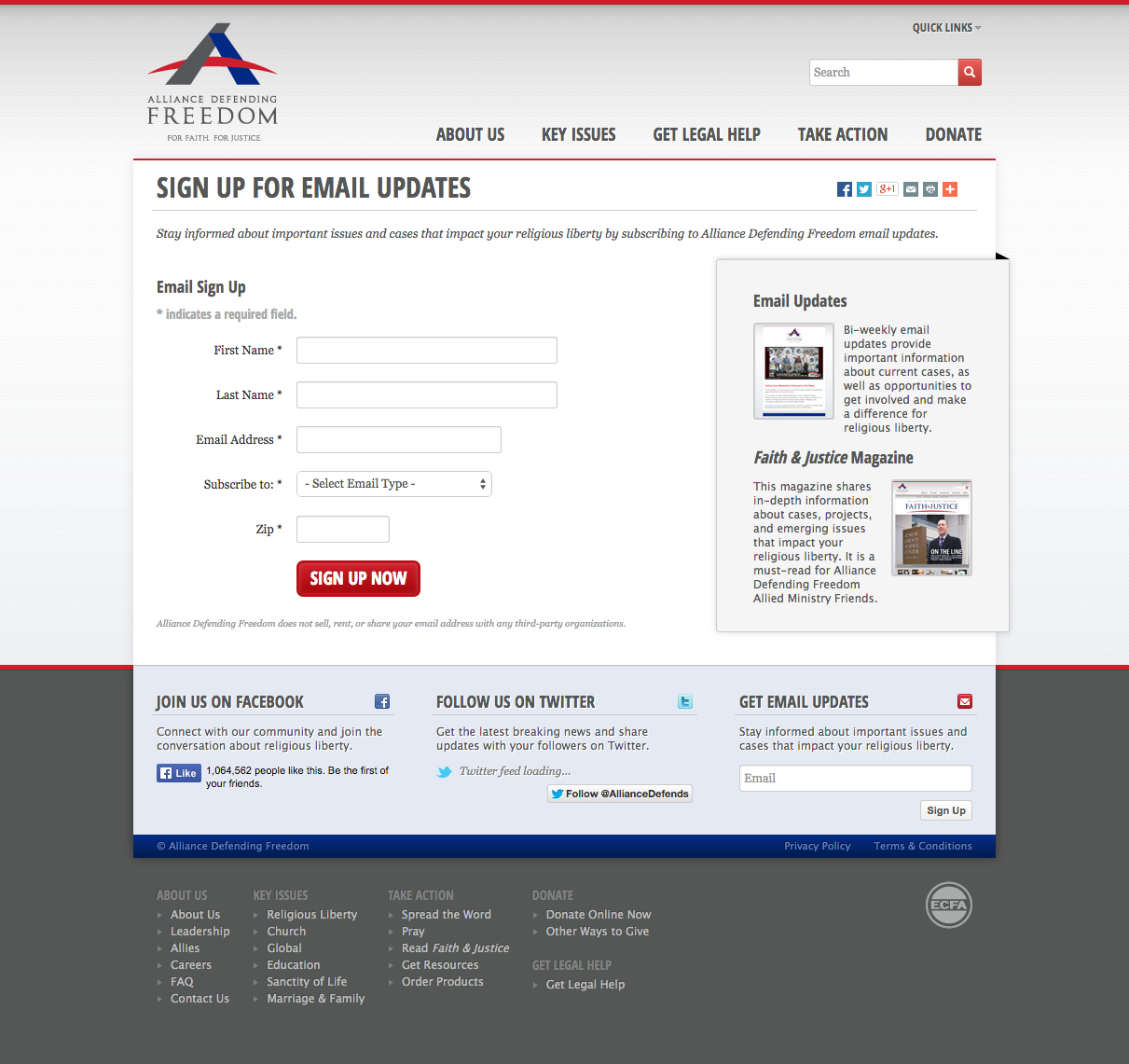
| C: | Original Design | 67.7% | ||
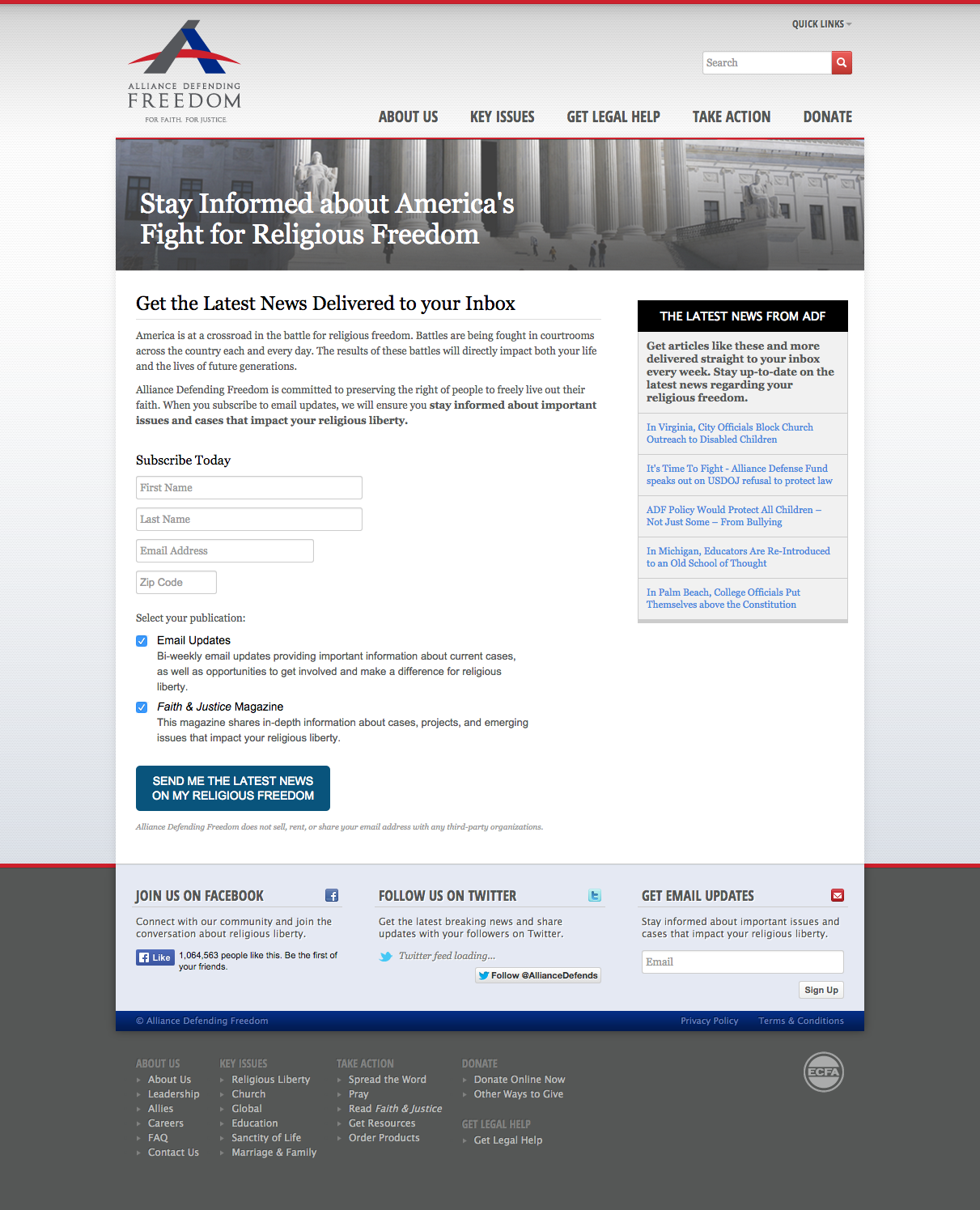
| T1: | Radical Redesign | 46.9% | -30.8% | 100.0% |
This experiment has a required sample size of 43 in order to be valid. Since the experiment had a total sample size of 367, and the level of confidence is above 95% the experiment results are valid.
Flux Metrics Affected
The Flux Metrics analyze the three primary metrics that affect revenue (traffic, conversion rate, and average gift). This experiment produced the following results:
0% increase in traffic
× 30.8% decrease in conversion rate
× 0% increase in average gift
Key Learnings
It is not uncommon in our attempt to make things look better that we take a step backwards when it comes to conversion. “Ugly converts” is a phrase that we throw around to the chagrin of our designers and, in this case, the data backed it up. In our attempt to add more value for the user, the form becomes visually complex, but more aesthetically pleasing. When you look at the forms side by side you can see how the addition of news items in the sidebar and email list options in the treatment gave users additional decisions to make and distracted them from the ultimate goal of signing up.
Our hypothesis is that, while the design of the treatment form is different, the likely reason why the control form won is that it limited the number of decisions a person needed to make to sign up. The headline for the control form is straightforward, visually the form is simpler and appears easier to fill out and there is no question that you are going to be signing up to receive emails.
Going forward we are going to see if there are other treatments we can would add perceived value to the user without adding friction or distracting from the ultimate goal of the page.