How adding a call-to-action to the top of a simplified landing page impacts conversion
Focus on the Family
Focus on the Family is a global Christian ministry dedicated to helping families thrive. We provide help and resources for couples to build healthy marriages that reflect God's design, and for parents to raise their children according to morals and values grounded in biblical principles.
Experiment Summary
Timeframe: 11/14/2017 - 11/30/2017
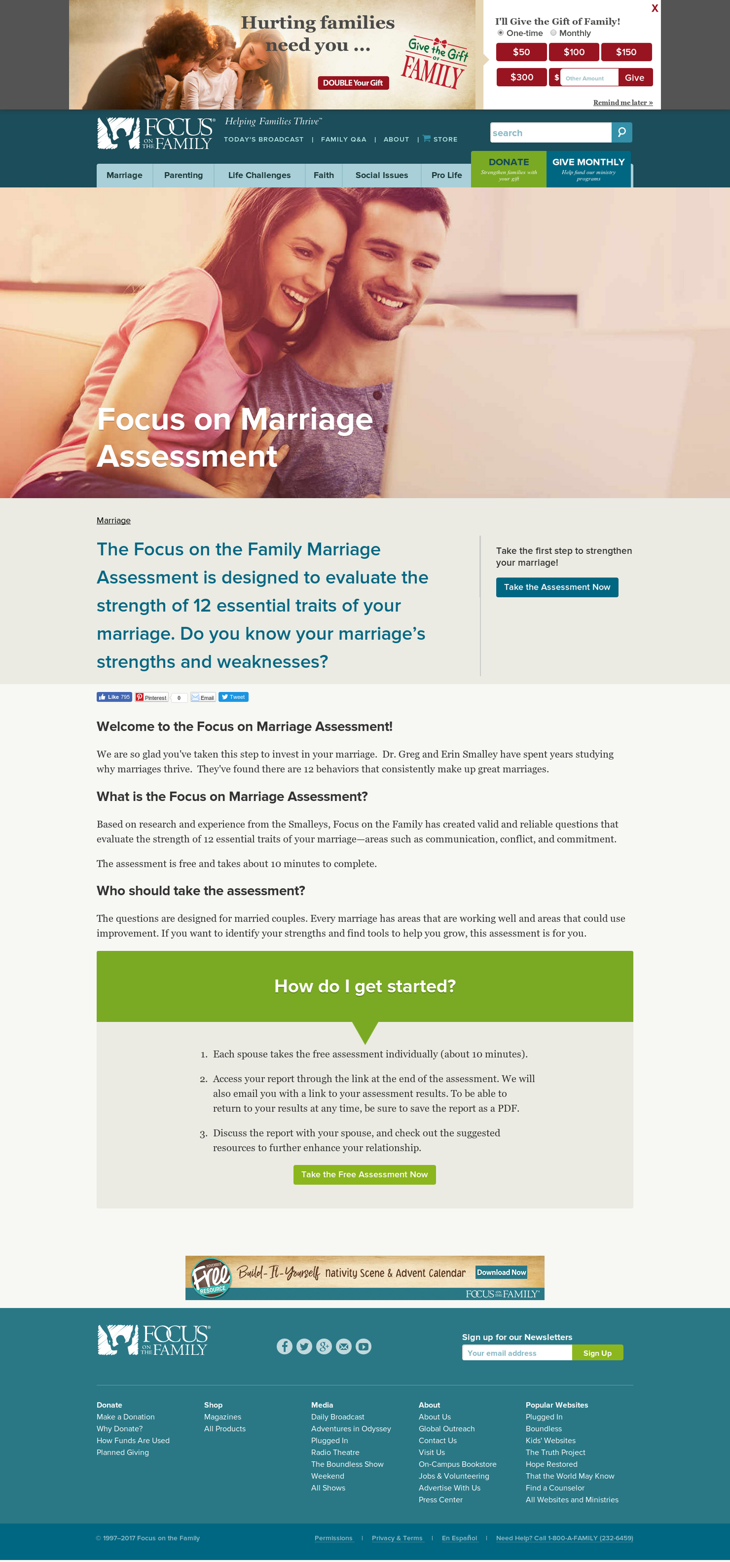
Focus on the Family offers a Marriage Assessment on their website. In a previous test on the assessment landing page, we learned that a simplified page where we removed elements of friction actually decreased conversion because we removed a button at the top of the page that would take this highly motivated audience directly to the assessment. To build upon those learnings, we hypothesized that we could increase conversion by keeping and testing the simplified version again but simply just adding back in the button to the assessment at the top of the page. We split the traffic and tested it.
Research Question
Would adding the button back in to the top of the page increase acquisition on the simplified page?
Design
Results
| Treatment Name | Click Rate | Relative Difference | Confidence | |
|---|---|---|---|---|
| C: | Radical Redesign without Button | 64.3% | ||
| T1: | Radical Redesign with Button | 62.1% | -3.4% | 99.8% |
This experiment has a required sample size of 3,647 in order to be valid. Since the experiment had a total sample size of 18,894, and the level of confidence is above 95% the experiment results are valid.
Flux Metrics Affected
The Flux Metrics analyze the three primary metrics that affect revenue (traffic, conversion rate, and average gift). This experiment produced the following results:
3.4% decrease in traffic
× 0% increase in conversion rate
× 0% increase in average gift
Key Learnings
By adding the button back in to the top of the page, we still weren’t able to increase the traffic going to the assessment. We saw a slight decrease in conversion – not as significant as when the button was completely removed – but still a dip.
We hypothesize that this audience is so highly motivated that they don’t actually need this assessment landing page. We propose testing removing this in-between page altogether and sending people straight to the assessment to get more people to take and complete it.