How an additional design element affected registrations from a webinar email
NextAfter
Experiment Summary
Timeframe: 06/12/2019 - 06/14/2019
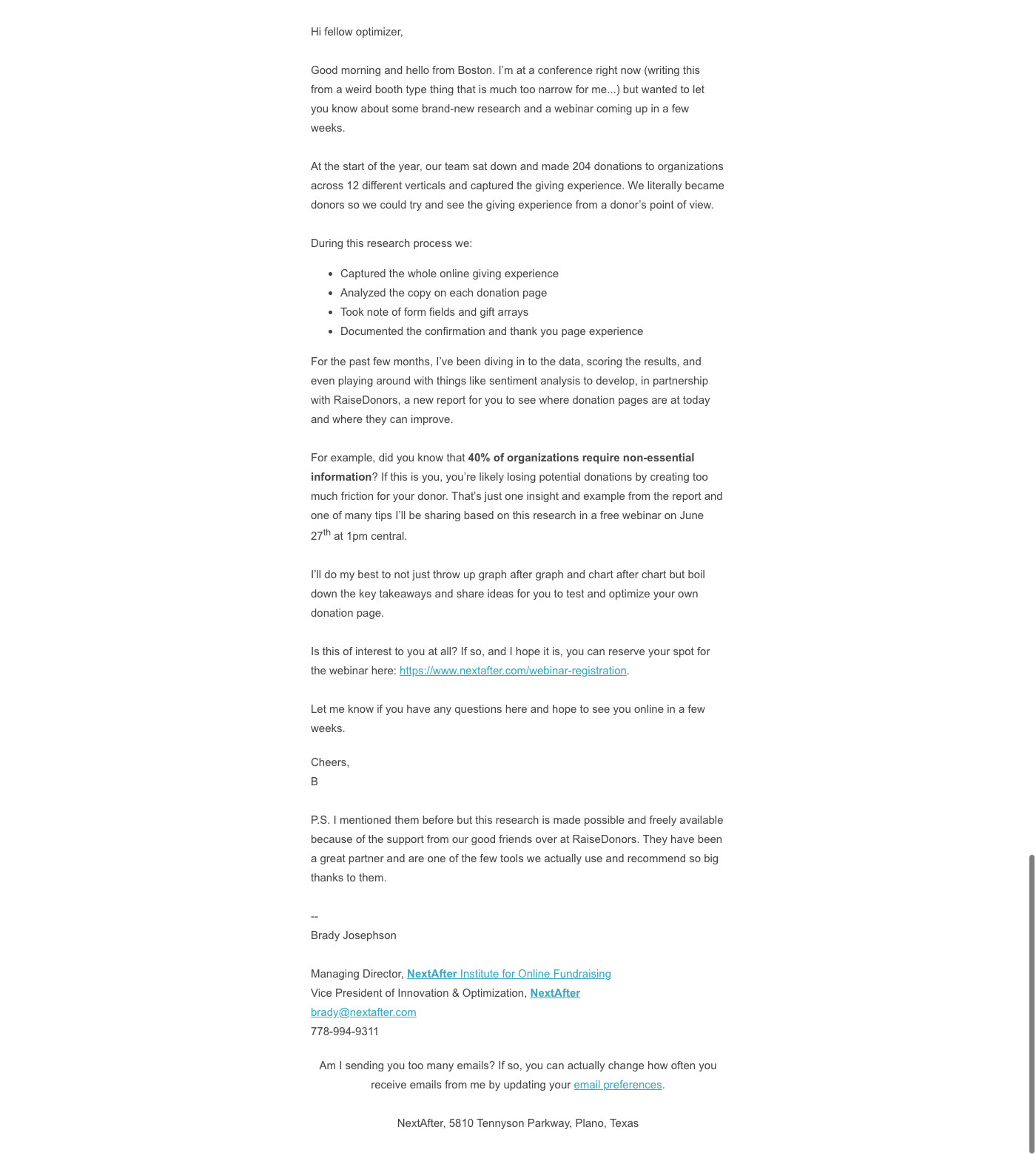
The majority of our emails are hyper-personal and text only. But recently, we’ve seen digest-style emails perform better using some basic design elements including simple images and HTML buttons. We believe the reason for this is that our emails can be very heavy. And if you’re not reading every line, a design element can quickly show what the offer is and provide a clear call-to-action.
In this case, we wondered if a similar approach could help improve registration rates in our webinar invitation emails.
Research Question
Will using an additional design element at the bottom of the email lead to greater webinar registrations?
Design
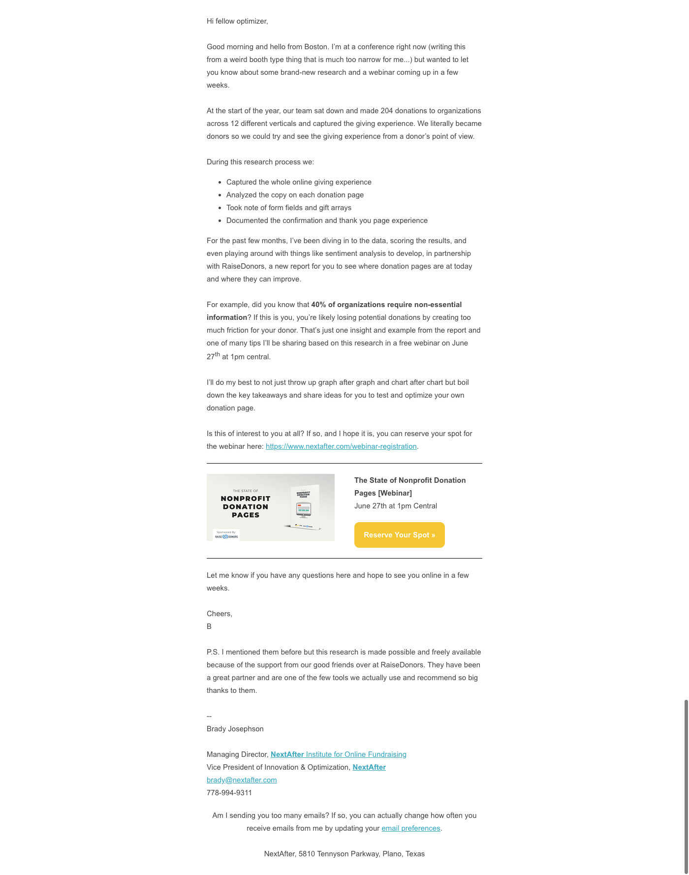
Results
| Treatment Name | Conv. Rate | Relative Difference | Confidence | |
|---|---|---|---|---|
| C: | Plain Text Email | 5.1% | ||
| T1: | Plain Text with Webinar Image and Button | 6.2% | 20.7% | 94.5% |
This experiment has a required sample size of 3,639 in order to be valid. Since the experiment had a total sample size of 6,975, and the level of confidence is not above 95% the experiment results are not valid.
Key Learnings
This experiment was just shy of reaching the desired 95% confidence level. The additional design element led to 20.7% more webinar registrations than the control. This seems to validate the hypothesis that these design element help give people a better understanding of the offer and call to action by adding visual clarity around the title, date, time, and content.
However, it is possible that the novelty of this design itself is leading to an increase. We will need to test again to make sure this increase is an ongoing trend and not a one-off result.