How a radical redesign impacted the Shoes for Orphan Souls donation page
Buckner International
Buckner International is a global ministry dedicated to the transformation and restoration of the lives we serve. We are a Christ-centered organization that delivers redemptive ministry to the most vulnerable from the beginning to the ending of life.
Experiment Summary
Timeframe: 06/24/2019 - 08/15/2019
Based upon the low traffic volume to the Shoes for Orphan Souls donation page, we knew that we would need to try something radical in order to validate an experiment. With this in mind, we decided to launch a radical redesign of the page in conjunction with a similar experiment on Buckner’s main donation page. Both experiments tested similar elements:
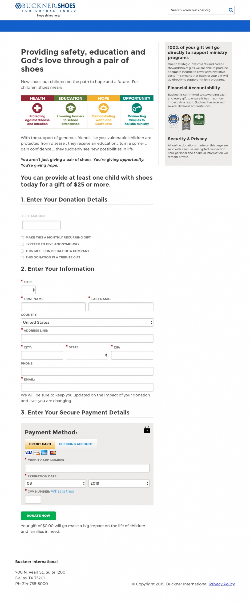
- We modified the form headers to be numbers steps instead of just labels.
- We removed the gift array which we’ve seen help with organizations that have a large volume of mid-level and major donors
- We increased the perceived security near the credit card form
- We reiterated the gift size and impact near the donation button
Research Question
Will a radical redesign of the donation page increase overall donor conversion?
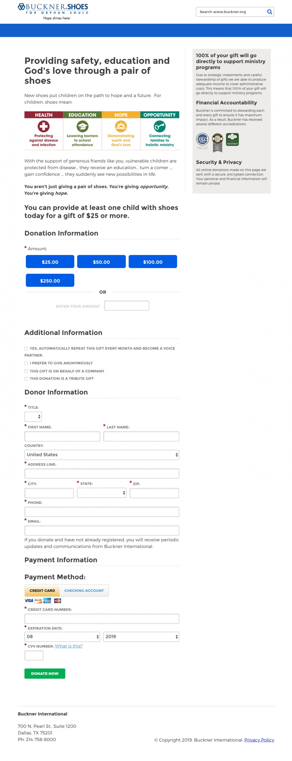
Design
Results
| Treatment Name | Conv. Rate | Relative Difference | Confidence | |
|---|---|---|---|---|
| C: | Control | 10.4% | ||
| T1: | With Updates | 20.3% | 94.0% | 89.9% |
This experiment has a required sample size of 105 in order to be valid. Since the experiment had a total sample size of 141, and the level of confidence is not above 95% the experiment results are not valid.
Key Learnings
While it did not statistically validate and it had a small number of conversions, we did see a directional lift with the radical redesigned donation page. What is surprising is that the experiment run on the main donation page that mirrored these changes saw a completely opposite result (41% decrease.)
When we analyzed both experiments, what we found was that the decrease on the main donation page was the result of a decrease in donors less than $100. The SOS donation page did not have this same issue (we actually saw an increase on this page.) The key difference is in the final subheadline on both donation pages. The SOS donation page makes an ask for $25 and the main donation page did not suggest any gift amount.
It is our hypothesis that removing the gift array from the main page increased the decision friction for the small-dollar donors. The SOS donation page did not experience the same impact since it had the $25 in the final call to action.