
If you have visitors to your website, but they’re not saying yes (or you simply want more to say yes), you have a conversion problem.
Conversion Rate is one of the three variables that determine your Revenue from online fundraising. I’ve highlighted it in the FCORM on the right.
In this post, I’m going to cover 3 strategies for optimizing conversion with examples you can try in your own experiments. Before we get into the examples, here’s some background on the concept of conversion.
Getting to Yes: The Conversion Heuristic
This heuristic, created by MECLABS, assigns relative weight to the variables at play in the conversion decision.

Conversion, according to MECLABS, is equal to four times the motivation of the user.
Motivation is the answer to the question, “What are they coming to the website for in the first place?” For example, if they’re visiting your website with an intention to donate, they’re going to have a higher probability of converting (completing a donation) than somebody who’s coming there to read a blog post.
The second most important variable in our conversion formula is the force of our value proposition. The essence of your value proposition is the answer to the question, “If I’m your ideal donor, why should I give to you rather than some other organization or not at all?”
Next, we can add an incentive to increase the appeal of conversion. Incentive helps counteract the negative impact of friction in the conversion process. Friction and anxiety can both stop potential donors cold in their tracks so that they abandon your page. So on top of improving our value proposition and incentives, we want to decrease the negative impact of friction and anxiety in the conversion process.
Each variable can be classified as either a “Value Force” or a “Cost Force.” Elements that increase the likelihood of conversion are said to be forces of value while elements that decrease are forces of cost.

These two forces, “value force” and “cost force,” sit on a very delicate scale that can make or break the conversion process for a potential donor. Tip the scale on the side of value and you get a “yes” – that’s a conversion. Tip the scale to the side of cost, and you lose donations.
Let’s look at some experiments where we’ve tested way to increase the “value force” and decrease the “cost force.”
1. Reduce the amount of friction in your online giving experience.
The first strategy you can use to increase conversion is to reduce the amount of friction that exists in your online giving experience. Friction is anything that causes psychological resistance to a given element in the donation process.
What is friction? Perhaps the easiest way to understand friction is to experience it. I’m going to pick on our good friends at World Vision. The following images are from a micro site for one of their fundraising campaigns several years ago. The purpose of this campaign was to raise money.
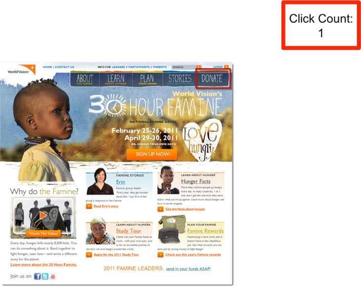
If I came to this website with an intention of making a donation, there are lots of things of happening on this website that are pulling my attention away from donating – lots of images and links and buttons. In the upper right-hand corner is a Donate button. I click on that and my expectation is that I will land on a page where I can give a gift. When I click on that button, this is where it takes me:
Now what? My eye is drawn to the center column, which is the main content column. In the center the first link I encounter says where your donations go. That’s helpful, but it’s not what I want to do. I want to donate. The button says Search for a student or group—what does that mean? You can search for your page; You can create your own page; You can share your page through email, Twitter, and Facebook; You can Sign up now; Or you can ask your question…
Here is my question: How do I donate?
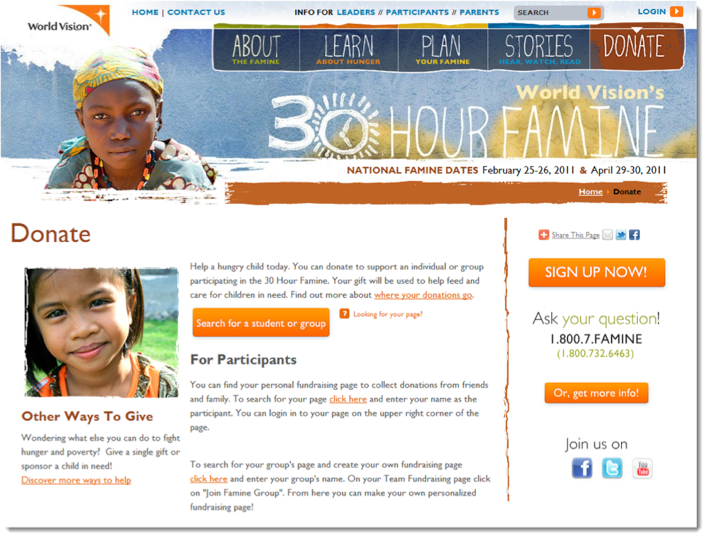
Well, believe it or not, the place where I need to click if I want to make a donation is down here in the bottom left-hand corner—this link that says Discover more ways to help.
Now, I’m a pretty savvy web guy, but it is not intuitive or clear that I am supposed to click on Discover more ways to help after I’ve already clicked the Donate button and communicated my intent of donating. All of that other stuff is getting in my way.
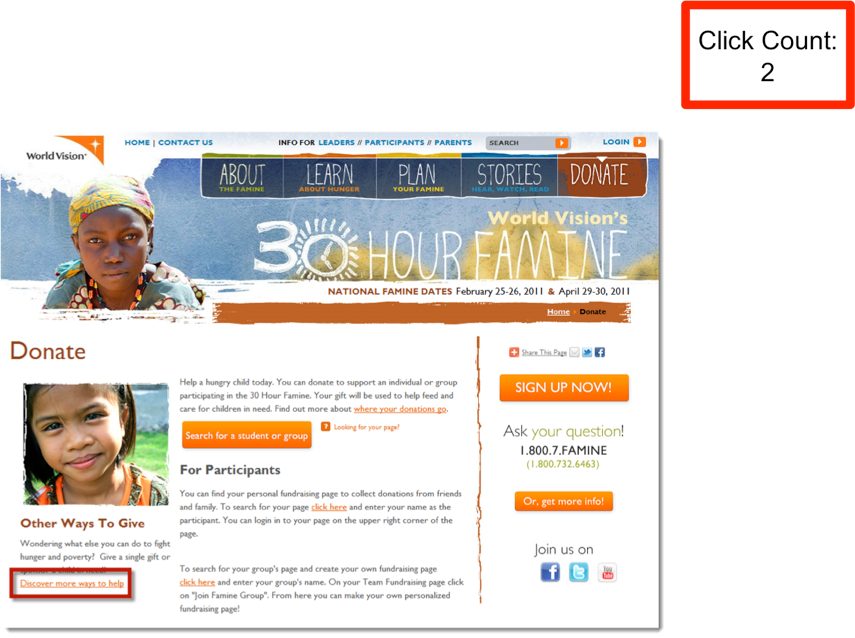
Well, if you’re patient enough and you found that link, it takes you to this page. So now I at least see a couple of buttons that align with my intent of giving a donation. So I click on the Donate Now button, and it takes me to what looks like a different website.
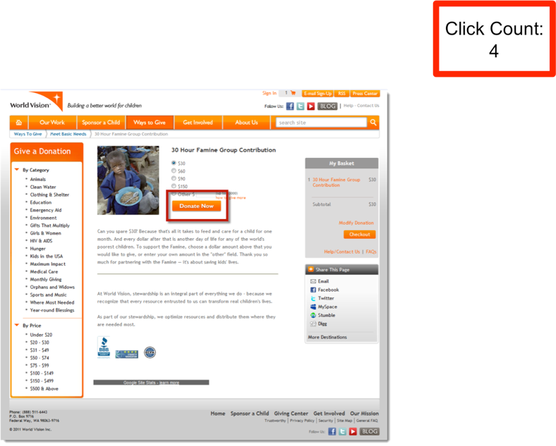
There is a different look and feel here. I experience slight disorientation—where am I? What am I trying to do? And how do I do it? I want to donate, so I hit Donate Now.
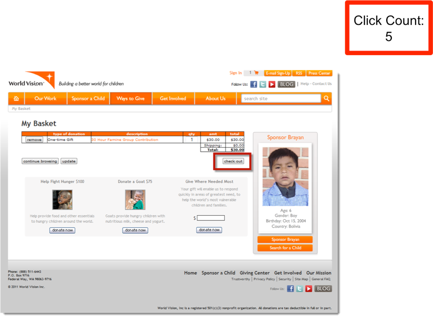
It puts my gift in a shopping basket, which I think is kind of strange because I’m not trying to purchase the child, I just want to sponsor one. So I hit the Check Out button.
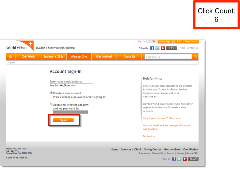
Now I have to create an account.
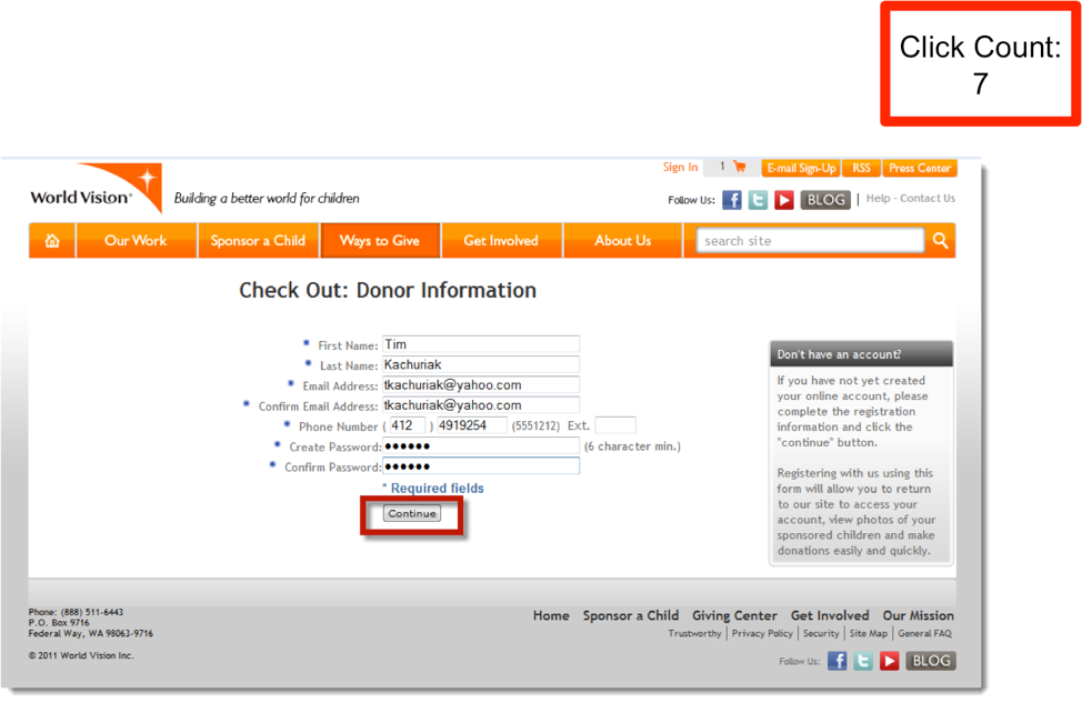
I have to fill in some information. I hit Continue. And for the next 3 clicks, I have to fill out even more information:
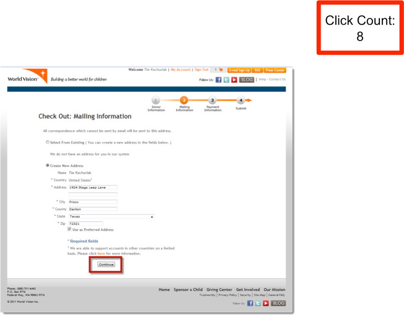
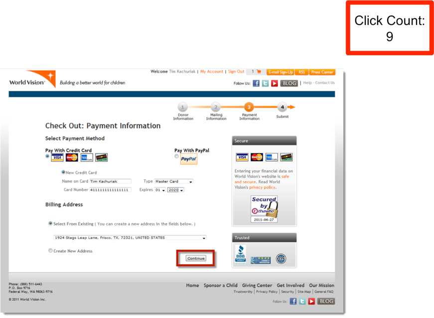
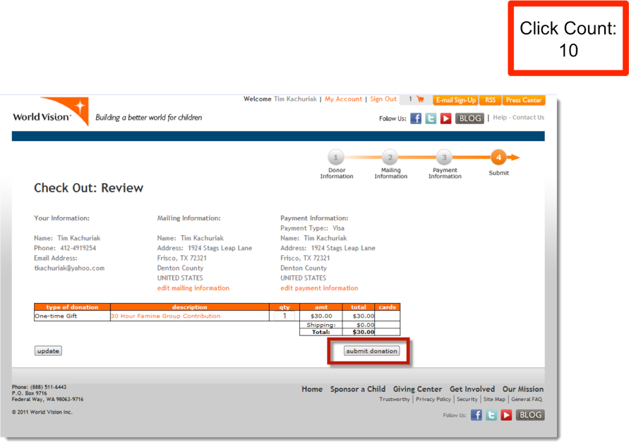
It’s like asking “Are you sure?” “Are you sure?” “Are you sure?”
If we think about it, perhaps this happens every day. Man organizations are beating the ever-living smarts out of their donors who are desperately trying to give them money.
That’s friction. It’s easy to recognize it when you see it.
To contrast that experience, let’s look at a low friction example:
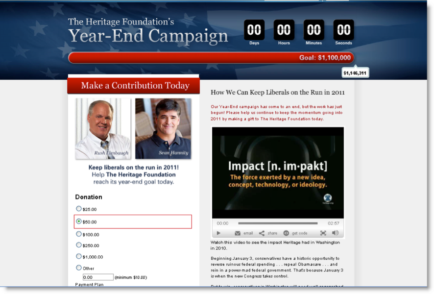
In the context of a timely goal—a specific end-of-year campaign—I can observe content through videos and copy that’s all right there on the same page, and it inspires me to give. And I can respond with a financial contribution.
The first strategy for optimizing conversion—reducing the amount of friction in your online giving experience—is absolutely critical. This is where most of the low-hanging fruit exists.
You can reduce friction by making it easier and faster for your website visitors to complete a gift. Simply removing obstacles for people who already have formed an intent to donate, is one of the most effective and easiest ways to boost conversion.
2. Enhance visitor motivation by creating multiple conversion pathways.
I’ve been taught throughout my entire direct response career that when we present people with two conflicting calls to action on the same page, it actually suppresses the response to both actions.
But we suspected that accepting this rule as absolute, we could be missing an opportunity. So we decided to test it.
We created two different versions of a donation landing page for The Heritage Foundation.
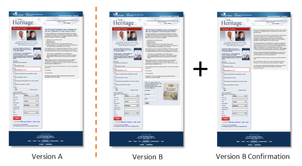
Version A is the control: it’s a two-column layout with a donation form on one side and copy on the other. Version B is exactly the same. The only difference is that down in the bottom right-hand corner, below all the content, is a secondary call to action, which is an email signup opportunity using an eBook offer incentive.
We reasoned, “If we give people an opportunity to sign up for that eBook, why don’t we give them a confirmation page that offers a chance to donate: ‘Your eBook will be sent to you momentarily. In the meantime, why don’t you give a gift?’”
So we had two ways to respond and give. Version A is one step and one call to action; version B is two steps and two calls to action.
We set up a simple A/B split test, and we discovered that version A produced a 2.52% donation conversion rate, and version B produced a 2.51%. There is no statistical difference between versions A and B for the primary call to action to give a gift.
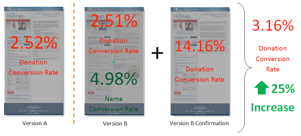
However, 5% of the people who came to the website went for that name acquisition offer. So we got the email addresses for 5% of those visitors.
Note that the donation conversion rate for the single step “donate” call to action remained the same. In version A, we were in fact losing 5% of visitors who would have responded to a secondary, softer call to action. And we weren’t just losing the immediate revenue opportunity, but the lifetime value of these new subscribers.
Here’s where it gets really interesting. When we look at the secondary confirmation page that offers users another opportunity to give, we experienced a 14.16% conversion rate on that page that effectively created a 25% lift in donation conversion rate.
Not only did we collect names we were missing in Version A, but we also increased immediate donation conversion rate (and therefore revenue) simply by presenting a second donation opportunity after the name acquisition offer had been accepted.
The broader principle for you to test is that you can create multiple conversion pathways by adding donation experiences as additional calls to action on your website. Append contextualized donation opportunities to your confirmation pages, thank you pages, registration pages, and see how much lift in conversion you can achieve.
3. Increase the force with which you communicate your value proposition.
Let me give an example of another experiment we performed with The Heritage Foundation.

We had gotten really good at doing a two-column landing page. Take a look at the control above. On the left side of the landing page, we have a contextualized, relevant donation opportunity. On the right side, we have content. We said, “You know what? We think it’s time to blow up all of our preset positions and come up with a completely radical redesign. We need to rethink this entire page.”
If you do enough testing, you’ll get to the point where you run out of room for making incremental changes, and that’s where we were.
In the treatment above on the right, you’ll see we created this ugly, Frankenstein-looking version of that landing page. It’s a single column, long-form copy, and you have to scroll forever to get to the bottom.
Then we did the unthinkable: we buried the donation form at the end of the page. However, when we set up our A/B split test, we discovered the treatment produced a 74% increase in donation conversion. It also produced a 274% increase in revenue.
Now this landing page had significant traffic. So with conversion and revenue increases of that magnitude, Heritage Foundation executives were asking “Why? What is happening down there? What are you guys doing that’s leading to this big burst in our P&L statement?”
We discovered that the single column layout forced visitors to engage with the full force of the value proposition, which is a major lever in the conversion heuristic. By increasing the force of the value proposition, we dramatically lifted conversion rate and average gift.
These principles were applied more widely throughout the organization. It’s pretty interesting how this optimization experiment can turn into opportunities for maximum growth across the organization.
Conclusion
When you’re focused on conversion, use the conversion heuristic to develop the treatments for each element in your conversion process. The examples I covered demonstrate how:
- Reducing friction boosts conversion by removing obstacles. Don’t slow the momentum or reduce the motivation of your prospective donors.
- Create multiple conversion pathways by giving website visitors more opportunities to donate. A good experiment to run is to add contextualized, relevant donations offers to piggy back on the momentum created by other milestones (registrations, sign-ups, opt-ins, etc.)
- Increase the Force with which you communicate your Value Proposition. Your value proposition (and how you present it) is one of the largest levers you control in the conversion equation. Make it as forceful as possible and promote deep engagement with your message to boost conversion.

Conversion gets a lot of attention in the world of online marketing and fundraising, and rightly so. But, if you are looking to truly optimize your online fundraising revenue, understand that conversion is one of three equally important variables that affect your over all revenue: Traffic, Conversion, and Average Gift.
Find out where the best opportunity is for your organization to begin optimizing by getting your free FCORM report. With just three pieces of data, this report will generate a detailed analysis of your organization’s strengths and weaknesses with opportunities to instantly increase your online revenue. Get your free FCORM report today.
Comments are closed.