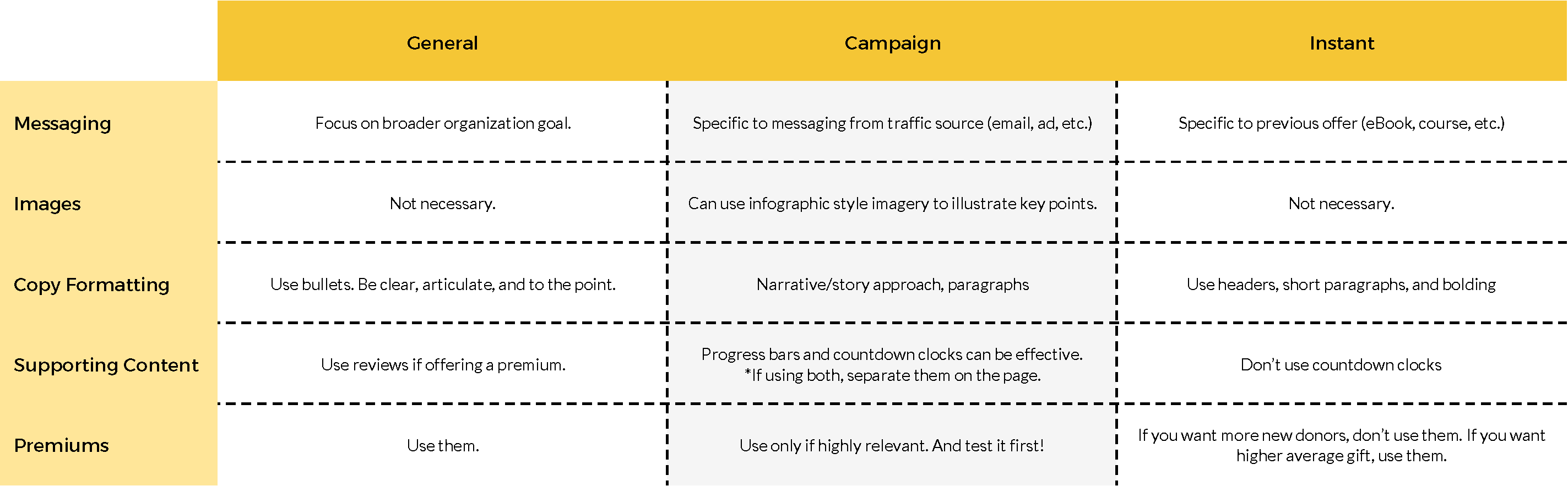
Over the past several months, we’ve been uncovering a new way of thinking about donation pages. There is no one-size-fits-all donation page that will ensure high conversion. And there is no ultimate donation page template. What we’ve found from 300+ donation page experiments is that there are 3 types of donation pages: general donation pages, campaign donation pages, and instant donation pages.
You can probably guess what the general donation page is…this is the page that your potential donor lands on when they click the “Donate” link in your website navigation.
Campaign donation pages are the second most common. These are stand-alone donation pages that are used in conjunction with something like an email appeal or an ad with a “donate” call-to-action.
Instant donation pages are the least commonly used donation pages. Although, as you’ll see in this post, they should be one of the most commonly used donation pages in your online fundraising.
What is an instant donation page, and why is it so important?
If you’re not already using instant donation pages in your fundraising, these could be transformational for your fundraising. To understand what they are and why they’re effective, we have to put ourselves in the mind of the donor.
 We often talk about the concept of a donor mountain…the potential donor starts at the base, and it’s the job of the fundraiser to help them up the mountain to the peak. The peak, in this case, represents the donation. Along the journey up the mountain are decision points where someone can say “no” and turn back.
It’s our job to turn each “no” into a “yes” and keep the donor moving up the mountain towards a donation. For example, if a potential donor sees an ad from your organization on Facebook, they have the choice whether or not to click the ad. If they say “yes,” they move on to a landing page – a new decision point.
On that landing page, they have the choice to either subscribe to your email file (or download your eBook, register for your course, etc.) or to abandon all together. If they say “yes” and accept your offer, they’re another decision point closer to a donation.
All along this journey, your potential donor is gaining momentum. Each little decision gives them more momentum, helping them to say “yes” to an even bigger decision at the next step. And once your potential donor has said “yes” to your content offer, you have an increased likelihood of them saying “yes” to a donation ask.
This is where the instant donation page comes into play. After someone fills out a form (a content offer in particular), you can direct them to an instant donation page rather than your standard confirmation page.
Although you won’t see massive conversion rates of 50-60%, an instant donation page will allow you to start converting your brand-new subscribers into new donors instantly. This means no more waiting around for 12 months hoping they organically donate.
Here are some benchmark donation conversion rates you can expect from various types of content offers:

But this instant donation page won’t be effective if it reads just like any other donation page.
How is it different than any other kind of donation page?
The key differentiator between the instant donation page and your other donation pages is motivation.
Someone visiting your general donation page has navigated there with the intention of donating, or at least considering a donation. They need less convincing.
Someone visiting a campaign donation page has been prompted by something like an email appeal. They’re coming to the page with a specific reason for giving.
Someone visiting your instant donation page has ended up there after engaging with content in some way – not by clicking a clear “donate” call-to-action. As a result, this page has to be significantly different.
The key to a successful instant donation page is the copy.
Keep in mind that a potential donor visiting this page did not land here knowing they were going to presented with a donation ask. As a result, we can’t slow them way down with a long and drawn-out explanation of why they should give (like you might on a campaign page).
At the same time, we can’t just bullet point out why they should give (like you might on a general donation page), or else they’ll never gain a full understanding of why they should give.
We have to meet in the middle.
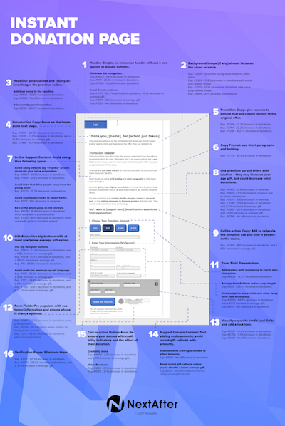
So then let’s take a look at the 16 core elements that make for an effective instant donation page.
How do you create an instant donation page?
1. Use a simple, no-nonsense page header without navigation or extra donate buttons.
2. If you use a background image, make sure it focuses on your cause of value proposition.
3. Write a headline (personalized if possible) that clearly acknowledges the previous action.
4. Write brief intro sentence or two that outlines the immediate next steps.
5. Write a brief transition paragraph that gives reasons to donate closely related to the original offer.
6. Make sure paragraphs are brief, and use bolding on key words or phrases.
7. Avoid in-line supporting content such as: videos, links that lead away from the page, countdown clocks, in-line reviews.
8. Use a premium offer only if you want to increase average gift. Beware…it may decrease your conversion rates.
9. Write a call-to-action header that reiterates the donation ask and how it advances your cause.
10. Use a gift array with big buttons. Make sure your first option is below your average gift size.
11. Keep these three things in mind when laying out your donation form:
- Use headers with numbers to clarify decision points.
- Arrange form fields to reduce page length.
- Avoid adaptive place holders or other fancy form field technology.
12. Pre-populate form fields with first name and last name if possible.
13. Visually separate credit card fields and add a lock icon to indicate that your page is secure.
14. Test adding supporting content (i.e. testimonials or endorsements) in a right column.
15. Add third-party credibility indicators (GuideStar, Charity Navigator, etc.) near the call-to-action button.
16. Eliminate any gift verification pages.
Where do I start?
 First things first, you have to have some sort of email acquisition or content offer on your website. Identify the email acquisition offer with the largest volume. Instead of using a standard confirmation page or message after the form is submitted, redirect your users to an instant donation page.
Craft your page using the free instant donation page guide. You can print it out, keep it at your desk, and use it every time you’re setting up a new page or looking for a brand-new idea to test.
Once you get a page up and running, would you let me know? I’d love to see what you put together. And if you’re running a test on an existing page, I’d love to help you document your results in the research library.