
“If you torture data long enough, it will confess to anything.”
That quote from Darrell Huff’s How to Lie With Statistics seems to be extremely relevant in the nonprofit sector. Now, I’m not going to call out any specific names or organizations, but I’ve seen this play out countless times.
I’ve sat through many meetings, webinars, and conference sessions where the data being shared either a) doesn’t mean what the speaker thinks it means, b) has been cherry picked in order to make a point, or c) is just outright irrelevant to the point being made.

Super duper honesty time…I’ve been guilty of this, and you probably have too – even if you didn’t realize it.
Insert Kevin Peters, our CTO. One of my first tasks at NextAfter was to run a web audit for a client we had just started working with. And Kevin showed me the ropes of how to use nonprofit data to tell a compelling story, while also being fair to what the data says.
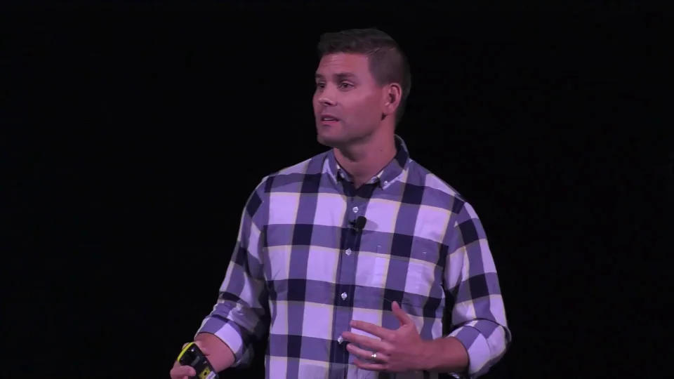
And at the last NIO Summit, Kevin shared his 7 guidelines for telling a story with nonprofit data. These guidelines will not only help you create better presentations to report your fundraising success, but also help you communicate your impact to your donors even better.
If you’d like, you can watch Kevin’s whole talk below. And if you’d like to catch all the NIO Summit action, you can learn more about the conference at https://www.niosummit.com
Let’s get into the 7 guidelines for telling a story with nonprofit data without manipulating it.
Keep Your Data in Context
It’s very tempting to cherry pick the data that best supports your case and ignore the rest of what the data is saying. But data is more compelling when it tells the complete story.
There are lots of way this can play out. Looking at demographic data without looking at population density can drastically change your view of the data. Adjusting the scale of a chart can make it look like there’s an even more drastic change than there really is.
There’s a great example of this in an article on #GivingTuesday from a fairly popular nonprofit blog. They were making the case for how important #GivingTuesday is.

The 3 graphs show 3 different major giving days – #GivingTuesday, December 31, and the typical response to a disaster (like a hurricane) – and how giving on those days compares to the surrounding 5 days.
When you take these graphs at face value, they clearly show #GivingTuesday is far superior to any of these other major giving days. And the implication is that you should prioritize #GivingTuesday over December 31st.
The data isn’t lying, but the lack of context is deceiving.
Their data isn’t wrong… but it’s misleading. Let’s look at some Google Analytics data comparing #GivingTuesday results and year-end results.

Those are great results, right? But there’s more to the story.
When we took a look at 17 of our nonprofit clients, we saw a total of $1.5 Million in donations on #GivingTuesday in 2017. That’s 3% of total year-end giving for this same group.

On the other hand, December 31st brought in $7 Million in donations – 14% of total year-end giving.
That makes December 31st more than 5 times as valuable as #GivingTuesday in terms of immediate revenue. Not only that, but the average gift size is much, much higher on December 31st as well.
The context is everything here. A good year-end fundraising campaign doesn’t just happen in one day. We’re sending messages leading up to year-end as part of a larger campaign. We’re talking to our donors. We’re leading into the next year, the big vision, and what we’re trying to accomplish.
So while #GivingTuesday can be super important – 3% of year-end revenue is nothing to sneeze at – the data would say that you shouldn’t prioritize #GivingTuesday over December 31st.
The most impactful story data can tell is the whole story.
Keep Your Data Honest
Honest data, even if it’s at your expense, is always superior to manipulated data.
In his talk, Kevin shared that he received an email from a nonprofit he believed deeply in. He’s a donor and was thrilled to hear that they had rescued 10,000 children with his help!

But at the bottom of the email, the footer said that the organization had rescued 9,977 children. They had rounded up to get the 10,000.
You may have the best intentions when rounding or approximating your data, but it can be perceived as dishonesty. And there are few things more harmful to your fundraising than degrading the trust of your donors.
When you’re not totally honest with your nonprofit data, it produces a disconnect in the mind of your donors, and it kills your credibility. And credibility is one of the essential elements of a value proposition. Keep your data honest.
Keep Your Data Humble
Most nonprofits are not overtly trying to deceive their donors. But it’s human nature to overstate the problem you’re trying to solve in order to get people to support our cause.
Overstating the problem you’re trying to solve can erode trust. For example, take a look at this infographic…

One out of four people will need a blood transfusion in their lives — yet less than 10 percent are giving blood. You see that and say, “Wow! I need to go give blood.”
The implication is that not enough people are giving blood to support the need – 1 in 10 people giving blood doesn’t support the 1 in 4 that need it.
BUT… these two data points are not referring to the same time periods. 1 in 4 people need a transfusion in their lifetime versus 1 in 10 people giving blood annually.
Let’s do a little data math…
Let’s say we’ve got a population with 1000 people. This data says 250 of these people will need a transfusion in their lifetime. And if all of these people needed a full blood transfusion, they would require (at the max) 12 units of blood each.
250 people X 12 units of blood = 3,000 units of blood needed
Now let’s assume the average lifespan is 65 years. And let’s also assume that people aren’t giving blood annually until they’re a legal adult at 18 years old. That means there are 100 people giving blood annually for a period of 47 years.
100 people giving 1 unit of blood X 47 years = 4,700 units of blood available
If you’ve followed all that math, it really looks like we have a blood surplus.
So for data nerds like Kevin (and me depending on the day), this infographic actually says “Hey, we’re good to go on blood.” Now, if you’re more informed on this issue than I am, you’re probably shaking your fist saying “You don’t understand! There is a shortage of blood!” But that’s exactly the point. I don’t understand the problem accurately based on the data presented.
Conflicting data doesn’t help you make your case – it erodes trust and makes people question your authenticity.
Kevin actually makes the case in his talk that we need more vampires. I’m not exactly pro-vampire, so I’ll spare you the pitch.
Keep Your Data Relevant
To tell a compelling story with nonprofit data, the information has to truly matter. It’s important to measure and report on data that makes a real change in the fight for your cause.
When you use data that doesn’t matter, your donors will start ignoring the data you present, because it doesn’t mean anything.
What does this actually look like? Below is an annual report from an organization. And similar to a lot of organizations, they talk about their social media reach.
In this case, they say they have a reach of 350,000 fans and followers. That’s pretty big number! But there’s a problem…

If you have 350,000 fans, that doesn’t mean you have 350,000 people.
Most of your fans have multiple social media accounts, which creates duplicates in your numbers. For instance, if a fan follows you on Facebook, more than likely, they also follow you on Instagram. That same person might follow you on Twitter as well, which means one person is following you on three different social media platforms.
Your total number of followers from all of your platforms could easily be three times the actual number of people following, because each person has more than one social media account.
The total number of fans doesn’t even tell us your true social media reach because social media platforms limit your organic reach.
You might have 100,000 Facebook fans, but according to the data below, you’re only going to reach 0.5% of them with any of your posts.
Over the years, Facebook has been steadily decreasing the amount of impressions a nonprofit can get as far as organic reach goes. If you want to reach all your followers, you have to pay.
So yes, you might have 350,000 followers and fans… but in all actuality you have 1,750 people that are actually engaged. That’s the actual impact that you’re having on social media.
But my goal here isn’t to rip on Facebook. That might be another blog. The point is this…
Use data that matters. Share numbers that communicate impact, even if they’re smaller. Impacting 1,750 people directly is much more compelling than have 350k followers that never see your posts.
Keep You Data Correct
Sometimes the story we’re telling with data isn’t compelling because we’re using the wrong metric. This example causes more damage when you’re reporting to a boss or a coworker, but it illustrates the issue well.
People like to champion their total number of email subscribers. It’s an important metric, but it’s not always the most informative.
So when someone says that have 1 Million email subscribers, we start digging in just a little bit.
If we have a million people, why are we getting a thousand dollars?
Yes, you have a million subscribers, but what are they doing? Uh oh… 57% have never clicked or opened a single email we’ve ever sent them. 60% haven’t opened in the last six months.
You have 1 million email addresses, but you actually have 270,000 subscribers. The people who actually open your email are your real subscribers.
Why is this a problem?
Because when you say you have a million subscribers and then you get a thousand dollars return on an appeal, it starts raising questions.
It’s important to recognize this so you can correct it and then get some actual stats that you can use to project out to the future.
Use the correct metrics to make your decisions, not vanity metrics.
Keep Your Data Personal
Keeping data relevant, honest, correct, and in context is all hard work. Many fundraisers would rather throw their hands in the air and say, “We don’t need data! We just need a good story.”
Let me argue that point…with data.
The majority of your best donors need good data to make your stories compelling. Allow me to explain.
The DISC assessment is a tool that analyzes communication styles and behaviors, and it categorizes people into four main personality types:
- Dominance
- Influence
- Steadiness
- Conscientiousness
Conscientiousness people (high Cs) are driven by being right and accurate. They want science or data to back up the claims they believe in. A study of 2 million Americans showed that around 14% of the population tends to have a High C personality.
What Is the Dominant Personality of Your Donors?
We conducted an experiment with four different organizations in 2017. We stumbled upon a technology called “Crystal Knows” which uses machine-learning algorithms to assess somebody’s personality. Let me tell you, this technology is creepily accurate.
We took all the donors from four different nonprofits and appended their DISC score to their donor profiles. The experiment sampled about 1.8 million people. Here’s what we found…
43% of donors have a High C personality.

In other words, 43% of your donor base is hard-wired to respond to appeals that are backed by good data!
Use data to tell your stories in a way that appeals to the different types of personalities in your donor base. When you understand how your donors think, you’ll begin to see that data is a very personal matter that speaks to them in their language.
Impact is always better than big numbers.
When you’re looking at statistics — when you’re looking at facts — don’t just look for facts that support your position. If the sum of all the facts doesn’t lead to your position, perhaps it’s time to readjust what you believe.
Present your nonprofit data clearly and simply. The more confusing it is, the less likely people will be to believe it.
Don’t be afraid of the truth that your data is telling you. The truth always tells a more compelling story than misleading exaggerations. And relying on your cherry-picked version of the truth is never going to lead to positive outcomes.
You don’t have to be a nonprofit data scientist to tell a story with data.
I am not a data scientist. I don’t have a degree in statistics, analytics, data science, or any type of math. But treating data accurately and fairly doesn’t require an advanced degree. And having an advanced degree doesn’t automatically mean your analysis isn’t manipulative.
It’s my hope that these guidelines will give you a framework to help you with your next presentation, your next deep dive into your analytics, and even the next email that you write to your donors.
And if you want more expert ideas and strategies for your fundraising, every speaker session from the Nonprofit Innovation & Optimization Summit is available to you watch for free. Each speaker has tips and ideas related to search, analytics, data, copywriting, recurring giving, advertising, and much more.
You can access every session from the 2018 NIO Summit and the rest of past NIO sessions here.