Adding unnecessary steps to the online giving experience can cost you donors and donations — this organization saw a 175.6% increase by removing a confusing, unnecessary step — which is why a checkout cart style giving experience is generally really bad for one-time and recurring donations. It adds steps that can frustrate donors and often adds confusion which are both types of donation page friction. And they could be killing your donation page conversion rates.
SIDE NOTE: Higher Ed organizations are particularly bad at having multiple steps in their giving experience as we observed that 8 out of 10 Higher Ed’s had 3 or more steps to complete a donation compared to just 3 out of 10 for “Other Nonprofits”.More here: higheredonlinefundraising.com/
But sometimes you’re stuck with a clunky tool or checkout experience so if you can’t switch to a better tool or solution (and you should consider it) what can you do?
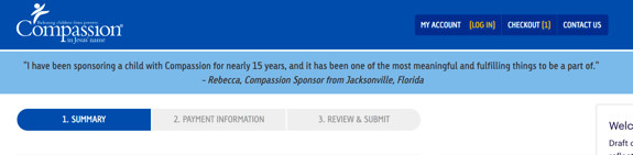
That’s where this child sponsorship organization found itself where they wondered if they could keep some value-focused messaging more present throughout the steps and giving experience and in turn could increase the conversion rate.
To test this, they put a ‘sticky banner’ at the top of the page and throughout the checkout experience. They tested a few different messages like:
- Celebrity endorsement—this banner featured an endorsement from a popular worship leader.
- Sponsor endorsement—this banner featured a personal endorsement from a sponsor from Florida.
- Time urgency and proximity—this banner reminded the user of the impact of their sponsorship and informed them that the end of the process was near and would only take a short amount of time.
- Construal level theory—this banner showed users the “club” they were joining by sponsoring a child and reminded them of the shared values of that group.
- International sponsor endorsement—this banner featured a personal endorsement from a sponsor from Finland, subtlely reminding the user that they were part of a global movement.
They then aggregated the results across all the treatments and here’s what they found:
Control
Treatment #1
Not only did they see a 13.7% increase in donations overall but every message had at least a 10% lift! The bulk of these transactions were on desktop (as most of online giving is) but there was no decrease on mobile.
KEY TAKEAWAY
Why someone should give to your organization and how you communicate that is the biggest factor in getting people to make and complete their donations – no matter how bad your online giving experience is.
And this doesn’t just apply before they get to your page or begin to complete the form/donation, but to the entire process. This is why a few sentences below the donate button at the end of the giving experience can still increase giving 31.3%!
So if you have a clunky donation tool or checkout cart flow, try finding ways where you can keep the reason why people should give more present to increase giving. Heck, even if you have a good online giving experience you should think about how you can add more value language and reinforcement with your copy and messaging throughout the entire giving experience. Good luck!
Watch the NIO Summit
Be sure to watch Brady’s session on Friction and hear from amazing speakers like Jen Shang, Dan Pallotta and more at the 2020 Nonprofit Innovation & Optimization (Virtual) Summit.
Learn More