This post will unpack the unique relationship between motivation and friction on your giving forms, and will show you two things:
- A simple model that will help you to understand the relationship between motivation and friction
- An experiment that will give you practical ideas for how you can test your own donation forms
The Special Relationship Between Motivation and Friction

The vertical axis represents motivation and the horizontal axis represents friction.
The blue line represents the probability of conversion. Anything above and to the right of the line will convert. Anything below or to the left of the line will not convert, it will lead to abandonment.
The upper right-hand quadrant is what we must aim for. We want to send highly motivated people to our donation form, so they are motivated to give. We also want to introduce as little friction as possible so it makes it easy for them to give. If we do that, we’ve got a great, great opportunity to get people to convert. Now maybe it’s not 100 percent of the time, but if we send highly motivated people to low friction forms, the chances are very high that they are going to convert.
Let’s move to the left box. In this box, we have high motivation and high friction. Now what’s interesting is that if we have an extremely motivated person come in to your website and they’re dead set on giving a gift to you (maybe they got a piece of direct mail or maybe there’s something else inspire them that sell something on TV or radio), then this person is super focused on giving a gift. Even if your form is the worst giving experience in the history of mankind, if the person is motivated enough they’ll persevere and they’ll give a gift.
Now, obviously it’s preferable to have less friction. But what’s interesting is that motivation trumps friction in this quadrant of the model.
Let’s look at the bottom left-hand corner. This left-hand corner represents low motivation and high friction. Here, if you have a form that’s really hard for people to use and they’re not very motivated in the first place, chances are you’re probably not going to convert that person to giving a gift. It’s just not going to happen.
Let’s look to the bottom right-hand box. This is the box represented by somebody that has low motivation and a form that’s really, really optimized. Now in this quadrant, we actually have a better shot than the bottom left (when there is no motivation) but at some point it levels off. It doesn’t matter how good your form is, if these people are not motivated or they do not have any intention of giving a gift, it’s just not going to happen.
What we’re aiming for is the top-right quadrant. When you combine these 2 things, high motivation and low friction, then you get results. When you experiment with influencing motivation and reducing friction, you’ll boost the probability of conversion at each stage of your funnel.
How Simplifying the Donation Form Impacts Revenue
Here is a landing page experiment. This experiment involves a donation form and demonstrates how simplifying the form can impact revenue. It’s experiment #1434 in the NextAfter Digital Fundraising Research Library. In this particular example, we’re focusing on the donation form. Now, understand that the form is part of a larger, longer landing page. We’re just zoomed in on the donation form for this experiment.
In this donation form, there are a variety of different elements of friction. Let’s first look at the different elements of friction on this page.
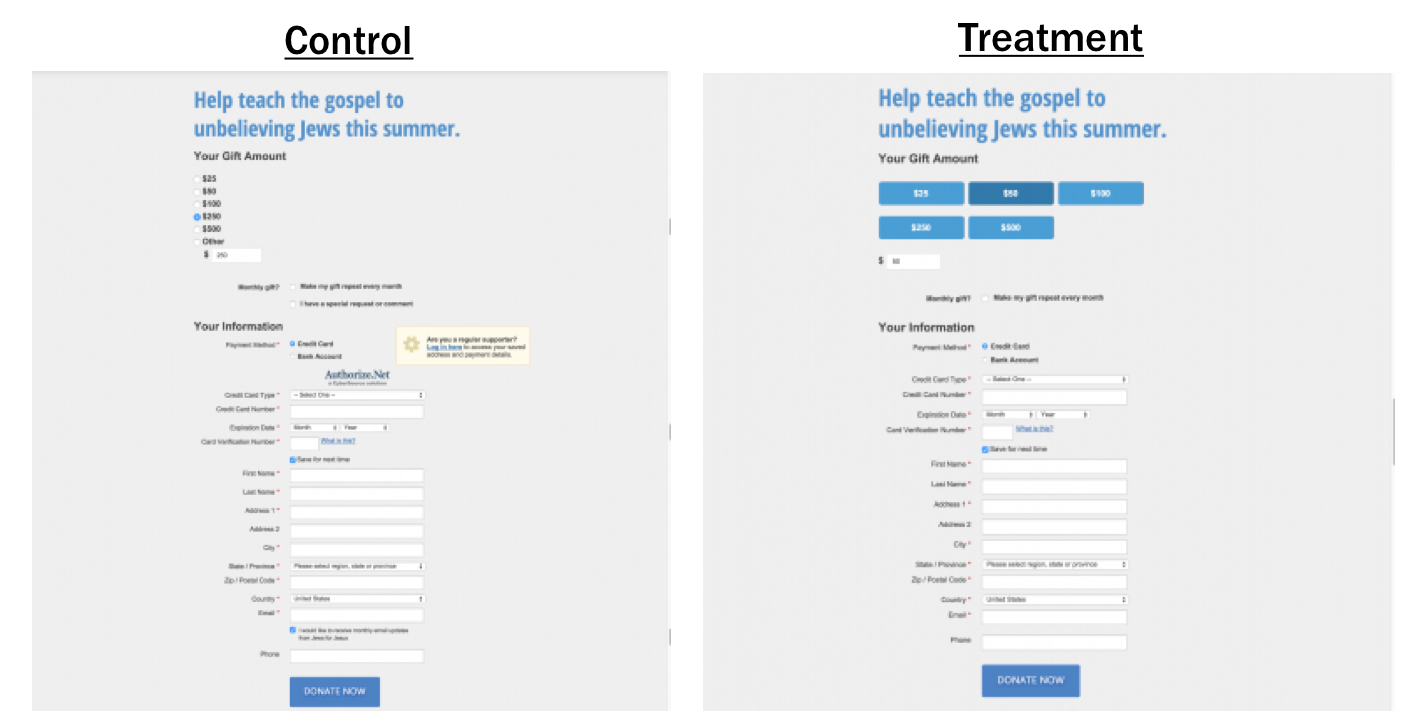
First of all, they have a gift array, which is generally helpful. Gift arrays are great because it helps orient the donor and communicate how much they should give. In this particular example, the gift array uses little “radio” buttons. It can be hard to click in those little tiny circles. Sometimes it doesn’t always work and it’s not especially clear which one you had selected, so that could present friction.
Secondly, the control has this little log in widget. If you’re already a supporter, you can log in to access your saved information and payment details. Our intuition might say, “Oh, it totally makes sense.” But there’s a problem with logins: every single login system has a different naming convention, process, and password requirements. There are so many different rules and they vary across the board. It’s not standardized. So this login function, which is meant to save us time, can end up becoming a distraction. I don’t know about you, but I have a short-attention span. There are always other things that are vying for my attention. Our goal is to remove the chance, the opportunity, for anything like that to happen.
A login form can introduce tremendous amounts of friction. Even though we think it’s a good thing, even if it stores all that information, it also introduces tremendous amount of friction.
The final thing we noticed there’s this little checkbox for email subscription opt-in. We said, “Maybe we can eliminate that and just put it on the confirmation page instead.”
We created a treatment based on these observations. We changed the gift array to get rid of the radio buttons and replaced those with big, easy-to-click buttons. Just a side-note: We find big buttons perform consistently well — like there’s something pleasurable to a donor about clicking a button. I don’t know what it is, but it’s amazing. Also, there’s a little area for them to submit a comment about their donation experience. You might not want that, because you don’t want to have any “unsupervised thinking”. Just get them focused on completing the form and getting out of there. If they want to leave comments, let them do it on the confirmation page. So, we got rid of that, too.
You can see control versus treatment head to head.
In our A/B split tests, the treatment produced a 252% increase in revenue to this campaign. Simply awesome.
The big takeaway here is that by reducing the number of decisions people have to make as they donate, you can actually unlock all of this motivation and get more people through your funnel.