

 One thing I’ve been learning recently is that many fundraisers don’t understand why email acquisition is so important. This is a little shocking to me since it’s so widely understood in for-profit industries that email file growth is essential to online revenue growth.
Since you’re reading this post, I’m assuming you already have some sense of why email acquisition is so important. But just in case you’re surrounded by nay-sayers that don’t see the value, here are 4 quick stats that illustrate the impact that email file growth can have at a nonprofit:
- Offline donors can be up to 90% more valuable when you have their email address.
- Retention increases by 29% for offline donors when you have their email address.
- Multi-channel donors can be 212% more valuable for your organization than offline-only donors.
- Multi-channel donors have a 56% higher retention rate than offline-only donors.
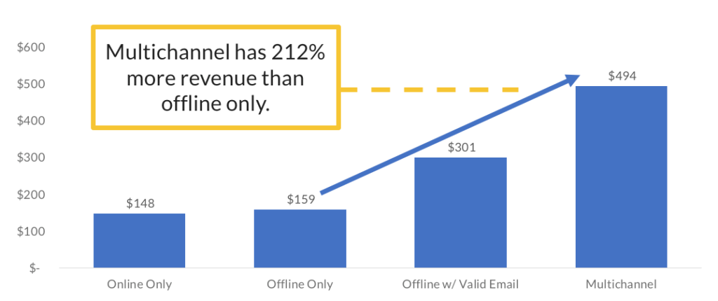
In short, acquiring more emails leads to revenue growth. If you want to read more on those stats, Brady Josephson breaks each one down a little more in his post on integrated fundraising.
So then, how do you increase email acquisition?
There are a million channels that you can utilize and invest in to try and grow your email file. Facebook advertising is a really good one (we have a free course on that). You can use search advertising like Google Adwords, email list rental, display advertising, native adverting, etc. The list goes on and on.
But regardless of what marketing channels you use to get your message out, you always need two things: a content offer and an email acquisition page.
We’re going to talk in depth about the email acquisition page, but if you need some ideas on what kind of content offers to create to acquire more emails, here are a few that we’ve found can be really effective:
- Petitions related to your cause.
- Quizzes that help someone see the scope of your work.
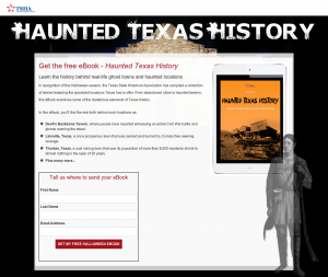
- eBooks that illustrate a need or your impact (these could be repurposed blog posts).
- Online Courses that help someone experience the value proposition of your organization.
Once you have an offer created, you need a dedicated email acquisition page where you can describe your offer and give someone the opportunity to sign-up, download, register, etc.
So once you have your offer ready to go, what makes for an effective email acquisition page?
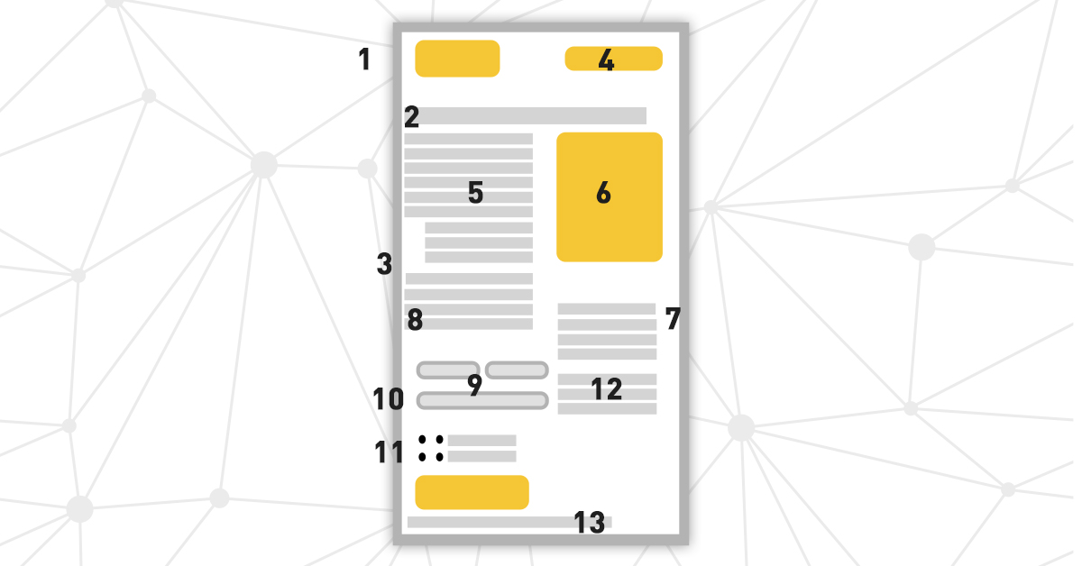
13 proven elements of an effective email acquisition page
After analyzing 80+ email acquisition page experiments, we’ve identified 13 elements that can help you see tremendous growth in conversion rates and increase the size of your email file.
These guidelines aren’t “best practices.” Rather, these are 13 elements that we have discovered using rigorous testing, optimization, and research. There certainly are other ways that these pages could be optimized; we just haven’t discovered them yet.
That being said, let’s dive in to the 13 elements.
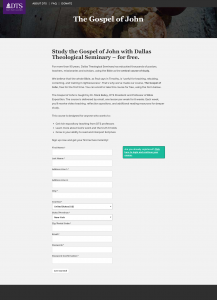
1. Use a linear layout.
The content on your page should flow from top to bottom, not left to right. Experiment #2472 is a great illustration of this principle. Adjusting the flow of the page increased conversion by 7.7%.
Control

Treatment #1
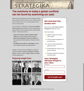
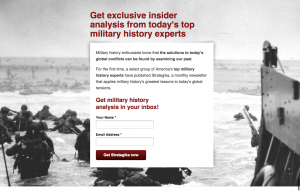
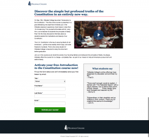
2. Use a text-only headline; not a banner image.
Don’t bury your headline in an image. For some reason, users tend to skip past headline images and miss the content within. But a text-only headline could give you an increase in emails like in experiment #2684.
Control

Treatment #2
3. If you use a background image, make sure it matches your advertising.
You don’t always have to use a background image. But if you use one, it needs to match the design of your advertising to give the user a sense of continuity. Experiment #314 isn’t just isolated to the background image, but it illustrates this principle of continuity really well – and it saw a 39% increase in conversion.
Control
Treatment #1
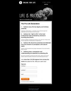
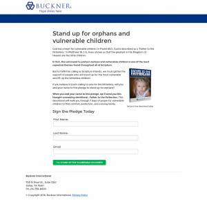
4. Add social proof.
If you’re not familiar with social proof, it’s essentially anything that creates bandwagon effect and demonstrates how much other people value your offer. The petition offer in experiment #2193 saw an 8.4% increase in conversion by showing the number of people that had already signed.
Control

Treatment #1
5. Write 2-3 short paragraphs of copy to convey your value proposition.
There are two things to keep in mind here…you want to make sure and thoroughly explain the value of your offer. So you need significant copy on your page. But there is such a thing as too much copy as we saw in experiment #4652.
Make sure your copy doesn’t drag on, but is clarified and direct.
Control

Treatment #1
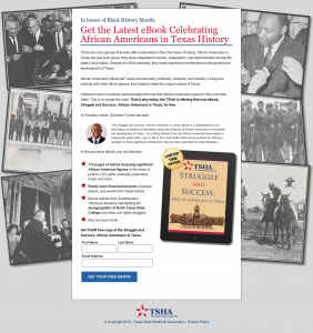
6. Use a primary image (not a video) if it adds clarity or increases continuity.
Images aren’t some magic tool to boost conversion. They’re only helpful if they add value and clarity. And please, don’t rely on a video to communicate the value of your offer. It might work as supporting content (more on that in a second), but definitely don’t put a video in-line like in experiment #6678.
Control

Treatment #1
7. Avoid supporting content in-line with the main content.
Supporting content is essentially anything other than your main copy. This could be reviews, testimonials, ratings, videos, endorsements, etc. This content can be helpful, but it shouldn’t ever go in-line with your copy. Keep it to the side, preferably near your call-to-action and form.
In experiment #3224 below, we see that adding a testimonial in-line with copy actually hurt conversion. So the right placement of this type of content is essential.
Control

Treatment #1
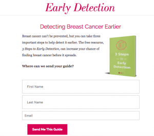
8. Add a call-to-action header and copy.
This one is easy to forget. But after you’ve explained why someone should accept your offer, you need to directly ask them to take action. Do this with a short header, and brief sentence or two. This experiment from National Breast Cancer Foundation is a perfect example of the importance of a call-to-action header.
Control

Treatment #1
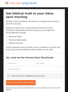
9. Use as few form fields as possible.
More form fields generally mean more friction and fewer conversions. So don’t ask for more information than you really need. Experiment #5847 is a great example where reducing the fields needed to register for an online course increased conversion by 8.9%.
Control

Treatment #1
10. Group form fields together to reduce page length.
The principle here is similar to number 9. We want this process to be as easy for the user as possible. Grouping form fields together can make it feel like you’re asking for less information, and in cases like experiment #4376, it can lead to an increase in emails acquired.
Control
Treatment #1

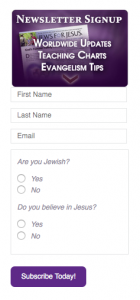
11. Consider adding qualifying questions to increase the user’s expectations.
Adding qualifying questions may seem counter-intuitive based on the previous two elements. But there are some instances where asking an additional question can increase the interest of the user and create an expectation that the offer on the other end of the form is of even greater value.
In experiment #2086, we saw that these clarifying questions gave more context for the email newsletter, and created an expectation that the content would be more relevant to them.
Control

Treatment #1
12. For supporting content, use testimonials or endorsements.
There are tons of different kinds of supporting content, but the two that consistently lift conversion rates are testimonials and endorsements. In experiment #6331, we replaced the online course schedule with testimonials from students and saw a 20% increase in registrations.
Control

Treatment #1
13. Add a privacy statement below the submit button.
Finally, ensuring that someone’s information will remain private and secure is a great way to relieve anxiety in the mind of the user. And it’s one of the simplest elements to implement.
Experiment #4354 helped us discover this principle. The original page had a privacy statement, and we wondered if it was actually introducing anxiety, rather than helping. When we removed the statement, it decreased conversion by 33%. We quickly learned that these privacy statements reassure skeptical users that their information will indeed be kept secure.
Control
Treatment #1

All these elements together led to a 448% increase in emails
All 13 of these email acquisition page elements have the power to increase conversion on their own. But they’re even more powerful when used all together.
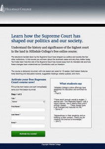
Harvest Ministries wondered if applying these principles to their free online course registration page could lead to an increase in conversions. They had many of these elements in place already, but for experiment #8531 they made 3 key changes based on the principles above:
- Removed the header-image and used a text-only headline.
- Added a relevant supporting image in-line with their copy.
- Added testimonials as supporting content (Although it may have been better if it was not in-line).
Control
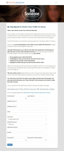
Treatment #1
By combining these elements together, Harvest saw a 448% increase in online course registrations.
Applying these elements to your own email acquisition page
You’re probably in one of two camps…either you have never intentionally focused on email acquisition and are starting completely from scratch, or you have an existing page (or pages) that you’re looking to optimize.
First…
No matter which camp you’re in, you’ll want to download the free PDF guide to the 13 elements of an effective email acquisition page. You can print it off, keep it at your desk, and use it every time you create a new page.
If you’re starting from scratch:
If you don’t have any email acquisition pages yet, my go-to tool for creating landing pages quickly and easily is Unbounce. They make it really easy to create pretty designs, test different variations of your page, and integrate into your email marketing tools.
Create a brand-new email acquisition page following these 13 elements as guidelines. Then consider testing a second variation where you focus your copy on a different aspect of your offer’s value proposition.
If you already have an email acquisition page:
Don’t go blindly make all these changes. If you have the capability, you should create a new version of your email acquisition page based on these guides and put it to the test. This will help you know exactly how much of a difference your changes are making. And if you get a big increase, it will help you report your success to your boss.
If you’ve never launched a test before, you can go sign up for a free Google Optimize account and set up a simple redirect test. Send half your traffic to your original page, and send the other half to your new page.
Keeping track of what you’ve learned
And after you let your experiment run for a few weeks, you can log your experiment in your own free research library at WinstonKnows.com. We initially built this tool for our own testing, and now it’s helping lots or organizations keep track of what they’re learning from testing and optimization.
If you put these elements to the test and find different results, I’d love to know about them. We’re always learning and want to be challenged by new research. You might discover something new that we haven’t seen yet. That’s what makes testing and optimization so much more powerful than following “best practices” – there’s always more to learn and more ways to improve.
Comments are closed.