

Why is nonprofit email acquisition optimization so important?
In our time researching and talking about this topic, a lot of people have asked us, “How is email acquisition applicable in the non-profit space?” The primary reason that growing the size of your email file is so important is this: email is the single largest source of online fundraising revenue for the vast majority of nonprofits.
Here’s what I mean:

It’s not a secret. Email is king when it comes to raising money online. The graph shown here is from one of our partners. The blue line represents traffic across all of their different traffic mediums, and the orange bar represents revenue. As you may have deduced, this organization has a very large email file. This is why email is the largest source of traffic.
But take a look at the relationship between the email traffic and revenue. Compared to the higher-traffic sources like organic search and direct visitors (none), revenue far outpaces traffic. Even compared to other direct response sources like mail, radio, DRTV, paid Facebook (newsfeed), you can’t get a better ‘bang for you buck’ as you can with email.
And here’s another client:

And another:

And another:

I hope you can see here just how important email fundraising is to these organizations. And just in case you’re not totally convinced, here are 4 quick stats that illustrate the impact that email file growth can have at a nonprofit:
- Offline donors can be up to 90% more valuable when you have their email address.
- Retention increases by 29% for offline donors when you have their email address.
- Multi-channel donors can be 212% more valuable for your organization than offline-only donors.
- Multi-channel donors have a 56% higher retention rate than offline-only donors.
So now the question is, how can you go about growing your email list? Well, you’re in the right place and reading the right post. Below, we’ll walk you through 7 proven ways that we’ve found to help grow the size and quality of your list but first, we have to start with…
Understanding the Value Exchange, Value Proposition, and Content Offers
When developing any sort of donor acquisition campaign, the first essential ingredient is an effective content offer. Without a good offer, you’ll have nothing to advertise to your likely donors. And if you aren’t capturing the attention of likely donors, you’ll never convert new ones.
So then, how do we create a winning content offer that will capture the attention of likely donors and influence them to give a gift?
Through our research and testing, we’ve identified three principles to guide you as you consider what kind of content offer to use for your donor acquisition efforts.
1. Your content offer cannot – and will not – appeal to everyone.
Not everyone is a prospective donor for your organization. We must understand this, or we’ll be continually disappointed.
For example, if you run a food bank in a specific city, you might create an eBook offer that explores the scale of poverty and hunger in your city. But this kind of offer won’t appeal to people who live in a different city, state, or country.
The key to success is defining who your likely donors are, developing an offer that will be relevant to them, and strategically targeting them with your advertising.

Demographic Targeting for Facebook Ads
We often hear stories of fundraisers who develop an offer like this, set up a Facebook ad campaign without any targeting, and then wonder why no one is clicking, downloading, or donating. And it’s because there are 1.8 billion active Facebook users – most of which aren’t interested in your offer.
2. Your content offer must deliver more value than it costs.
People aren’t looking for a reason to take your offer. People are looking for a reason to move on and do something else, especially on Facebook. So for an offer to be successful, it has to be higher in value than it is in cost.
You might ask “What cost does my offer have if I’m giving it away for free?” While there may not be a monetary cost for your offer, asking for someone’s name and email address creates cost. They have to give something up in order to receive your offer.
We also create cost when we increase the amount of effort it takes to get the offer. For instance, a petition has very low cost. Someone will read through your petition and sign their name to it by giving you their email address, all within a matter of seconds.

On the other hand, an offer like an online course has a very high cost. It requires the user to dedicate a significant amount of time in order to read, listen to, or watch the course. In both of these cases, the value of the offer needs to outweigh the perceived cost.
If we get this out of balance, and the perceived cost is greater than the value of the offer, you’re going to see very low conversion rates.
How perceived cost affects value
However, sometimes there needs to be a small amount of cost. We have found that the increasing amount of investment that someone spends on your offer has a significant impact on their likelihood to eventually become a donor.
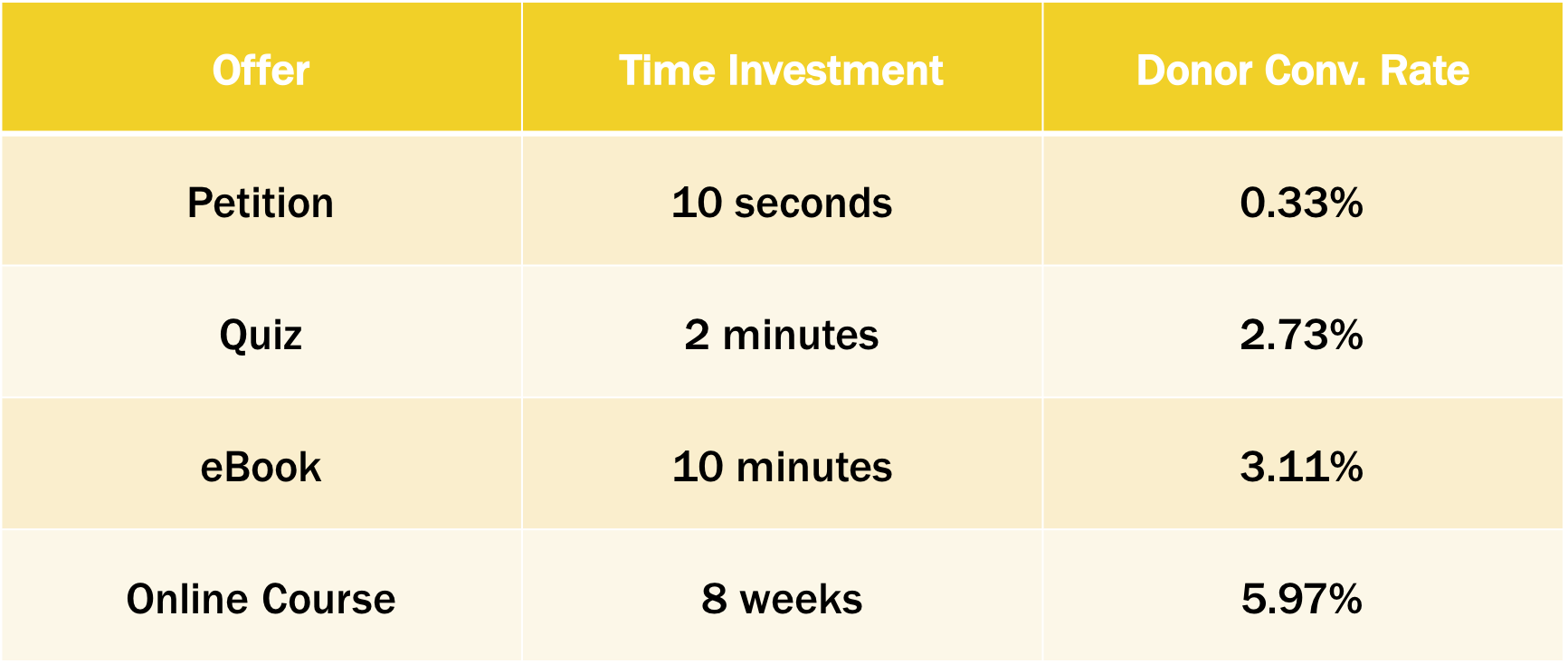
Petitions have very little investment and cost. They are great opportunities to get cheap emails because a lot of people will fill them out. But we’ve seen that the donor conversion rate is usually low.
A quiz requires a little more investment of time and effort, but they also require an added level of intellectual engagement. This helps people understand the problem to which your organization offers the solution. Because of this extra investment, we have seen a 2.73% average donor conversion rate with this type of offer.
An e-book might take around 10 minutes to read. But when people are willing to invest in that time, they have a much higher likelihood of donating. An online course can take several weeks, but it has almost a 6% donor conversion rate.
From this data we can draw the conclusion:
When people are willing to invest their time, they may be more willing to invest their money.
3. Your content offer must be relevant to your mission.
For example, it doesn’t make sense for a breast cancer awareness foundation or humanitarian organization to give away the Texas Almanac as a free offer. But this offer has meaning when it comes from the Texas State Historical Association.
There are all kinds of offers out there that you could give away, but you have to ensure that they line up with what your cause is about.
One of my favorite places to find an offer is to walk to the receptionist’s desk at a nonprofit organization. Most of the time there are pamphlets and written content like magazines or books that never make their way into the digital world. We can digitize those products and offer them because they have value packed inside.
Hopefully, these parameters help you begin to understand what it takes to create an effective offer. Target your offers to your ideal donor. Make sure your offer delivers more value than it costs. And make sure your offer is relevant to your mission.
Alright, now on to 7 ways you can grow the size and quality of your email list!
1. Writing Effective Copy
The most important factor that influences conversion is your value proposition. And the most important tool you have to communicate your value proposition is your copy. When writing email acquisition copy, clarity equals persuasion.
The goal is to communicate the value of the offer as clearly as possible.
Communicating your value proposition in email acquisition copy
Experiment #1621
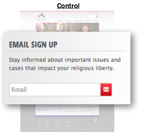 Our research partner for this experiment is Alliance Defending Freedom. The purpose was to test email acquisition copy on their homepage. This page was receiving about 12,000 visitors each month, and less than 1% were giving their email address.
The initial signup offer was very simple.
We decided to add a call-to-action in the headline. We changed the copy to sound like less a command, and included value proposition language to identify the benefits of giving an email address. Lastly, we added a button that communicated real value.
 The difference in the A/B split test was a 44.1% increase in the number of email signups.
Every interaction with a visitor is a potential for a value exchange. Maximize that opportunity by choosing the best potential way to communicate your value to the visitor.
Eliminating Copy that slows down your visitor
Experiment #2313
In some cases, optimizing your email signup offer by adding copy will increase its value. But sometimes there is too much copy on the page, and it needs to be condensed.
In the initial offer, there is a large block of copy for the visitor to work through before giving their email. We wondered if this slowed down the visitor’s ability to move through the form, so we removed it entirely.

The difference in the A/B split test was a 26.2% increase in the number of email signups acquired.
Choosing the right copy
Experiment #2606
More important than adding to or subtracting from your email acquisition copy is choosing the right copy. After our breakthrough on Experiment #1621 (our first example), we tested a few variations of language within the copy to see how it influenced conversion. Here’s what we tested:

We found that different language represented a different value proposition, and in this case, the treatment was less attractive to our audience. Conversion decreased by 29.5%.
What we love about continual and consistent testing is that, whether your conversion rates increase or decrease, you will always evolve your understanding of your donors and subscribers. Most importantly, you gain more insight into what they value most, and you learn how to communicate better. Your website shouldn’t be just a collection area. It should be a place where you can listen and pay attention to data!
Clarifying the process-level value proposition
Experiment #833
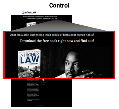 This experiment was for Good of All for an email acquisition campaign. Traffic was driven to this page from Facebook, and visitors were offered an e-book in exchange for their email address.
As you can see, the initial call-to-action focuses on what you need to do instead of what you can get.
We decided to nuance how we communicated the value proposition and add clarity. Instead, we addressed the reader as a “fellow world-changer” and communicated the value of the offer rather than the action required. Then we added an intriguing question to draw in the reader. Here’s what the treatment looked like.
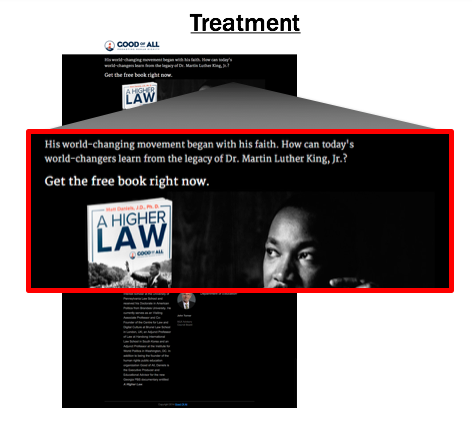 With these small changes, we received a 133.7% increase in the number of new emails acquired.
The goal of your copy – including the headline and call to action – should be to consistently and compellingly communicate value at every step.
Using visitor-focused language
Experiment #986
In this last example, we tested an email signup page for Hillsdale College. The purpose of the page was to get people to signup for their free course, “The Federalist Papers.”
We wondered if the word enrollment was a rough choice. For some, it implies filling out applications, or it brings back anxious memories of enrolling for classes at the start of a new semester. That wasn’t the picture we wanted to paint, so we decided to try a different approach.

We changed the call-to-action above the signup form, and left the remaining copy exactly the same. In comparison, activation suggests that the course is already in one’s possession; it only needs to be turned on, if you will. In contrast, enrollment suggests a series of work that needs to be done in order to access the course.
In an A/B split test, this treatment produced a 31% increase in the number of email signups received.
We discovered that activation language is a significantly more attractive way of describing what the user desires. Even if the internal goal is to get a user to enroll in the course, the user wants to activate the course immediately instead.
Wrap Up…
Each experiment above shows a different concept of manipulating your email acquisition copy. Overall, the elements you can test with copy are:
- Adding copy
- Subtracting copy
- Different value propositions
- Headlines
- Body copy
- Calls-to-action
The most important factor that influences your conversion rate is the value proposition. The words used to communicate that value are your most important tool. On every level of the page, the goal is to communicate the value of the offer as clearly as possible. Use copy to create some suspense within the readers to propel them forward into the page. Hopefully, these examples give you ideas to begin testing your own email signup offers right away!
2. Design an Effective Email Acquisition Landing Page
Your email acquisition page design should have just one goal: to facilitate the mental conversation between you and your visitor. If the design is too beautiful, it’s a distraction. If it’s too ugly, it’s a disgrace.
The goal is to strike a balance. The whole page design should focus intently on the offer that’s being communicated.
Using your email acquisition page design to clarify the header
Experiment #2684
In this example, we tested an element of copy – a header – that doubled as an element of design. We’ve noticed that it’s become somewhat of a website design standard to put a big block of imagery at the top of every page.
This page was for Hillsdale College as part of an email acquisition campaign. It uses a traditional page header that contains the headline for the landing page. Traffic was being driven to this page from a Facebook ad with a similar “We the People” design in the background and floating text to create congruency between them.
When we reviewed the page, we wondered if this design took up too much space. Was the key headline that conveyed the value proposition getting lost in the background?
To find out, we first removed the graphical header and created a new headline. This was Treatment 1.
Then, we created a second treatment. We still removed the graphical header but kept the headline exactly the same as the original page. This was Treatment 2.

Treatment 1 produced a 6.6% increase in conversion rate, and Treatment 2 produced a 9.2% increase.
For whatever reason – mental friction, distraction, etc. – we saw a lift in performance with both treatments by removing the header entirely and moving the headline into the content area. We created a tighter connection with the value proposition. After this, we began testing the headlines themselves and chose the one that conveyed a stronger value proposition.
The difference in these conversion rate percentages may seem minimal, but they’re meaningful because these are easy changes. Not every experiment on your email acquisition page design needs to produce huge results. Small changes like this get you one step closer to better conversion.
Visually reinforcing the value proposition
Experiment #1937
When a site has minimal traffic to begin with, testing small differences may not be the best place to start optimizing your email acquisition page design. When you have low traffic and small changes in conversion, tests normally take too long to validate.
Let’s look at a radical redesign example. This is an events signup page for Heritage Action for America. Traffic is being driven to this page from multiple sources, but primarily from Facebook and email. The goal of the page is to get people to sign up to attend their event.
As you can see, the initial page is text-heavy. It focuses on communicating the value of becoming an insider and gaining exclusive access to this special forum being held for the upcoming presidential election.
The treatment version of the page is radically different. We wondered if we could use images to enhance the value proposition for attending the event, so we added a full-color image of each candidate that would be present. Then we nuanced the copy and the primary value proposition to focus on accountability.

Even though a visitor may not want to see each of these candidates at the event, it does communicate more clearly the value of actually attending.
This change produced a 28.8% increase in the number of signups for the event.
Doing a radical redesign of your page might be a great place to begin increasing your conversions. Consider starting over with a completely different hypothesis than what the existing page is portraying, and then test the differences against each other. Of course, there is always the possibility that a hypothesis produces negative results.
Regardless of the outcome, you will be able to discover exactly why the hypothesis was right or wrong and adjust the page accordingly. Be sure to document each test result to learn from each one and to confidently make changes to optimize the page.
Increasing congruence between your email acquisition page design and your ads
Experiment #314
This is an email signup page we treated for the Hoover Institution. Traffic is being driven to this page from a Facebook ad in order to sign up to receive their newsletter, Strategika.
We used a long-form page and a two-column layout. As you can see, there’s a branded header, a clear call to action, and plenty of copy to communicate what a person will receive by signing up. Overall, the page was performing well, but we wanted to make it better.
Here is the Facebook ad that drove people to the signup page. As you can see, they look very different.

We wondered if that difference was causing cognitive friction for the visitor, and decided to test it. We created a treatment that follows the same stylistic approach as the ad to create congruency between them. We matched the background image of the ad, and took the brand – which was unfamiliar to the visitor – out of the headline. Then, we highlighted the credibility factors instead of showing unknown contributors. This treatment uses less copy, and follows the same design theme introduced by the ad.

The treatment produced a 39.2% increase in the number of email signups.
Not only did it increase conversion on the page, but we also reduced the cost per subscriber by 86%! This is because we were sending paid traffic from Facebook advertising to this signup page. Every boost in performance, in terms of conversion, means that it costs less per subscriber to grow the email file.
The key insight we learned from this experiment is that the site visitor is more likely to respond when the ad and the landing page maintain a consistent visual experience.
Wrap Up…
A well-balanced email acquisition page design is important. Review your page, and make sure that the entire design focuses on the offer that is being communicated. If it doesn’t, consider a radical redesign of your signup page, or adding congruency between several pages. The goal of the design is to facilitate the mental conversation between you and your visitor.
3. Think About Thought-Sequencing
Every time you ask for something – whether it’s a donation or just an email signup – you are entering a mental conversation with your visitor. To increase the potential for success, it is important that the thought sequence of that conversation take place in the proper order.
Briefly imagine if you were approached by a stranger on the street, and they said, “Hey, my name’s Tim. Can I have your business card? I’m going to call you later!”
You probably would give this person a weird look, and think, “No way, I don’t know you! Of course, you can’t have my contact information! Leave me alone.”
We would never give away something valuable to us, like our contact information, just because someone asks for it. The same is true online.
Not only does it matter how we ask, but the order in which we ask for someone’s information is crucial. When we ask for it out of order, we create anxiety in the mind of the person on the other side of the screen.
Reordering the elements of your landing page
Experiment #1692
This is an email acquisition page for an e-book offer for the Stanford Graduate School of Business. They have a good headline at the top of the page, and they use a three-column layout that mirrors their branding throughout the site. As you can see, they include third-party credibility indicators at the bottom of the page.
Do you notice any problems?

Notice your eye-movement as you work through page. A visitor has to read the copy in the first column, then move back to the top of the page to view the book, and then come back up again to complete the signup form. Up, down, up, down, up, down.
The horizontal layout forces you to slow down to work through the page, and affects the thought sequence leading to the final call-to-action.
We wondered if reorienting the thought sequence would affect the conversion rate on the page.
First, we put all these elements in a linear path from top to bottom of the page to create a more effective flow. We changed the headline to convey value, gave the copy contextual placement near the form, and moved the email acquisition form into the eye-path of the visitor. Then, we moved the book image and credibility indicators to the right column as supporting content. Below the first paragraph is the call-to-action restated as an opportunity to respond.

The treatment produced an increase in conversion by 10.8%.
Matching branding throughout the site is not enough. Each landing page must be optimized to maximize perceived value and minimize perceived cost.
Re-ordering the thought sequence of your landing page
Experiment #2472
This example is based on a similar concept.
The design below is something I call “above the fold.” For some reason, we’ve been taught to include all the important information in a header at the top of the page.

The “above the fold” idea was originally created for traditional newspapers so that a folded paper on a newsstand would still display the daily headlines. To see more, the reader has to physically pick up the paper and unfold it.
This problem doesn’t exist online, and yet, so often we follow this same practice! Scrolling up and down through a page is different than unfolding a newspaper, so our websites should function differently.
In this experiment, we reordered the elements on the page, removing the “above the fold” design and created a vertical sequencing path from top to bottom.

The treatment produced a 7.7% lift in conversion on the page.
Wrap Up…
Re-ordering page elements to create a top-to-bottom flow is a simple, easy change you can make on any page. Think of it like a real, face-to-face conversation you’re having with the person on the other side of the screen. The order of the conversation is crucial. Don’t jump the natural sequencing process and require too much too early.
Having a natural and logical thought sequence on your landing page is essential to reducing friction and anxiety on your landing page. But there are many other factors that can cause friction and keep your potential donors from taking that first step to connect with you.
4. Choose the Right Incentive
When choosing your email acquisition incentive, you must present something that the visitor perceives to be of greater value than their personal contact information.
What do I mean by an email acquisition incentive?
An incentive is an appealing bonus that increases the perceived value of your offer. It is used best in conjunction with a good value proposition. You could use e-books, white papers, downloads, access to a special resource center, signing a name to a petition, additional resources, articles, and so much more.
The incentive should inspire people to enter a value exchange.
Testing to determine the right incentive
Experiment #1355
In this example, we tested three unique incentives against each other using an email acquisition form for the Texas State Historical Association.

Visitors complete a ten-question education quiz over Texas history called “Are you Smarter than a Texas Seventh-Grader?” Each question was based on real material taught in seventh-grade classrooms throughout the state. It was designed as a unique way for people to experience their value proposition as an organization.
The goal of the final page was to present the visitor with an opportunity to learn more about the Texas State Historical Association. This page offered one of several prizes in exchange for an email address.
The initial incentive was a free chapter of the Texas Almanac. We tested this against Treatment 1, an e-book about the Battle of the Alamo. We also developed a second Treatment, a compilation of several scholarly essays produced through their Southwestern Historical Quarterly.
After conducting an A/B/C/D test, we discovered that Treatment 1 produced a 50% increase in conversion and Treatment 2 produced an 14% increase.

By running this split test with different incentives, we were able to identify what specific offer would be most appealing to our target audience. In doing so, the TSHA achieved increased acquisition in their campaign.
This is an easy way to evolve your incentive into the best possible offer for your audience!
Creating an Email Acquisition Incentive From Existing Content
You might be thinking you don’t have the right content to run tests like these. But the truth is, you probably do.
E-books are an excellent tool to use as an incentive! As we’ve conducted research, we’ve been amazed at how high their value is perceived. They have a low fulfilment requirement via email, and they cost very little to create.
You probably have plenty of content already in your organization: blog posts, articles, webinars, books, recorded speakers from past events, etc. Any content can be turned into an e-book and offered as a way to help grow and bolster your email file.
Wrap Up…
Most people don’t hand out their personal information just because you ask for it. And most people aren’t motivated to give you their email address just because you have a newsletter. An incentive can give someone a tangible reason to give you their contact information. And testing your way to the right incentive will not only help you get a higher conversion rate in your acquisition efforts. It will also help you grow a deeper understanding of the motivation of your target audience.
5. Create a Conversion Focused Form
The email acquisition form is both your best friend and your worst enemy. The amount and nature of information you ask for will determine which one.
How the amount of required information impacts conversion
This is a test we performed with Hillsdale College. They have a free publication called Imprimis that’s almost 40 years old, and can be delivered in a hard or digital copy.
Below is the name acquisition offer for this publication. Historically, this form required both an email and home address so it could be delivered both ways.
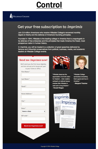 Hillsdale College thought that the number of required fields in the email acquisition form was contributing friction, and lowering the conversion rates on this page. For the treatment, the number of required form fields were reduced. Specifically, we removed the address information and removed an image of Imprimis issues.

The treatment produced a 136% increase in the number of email signups received! The conversion rate increased from 32% to 76%.
Truth be told, there is a downside to reducing the amount of information required on a form. When you ask for less information, the volume of names acquired typically increases, but the quality of the names is typically lower. If you have fewer fields, you typically have less friction which means that your traffic doesn’t have to be as highly motivated to convert.
When you ask for more information, the volume of names acquired may drop, but those who do convert will have a higher motivation – making them a higher quality lead.
It’s important to weigh the value of having both the email address and the postal address, and ask which is more important: having high-quality names or high volume?
By asking for only email addresses right away, you may see a lift in conversion through the form. This means you won’t receive their postal address right away, so you’ll need to find a different avenue to obtain it. It creates multiple ways of engaging and communicating with the person on the other side of the screen.
For example, you could send a follow-up email saying, “You just received the digital copy of this. Do you want me to send it your home? Just fill out your postal address here!”
How breaking up the email acquisition form into two parts affects conversion
Another strategy is to break the form into steps. This allows you to get more names and emails initially, and then you can customize those names and emails in the second step. It reduces cognitive friction for the user.
Here’s an example. This is a signup page for the Heritage Foundation’s President’s Club Event hosted in Washington D.C. 
As you can see, the form is designed as one long page. It requires all the information necessary to register for the event at once. Right away, the visitor is required to provide an enormous amount of information that takes time, energy, and immediate planning.
The visitor has to think through a lot of details to answer the questions on this form.
By requiring all this information up front, we were excluding a potential segment of the audience that planned to come but hadn’t figured out all of the details of attending.
For the treatment, we broke the form into two separate pages. The first page acquired the commitment to attend the event and the relevant contact information. The second page captured the rest of the event details.
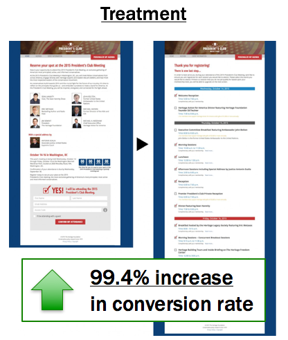 The treatment produced a 99.4% increase in signups for the events!
Wrap Up…
The strategies shown in these examples are the easiest places to begin optimizing your email acquisition form. Get rid of fields, change the types of fields required, and break the form into two steps. There are many more ideas that can be tested, such as combining the use required and non-required form fields. As you make changes to your forms, continue to test what works best for your target audience.
6. Place Your Offer in Proper Places
If you have a great offer but nobody can see it or find it then how can they evaluate if they want to sign up or not? Great offers must be found!
It seems that every time you go to a technology website, you get a pop-up ad about the latest and greatest gadget. Pop-ups are all over the internet, and now I almost expect them! Even though they are intrusive and annoying at times, they are extremely powerful in terms of their ability to help you get your offer in front of a captive audience. And from our research, we’ve learned that offer placement can be critical to the success of your acquisition efforts.
Pop-ups, slide-outs, take-overs: we all hate them, but they work!
How an alternate offer, given at the right time, increased emails acquired
Our first example was a test performed with Texas State Historical Association. Here is their actual email signup page for a Civil War e-book offer. By comparison, the page had a good conversion rate. But even so, the majority of visitors did not convert.

What happens if the visitor isn’t interested in the Civil War e-book? They start to exit the page. Instead of letting them go entirely, we created a pivot offer that would appear as soon as the visitor showed intent to exit, also known as an exit pop-up. This is a relevant but different offer that appears when the visitor brings the cursor to the left or right corner.
In this example, the exit pop-up offer was to receive a weekly email called Texas Day by Day. It offers education on the rich history of the state in bite-sizes pieces, conveniently sent to your email address every week.
The control has only one call to action. The treatment has a secondary call to action, but it displays only when someone indicates intent to abandon the offer or page.

The treatment produced a 36.9% lift in the number of new subscribers.
You might hesitate to take advantage of pop-ups because of how annoying they’re perceived to be. But, again, they work! There’s no harm in giving visitors another opportunity. Whether it’s when they first appear on the page or when they get ready to leave – you can redirect them with a completely different offer.
Relevant offers presented at the right time can increase conversion rate.
How a disruptive offer placement increased email acquisition
This test was done in partnership with Alliance Defending Freedom. We specifically wanted to test email acquisition on their active blog. It receives between 3,000-5,000 visitors each day, and each post ends with multiple calls-to-action. One call-to-action is to donate. The other call-to-action is to sign up for their email list.
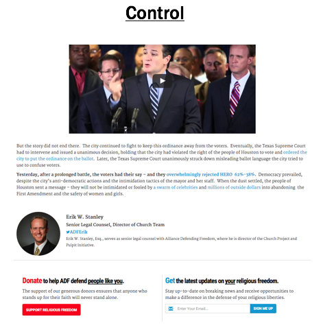
Data told us the email signup offer was more successful in than the donate option in terms of conversion. We isolated this email offer and created a slide-out ad. Our hypothesis was the offer placement was keeping most blog readers from seeing it.
In our treatment, we also included value proposition language that identified the benefits of giving an email. The button text was also changed to communicate more value. As the visitor scrolled near the bottom of the page, the subtle slide-out appeared from the right.

After conducting an A/B split test, we discovered a 523% increase in the number of new email subscribers by adding this more disruptive technique!
Wrap Up…
Compelling content by itself is not enough. We need to present our captive audience with timely, compelling offers. Yes, pop-ups are annoying. You probably hate them, and we do too. No one goes to a website hoping one will appear. But there’s a reason why we use them: they’re powerful!
Sometimes there needs to be a disruption on the page that will position our offer to the right person at the right time. There are a lot of ways to create more opportunities to grow your email file with this strategy. The goal is to create more traffic to your email signup offers, which will increase the total number of net subscribers onto your file.
7. Collect Emails Offline
One of the easiest ways to grow your of email list, particularly if you’ve been doing a lot of offline work, is to simply start asking for, collecting, and importing emails from offline sources.
If you send direct mail out, add a field that asks for email when people send in their donations. Do you do events? Have an email field when people buy tickets online with an opt-in or on their pledge card when/if they donate. Have sign-in sheets at volunteer training and gatherings. Pretty much anytime you get together, try to collect email addresses (properly) and import them into your database and email provider.
It’s a good idea to send them a welcome email or two when you do just so they are aware you’ll be sending them content and they can unsubscribe at any point.

Get More Resources
You can download the PDF version of this post by filling out the form below:
You can also go deeper with one of our courses or find more related blog posts here. And if you have any questions about this or as you go, feel free to email us at hello@nextafter.com. Good luck!