

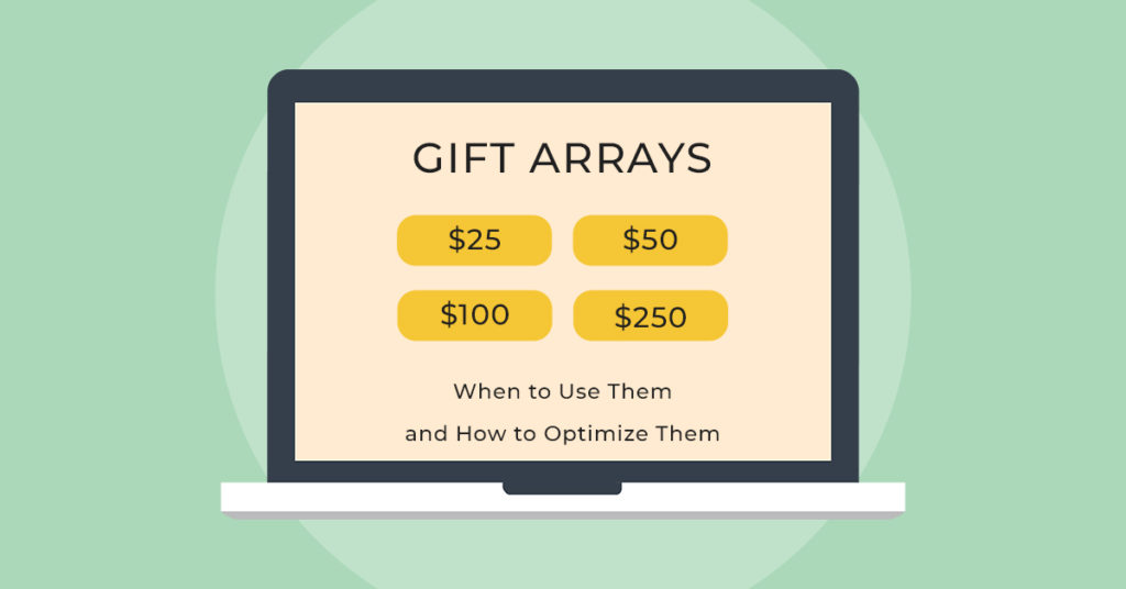
If there is one thing that is almost entirely unique to the world of nonprofit websites (compared to the for-profit companies I have assisted for the past 10 years), it is the part of the donation form we call the gift array.
This is also referred to as an ask array, an ask ladder, or suggested gift amounts. This assembling of giving options (or buttons, depending on the site) seems to be a common staple on just about everybody’s main online donation form.
In the for-profit world, we really only see this in buying gift cards. And though a gift is about to happen, the situation is different as it is expected that there will be some sort of product/service that comes with that. So here’s my question:
Has anyone really asked why we use gift arrays in the first place?
Why not just let donors tell us what they want to give? Chances are, we put them there because someone once said that they inspire people to be more generous, or to give when they wouldn’t have. And actually, that may well have been true for a given situation and time.
Does a gift array, and its presentation, really have any impact on generosity RIGHT NOW? Is it OK that fundraisers default to using gift arrays? And is it OK that gift arrays start with a higher amount rather than a lower amount?
Why do many gift arrays go from high to low?
While working on a recent online fundraising research study, we noticed that a) organizations are all about using the classic gift array and b) a LOT of organizations like to start with HIGHER amounts first in the eye-path.
Here is an example (left to right):

Or a mobile example (top to bottom):

Why would you start with a higher amount? What is the logic?
“Well, it’s going to encourage people to give more,” someone thought, “because higher amounts are presented first as their options…and by emphasizing giving more we will convince them to give more!”
Is that how we really think of our donors?
The real question we need to ask is this: what effect does the gift array’s presentation truly have on individuals who are contemplating a donation? Does it really affect them?
Obviously some people will not care and make their donations regardless. But if there is a large enough group of people that DO care, I wouldn’t want to lose them at this donation opportunity (and possibly forever) because of my array presentation.
Testing the Order of the Gift Array
We wanted clear answers, so we put it to the test.
One of our partners, CaringBridge, offers free personal, protected websites for people to easily share updates and receive support and encouragement from their community during a health journey. Here is what their gift array on most of their donation pages looks like:
The Control (original)
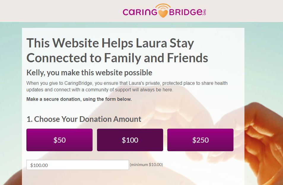
The control (original) uses a rising suggested amount approach, starting with $50 on the left (assuming visitors in this case naturally read left to right) and ending with $250 on the right. On mobile, it stacks on top of each other with the lower amount first.
The Treatment (test version)
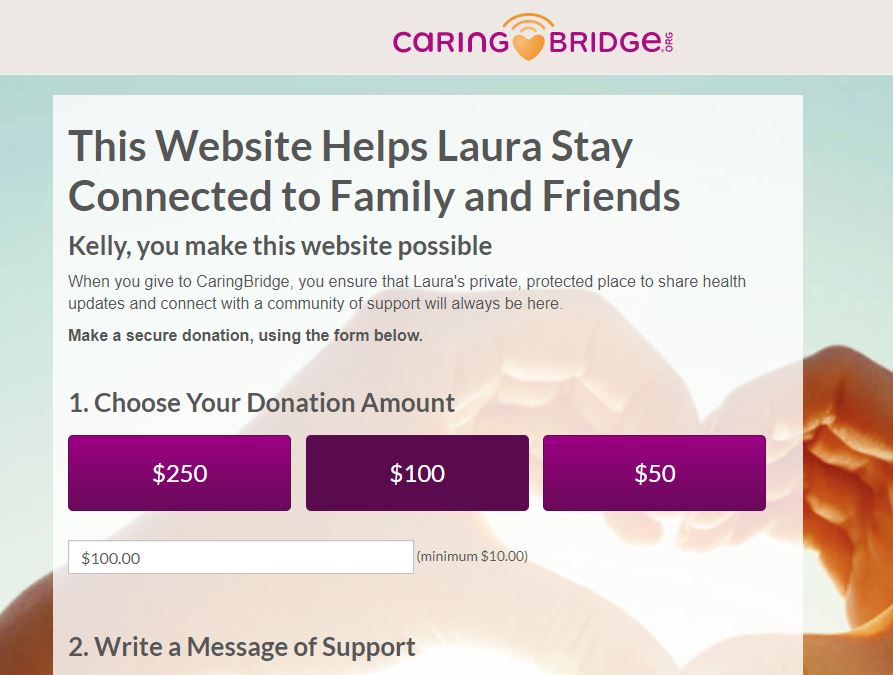
For the treatment (or the test version), we switched the $50 and $250 options, so that people reading left to right would see the HIGHER option FIRST. And the same in mobile… the higher amount was stacked first.
The Results
So what was the result?
The treatment’s high-to-low emphasis approach achieved a whopping 15.7% DECREASE in donations, and an 11.3% DECREASE in Average Gift size, resulting in a total 25.2% statistically significant DECREASE in revenue. You can see the full results and write-up here.
By showing the larger amount first, many visitors were LESS likely to donate, and LESS likely to give in larger amounts.
And that was the ONLY change. Nothing else. But why?
Why does the gift array order affect donations?
“We have found that people give to not-for-profits not as faceless organizations, but humanize them as people…” -Josh McQueen
It is possible that people see your gift array as more than just a gift options. They also see the way in which you present the array as a point of communication from you, much like how body language communicates in real life. If this is the case, then let’s examine what this high-to-low approach subtly communicates to someone:
- Lower amounts are less acceptable.
- “Sure, we’ll TAKE your donation, but we might not appear as happy about it, or, we really don’t prefer the lower amounts… that’s why they’re last… duh.”
This would explain the drop in completed gifts altogether. Some people (to the tune of 15.7%) probably felt that their small gift wouldn’t be appreciated, simply because it was at the bottom of the list. It would be no different if the gift array started at $500 and moved its way up the ladder to $5,000.
“Anything less than $500 isn’t significant,” the array says. Even though any gift is better than zero, that is not communicated here. When the gift array is ordered from high to low, the lower gifts are devalued psychologically.
But wait… shouldn’t the average gift amount have at least gone up??? After all, we are emphasizing larger gifts, so even if we lose some donations, the larger gifts should have made up for it. That’s the fundraiser’s mindset, not the donor’s. To that stereotypical fundraiser, it’s money-ball, statistics, number crunching… winning the game. To the actual person giving the gift, it’s something entirely different.
Gift arrays from the donor’s perspective
Let’s think about the donor that wants to give $50.
When the array is presented high to low, a $50 donation ALREADY looks bad. If the donor upgrades to $60 or $75, what difference does that make?
According to the high-to-low gift array, the organization doesn’t really notice. They notice the big gifts, so there is no additional benefit to the donor to give a little more because it seems like the organization doesn’t want it or care.
What about the low-to-high gift array?
So back to the $50 giver. The first option they see is the lowest – $50. And they are thinking… “You know, I really appreciate this organization so much… how about I give a little more?” And all the sudden that increase in giving becomes an UPGRADE.
Now the donor feels like their slight donation increase just morphed into a mid-tier gift, instead of being an “unappreciated low tier gift.” The gift rose above what appears to be what the organization deems as desirable. (We often interpret the first option as what is considered desirable and acceptable, similar to how we interpret a body that leans into a conversation as interested).
The big takeaway
“Users [of digital experiences] will infer a psychology whether or not the designers intended this. For this reason, I believe designers must embed appropriate psychological cues.” -Dr. B.J. Fogg
Your donation page carries a conversation with the person whether you like it or not. People read into this stuff!
It is our responsibility to make sure our digital experiences communicate how we truly feel about our donors: deep appreciation. And if we truly don’t want to accept someone’s lower donation amount and only want donors willing to give a minimum large amount, then we get what we deserve.
This was originally published on npENGAGE and can be found here.
Comments are closed.