

Is your donation page suffering? Does it fail to raise the money your nonprofit needs? Learn these 7 secrets to create a donate page that’s optimized to work!
If you want your donation pages for fundraising to be more successful, then this powerful guide is for you!
It’s totally stacked top to bottom with tons of valuable info that’ll make your donate page more appealing to donors and increase your donations online. But we didn’t learn the 7 secrets we’re about to share with you overnight….
Our fundraising optimization team at NextAfter has spent many years performing hundreds of experiments to create the best nonprofit donation pages!
So everything you’re about to learn is backed by years of real research, data, and proven to work.
It’s why we know you’ll love the actionable advice you’re going to get!
Here’s a preview of what you’ll learn inside this helpful guide:
- 7 donation page optimization secrets that’ll transform your donation page into a donation magnet
- Formulas to help you write effective headlines, intro copy, body copy, and call-to-actions
- Expert insights along with tips, strategies, and ideas to try (that you’ve never thought of)
- The #1 biggest mistake you must avoid with your donation page
- 1 extra secret (at the very end of this guide) that’ll change the way you think about donation pages forever
Plus, you’ll also get free access to…
- 7 donation page examples that’ll ignite your imagination
- 1 amazing donation page template you can get right here!
By completing this guide…
You’ll finally understand how to create the best donation page for your nonprofit organization and you’ll never wonder “what should a donation page say” ever again.
Are you ready to learn 7 secrets that’ll instantly optimize your donate page?
Here you go…
Secret 1: Optimize The Header
The header of a donation page should help you gain a donor’s trust and make them feel safe about donating online.
It does this by instantly telling people who your organization is and whose website they’re on, so they know exactly who their money is going to!
A quick solution to help donors feel reassured about these things is to make sure your header is optimized.
The best part is you can do this less than two minutes!
How To Optimize The Header Of A Donate Page
To optimize the header of a donation page, we recommend you do 3 things:
- Keep it simple in appearance
- Remove all navigation links
- Remove the donate button
For Example…
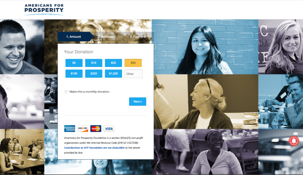
In experiment #4903, one of our client’s donation pages used a header with a large navigation menu that included their logo and a bunch of links for people to click on.
In fact, this was the exact same header on every other page of their website.

The Problem
The links in the header made it easy for people to visit other parts of the website, like the blog page, events page, etc.
As a result, people who clicked the links actually left the donation page and didn’t donate.
This was a big bummer for the client!
It’s exactly why links never belong in the header of a donation page.
The Solution
The optimization team at NextAfter removed all of the navigation links from the header.
We also got rid of the Donate link, too (since people were already on the donation page).
Only the logo remained in the header.
After we made this quick and easy fix…
The result for the client was a 195.1% increase in donations!
Impressive stuff, right?
What You Must Know…
The header you use on your website and donation pages should not be the same!
If you want to see a significant increase in your donor conversion rate, simply eliminate all of the navigation links including the donate button from the header of your donation page.
It’s one of the easiest and overall fastest ways to optimize any fundraising page.
So please, try it out and let us know how it works for you.
Now that you know a couple of things to remove from your donation page…
You should also know what to add!
One easy thing we suggest you try is including a background image!
Because as they say…
One picture is worth a thousand words.
The right background image could also be worth thousands of extra donations, too! We have compiled 19 tips for improving your donation pages for fundraising. Take a look!
Want to know how to find the best one for your donation page?
Keep reading and we’ll satisfy your curiosity….
Secret 2: Optimize The Background Image
The background image of a donation page should communicate your mission to donors and help them feel an emotion that motivates them to give.
Although some donation pages will actually perform better with no background image…
Some perform much better with them!
If you decide to use one…
You should know the most successful background images portray one of the following things:
- Who or what a donation will benefit
- The positive results of making a donation
- The negative results of not making a donation
- Why donors should urgently give now
- How generous with money donors should be
The persuasive power a picture can pack is truly unfathomable, but not unpredictable!
You can optimize your background image by choosing one that conveys the right message!
How To Optimize The Background Image Of A Donate Page
To optimize the background image on a donation page, we recommend you try 3 things:
- An image related to your mission, or…
- An image related to your value proposition, or…
- An image related to the people who are directly impacted by donations
For Example…
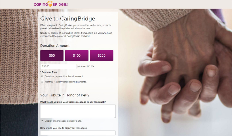
In experiment #2569, one of our client’s donation pages had a background image which showed a person’s hands raised high in the air.
Their fingers formed the shape of a heart that was superimposed on a visible sunlit sky in a scenic backdrop.
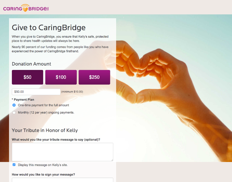
The Problem
The background image didn’t fully resonate with donors.
It failed to depict anything about the nonprofit’s mission.
Nor did it represent the nonprofit’s value proposition (a reason why someone should donate).
The background image was just too vague.
Ultimately, it didn’t convey anything meaningful to potential donors.
This conundrum begged the question…
What image would convey the right message and stimulate donors to give to this nonprofit?
It turns out, we only needed to consider one thing…
The nonprofit’s mission.
The Solution
It was clear.
In order to find the best background image for our client…
All we needed to do was find a picture that portrayed the concept of their mission which is “to connect people during life’s most difficult times.”
So we brainstormed together and finally found something that matched…
A closeup shot of two people holding hands.
Makes perfect sense, right?
The next thing we did was test the photo as the background image on our client’s donation page and wait a few days to see how donors responded.
When the results came back to us, we were all pleasantly surprised.
By only changing the background image…
The donor conversion rate jumped by 19.8%!
So we jumped for joy.
Wouldn’t you, too, if you could get more donations this easily?
What You Must Know…
A background image that can impact your donors’ imagination will help them empathize with your organization’s cause in fractions of a second.
This happens because images have the power to stir up people’s emotions in ways that words can’t!
So be mindful of this if you use a background image for your donation page.
If you do use one, choose a background image that portrays the people (or thing) your nonprofit serves, and make sure it helps donors visualize the positive outcome of a donation (or the negative outcome of not donating).
When you finally do discover the perfect background image that has a natural and strong emotional appeal…
It’ll seem like magic when more donations suddenly begin to appear, as if they came out of nowhere!
POOF!!
Do you know what else works like magic to increase donations?
Optimizing the design of your donation page.
However, you should know that not every section of it needs a pretty makeover.
To know which design changes will work to increase your donations…
Read onward…
You’re just a few seconds away from finding out!
Secret 3: Optimize The Design
The design of a donation page should make things easy to read for donors, show them where or where not to look, and be used strategically so people aren’t distracted from giving a donation.
The elements of design can include:
- Images
- Size and color of text
- Space between text (line height)
- Special font
- Background color
- Bullet points
- White space (space around the elements)
…and more!
All of these design elements have an affect on your donor’s ability to reach the donation form and can impact their motivation to give.
In order for your donation page to present a wonderful aesthetic appeal…
You need to consider how to optimize the design of (1) the header and (2) everything below it.
How To Optimize The Design Of A Donate Page
To optimize the design of a donation page, we recommend you do 2 things:
- Avoid over-investing in the header’s design and K.I.S.S. (Keep it simple, silly!)
- Ensure everything below the header is easy to read and visualize
How do we know these are good suggestions that’ll improve your donation page?
We’ve tested the design of multiple donation pages to uncover the truth and find what does work and what doesn’t work!
For Example…
In experiment #5641, a nonprofit client of ours was using donate page with a very simple blue header with a plain white logo positioned on the middle-left side.

See there?
We told you the design was simple.
The Problem
We weren’t sure if there was an issue with the header’s design.
However, our client gave us permission to perform a quick experiment, so we could determine if changing its design had any major impact on donations.
We wondered…
Could an updated header with a sleek design entice people to read more of the donation page, or somehow evoke more generosity and donations?
This question shaped our hypothesis:
Perhaps donors could indeed be dazzled with a better header design.
Testing this idea was the only way to find out!
The Solution
We swapped the old logo for one that was deemed to be more eye catching.
Then, we repositioned this new logo to the top-left corner of the header (away from the center).
Finally, we added a teal-colored transparent background image in the header that was representative of the client’s nonprofit organization.
Sweet.
The newly designed header looked much prettier now!

However, we received some surprising results about this donation page we’d given a facelift.
Compared to the original donation page, the donor conversion rate of this one stayed the same.
Thus, we concluded that donors aren’t influenced by the design of a beautiful header…
However, the design of everything below the header absolutely does impact donations!
You’re about to find out why….
We tested the design of a different donation page for the same client.
(Because we’re always testing to see what works best!)
But this time around, the majority of the design changes we made were below the header.
Here’s a few examples of the changes we made:
We compared the newly designed donation page to the older version, and looked at the results.
We had a clear winner!
The donation page with the superior new design received a whopping 85.1% rise in revenue (due to a 67.7% increase in donor conversion rate and a 54.1% lift in average gift amount!).
We also had a clear answer to the question:
“Did a better design (below the header) have a major impact on donations?”
It totally does!
Here are some of the design changes we made to improve the donation page:
- The headline and subheading text was emboldened and its text was enlarged in size
- The donor testimonials were given a bold typeface and a bluish text color
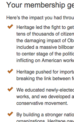
- We replaced bullet points with red checkmarks
As you can see, it’s often several little things in design that can make the biggest difference in the performance of your donation pages.
We proved it!
What You Must Know…
Donors don’t care about extra design elements in the header of your donation page.
And if they don’t care…
You shouldn’t either.
So you can stop wasting time trying to make your header look amazing.
However, donors do care about how easy it is to read and scan your donation page, so…
You should optimize its design for legibility!
This will reduce the reading friction for donors…
Which makes it much easier for them to reach the donation form (and give to your nonprofit)!
Now, since we’re on the topic of reading…
You should focus on creating a powerful headline and subheading for your donation page, too!
Secret 4: Optimize The Headline & Subheading
The headline and subheading of a donation page should capture a donor’s eyes and pull on their heartstrings, so the first things they read immediately capture their attention and make them feel an urge to donate.
This will make your donors want to stick around to read the other info on your donation page.
By optimizing your heading and subheading, you can achieve this desired outcome!
Here, we’ll show you!
How To Optimize The Headline & Subheading Of A Donate Page
To optimize the headline and subheading of a donation page, we recommend you do 2 things:
- Clearly and briefly describe the effect of someone’s donation
- Make an emotional connection with your donors using imagery or personalization
For Example…
In experiment #4164, one of our clients donation pages was personalizing them by automatically adding the first names of its beneficiaries to the headline.
So if someone’s name was Kelly, then the headline on the donation page would simply read, “You Make Kelly’s Website Possible.”
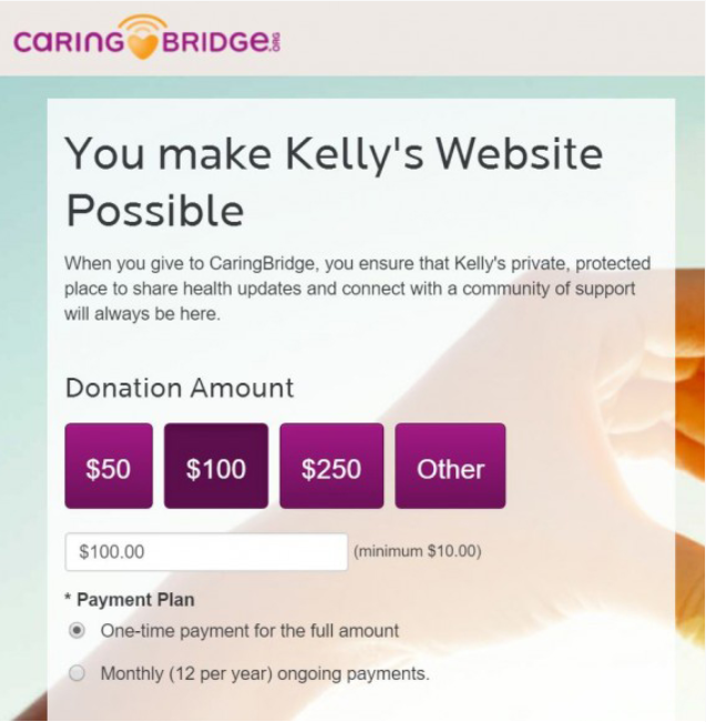
The Problem
The headline was too generic, misleading, and it was unclear how donations would impact Kelly.
As a result…
Donors were led to believe their money was helping the organization’s website remain online…
Instead of assisting Kelly’s journey to better health and giving her access to community support.
Since Kelly’s real cause wasn’t clarified in the headline, people weren’t interested in donating.
The only thing clear was that the donate page was underperforming and failing to raise money.
So here at NextAfter, we formed a hypothesis that helped us fix the issue fast.
The Solution
The NextAfter optimization team proposed a new headline, “This Website Helps Kelly Stay Connected To Family & Friends.”
This would certainly make it clear how donations would impact Kelly’s life and well-being.
But that’s not all we changed…
We moved the original headline, “You Make Kelly’s Website Possible”, to the subheading.
Then, we tweaked the wording so it addressed every potential donor by their first name.
So if someone named Jeff visited the donation page, the subheading would read, “Jeff, You Make This Website Possible.”
Now potential donors, like Jeff, would become emotionally connected to Kelly’s cause.
Take a look for yourself!
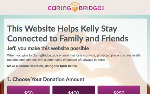
By making these couple of changes to the donation page…
The donor conversion rate went up by 21.2%!
Overall, the new headline and subheading were a big success.
We were thrilled about it — and so was our client!
Formulas To Write Your Headline Copy
Formula 1:
“This Website Helps [who or what is helped by donations] [benefit #1]”
(Note: You can replace “This Website” with the name of your organization if it makes sense.)
Formula 2:
“Providing [benefit #1], [benefit #2], and [benefit #3]”
Formula 3:
“You can make sure that [who or what is helped by donations] does not [negative outcome]”
Formula 4:
“You can save” [who or what is helped by donations] from [negative outcome] 365 Days a Year!”
Formulas To Write Your Subheading Copy
Formula 1:
“[Name of donor], You Make [effect of donation] Possible.”
Formula 2:
“A [$ amount] donation to [name of organization] supports [who or what is helped by donations] for [number of days, month, years]. Will you make a gift to ensure that [benefit #1]?”
What You Must Know…
Too often, a donation page will ask people to donate without mentioning the impact of the gift!
The words people read on a donation page may also not provide enough imagery or personalization to pull on the heartstrings of donors…
So they won’t be able to make an emotional connection when it comes to the idea of donating.
Unfortunately, these silly mistakes will cause even the most generous donors to keep their wallets in their pockets and resist being charitable.
So don’t be shy!
Be upfront about the effect a donation will have at the very beginning of your donation page, right there in the headline and subheading.
When you provide this quick clarity, your potential donors will do at least 4 things:
- Understand the value of their contribution
- Believe their goodwill is going to make a specific change in the world
- Trust what the nonprofit organization says they’ll do with their donation
- Feel comfortable donating since they can easily imagine the effect of their donation
Once you successfully hook your donors with a brilliant headline and subheading…
You can easily progress the conversation with them on the donation page…
By reeling ‘em in with some carefully crafted intro copy!
Secret 5: Optimize The Intro Copy
The intro copy of a donation page should introduce your general value proposition.
This explains to donors why they should give to you and reveals the effects of a donation.
Since the intro copy is just a short block of text meant to stimulate a donor’s initial interest…
You should avoid going into too much detail here.
After all, it’s just an introduction that allows donors to get a preview of why they should donate!
It of course needs to be optimized, too!
How To Optimize The Intro Copy Of A Donate Page
To optimize the intro copy on a donation page, we recommend you do 4 things:
- Always be clear and concise (It’s the ABC’s of copy writing!)
- Use a maximum of 6 sentences (anything over is overkill)
- Mention 1 specific undesirable event and main problem that a donation will help solve
- Mention 3 effects a donation will create so donors know the outcome of their contribution
For Example…
In experiment #900, one of our client’s used a donate page with no intro copy on it.
The only thing donors would see is a call-to-action that asked them to give to the organization.
The Problem
Without intro copy, donors couldn’t understand why they should give.
They weren’t aware of the specific problem donations would solve…
It was also unclear exactly who a donation would help.
The donation page basically just said “Gimme your money!”
But there was no incentive to do so.
In order to fix this issue with intro copy…
We realized we’d have to start from scratch!
The Solution
We asked our client one simple question:
“When someone donates to you, what is one specific outcome?”
The answer they gave us demonstrated why donors should give to their organization.
We knew if the intro copy demonstrated this…
Donors would feel more confident and eager to donate!
Once we added the intro copy to the donation page…
Our client quickly saw a 28% increase in donations!
The intro copy worked like a charm!
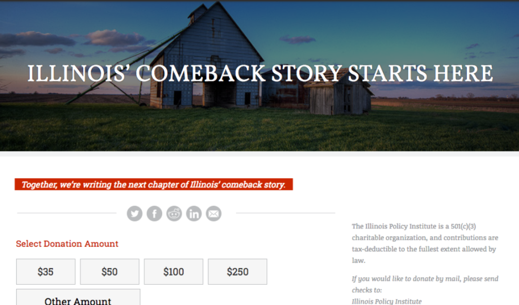
For another client and experiment #6623, we took a radically different approach.
We totally scrapped the single line of intro copy highlighted in red, and we did this instead…
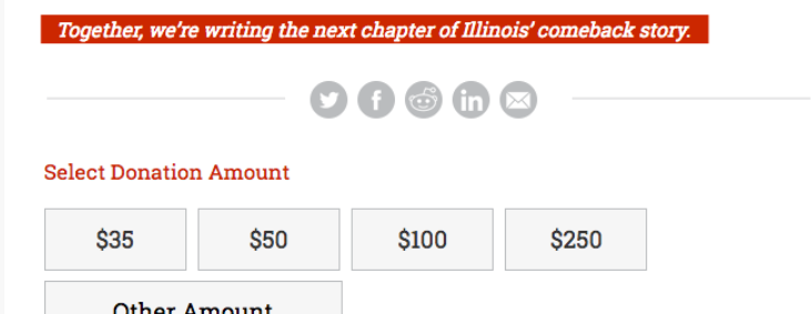
We told donors the beginning of a story that was connected to the nonprofit’s mission!
The details of the story included a relevant chain of events:
A tragic event that caused a problem the nonprofit could rectify with a solution.
Here’s how this story read…
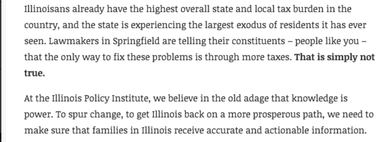
In case you missed it…
The tragic event is mentioned in the first sentence which tells donors this:
Illinoisans are living in a state with the highest tax burden in the country, so residents (taxpayers) are leaving the state to go live elsewhere.
The problem is mentioned in the second sentence which tells donors this:
The state’s lawmakers are misinforming citizens that raising taxes is a good thing.
The nonprofit’s solution is mentioned in the last sentence which tells donors this:
Families in Illinois need to receive accurate and actionable information.
Now the client had effective intro copy!
The words it contained engaged donors.
It aroused their interest.
And it made them curious to find out why they should make a donation.
Ultimately, it pulled donors into a story they couldn’t help but want to read more about!
Smart, right?
Once we added the new intro copy to the client’s donation page…
They had a 150.2% increase in donor conversion rate!
Again, this was only made possible by telling donors a story they couldn’t refuse to read!
Formulas To Write Your Intro Copy
Formula 1:
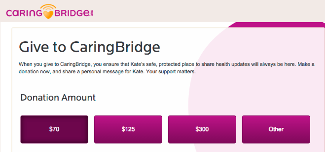
“When you give to [name of organization], you ensure that [effect #1], [effect #2], and [effect #3]. Make a donation now. Your support matters.”
Formula 2:
Paragraph 1
[Describe a tragic/important event that’s happened or still happening]
[State the main problem or the most obvious negative effect this event caused]
Paragraph 2
“At [name of organization], we believe in/that [your philosophy that’s specifically related to solving the problem in sentence 2].”
“To [support word] [result #1 your organization wants], to [result #2 your organization wants], we need to [solution/action that will cause results #1 and #2]
Try both of these to see which one helps you get more donations!
They’re bound to work!
What You Must Know…
As we mentioned, the best intro copy will pull your donors into a story they’ll love to read.
However, it’s also important for you to tell them a story they can actively play a role in!
By emphasizing to donors they must become involved in your nonprofit’s mission…
They’ll feel an urgent call of duty to help you by donating.
It’s why your donors are the story’s hero.
In fact, you need to help them understand their role when they read the body copy, next!
Secret 6: Optimize The Body Copy
The body copy of a donation page should prove to donors that your mission is their responsibility.
It needs to focus on your organization’s role, what it stands for, and how it hopes to change the world.
Then, it needs to explicitly reveal the donors’ role and that it’s up to them to make good change happen!
Articulating these things in your body copy is absolutely advised.
The optimization tips below will help you!
How To Optimize The Body Copy Of A Donate Page
To optimize the body copy on a donation page, we recommend you apply the 3 R’s:
- Remind donors about the real-world impact your organization is making
- Reassure donors why they should donate by giving them great reasons to donate
- Reveal to donors that your mission ultimately relies on their generosity and donations
To further optimize the body copy on a donation page, we recommend you do 4 other things:
- Begin with a transitional statement that connects the intro copy to the body copy
- Stick to a concise, general, bulleted message (after the transitional statement)
- Avoid excessive explanation copy and narrative (so donors don’t get lost in the details)
- Use a maximum of 6 sentences (remember, anything over is overkill)
While this may seem like a lot to remember or follow through on, you can (and should) do it.
Many of our most successful clients already have!
For Example…
In experiment #6623, a client of ours wasn’t using any body copy whatsoever on their donate page!
As a matter of fact…
After the headline and a single line of intro copy, donors were told to select a donation amount.
The Problem
Without any body copy, donors couldn’t…
- Be reminded what the organization does…
- Recall how the organization makes the world a better place.
- Feel reassured about the organization’s role or capabilities to change the world.
Without any body copy, donors also couldn’t…
- Be reminded the organization’s mission was only made possible by donations.
- Recall how important the role of a donor truly is to the organization
- Feel responsible to take action and drive change in the world.
Overall, the donor wasn’t told how they must be the hero in the nonprofit’s mission.
This needed to change.
The Solution
We thought about the answers to 4 questions.
- “What does the organization do?”
- “What impact does the organization hope to make?”
- “How exactly is the organization creating this impact?”
- “Who or what is the main beneficiary of the impact they want to make happen?”
That’s it.
Next, the answers we arrived at were plugged into a formula for writing effective body copy.
At this point, we simply added the optimized body copy to the client’s donation page.
BOOM!
The body copy increased the donor conversion rate all the way from 2.5% to 6.3% !!!
As a result, the amount of donations the organization received more than doubled!
How amazing is that?!
All we had to do was conclude the story by reminding people about two things:
The organization’s role and how important a donor’s role is!
Formula To Write Your Body Copy
Formula 1:
Transitional statement
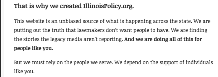
“This is why we created [name of organization or website]”
Paragraph 1
“This organization is [what your organization or website is]. We are [what impact your organization is making]. We are [how your organization is creating this impact]. And we are doing all of this for [you, the people, place(s), or thing(s) your organization will impact].”
Paragraph 2
“But we must have your help to accomplish our mission. We depend on the support of individuals like you.”
What You Must Know…
Writing extraordinary body copy for your donation page will become easy for you.
It just requires a little bit of practice, testing, and tweaking until you find what works best!
In fact, you’ll be well ahead of the curve if you just know 3 things:
- The purpose of the body copy (which we’ve explained)
- The 4 key questions you’ll to need to address (which we showed you in the formula)
- How to answer those questions in very short sentences (because concise is nice!)
Overall, the body copy assigns the responsibility of being a hero and doing good in the world…
To your donors!
Once you help them realize this is the true role they can play in your mission’s story…
Your donors will be convinced that making a donation isn’t just something you want them to do…
They’ll believe it’s the right thing to do.
So they’ll have all the desire in the world to donate!
You can easily evoke this mindset in your donors by learning how to write better body copy.
Lucky for you, we’ve given you everything you need to get started.
You’ve got this!
Secret 7: Optimize The Call-To-Action Copy
The call-to-action copy of a donation page should persuade your donors to mentally commit to giving you a donation before they fill out the donation form.
It should also laser-focus the donor’s mindset on the action you want them to take.
Learning how to optimize your call-to-action will help you achieve these goals.
How To Optimize The Call-To-Action Copy Of A Donate Page
To optimize the call-to-action copy on a donation page, we recommend you do 3 things:
- Provide a single call to action that reinforces the impact of giving a donation
- Include a support word (help, keep, save, change, rescue, protect, transform, support)
- Make your donors feel like they are pledging to do something specific
While not mandatory, you can try 4 other things to optimize your call-to-action copy, too!
- Include a numeric goal that describes how many people will benefit from donations
- Use imagery so donors can visualize the real-world outcome of their donation
- Experiment with all capital letters
- Create a sense of urgency
For Example…
In experiment #641, our client was already using great CTA copy on their donate page…
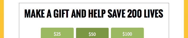
They had a single call to action at the end of the body copy (and directly above the donation form.)
It included a number to describe how many people would benefit from donations.
It used all capital letters to help make the call-to-action a main focus of the donation page.
The Problem
There wasn’t necessarily a big problem with the call-to-action copy.
But in truth, we knew it could be improved with just a few little tweaks!
Like always, the goal was to help the client raise their donor conversion rate!
And we believed we could do it — and we ultimately did with the changes we made!..
The Solution
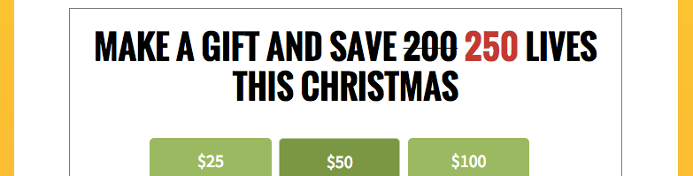
The first change we made was quite clever…
We used strikethrough text, j̶u̶s̶t̶ ̶l̶i̶k̶e̶ ̶t̶h̶i̶s̶ , to cross out the original number that described how many people would benefit from donations.
Directly next to this crossed-out number…
We added a slightly higher number using red text, so donors understood that more people could be helped and a new goal could be reached if more donations were given.
This goal tactic was proof that donations were already working and it provided the imagery of hundreds of people being helped to make the impact of donations seem more real to donors.
Here’s what else we did…
Since it was December, we added “this Christmas!” to the end of the call-to-action copy.
This created a sense of urgency for the donor so they would commit to donating now.
After all was said and done, our client’s donation page was transformed.
And so were the results they’d been getting…
The amount of donations increased by 166.4%!
If donation pages could print money, this one certainly had the power to now!
Formulas To Write Your Call-To-Action Copy
Formula 1:
“MAKE A GIFT AND [support word] [o̶r̶i̶g̶i̶n̶a̶l̶ ̶n̶u̶m̶b̶e̶r̶ ̶o̶f̶ ̶p̶e̶o̶p̶l̶e̶ ̶t̶h̶a̶t̶ ̶w̶i̶l̶l̶ ̶b̶e̶n̶e̶f̶i̶t̶ ̶f̶r̶o̶m̶ d̶o̶n̶a̶t̶i̶o̶n̶s̶] [slightly higher number (in red text)] LIVES THIS CHRISTMAS!”
(Please note: You should only use holidays in your call-to-action copy if it’s close to a holiday. Otherwise, you can still create urgency with donors by using “in [year]!”, “this [name of month]!”, or “in the next [number] days!”)
Formula 2:
“Yes! I want to [support word] [benefit others experience from organization]”
Formula 3:
“You can [support word] [name of organization] [the mission your organization wants to accomplish] by making a gift today.”
Formula 4:
“You can [support word] [number] [specific demographic of people your organization helps] with [what the recipient of a donation will get] today for a gift of [dollar amount] or more.”
If you feel any of these formulas apply to your organization, feel free to test them on your fundraising page to see how your specific audience of donors respond.
You can also use the formulas as pure inspiration to give you ideas on what your donation page should say.
It’s up to you!
What You Must Know…
Writing a strong call-to-action for a donation page doesn’t take much time at all.
You just need to consider:
- Who exactly donations will help
- How many people your organization can help with donations
- What is the specific impact or outcome of a donation
Be sure to apply some of the other optimization tactics we taught you about call-to-actions, too.
Then simply tweak your wording over time.
You’ll know you’re on the right track when you begin to notice an increase in donations.
Believe this…
You’re going to love it when you figure out what call-to-action copy triggers your donors to give! Discover more ways to increase donations by improving and optimizing your copy.
The #1 Mistake You Must Avoid With Donation Pages
Do you want to kill your donor conversion rate?
No?
Then whatever you do…
Do not put video on your donation page!
Here at NextAfter, it’s a common yet unfortunate mistake we often see a lot of nonprofit organization’s make!
But it’s not their fault.
They’re misled by all the fake gurus out there who claim that a video on a donate page makes it easier to convey an inspirational message, connect with donors, and get more donations.
However, this isn’t true.
After several experiments, we’ve learned that video actually has the opposite desired effect!
In fact, having one on your donation page will dramatically decrease the donations you’ll get.
Everytime!
“Why is this?,” you ask?
It’s simple.
Giving your donors a video to watch (regardless of its length) will do 4 horrible things:
- Needlessly shifts your donors’ attention and change their mindset about donating
- Creates friction by disrupting the flow and momentum of the donation page
- Erases the power of persuasion contained within your copy
- Stops or impedes donors from reaching the donation form
The end result is that any enthusiasm a donor once felt about making a donation…
Will be lowered, lost, and long gone forever.
So please, we beg you…
Remove any videos on your donation page.
If you follow this advice…
You could quickly lift your donations by 560%, 203%, or 342% like some of our clients did!
You can check out experiments #5287, #3970, or #1985 for proof!
Final Words…
Congratulations!
You just learned a lot about donation pages!
It must feel great to know…
You’re just moments away from getting more donations for your nonprofit!
We certainly wish you the best of luck, and…
We’re beyond thrilled that we’ve helped you grow the generosity of all your future donors!
Now it’s time to take your newfound knowledge and make your own donation page…
That’s optimized to work!
Before you go…
Here’s a recap of the 7 secrets you learned that’ll help you create the best donation page for your nonprofit organization!
Secret 1: The header of a donation page should help you gain a donor’s trust and make them feel safe about donating online.
Secret 2: The background image of a donation page should communicate your mission to donors and help them feel an emotion that motivates them to give.
Secret 3: The design of a donation page should make things easy to read for donors, show them where or where not to look, and be used strategically so people aren’t distracted from giving a donation.
Secret 4: The headline and subheading of a donation page should capture a donor’s eyes and pull on their heartstrings, so the first things they read immediately capture their attention and make them feel an urge to donate.
Secret 5: The intro copy of a donation page should introduce your general value proposition so donors know exactly why they should give to your organization and the effects on donating.
Secret 6: The body copy of a donation page should prove to donors that your mission is their mission too, and that it’s their responsibility to take action and donate to change the world.
Secret 7: The call-to-action copy of a donation page should persuade your donors to mentally commit to donating before they fill out the donation form.
The biggest secret of them all…
Whatever optimizes one organization’s nonprofit donation page may or may not optimize yours.
The only way to find out what jives with your unique donor audience is to perform experiments.
It’s why we encourage you to make multiple changes to your donation page over time…
And never be afraid to test things out…
Until you find what works best for you.
Whatever you do, make sure you always listen to your donors by examining the data and amount of donations you get when you apply any changes to your donation page.
Because ultimately…
It’s your donors who will tell you how to create a donate page that’s optimized to work.
It’s up to you to hear them.
Download your FREE Donation Page Friction Checklist
This checklist will walk you through 8 common types of friction that often slow donors down and keep them from giving including, field layout friction, decision friction, waiting friction, error friction, and more.
Get the Checklist here
Comments are closed.